Go to content

Realize Me

INTRODUCTION

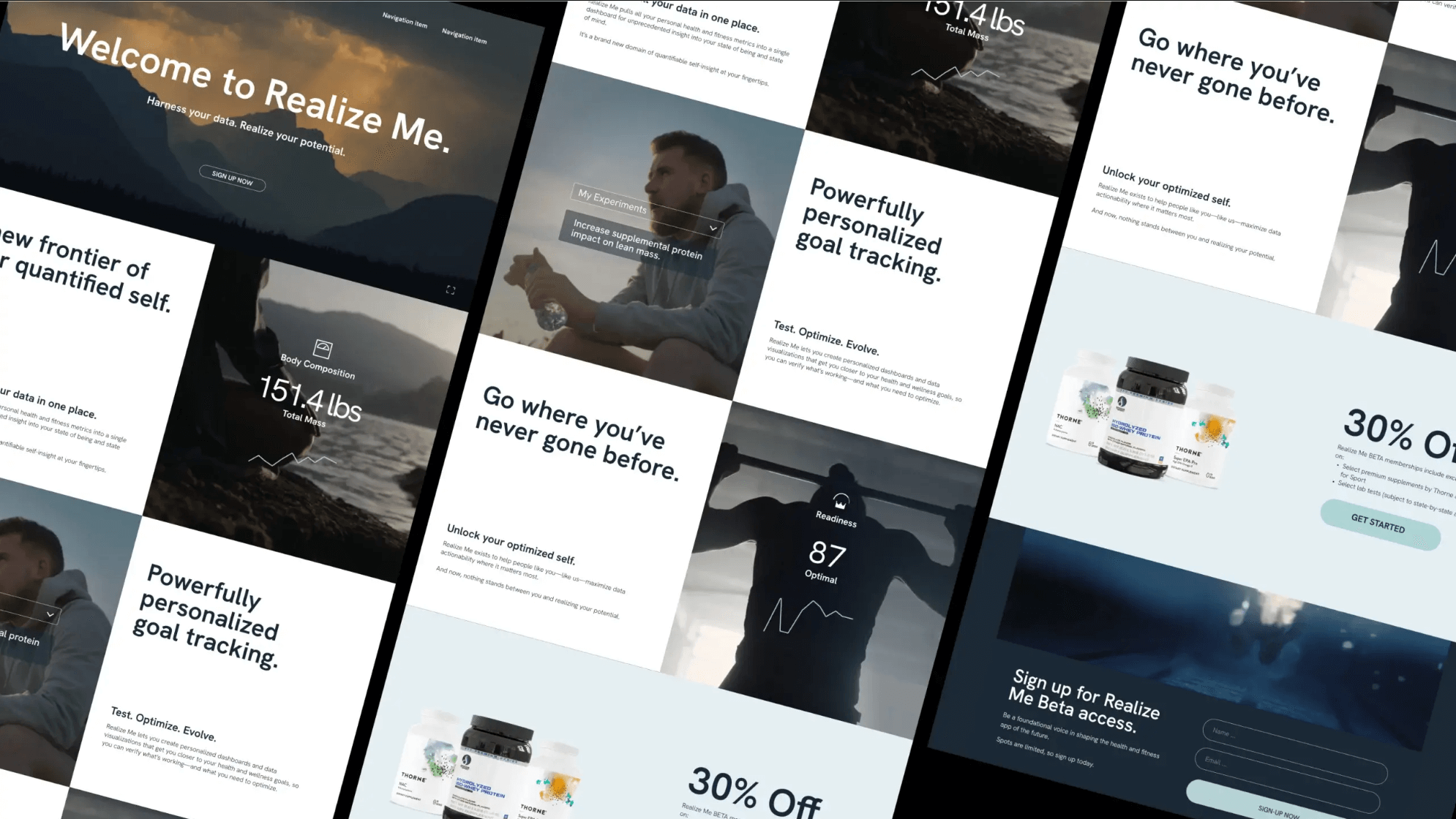
Fueling Peak Performance: RealizeMe’s Journey to Optimize Health Tracking + Wellness

Amongst us—at the office, in the gym, and even the produce aisle—are a select few who live a life in pursuit of optimal health and wellness optimization. These people are cyclists, marathon runners, bodybuilders, and cross-fit enthusiasts… you know the type. They’re also everyday people who’ve woken to the fact that they alone are responsible for their health and well-being and have taken it upon themselves to ensure they are in optimal health.

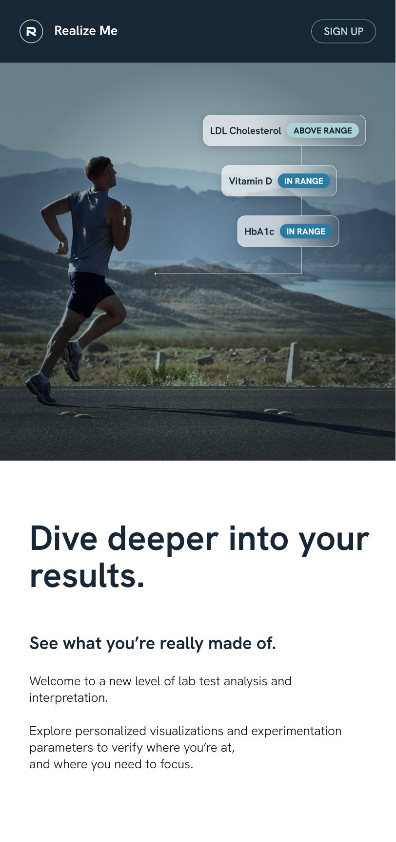
Any number of devices, apps and programs exist for these individuals; however, a common problem persists for all: How does one really know if what they’re doing is working and if a specific approach is moving the needle in the right direction? Is that intermittent fasting diet lowering your glucose levels? Are those additional three grams of protein a day increasing your body’s lean body mass? What about that sleep supplement you’re taking before bed—is it improving your sleep quality? That’s where RealizeMe comes in.

Founded in Los Angeles by accomplished serial entrepreneurs Ryan and Dani, this health and fitness startup has created a dashboard and program that integrates with all your various smart devices (smart watches, rings, scales, apps, glucose measurers, etc) so you can:

  • See all your health data in one central dashboard
  • Create custom experiments to see what’s working
  • Track progress in a custom dashboard
  • Share results and experiments with others.

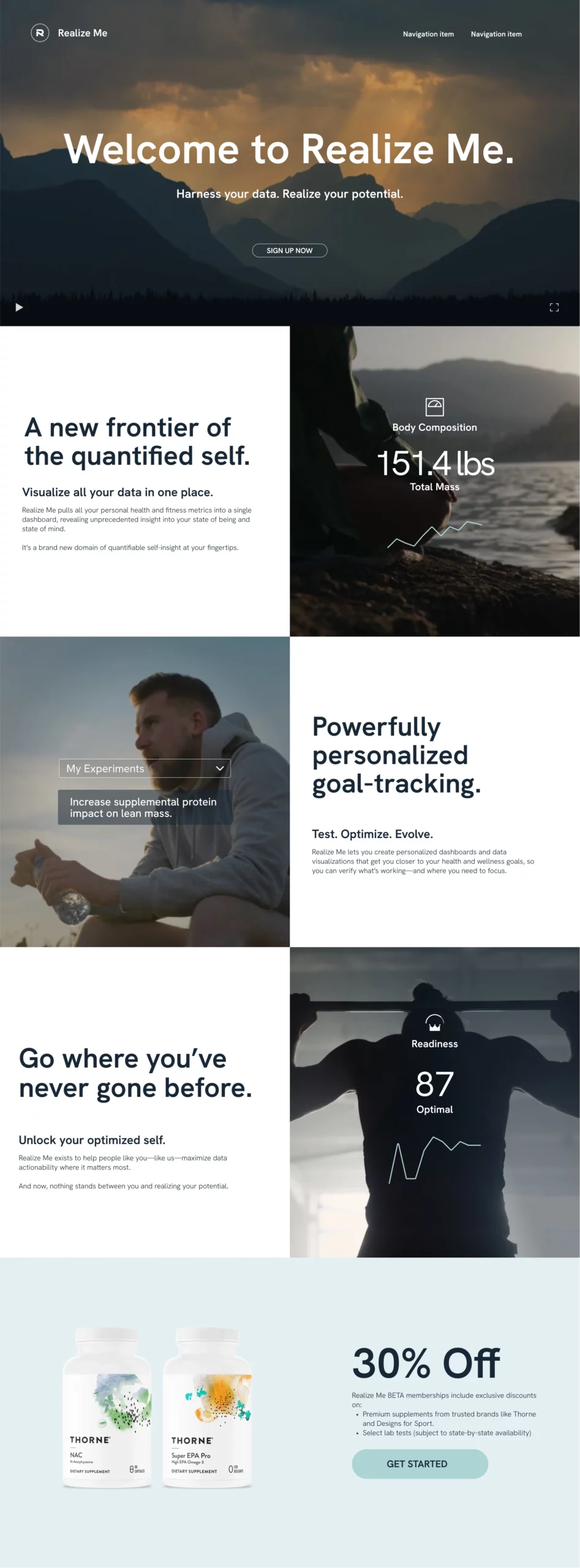
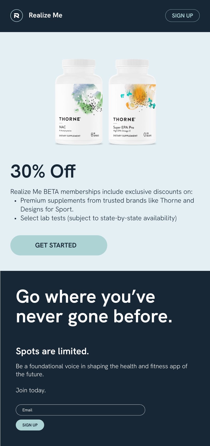
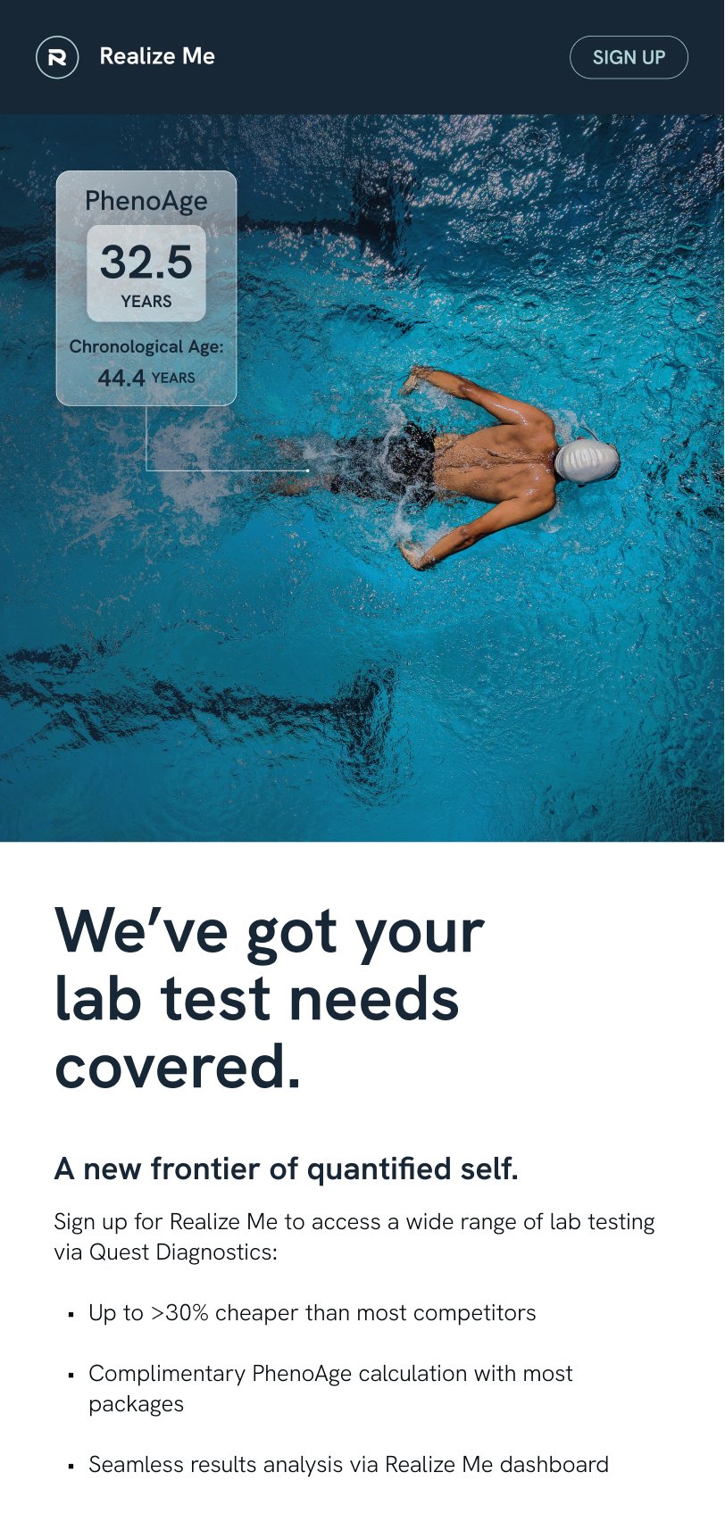
Additionally, for a monthly fee, app users are offered exclusive access to deals on select supplements and lab testing. The challenge for RealizeMe was that the startup needed between 150-300 beta platform sign-ups in preparation for its full product launch, scheduled for early 2023. As a group of wellness and data enthusiasts, this was an opportunity we couldn’t wait to get behind.

Turning Opportunity Into Action

Our first step was to dive a little deeper into the design parameters and culture of the available digital channels.

On Reddit, for example, our collateral couldn’t look like an ad. For YouTube and Instagram, our visuals needed to elicit a visceral “WOW factor” that would quickly harness people’s attention

To develop our strategy, we started storyboarding and splitting our audiences into different personas:

  • endurance and performance
  • biohacker/optimizer
  • discount and incentive seekers

For our first two personas, we took elements of the Realize Me dashboard and broke it down to visualize how the platform functions, its value, and to make it easily digestible  for a wide range of audiences with a variety of goals.

The concepts were different but married to the same visual ID. We built two different stories for those two different experiences, leveraging the power of the dashboard itself in facilitating fitness-optimizing experiments.

For the discount and incentive persona, the campaign was geared towards offering an exclusive discount on supplements to earn beta sign-ups. This campaign still focused on the functionality of the dashboard, but from a nutritional lens, with discounted premium supplement front and center.

Helping Others Realize Their Full Potential

The final campaign result consisted of

  • a 60-second brand video that primarily spoke to the power of the dashboard
  • a shorter video focused on endurance that was dashboard focused
  • and a 30-second video aimed at the optimizer persona but with a heavier focus on the supplement discounts

The videos created a vibe of intensity, sleekness, and peak performance, that tapped into the psyche of folks who are really dedicated, curious, intense, and data-driven.

On top of that, we developed a social media calendar with visual collateral and branded content, providing the client with the strategic direction that would carry them to their product launch and beyond.

And the timeline? We put all of these campaigns and strategies together in-house and in a matter of two weeks with one video editor, one designer, and two brand strategists – a tidy bit of work that we’re quite proud of.

Since the campaign launched, our strategy has shifted to a process of monitoring and iterating. We continually track audience trends across our digital platforms, testing images, copy, and themes to understand what is resonating and what is not.

Like the endurance and bio-hacker audience that Realize Me is designed for, we are committed to finding the optimal strategy and increasingly punching higher above our weight each week.

RELATED PROJECTS

VIEW ALL CASE STUDIES

Frequently Asked Questions

Common questions about healthcare website projects, answered from experience.

What makes a healthcare brand strategy different from branding in other sectors?

A healthcare brand strategy has to earn trust before it can earn attention. Patients, caregivers, partners, and referring professionals, for example, expect signals of safety, credibility, competence, and care, often while navigating stress, uncertainty, or highly personal decisions.

Our approach starts with the organization’s specific trust-building architecture: who the key audiences are, what reassurance looks like for each, and where perception is misaligned with reality. That work is grounded in research, whether that means stakeholder interviews and value-definition workshops, competitive review, audience and behaviour analysis, or a bespoke combination of these mechanisms, depending on the project’s unique goals and context.

It also means recognizing that “healthcare” is not a single audience or emotional context. Recovery College YVR needed a brand that felt inclusive, real, and community-led, as opposed to clinical or institutional, which led to the narrative “Real people. Sharing. Learning.” Community Action Initiative, by contrast, needed brand strategy and messaging that clarified its mission and distinct role in British Columbia’s mental health and addiction landscape after confusion around its name and purpose. For Medtronic Labs, that meant using workshops and stakeholder interviews to clarify core values such as pioneering, collaboration, and empathy for a global health innovation organization.

The common thread is that healthcare branding works best when it translates complexity into trust, and when the strategy is precise enough to reflect how people actually experience care, support, solutions, and/or wellness.

How do you communicate clinical credibility without making a healthcare brand feel cold or inaccessible?

Clinical credibility comes from specificity, not jargon: naming what a service does and what outcomes it produces in language real people can follow. Warmth comes from how the brand frames that science in relation to the person receiving care. When both work together, clinical detail actually makes the brand feel more human, because it signals that the organization takes its patients seriously enough to be precise.

In practice, this shapes decisions across the entire brand system: messaging hierarchy, visual tone, typography, imagery, and the language used in patient-facing content. The goal is never to strip out the science. It’s to make the science feel like it belongs to the patient, not just the clinician.

We’ve navigated this tension across very different healthcare contexts, from Medtronic LABS (global health innovation speaking to government partners and underserved communities) to Evergreen MD Aesthetics (a physician-led cosmetic clinic in a crowded consumer market).

When should a healthcare organization consider a rebrand?

A healthcare organization should consider a rebrand when there’s a meaningful gap between what the organization has become and what its brand communicates.

That gap shows up as difficulty recruiting staff who don’t recognize the organization from its public presence, patient confusion about available services, fragmented brand architecture after a merger or expansion, or a strategic pivot the existing identity can’t carry.

A rebrand isn’t always the answer, though. Sometimes the issue is messaging clarity or visual consistency, not positioning. We start by diagnosing which problem actually exists before recommending scope.

The work we did with CMHA North + West Vancouver was a structural and digital overhaul, not a repositioning. The work with Community Action Initiative required a full brand strategy and visual identity because stakeholders were confused about the organization’s name, mission, and distinct role. Two different diagnoses, two different scopes.