Go to content

Adler University

INTRODUCTION

Education Designed for Impact

Adler University exists to advance social responsibility through education — preparing practitioners who see the world’s challenges not as headlines but as calls to action. Rooted in the philosophy of Dr. Alfred Adler, the University believes that personal growth and community wellbeing are inseparable.

But while Adler’s mission had never wavered, its digital presence hadn’t kept pace. The brand and website lacked cohesion across its campuses in Chicago, Vancouver, and online programs. Prospective students struggled to navigate complex program structures, and the story of Adler’s enduring purpose wasn’t being told with the clarity it deserved.

Takt was brought in to lead a comprehensive rebrand and digital transformation — including visual identity, messaging, content strategy, UX design, website development, and branded photography and video.

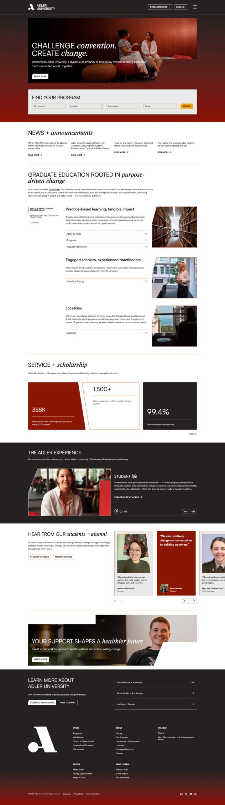
The Adler University homepage. Designed and developed by takt.

Reframing Purpose for a Global Audience

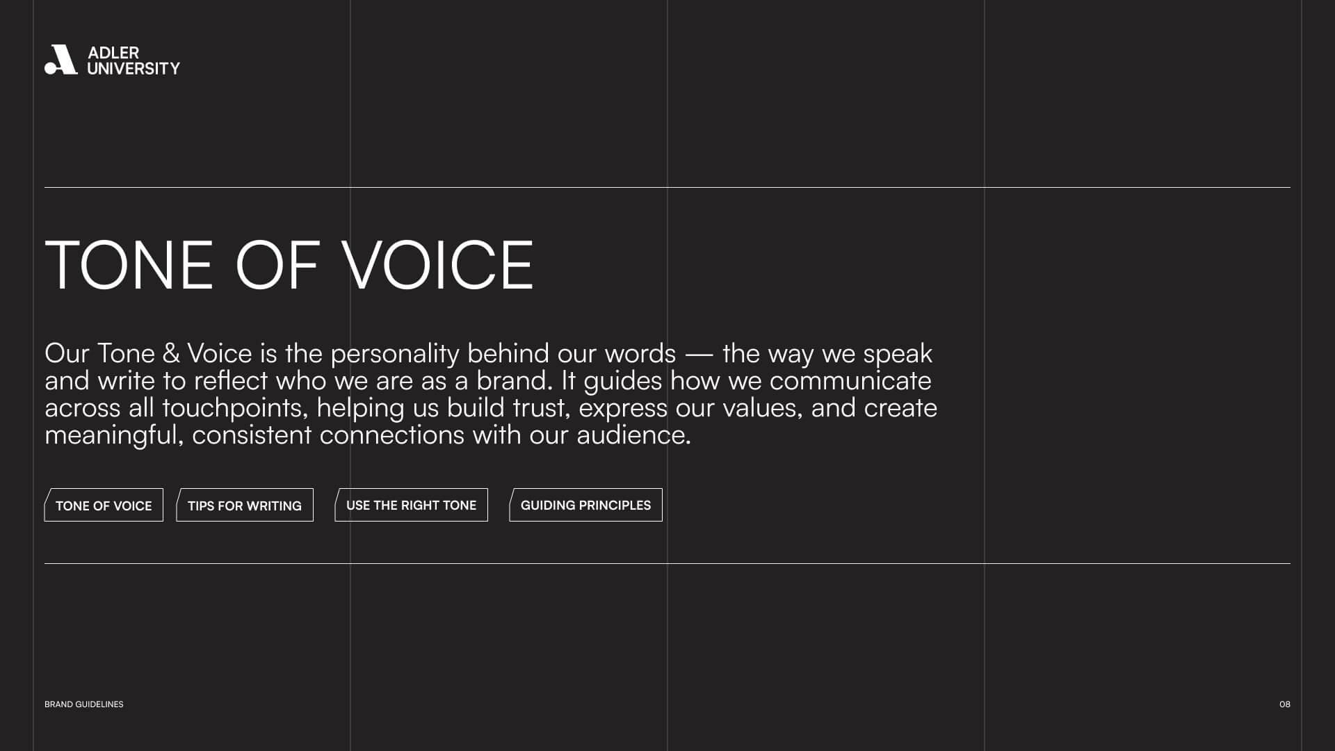
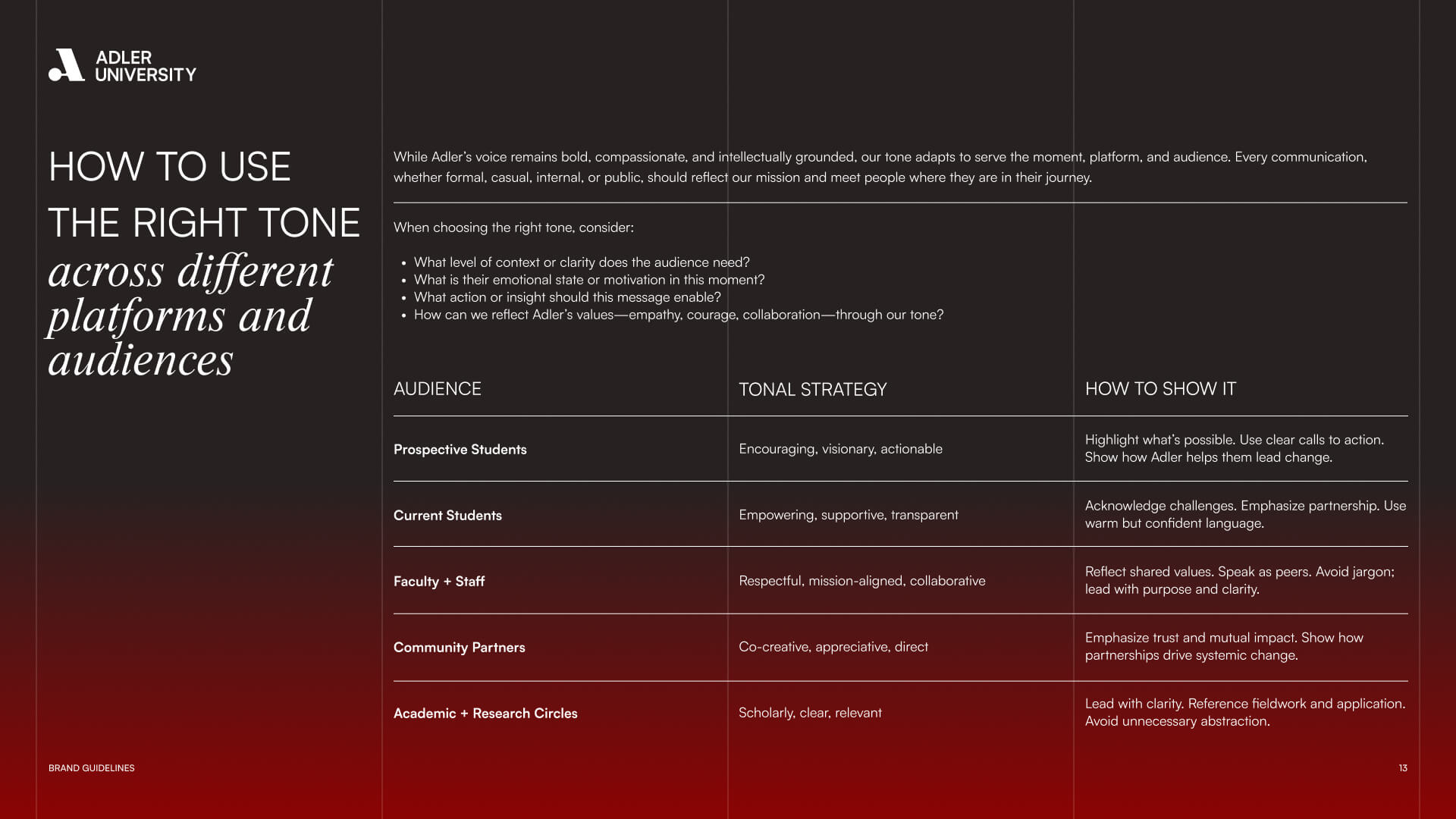
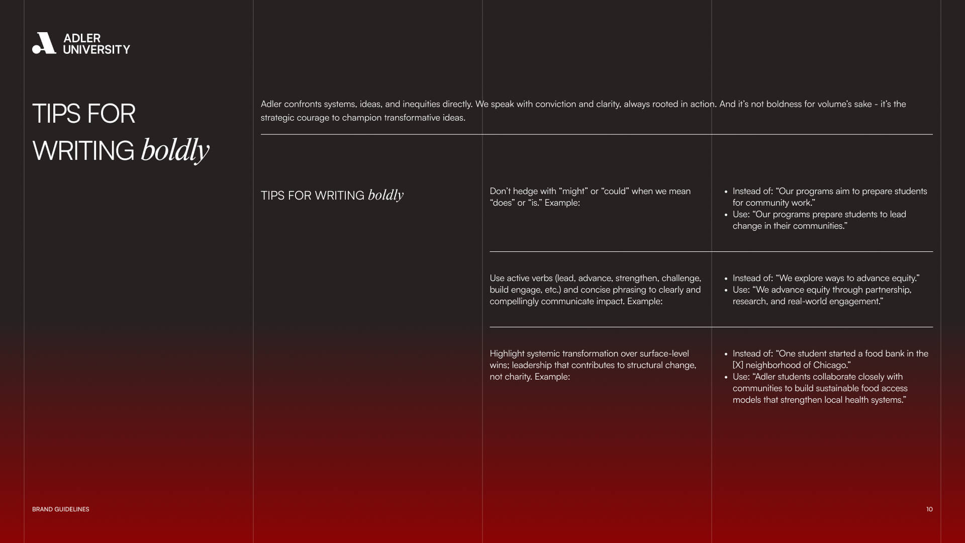
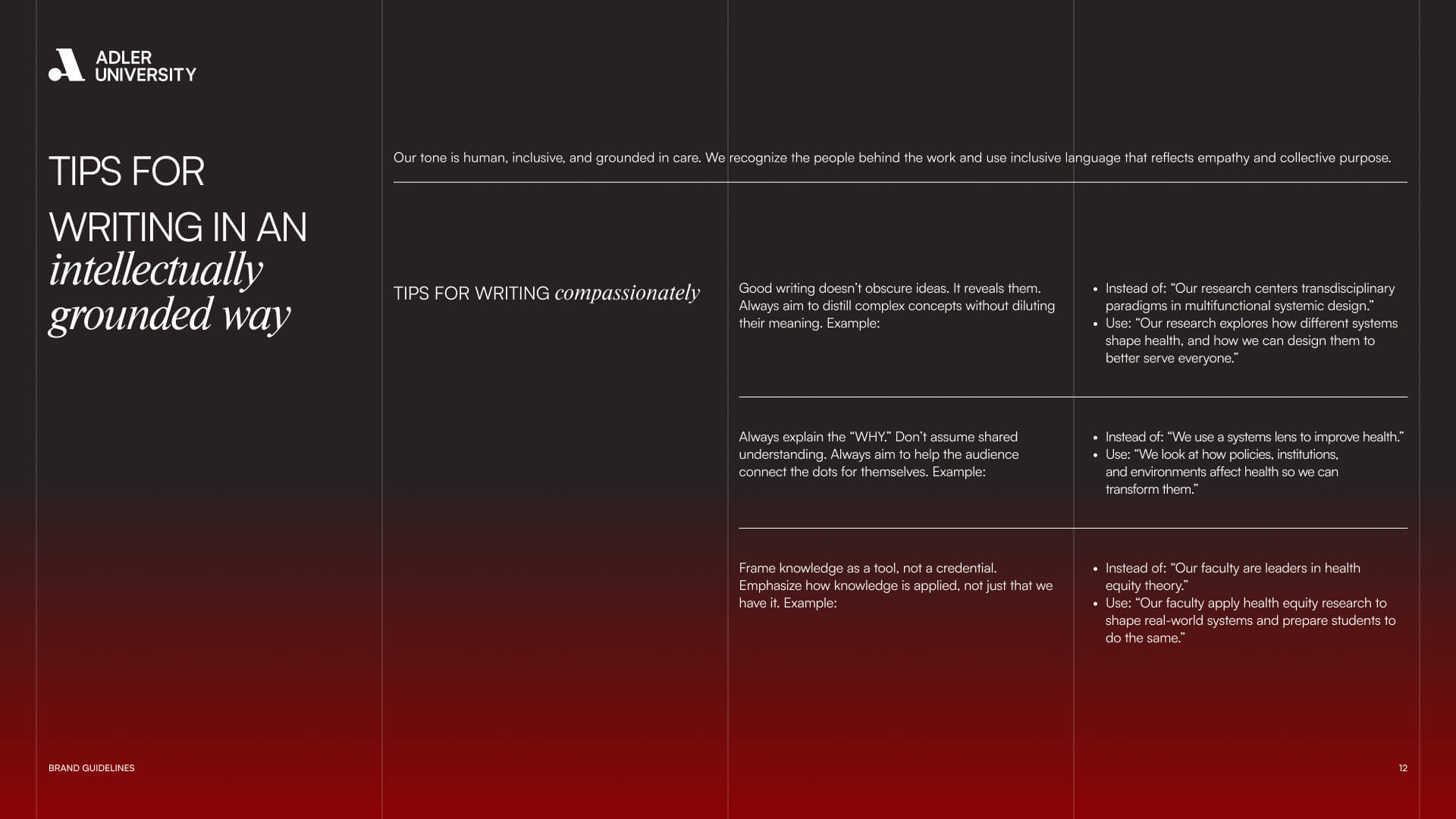
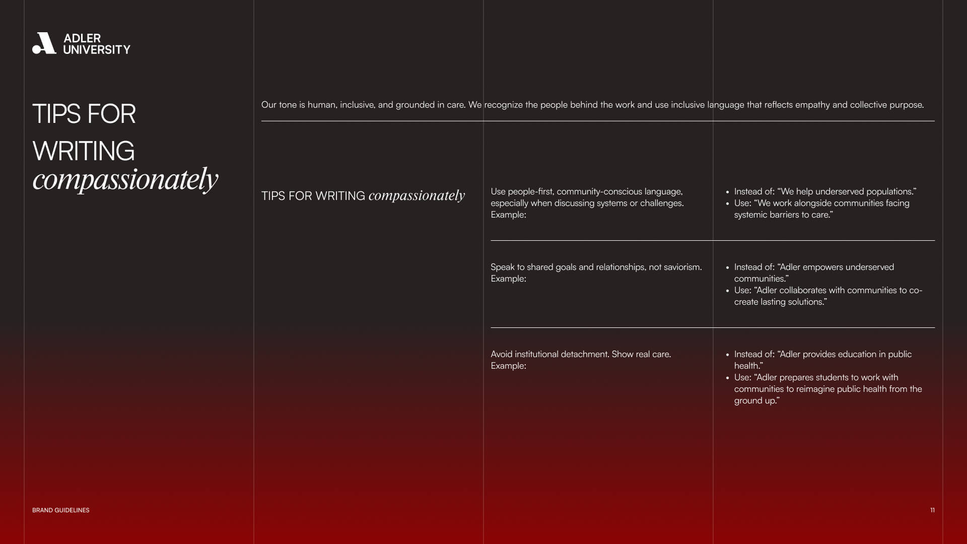
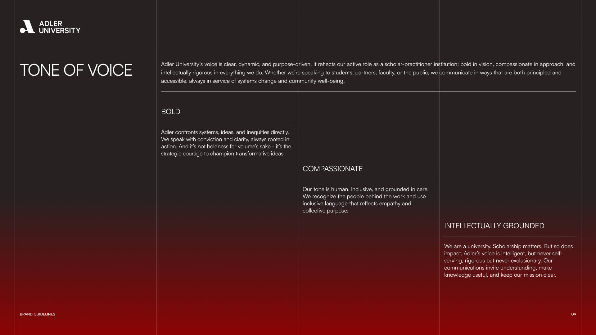
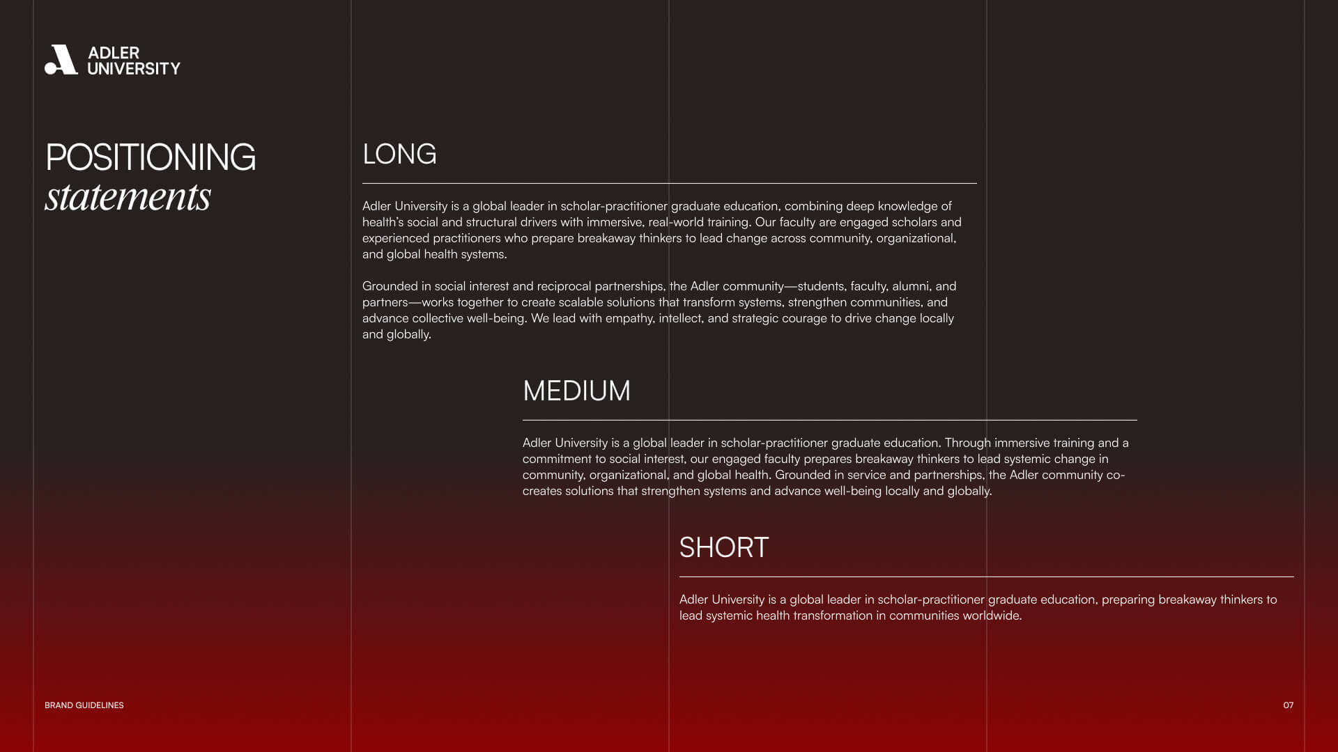
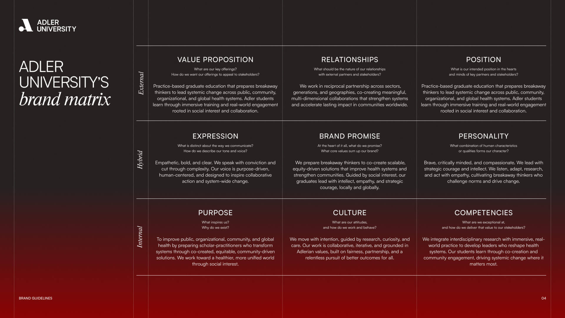
Our first task was to give language and form to what Adler has always stood for. The result: a refreshed brand platform that communicates empathy, leadership, and action without leaning on buzzwords or moral posturing.

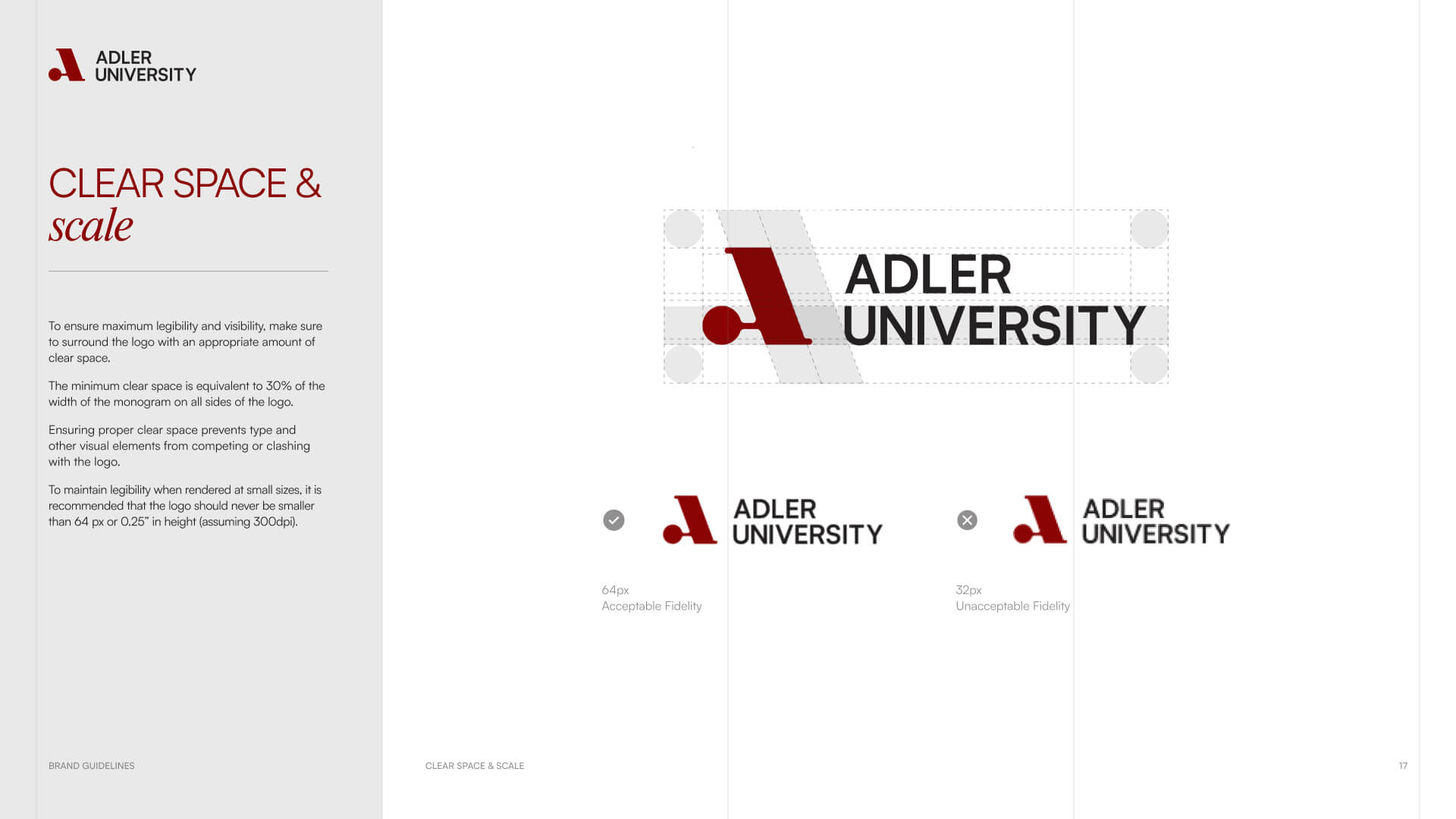
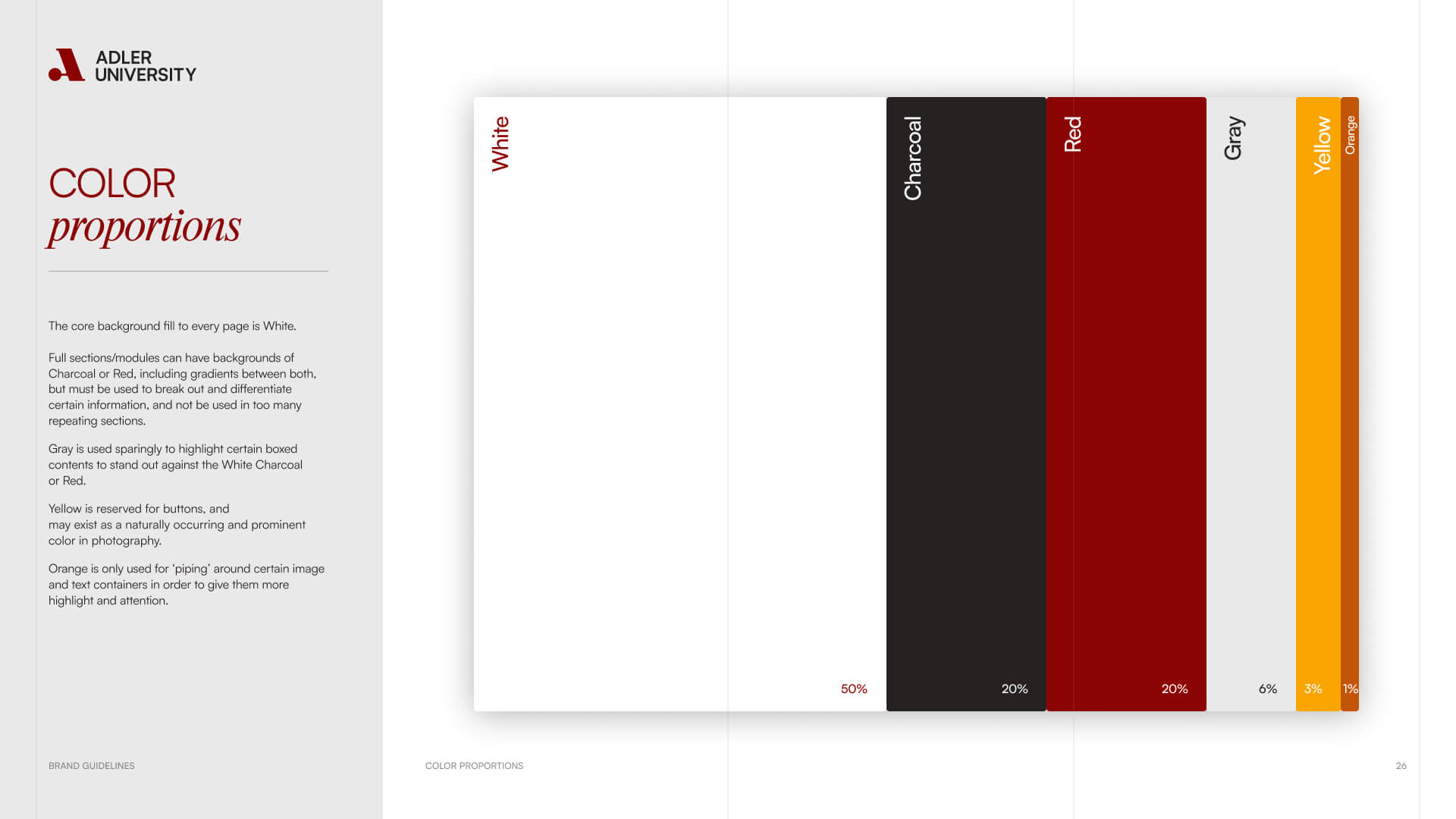
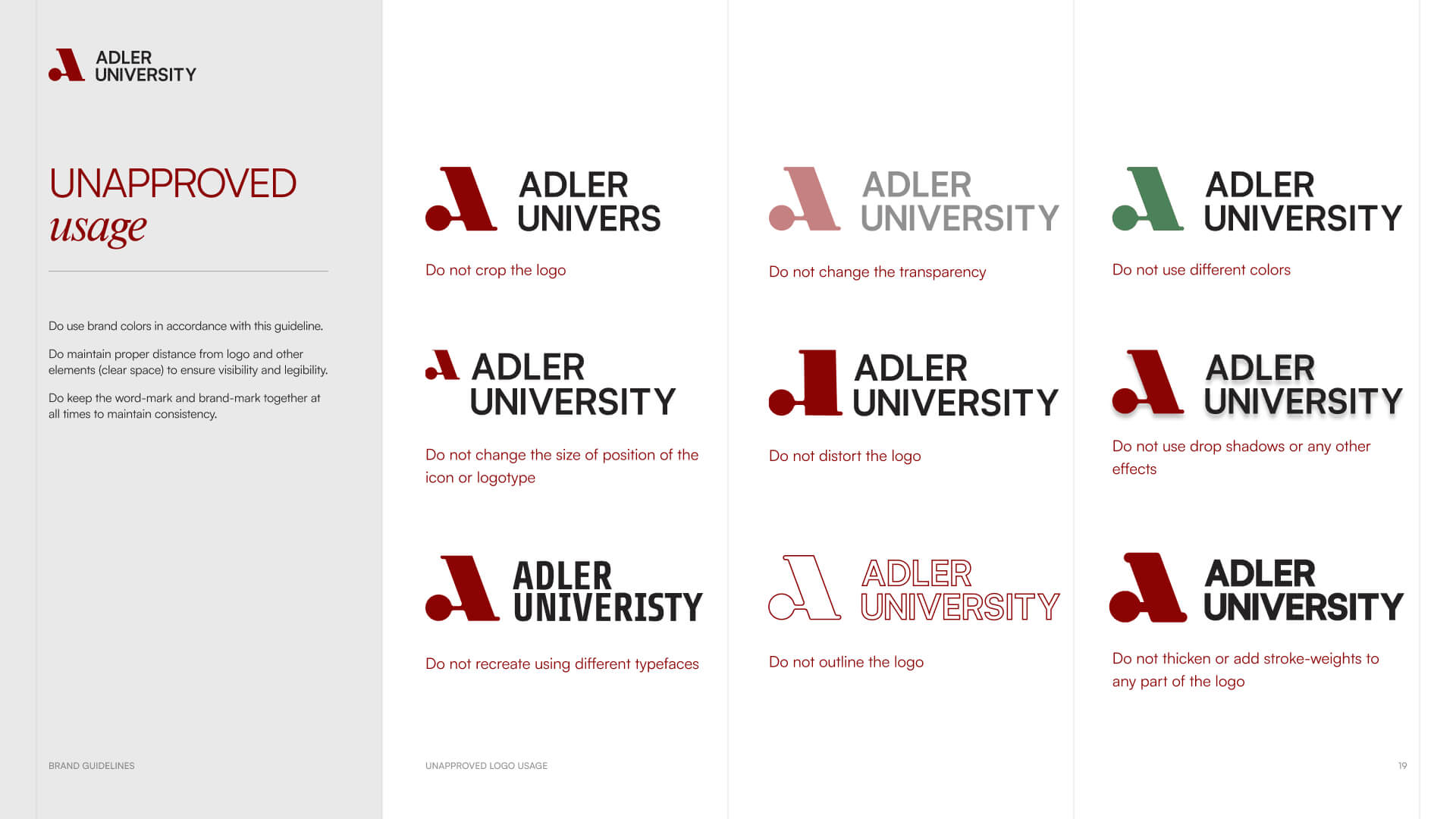
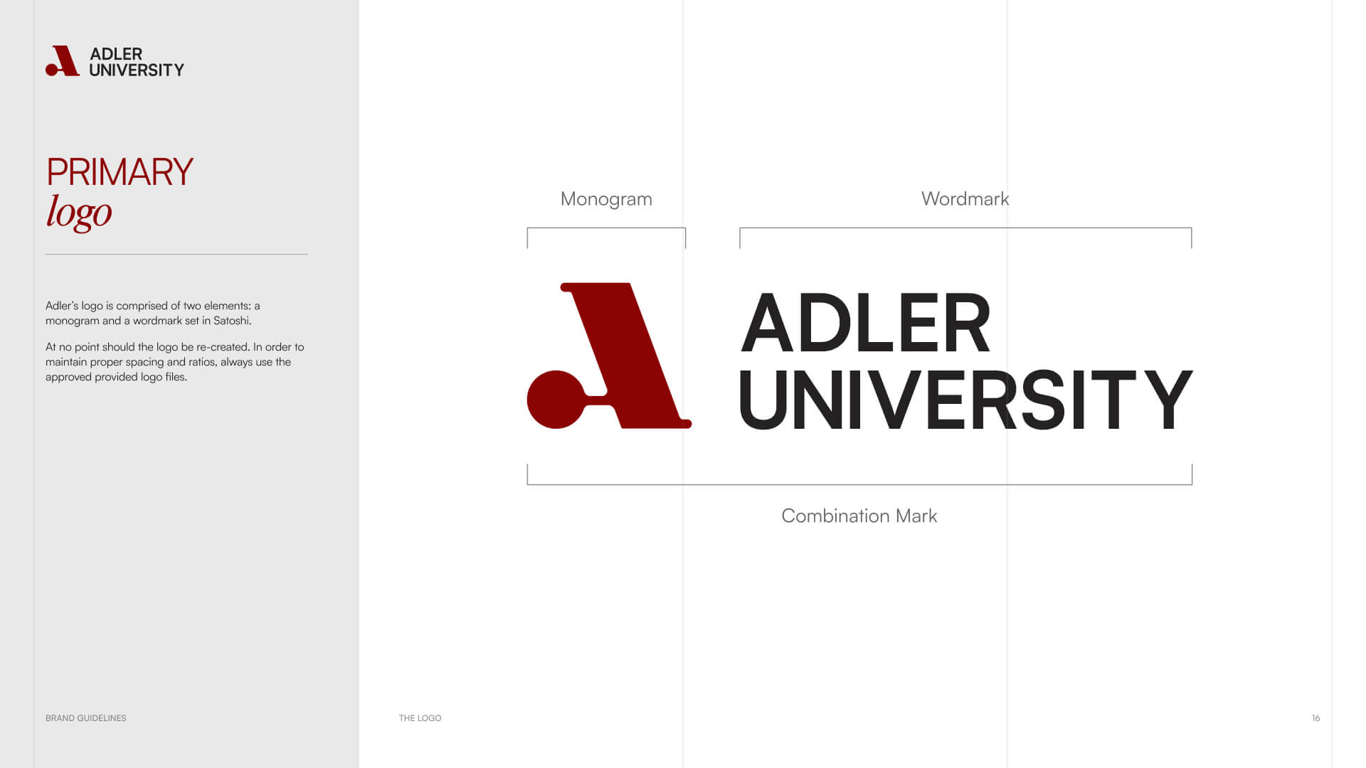
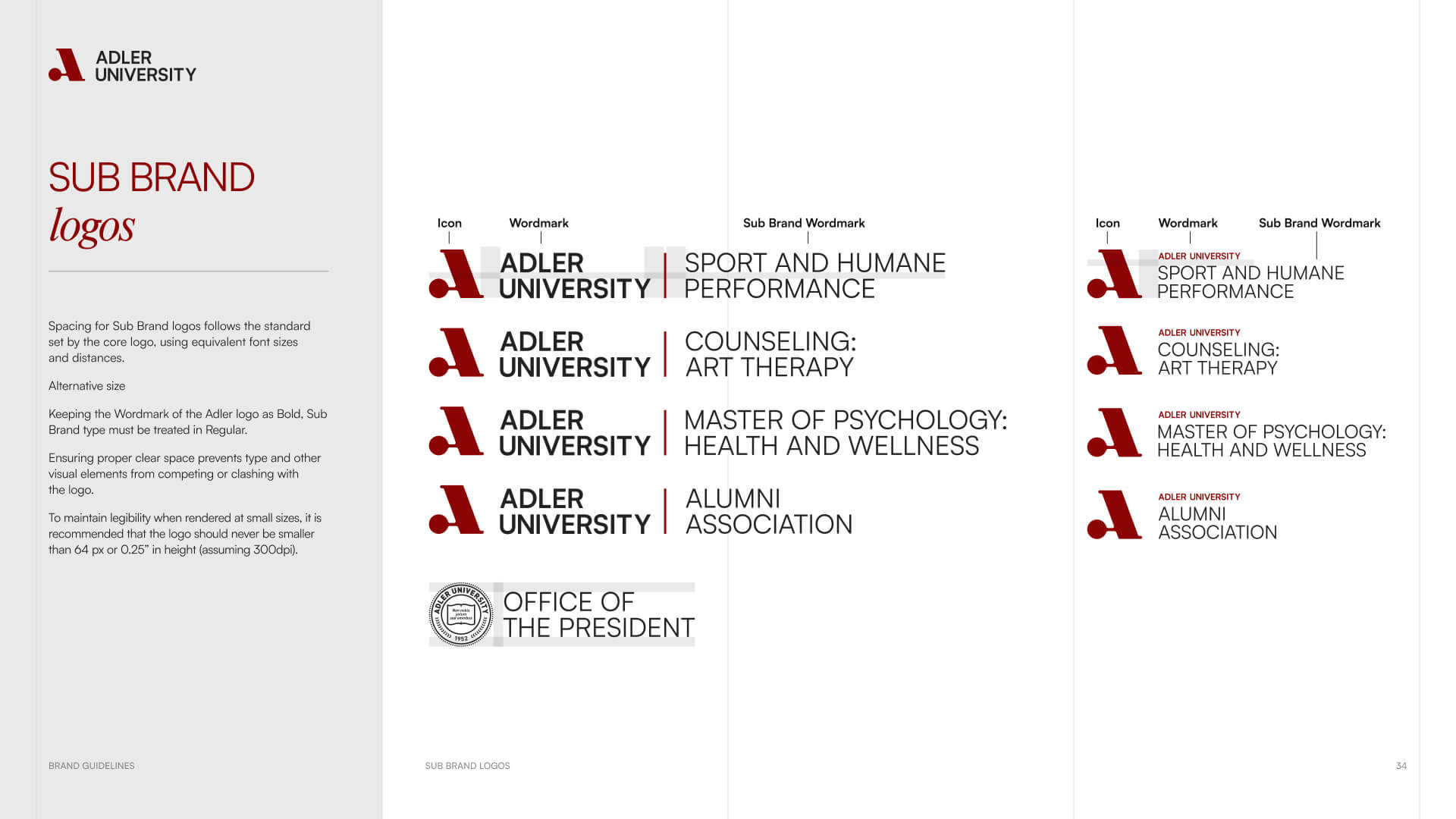
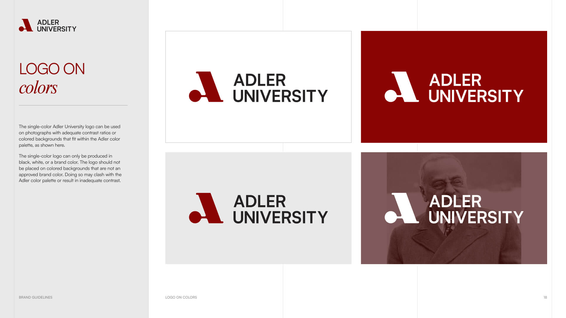
We simplified the core messaging around three principles — connection, courage, and community impact — positioning Adler as a global university grounded in purpose and progress. The new logo and visual system reflect academic confidence balanced with warmth and humanity.

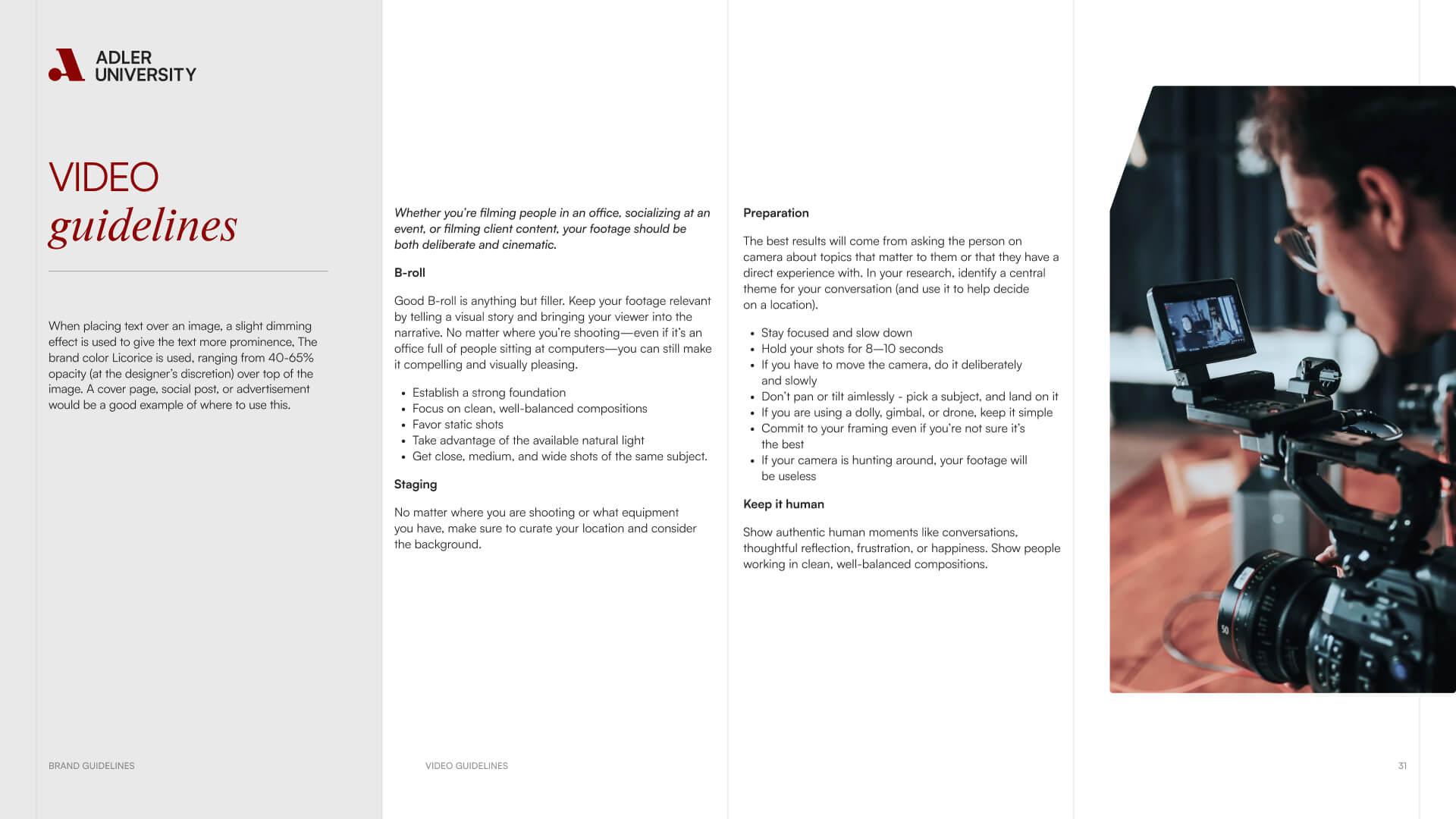
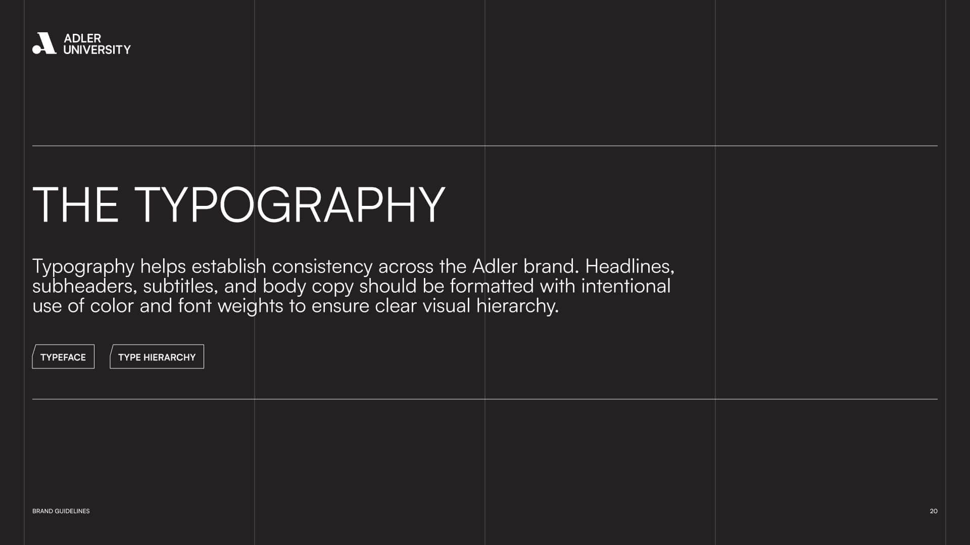
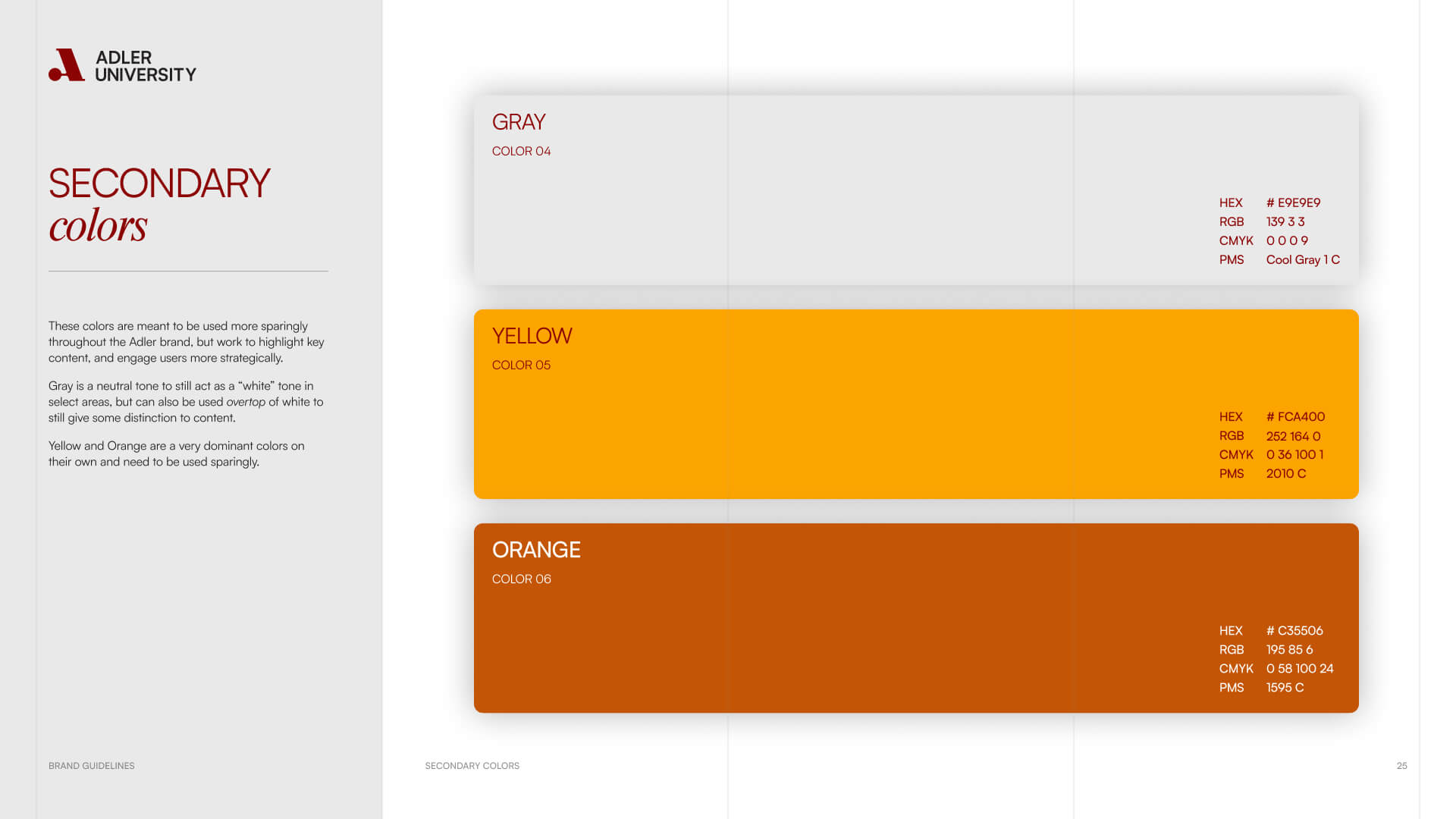
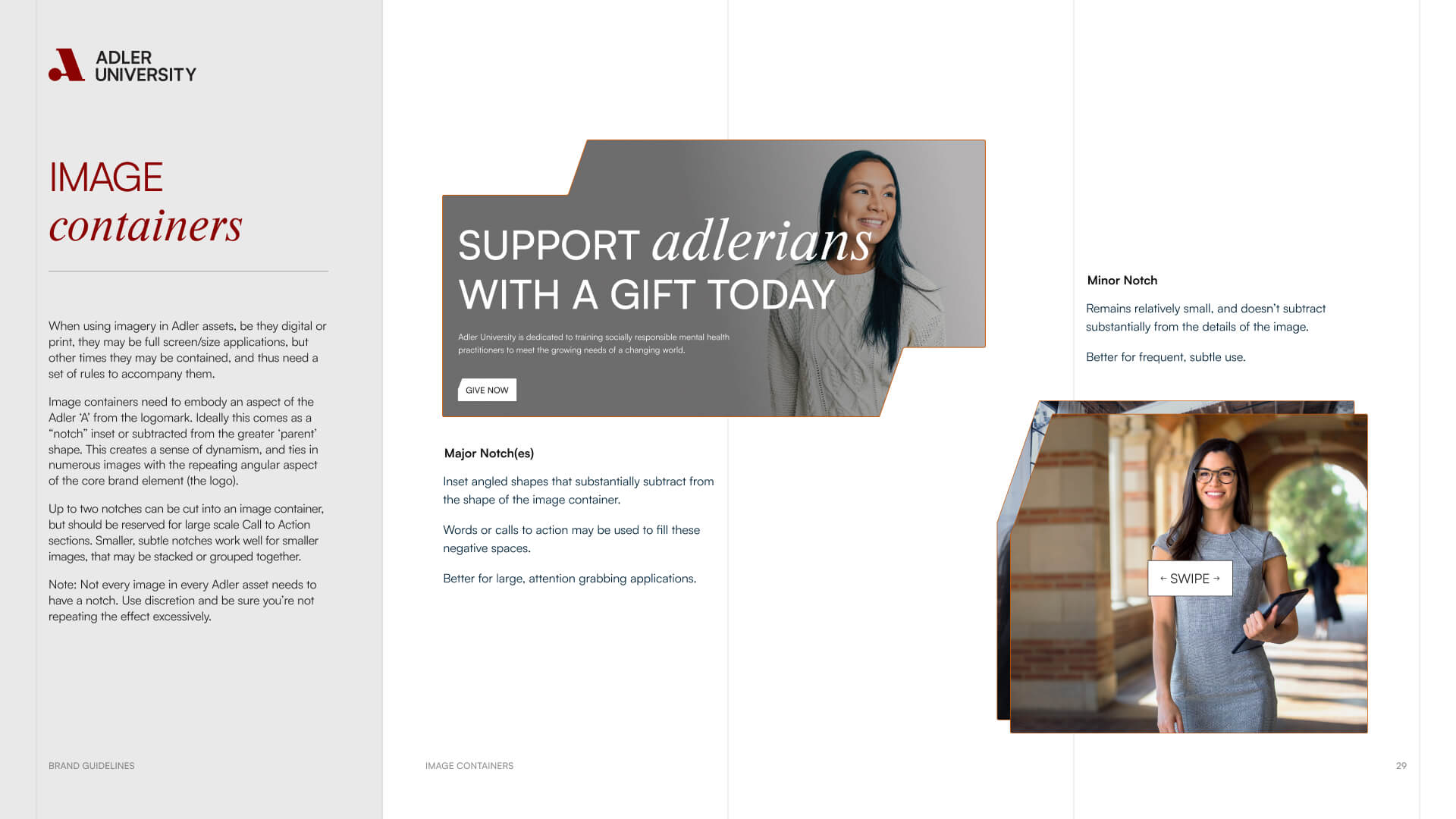
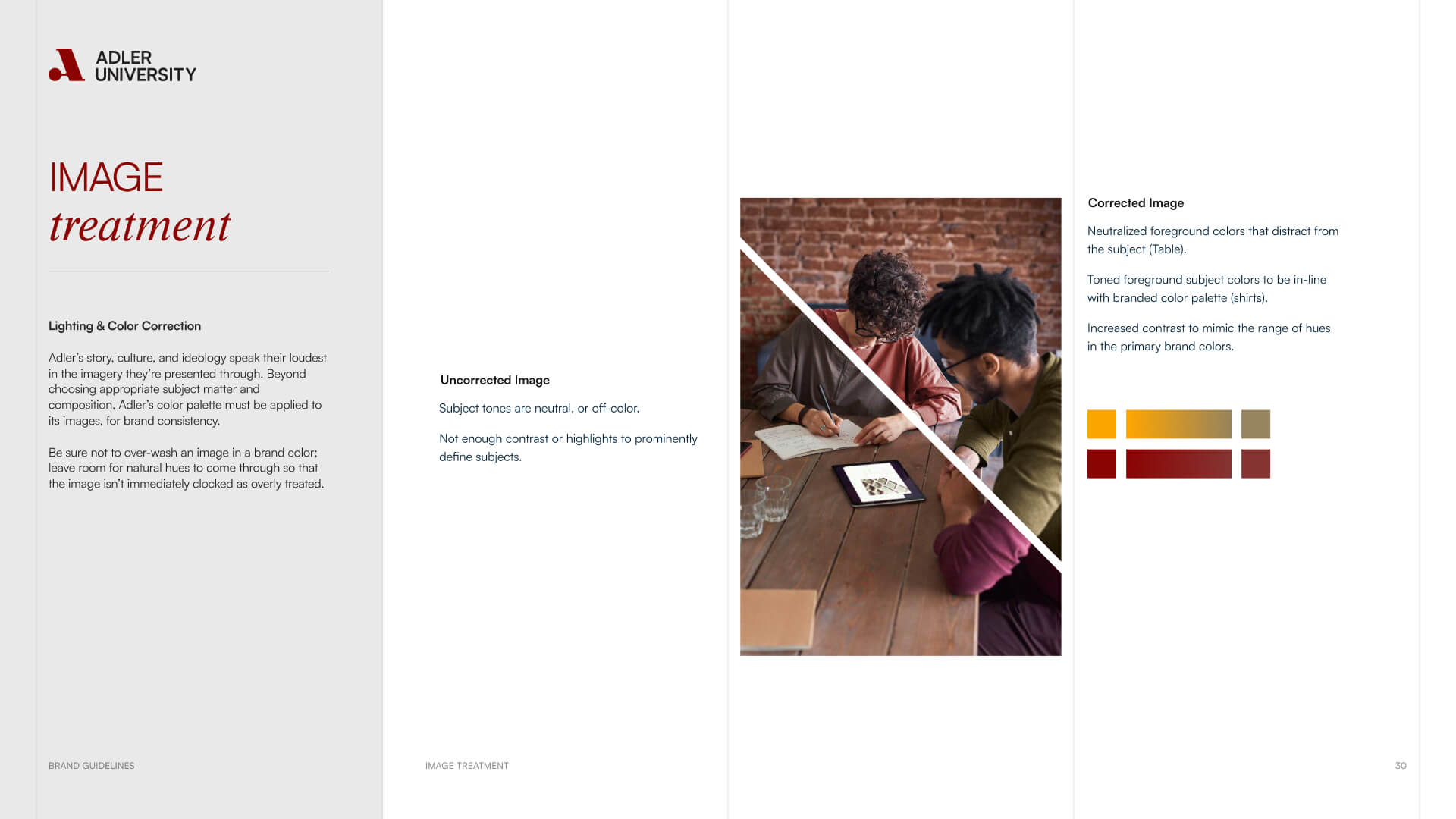
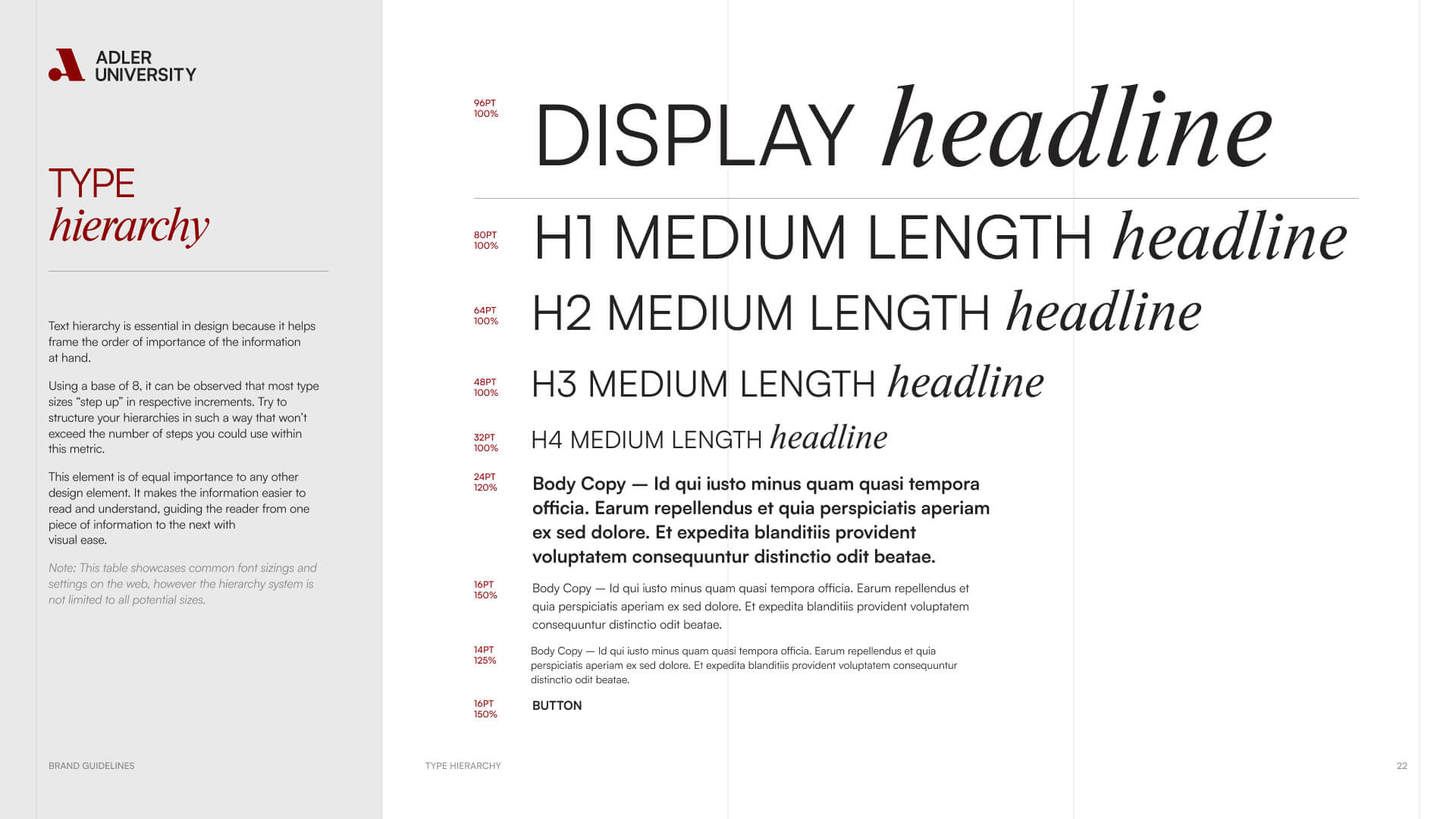
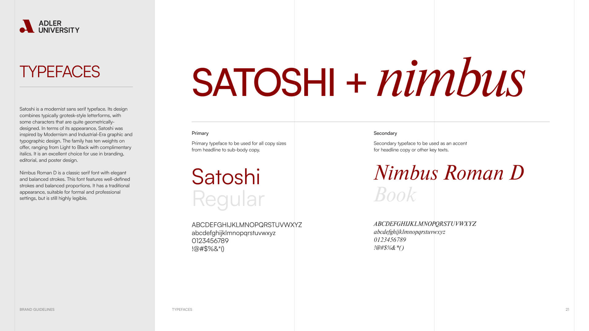
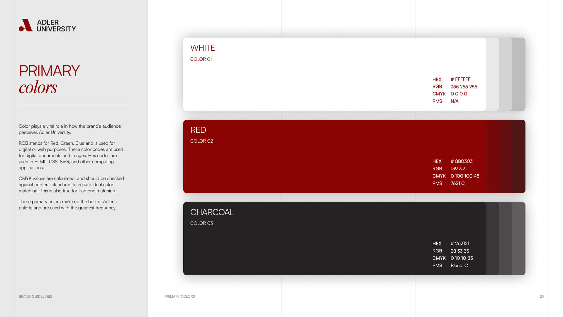
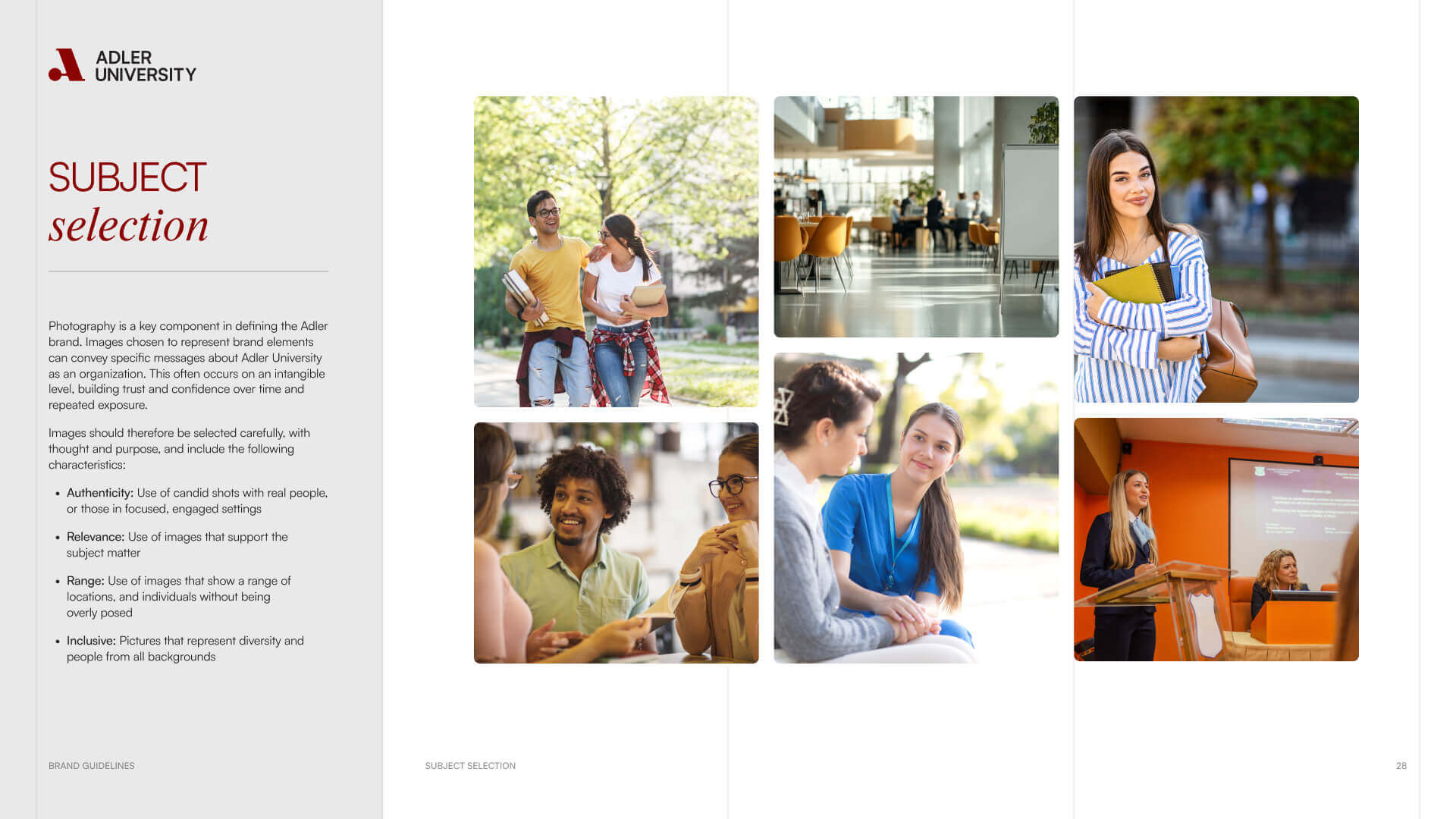
Across every touchpoint, the brand signals motion: gradients that suggest change, typography that feels open and assertive, and photography that captures authentic campus life and student connection.

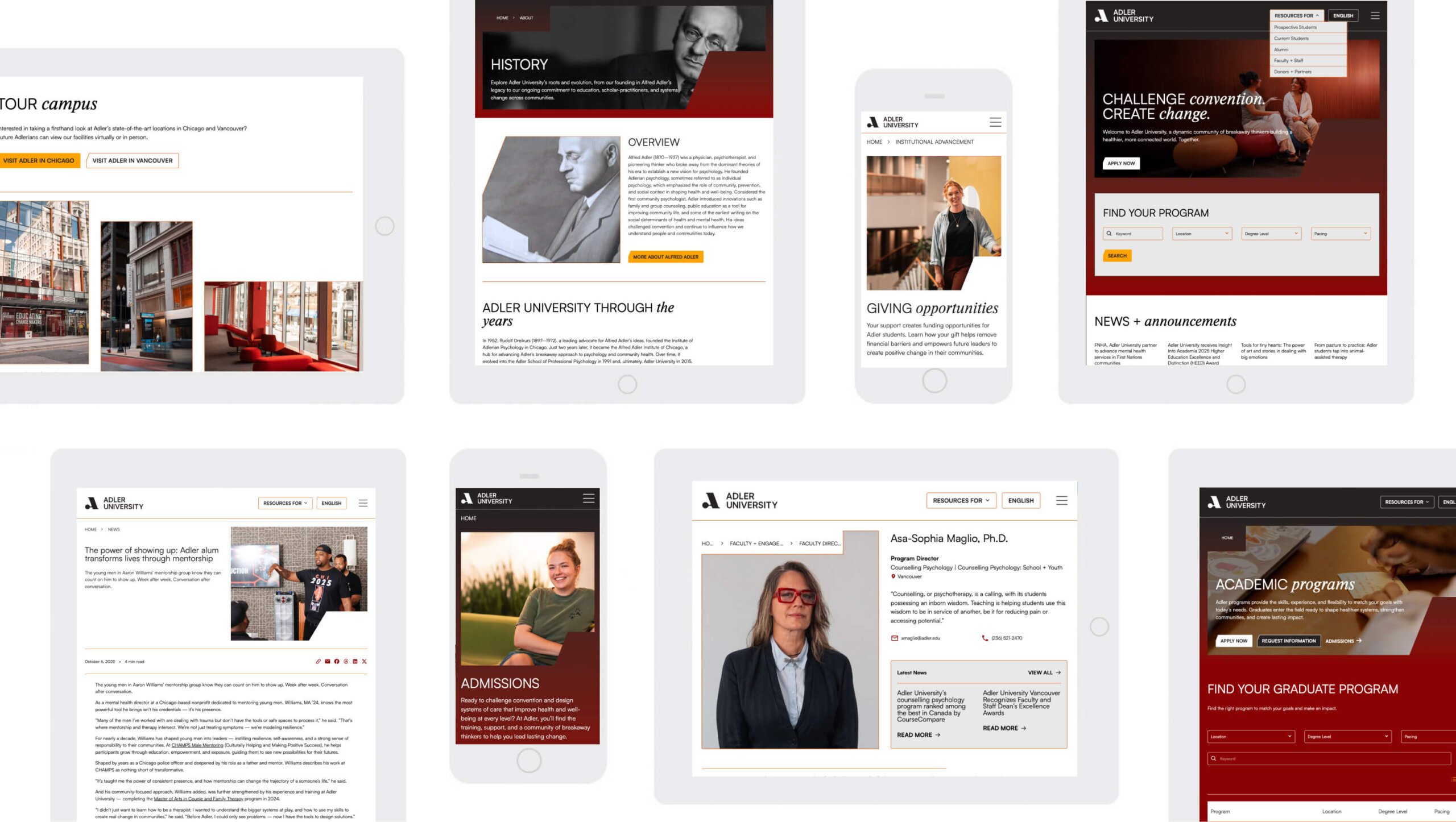
The Adler University website, presented across different screen sizes and device types.
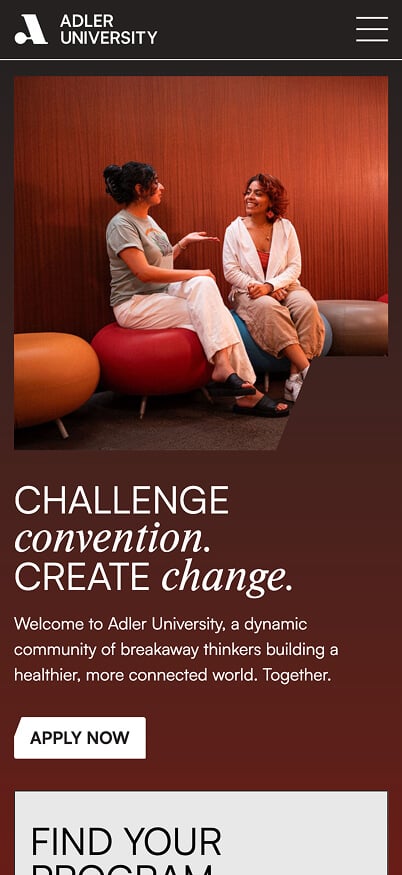
The Adler University website homepage on mobile.
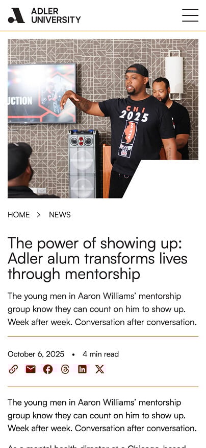
A news post on the Adler University website. Shown in mobile format.
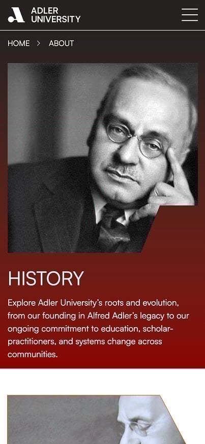
History page on the Adler University website. Shown on a mobile screen size.
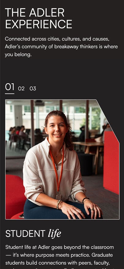
A page on the Adler University website. Shown in a mobile screen size.
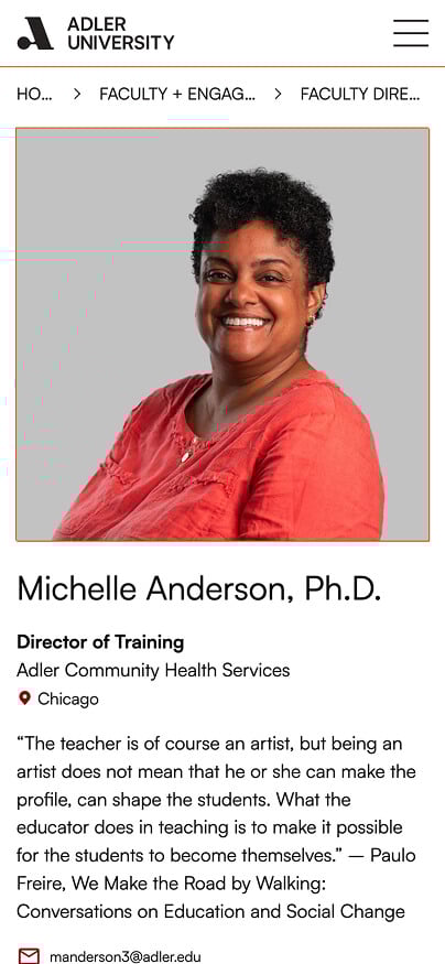
A bio page for an Adler University faculty member. Shown on mobile screen size.

Building a Digital Experience That Feels Human

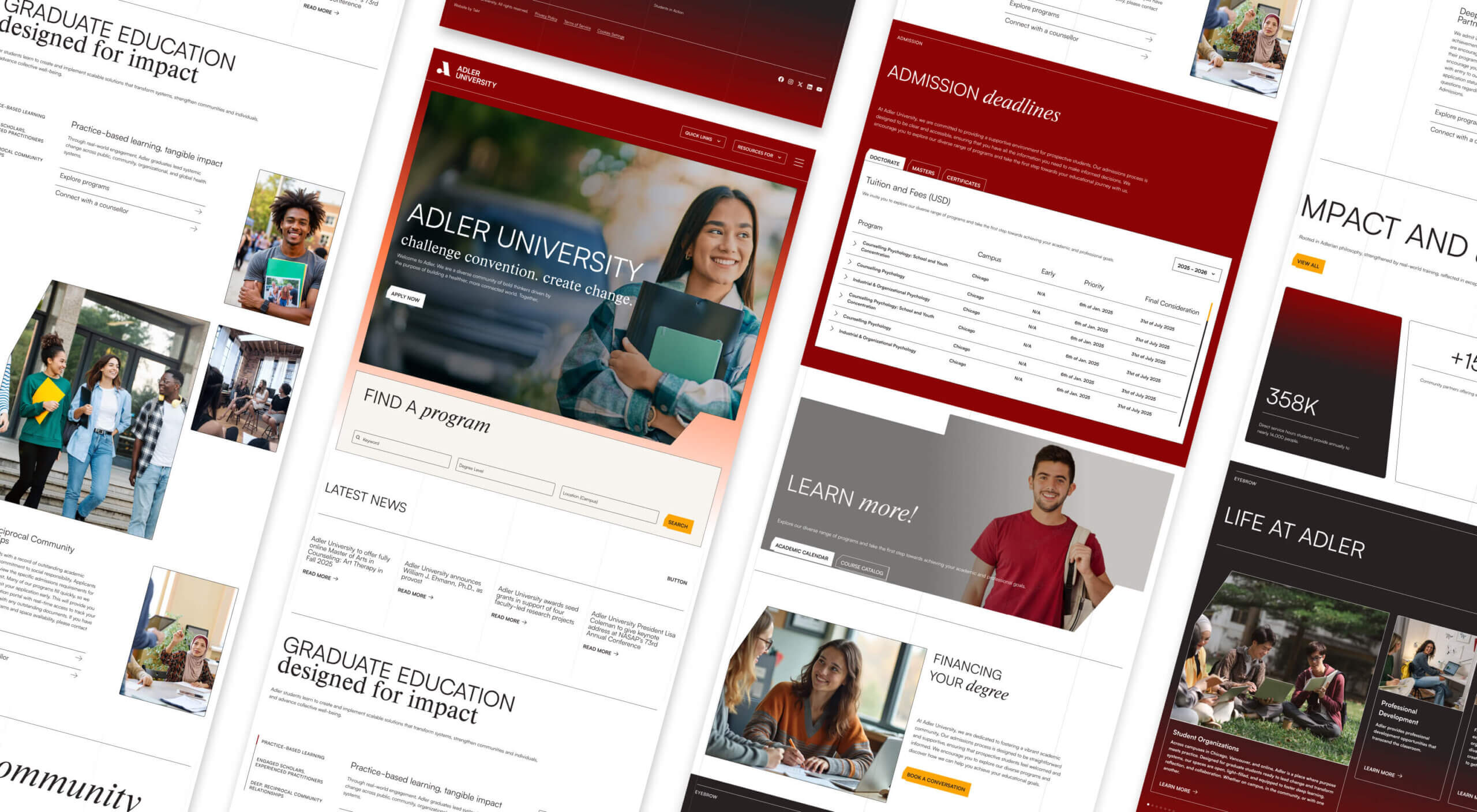
Higher education websites are often built for institutions, not users. Adler’s had to be different. We reorganized the site around user journeys — creating shortcuts like Resources For that guide prospective students, alumni, faculty, and donors directly to what matters most.

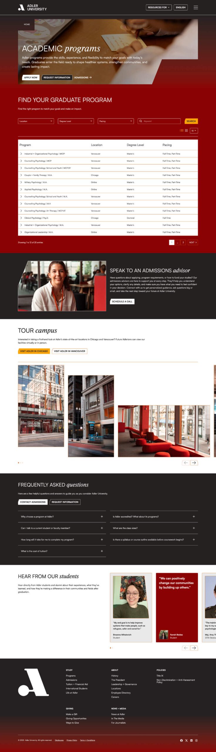
Every design decision supported clarity. Program pages balance academic depth with accessibility, unifying campus-specific details while maintaining flexibility for future growth. Faculty and staff received their own structured profiles, giving each academic a visible, connected home for bios, publications, and leadership.

The architecture embraced a “place for everything” philosophy — ensuring content was discoverable, logical, and meaningful. From student resources to admissions deadlines, everything now lives where users expect it to.

We also surfaced relevant content from the internal portal when it aligned with a user’s context — helping bridge the gap between external storytelling and internal functionality.

A collage of pages from the Adler University website. Shown on desktop screen sizes.
A program page on the Adler University website.

From Legacy to Living Brand

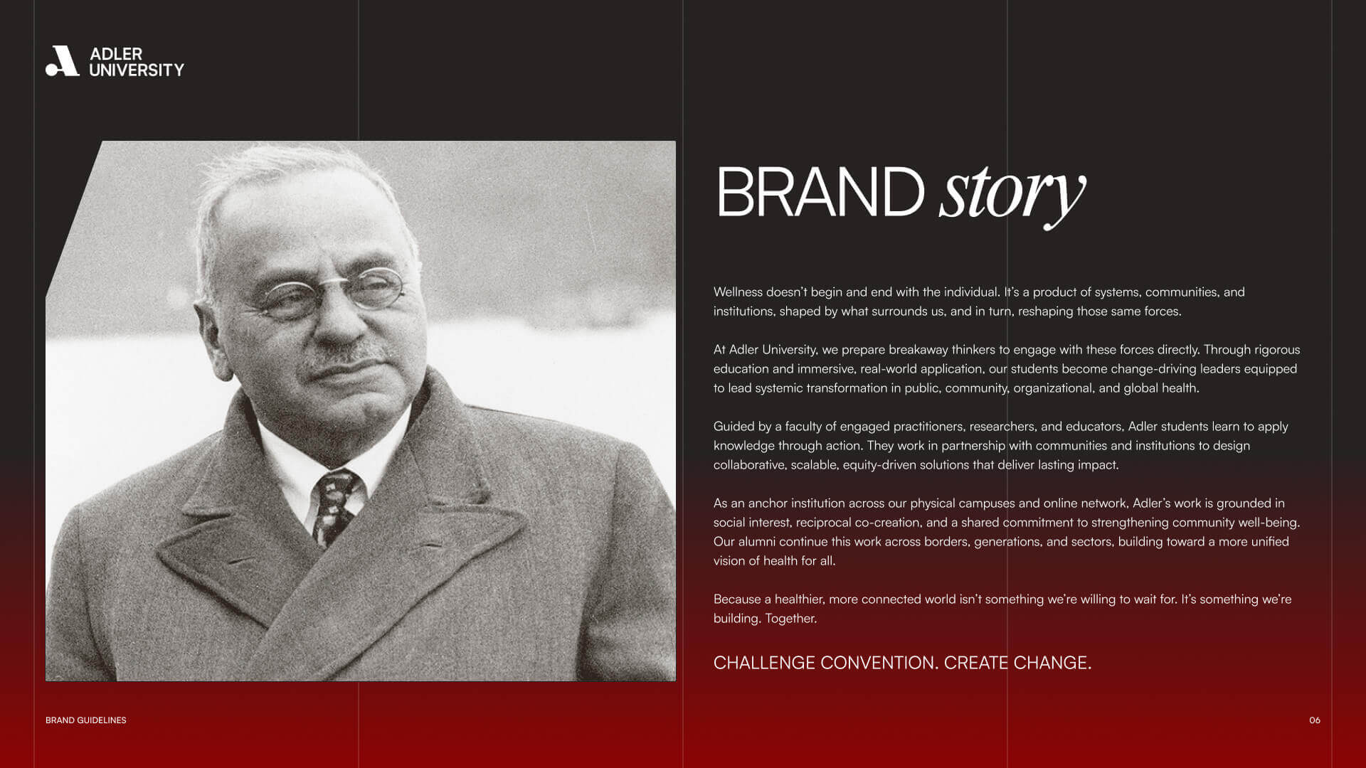
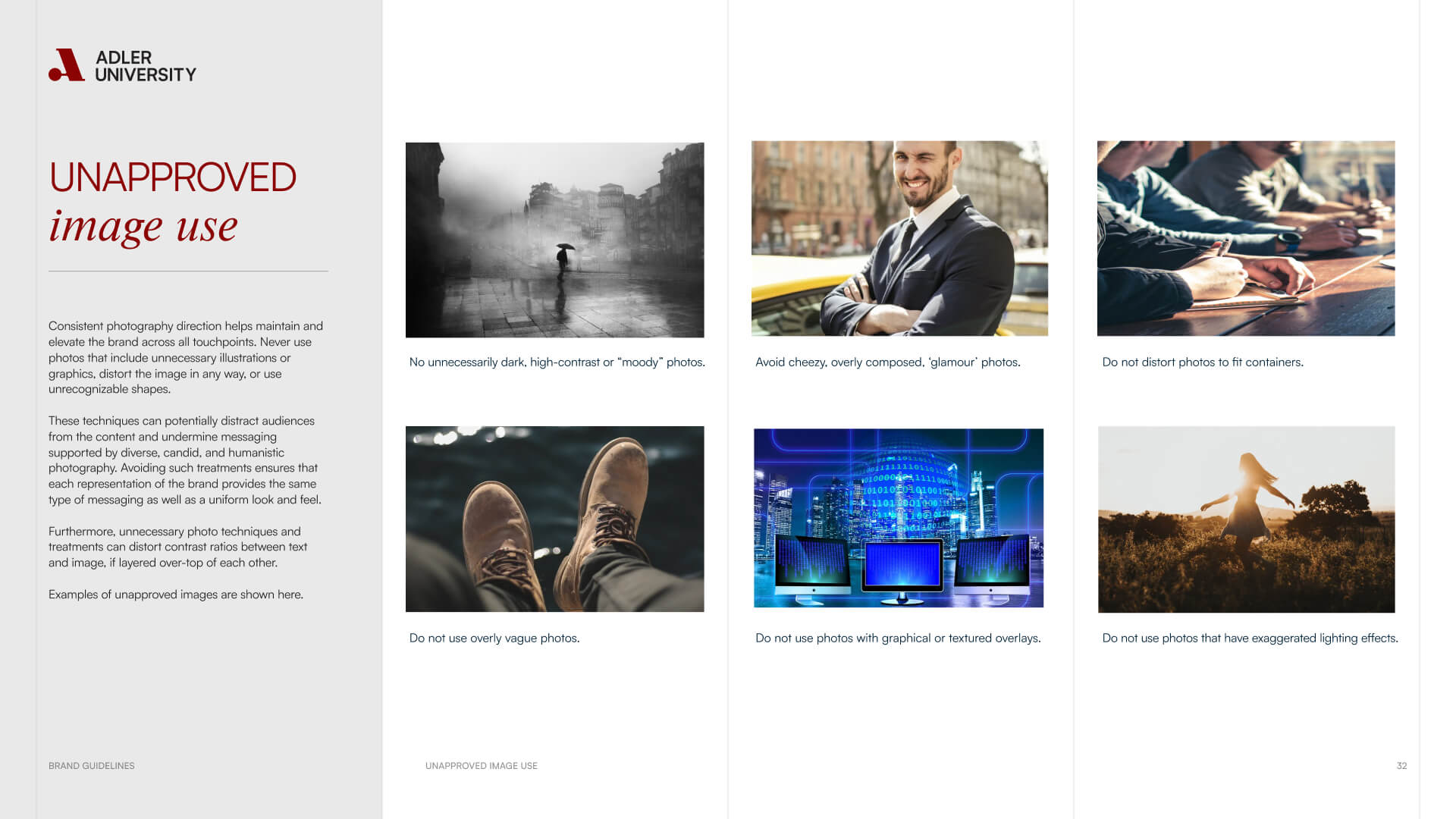
Adler’s new creative direction honours its namesake’s legacy while looking forward. Photography and video capture real interactions — classrooms, communities, and campus life — shot on location in Chicago and Vancouver.

The interface is bright, editorial, and grounded in simplicity. Responsive layouts and refined motion give the site a contemporary pace, while color and typography maintain academic credibility. The result feels both institutional and alive — professional without being sterile.

TECHNICAL FRAMEWORK

A Platform Built to Evolve

The new Adler site was built for agility, accessibility, and speed. Its CMS allows decentralized content creation while preserving design consistency across programs and regions. Global modules accommodate updates without duplication, and performance optimization ensures fast load times and WCAG compliance across devices.

Every component supports storytelling — a modular design system built for flexibility, scalability, and collaboration between marketing and academic teams.

Adler University now stands on a unified foundation — one that matches its global mission and modern relevance. The new brand and website capture what Adler has always represented: an education built for impact.

From brand to build, the work celebrates substance over slogans — giving Adler the clarity, confidence, and reach to continue shaping leaders who create lasting change in their communities and beyond.

Frequently Asked Questions

Common questions about education website projects, answered from experience.

How long does an education website redesign take?

Most education website redesigns take 9–18 months, with around 12 months being typical for higher education. The timeline isn’t driven by design alone—it’s shaped by scale, complexity, and how decisions get made inside academic institutions.

Time is most affected by three things: content volume and governance (often 100–250+ pages requiring departmental and faculty review), technical and UX complexity (accessibility standards, CMS governance, integrations, and IT approvals), and stakeholder structure (multiple decision-makers, committees, and limited availability around the academic calendar). The more layers involved, the more important sequencing and coordination become.

We address this early through a structured Research and Discovery phase that maps stakeholders, approval paths, and real capacity before timelines are locked. Schools that clarify decision-making and content ownership upfront often finish closer to 12 months; those that uncover complexity later tend to extend toward 18.

What impacts a higher education project timeline the most, and how do we plan for it realistically?

Based on our experience across higher education projects, the two factors that most consistently control the timeline are decision-making structure (how many approval layers exist and how long they realistically take) and the academic calendar and the client team’s real capacity within it.

For a rebrand of this scope, we build a detailed project timeline collaboratively at kickoff that accounts for all of these factors, including blackout periods, leadership review windows, and department consultation phases. Who has final approval authority, and how long do their review cycles realistically take? Are there known high-demand periods, such as enrollment season, convocation, or board reporting cycles, that compress the team’s availability? These questions need answers before the timeline is set, not after delays appear.

How do you build the academic calendar and institutional operational reality into the timeline?

Before the project timeline is set, we map the constraints: known low-availability periods, enrollment season, convocation, board reporting cycles, budget cycles, and the real capacity of the client team across the year. The timeline is built around those realities, not adjusted for them after delays appear.

The two factors that control timeline most consistently on institutional rebrands are decision-making structure and academic calendar constraints. Both are knowable in advance. Projects that finish on time plan for them from day one.

What does a full education website redesign project typically include?

A full education website redesign typically includes strategy, experience design, content planning, design, development, and launch, sequenced to reduce risk and align complex stakeholder groups. At Takt, we begin by clarifying your institution’s positioning and messaging, then translate real user needs into clear UX and Authoring Experience (AX) requirements that define journeys, content, and functionality.

Designs and user flows are validated early through testing before moving into development, content migration, and QA across multiple sprints, with decisions informed by both qualitative insight (interviews, workshops) and quantitative data (analytics, surveys). This approach is reflected in our work with New York University’s Webby Award–winning Casa Italiana website.

How will you bring faculty, staff, and alumni along without slowing momentum?

We build internal support by co-creating the brand architecture rather than just presenting it unilaterally.

Architecture-led engagement means faculty and staff aren’t reviewing the brand at the end. They’re actively helping shape the rules that govern its operation. The institutional spine (e.g., position, proof pillars, message hierarchy) never changes. But the flex zones, such as sub-brand rules and decision-context translations, are co-authored by the specific in-house individuals who need to carry them out.

This builds support without slowing momentum because the work is structured around artifacts. Workshops produce brand spine drafts, flex rules, and exemplars, not open-ended feedback sessions. Faculty and staff help author the flex rules, so the position is carryable from day one. Broader community stakeholders pulse-test for clarity and credibility, not preference.

The system holds without constant central policing through a guardianship model: a Brand Advocacy Team that functions as an internal agency, a hub network of designated champions within faculties and units, and an enablement rhythm of onboarding, working sessions, and office hours that keeps the brand alive after the engagement ends.

What level of involvement is required from a university’s internal team during a website project?

University website projects work best as a partnership, not a handoff. Internal teams are most involved during discovery, content planning, and key review moments, where institutional knowledge, decision-making, and timely feedback are essential.

We structure the process to respect real capacity, with clear roles, predictable touchpoints, and defined expectations so teams can contribute meaningfully without being overwhelmed. The goal is steady engagement at the right moments, not constant involvement.

How do universities connect a public website to an internal portal without confusing prospective students?

Universities avoid confusion by clearly separating the public website from internal portals while designing intentional, well-signposted handoffs between them. The public site focuses on discovery and decision-making, while portals are reserved for authenticated tasks like registration, coursework, and internal services.

We design these transitions with clear language, expectation-setting, and role-based pathways so prospective students always know where they are and why. This preserves trust, prevents dead ends, and ensures internal tools don’t leak into the public experience.

What should educational institutions prioritize when marketing to prospective international students?

International student recruitment requires a meaningfully different approach than domestic marketing, different trust signals, different information needs, and different barriers to action. The most common mistake is running the same campaign with a translated landing page and calling it an international strategy.

We approach international recruitment marketing by mapping the specific decision journey for international prospective students: when they start researching, what information they need at each stage, where they’re most likely to encounter the institution, and what makes them trust a school enough to apply from a different country. That typically means earlier-stage content, stronger program-specific proof, clearer pathways around visa and support services, and channel strategies that reflect where international students actually research, which isn’t always where the domestic campaigns run.

How do you unify multiple campuses and online programs on one university website?

The most effective multi-campus university website redesigns start by organizing the experience around user intent. We map primary audiences and tasks, then build shared templates that adapt to campus and modality differences without fragmenting navigation. During Adler University’s website rebuild, the site was reorganized around user journeys, and program pages were designed to remain consistent while still supporting campus-specific details.

How do you design education websites that serve multiple audiences with very different needs?

We design education websites for multiple audiences by starting with clear intent and hierarchy, not compromise. That means defining who each audience is, what they are trying to accomplish, and which needs must be met first versus supported second.

We validate these decisions through user testing at key points in the project, including wireframing and key page design, to ensure the experience works in practice, not just in theory. Strong governance, ongoing measurement, and continuous optimization ensure the site is treated as a living product, not a set-it-and-forget-it website, so it continues to serve diverse audiences over time.

RELATED PROJECTS

VIEW ALL CASE STUDIES