Go to content

NYU | Casa Italiana

Discover Takt's work with Casa Italiana. Read our case study.

INTRODUCTION

A New Home for Italian Culture at New York University (NYU)

At Takt, we believe digital experiences are more than just interfaces—they are storytelling tools that shape identity, legacy, and cultural resonance. We build brands and digital platforms that not only perform but endure, balancing modern functionality with deep-rooted meaning.

That ethos led us to Casa Italiana Zerilli-Marimò—or simply, Casa—a cornerstone of Italian culture at New York University (NYU) and a bridge between Italy and the U.S. Casa hosts free public events, academic discussions, and artistic performances, making it a hub for cultural and intellectual exchange.

Casa needed a website that could match its mission—one that felt as rich, layered, and immersive as the institution itself. The challenge? Aligning with NYU’s broader digital ecosystem while preserving Casa’s distinct voice.

We partnered with Casa to craft a brand-led website experience that seamlessly blends heritage and modernity, ensuring its digital presence not only informs but captivates.

The NYU Casa Italiana homepage.

Cultivating Inclusivity Through Messaging

Our work with Casa began by addressing the fundamental question: How do we distill an institution’s cultural essence into a digital space while ensuring accessibility, clarity, and engagement?

Casa exists at the crossroads of higher education, the arts, and public discourse—an intellectual home where the past meets the present. To translate this into a compelling brand strategy, we conducted deep discovery sessions, aligning Casa’s voice with NYU’s broader framework while ensuring it remained unmistakably its own entity.

A Humanities-Driven Digital Experience

At its core, Casa is more than a cultural center—it is a champion of the humanities. Our messaging strategy drew inspiration from Renaissance humanism, centering on values like:

  • Mutual respect – Open discourse and cross-cultural dialogue.
  • Freedom of thought – An institution where knowledge is not confined to classrooms.
  • Universal access to knowledge – A commitment to public, free programming.

This historical foundation wasn’t just thematic—it was strategic. Casa’s brand story needed to transcend academic language and connect with diverse audiences, from students and scholars to the broader New York cultural community. The result? A messaging framework that honored Casa’s past while reinforcing its role in today’s cultural landscape.

A page on the NYU Casa Italiana site shown on a mobile screen.
An events booking module on the NYU Casa Italiana website.
History page on the NYU Casa Italiana website.
Events display on the NYU Casa Italiana website.
Events filtering options on the NYU Casa Italiana website.

Timeless Italian Design

Higher education websites often face aesthetic and functional challenges—they must fit within institutional branding while standing out in a competitive digital space. Casa’s website had to do both.

Our design solution centered on:

    • Harmonizing Casa’s identity with NYU’s branding—leveraging NYU’s iconic purple while introducing a complementary palette inspired by Italian art and architecture.
    • A type system that embodies sophistication—Gotham, a font chosen for its structural elegance and historical weight, echoing Italy’s architectural legacy while maintaining a modern feel.
    • Immersive digital storytelling—a site that feels like stepping into Casa’s historic brownstone, with elegant visual flourishes that mirror its physical space.

This wasn’t just about aesthetics—it was about ensuring Casa’s brand resonated deeply with digital-first users, whether a student exploring events or an academic engaging with research materials.

NYU website design and development project by Takt showcasing multiple screens.

USER EXPERIENCE (UX)

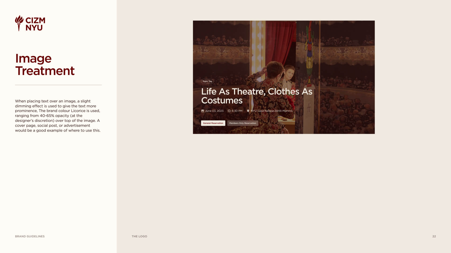
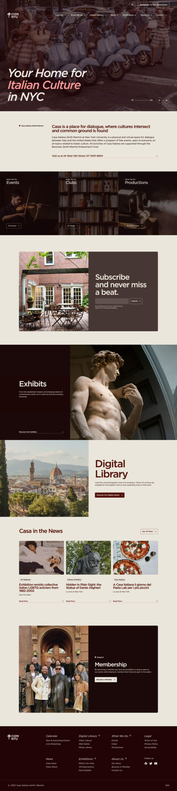
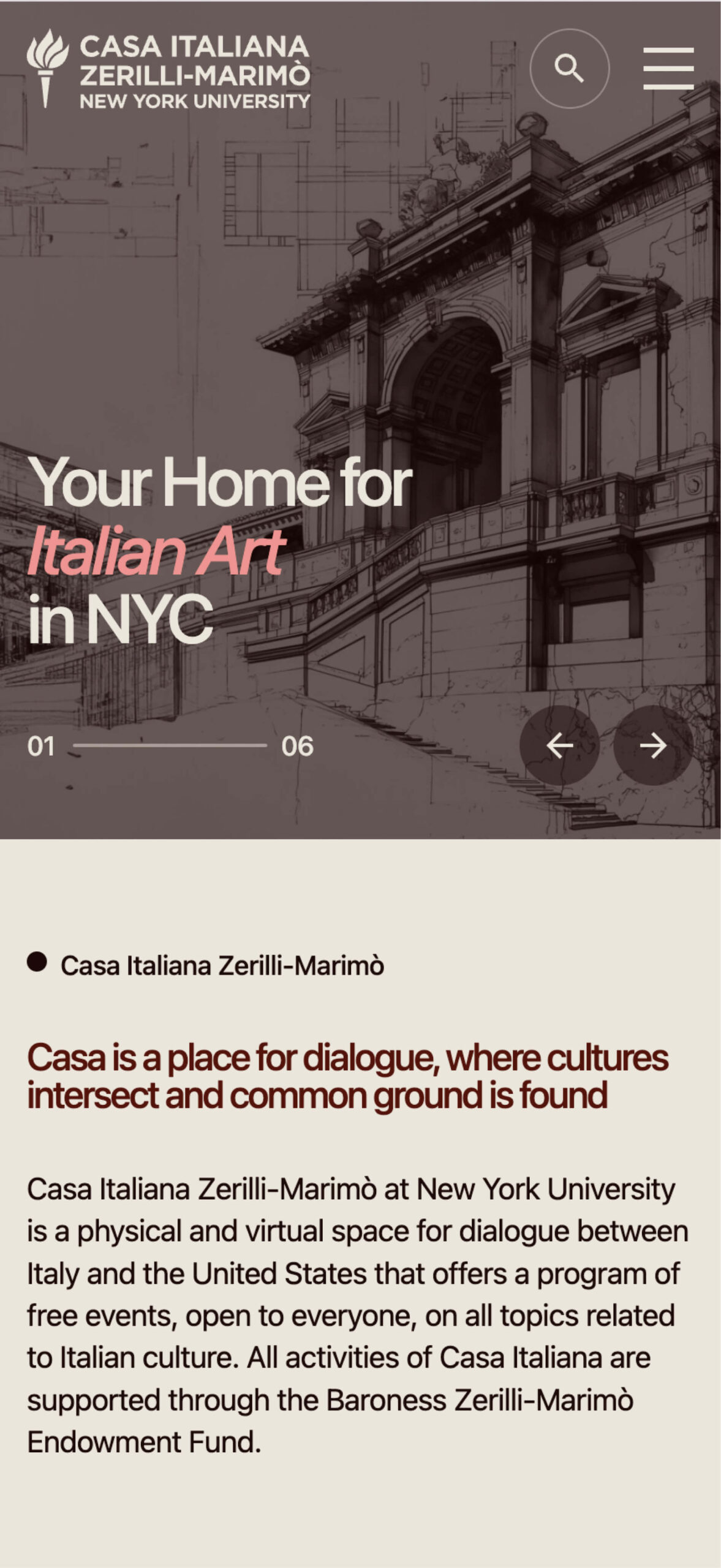
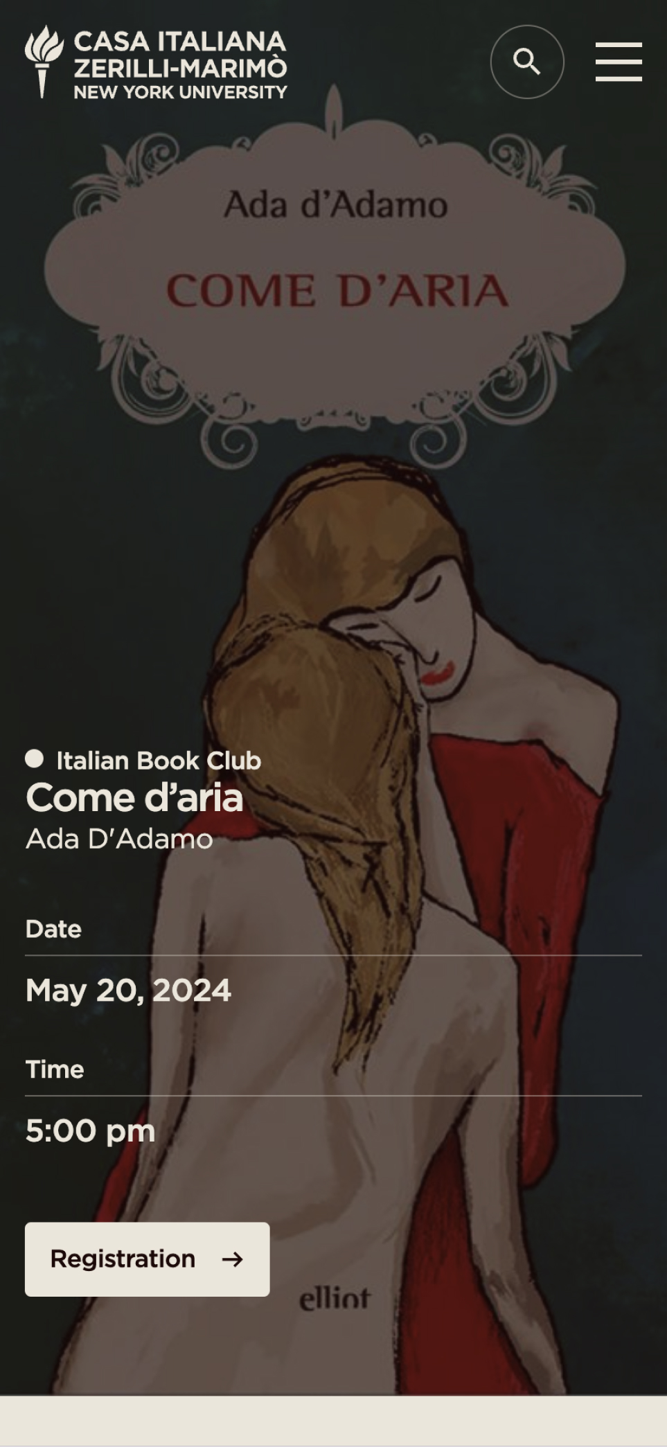
UX That Drives Engagement

Beyond its design, the new website had to function as a true engagement tool—a dynamic, accessible hub that connected visitors with Casa’s vast programming. We implemented:

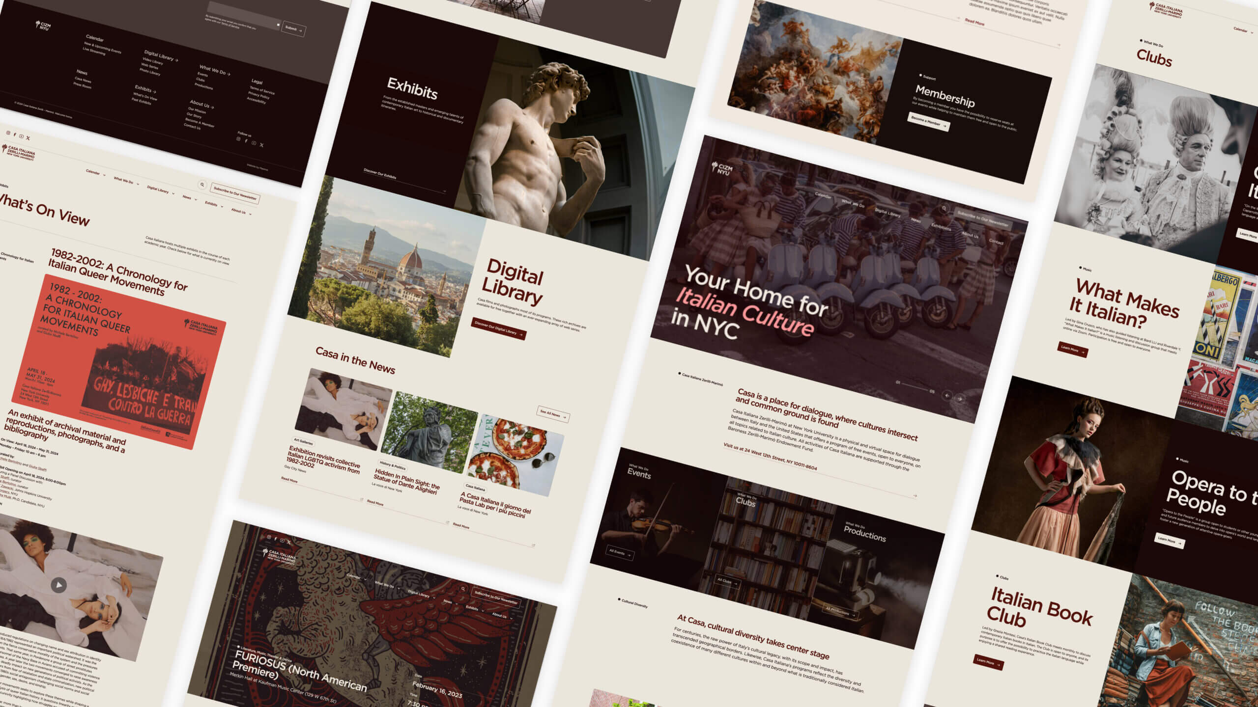
  • An intuitive, interactive event calendar – Allowing users to browse and filter by interest, driving an 80% increase in event attendance.
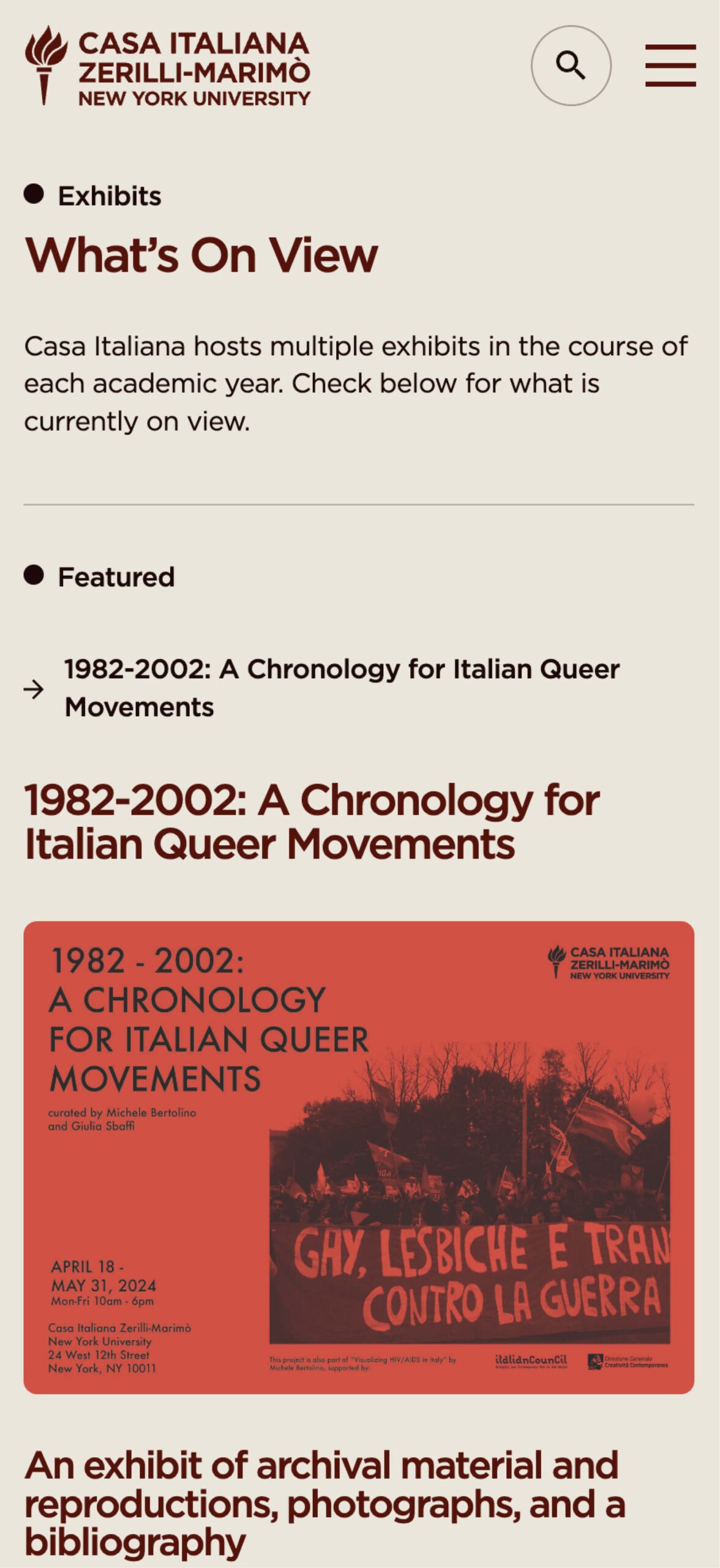
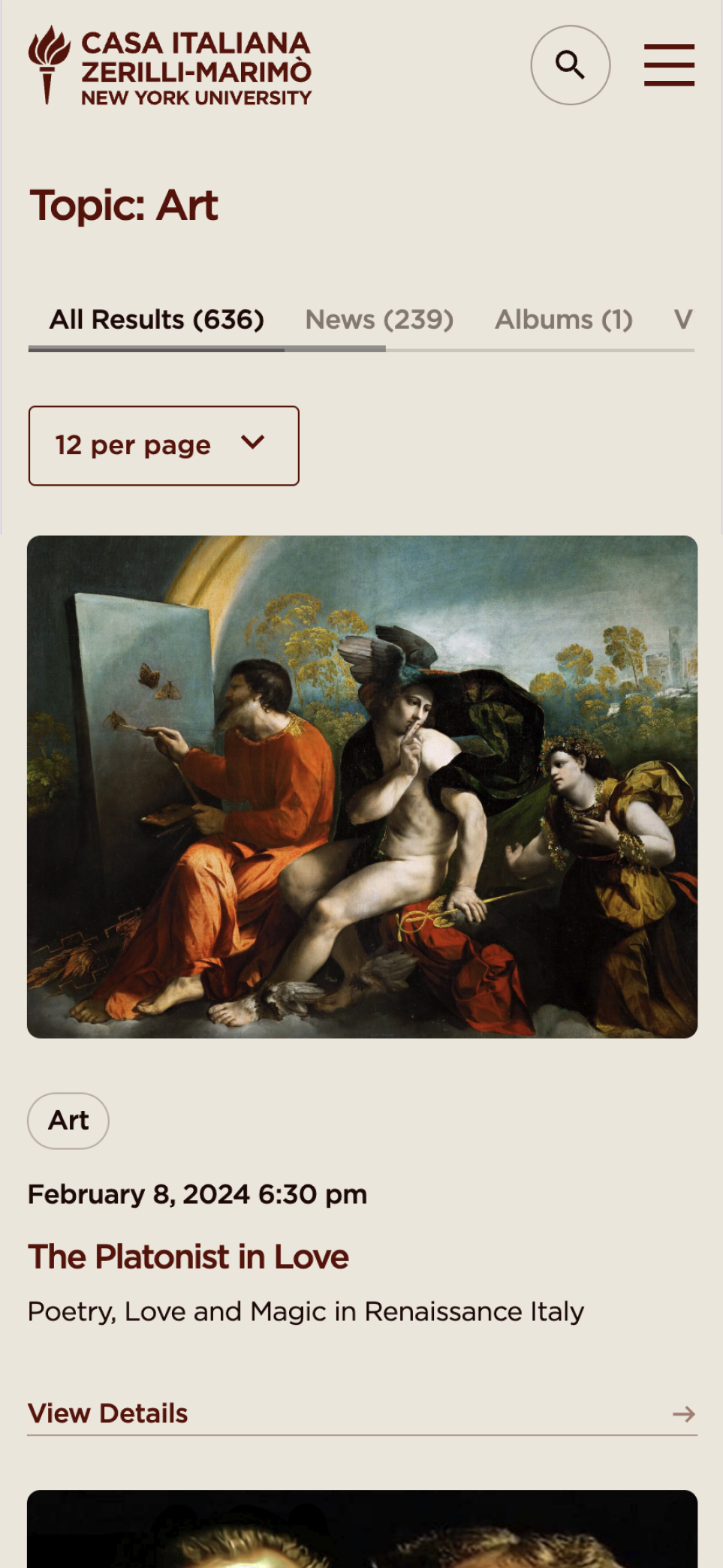
  • A content-first approach – Ensuring Casa’s rich video, photo, and written archives were easily navigable and optimized for SEO-driven discoverability.
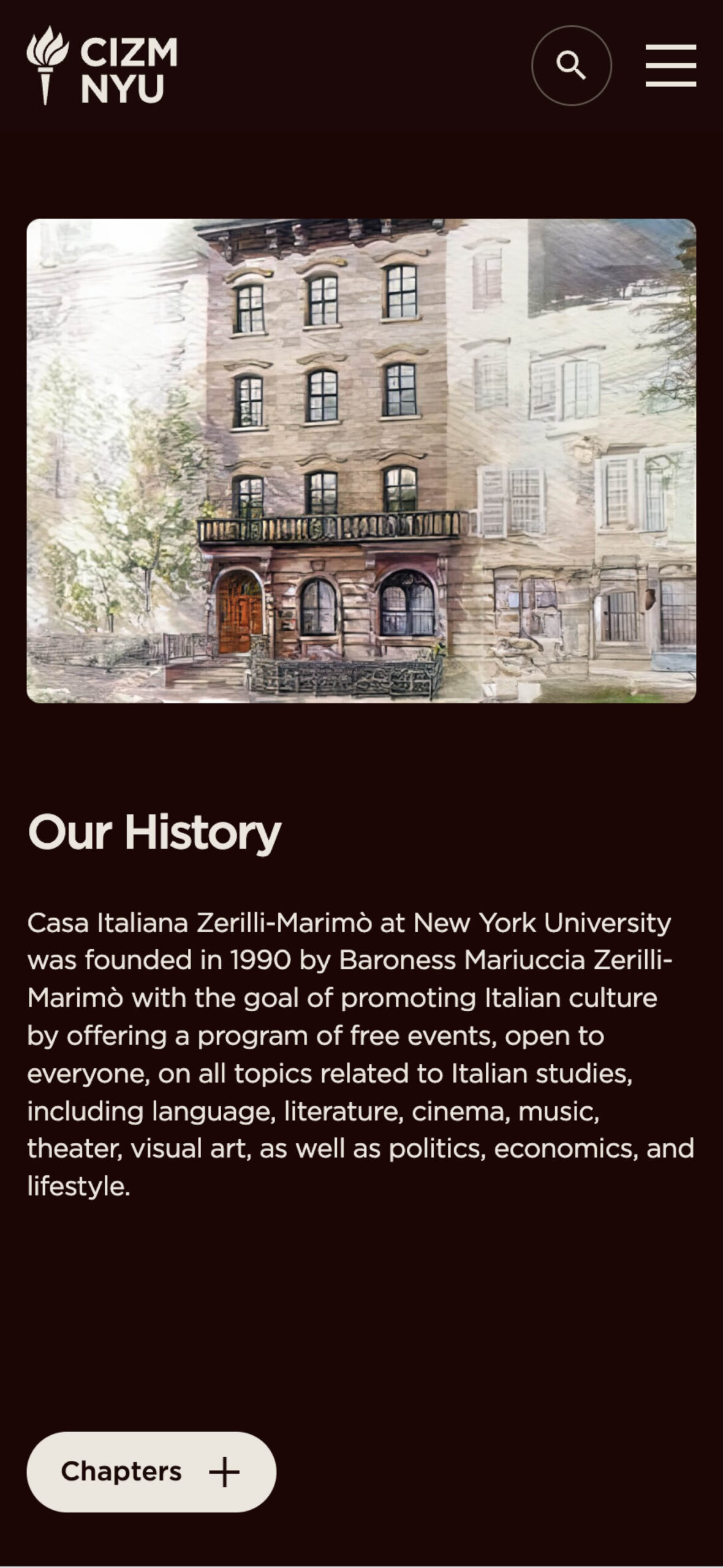
  • Mobile-first design – Given the site’s academic and public audience, it had to be fully responsive, ensuring accessibility on any device.

This user-centric approach led to significant engagement growth, proving that a higher education website design can be both strategic and deeply human.


METRICS

+ 70 % ORGANIC SEARCH TRAFFIC

Increased visibility, ensuring more users found and engaged with Casa’s programming.

+ 71 % PAGE VIEWS

Deeper site engagement, reflecting a stronger user experience and better content navigation.

+ 80 % EVENT COUNT

Streamlined UX and clearer calls to action directly influenced attendance growth.

+ 82 % TOTAL SESSIONS

More users staying longer, exploring more pages, and returning more frequently.

+ 52 % NEW USERS

SEO-driven discovery and improved brand clarity brought in a broader audience than ever before.


RESULTS

Reframing Higher Education Website Design

Too often, higher education websites sacrifice identity for usability—or vice versa. This project proved that the two aren’t at odds.

At Takt, we approach higher education website design as an opportunity to do more than inform—it should inspire, engage, and tell a story. Casa Italiana’s new digital home is proof that a university-affiliated website can be distinct, immersive, and built for both legacy and growth.

The work we do isn’t just about websites. It’s about crafting experiences that matter. And for Casa, that meant building a digital space that honors its heritage while making it unmistakably relevant for the future.

Ready to build a website that isn’t just functional, but iconic? Let’s talk.

Frequently Asked Questions

Common questions about education website projects, answered from experience.

How do you build an education brand that resonates with both students and institutional stakeholders?

Our approach to brand building in education depends on the role an institution plays in its ecosystem, its network of relationships, and the influences around it. For example, community-based education brands resonate most when they reflect the real lived experiences and views of students and staff. We compare how people inside and outside the institution perceive it, set a clear, culturally relevant position, and track progress as messaging and identity evolve.

On the other end of the spectrum, for pioneering or future-defining institutions, brand strategy is more future-facing and directional, setting a path forward based on a distinctive vision. In these cases, we typically opt to lead with vision and belief, using research to test clarity and credibility.

What does a full education website redesign project typically include?

A full education website redesign typically includes strategy, experience design, content planning, design, development, and launch, sequenced to reduce risk and align complex stakeholder groups. At Takt, we begin by clarifying your institution’s positioning and messaging, then translate real user needs into clear UX and Authoring Experience (AX) requirements that define journeys, content, and functionality.

Designs and user flows are validated early through testing before moving into development, content migration, and QA across multiple sprints, with decisions informed by both qualitative insight (interviews, workshops) and quantitative data (analytics, surveys). This approach is reflected in our work with New York University’s Webby Award–winning Casa Italiana website.

How do you keep education websites fast when they are content-heavy?

Keeping content-heavy education websites fast starts with treating performance as a design constraint, not a technical afterthought. We structure content modularly, limit unnecessary animations that could impact page load times, and prioritize what loads first so users get clarity and value immediately.

At Takt, we pair thoughtful information architecture with modern development practices, performance budgets, and ongoing monitoring to ensure speed holds up as content grows. The result is a site that remains accessible, search-friendly, and responsive without sacrificing depth or scale.

Post-launch, effective content management needs to support the system that’s been built. To support this, we provide a Content Editing Guide as well as a recorded training session to teach our clients how to best add new pages and content to the website.

How should education websites handle events and programming calendars?

Education websites should treat events and programming calendars as discovery tools, not dumping grounds. The goal is to help different audiences quickly find what’s relevant to them, while preserving performance, clarity, and SEO.

We design event systems with clear taxonomy, filtering, and modular templates so calendars scale without becoming overwhelming or outdated. Combined with strong governance and automation, this ensures events remain accurate, searchable, and useful over time.

How do education organizations maintain website accessibility over time?

Education organizations maintain website accessibility by building it into the website’s system, rather than treating it as a post-launch audit. That means designing with semantic HTML, proper heading structures, keyboard navigation, colour contrast, and ARIA labels from the start, and then creating templates and modules that effectively maintain those standards whenever new content is published.

Key insight: Accessibility sustained through code and design decisions is durable. Accessibility that depends solely on individual content editors getting it right every time is a lot less dependable at scale.

The truth is that compliance is a score rather than a binary outcome. For example, a website can be 90% compliant when measured against a specific standard and still be considered highly accessible. Content updates will always introduce new variables (e.g., an image missing alt text, a heading level out of order, etc.), so what matters most is creating and maintaining a governance plan that consistently identifies and resolves these sorts of inevitable challenges.

We also work with institutions to determine the right compliance target:

  • WCAG 2.1 AA is our baseline for every project
  • Some institutions need 2.2 or even AAA, which carries significantly stricter requirements that aren’t necessary for most organizations.
  • Design decisions, like detailed animations and visual effects, also impact compliance at higher levels, so those trade-offs need to be part of the conversation early on in the engagement.
  • Reporting requirements also matter quite a bit. If an institution is required to report accessibility to a regulatory board or internal department, that shapes how stringent the standards need to be and which stakeholders are involved in the decision-making process.

For institutions that aren’t currently fully compliant, the most important deliverable often looks something like a strategic roadmap, i.e., a prioritized plan that catalogues what’s been addressed, what’s outstanding, and what the path to resolution looks like. Flagged items can be ranked by severity, and not all of them will require action. Some are minor, some aren’t applicable, and some reflect deliberate decisions the team has made with full awareness of the trade-off.

We’ve built accessibility-first systems for institutions like Queen’s University, New York University, Adler University, and Nunavut Arctic College, and work directly with campus accessibility offices to ensure educational websites meet both institutional standards and the specific needs of diverse user communities.

RELATED PROJECTS

VIEW ALL CASE STUDIES