Go to content

Kent + Essex

INTRODUCTION

Tradition Meets Modernity: Reimagining Kent & Essex Mutual Insurance

With over 130 years of history, Kent & Essex Mutual Insurance (K&E) has been a trusted provider of insurance protection for Ontario residents since 1888. As a mutual company, K&E is fully owned by their policyholders, emphasizing community values and customer-centric service. Despite their long-standing reputation, their digital presence was struggling to keep pace. Their outdated website was not only aesthetically lacking but also unusable on mobile devices—an increasing concern for a growing digital audience.

K&E approached us with a challenge: modernize their brand and digital presence while staying true to their rich heritage and small-town roots. The goal was clear—create a digital experience that reflects their legacy while preparing them for future growth.

VISUAL ID

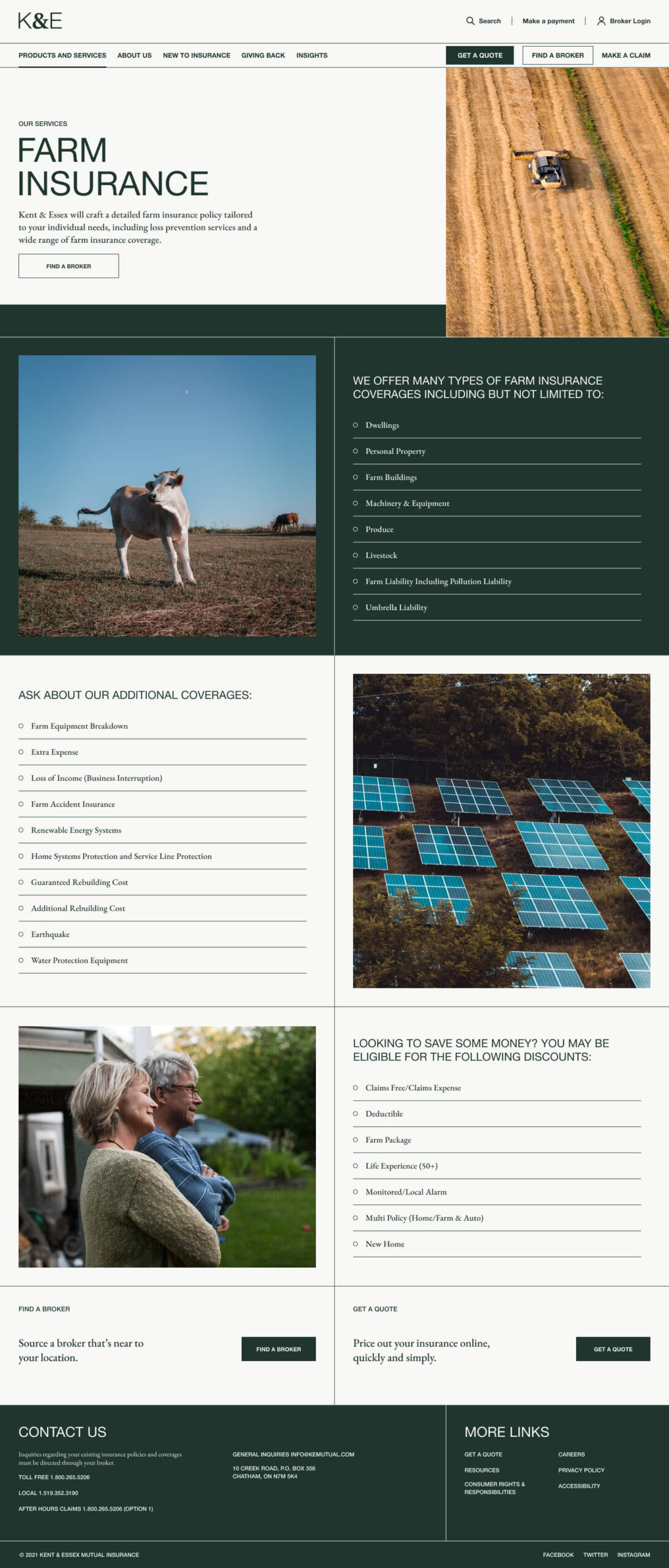
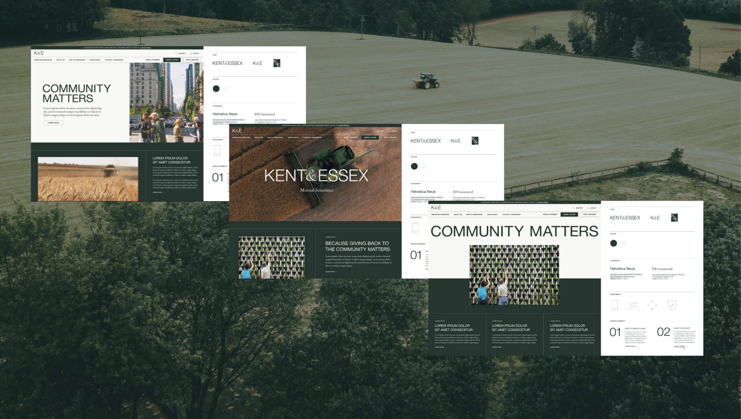
Rediscovering Identity: A Refresh with Purpose

Kent & Essex needed a brand refresh that would honor their legacy while projecting a modern, trustworthy image. We began with a subtle logo refinement, adjusting the line-weight and typography to improve clarity and scalability across digital and print mediums. The color palette was updated to include richer tones, enhancing visual appeal and supporting accessibility standards.

The brand’s visual language was reimagined to communicate professionalism, stability, and community involvement. We maintained the core elements that policyholders had come to recognize but presented them in a more contemporary and polished way.

Navigating the New: User Experience with a Human Touch

For K&E, user experience was a critical focus. The existing website’s navigation was cumbersome, and users struggled to find essential information. Our research revealed that policyholders and potential customers were often left confused by the process of obtaining insurance and connecting with brokers.

To address this, we redesigned the site’s information architecture to prioritize clarity and ease of use. The “Find a Broker” tab was enhanced with improved filtering options, allowing users to quickly find brokers based on specific insurance needs, such as farm or auto insurance. A step-by-step visual guide was integrated to help new customers understand the process of acquiring insurance, providing a transparent, stress-free journey from inquiry to policy acquisition.

To strengthen K&E’s position as a community-focused company, we elevated their “Giving Back” and “Careers” sections. By highlighting their local impact and commitment to employee growth, we helped them resonate more deeply with their audience.


Designing for Impact: A Visual Approach Rooted in Community

The creative direction for the K&E website was guided by the principles of authenticity and community trust. We leveraged the brand’s heritage elements but infused them with modern design sensibilities. A clean, spacious layout with subtle design moves—like strategic use of color and proportion—was employed to direct focus to the information that mattered most.

The color palette, grounded in rich blues and greens, communicated stability and trust, while accents of gold brought warmth and approachability. The website components alternated colors as users scrolled, creating a dynamic and engaging experience that encouraged exploration.


DEVELOPMENT

Technology with a Purpose: Building a Future-Ready Platform

The new K&E website was built on a custom WordPress theme, optimized for speed, SEO, and accessibility (WCAG 2.1 AA). The site was designed with scalability in mind, allowing for the future integration of features like an insurance portal.

A key focus was ensuring the site performed seamlessly on mobile devices, given the increasing number of users accessing it through smartphones and tablets. This mobile-first approach meant that policyholders could now easily navigate and interact with the site, regardless of device.

We also took steps to improve the payment process, creating a stronger link between the K&E website and the financial transaction page. Warnings were integrated to notify users when they were leaving the site for payments, and the styling of the payment form was aligned with the K&E brand to maintain a consistent user experience.


More Than Just a Website: Empowering Through Information

Insurance can be complex, and K&E wanted to position themselves as thought leaders by providing valuable, educational content. We introduced a blog featuring loss prevention tips, FAQs, and advice-based articles to help users better understand their insurance options and make informed decisions.
Testimonials were segmented based on specific services, providing social proof and enhancing customer confidence. By integrating these elements into the site, we not only improved the user experience but also reinforced K&E’s reputation as a knowledgeable and caring insurance provider.

The revamped website and refreshed brand have not only modernized K&E’s digital presence but have also strengthened their connection with policyholders and the community. The new site, with its intuitive navigation, clear messaging, and engaging design, better reflects the company’s values and commitment to customer service.

K&E is now equipped with a future-ready platform that can grow with them, supporting their mission to provide reliable insurance protection while staying true to their small-town roots.

RELATED PROJECTS

VIEW ALL CASE STUDIES

Frequently Asked Questions

Common questions about insurance website projects, answered from experience.

How long does a banking or finance website redesign project take?

Most banking, finance, or insurance website redesign projects run in phased sprints because discovery, information architecture, content system design, and development have different dependencies. We reduce risk by locking navigation, templates, and a structured content model early, then scaling page production through a modular component system. In our work with Kent + Essex Mutual Insurance, we combined a brand refresh with a future-ready website rebuild to deliver a mobile-optimized experience and support ongoing growth.

What improves mobile UX most for banking and finance websites?

Mobile UX improves fastest when the navigation is simplified, key tasks are surfaced early, and forms or multi-step journeys are designed to feel predictable and low-effort on small screens. We build mobile performance and responsive behaviour at the component level so it holds up as the site grows. For Kent + Essex, mobile usability was a key driver of the website redesign, alongside making essential pathways easier to find and use.

What should an insurance website redesign focus on first?

Insurance websites carry a specific burden: they need to explain complex, sometimes anxiety-inducing products clearly enough that people can make confident decisions, while also converting visitors who arrived with real urgency. Getting that balance wrong in either direction, too technical, or too sales-driven, erodes trust.

We start by mapping the highest-intent user journeys: someone who needs to understand what coverage they have, a prospective customer comparing policy options, a broker looking for product documentation. Each of those users has a different starting point and a different definition of “clear enough to act.” The site structure and content templates need to serve all of them without forcing anyone through a journey designed for someone else. For Kent + Essex Mutual Insurance, a mobile-optimized rebuild organized around real user tasks significantly improved how customers could access and understand their coverage options.

How do you make insurance products understandable on a website without oversimplifying them?

Progressive disclosure is the structural answer: give users a plain-language summary first, then layer in the detail, coverage specifics, exclusions, claims processes, for the users who need it, at the moment they need it. The goal isn’t to hide complexity. It’s to sequence it so users aren’t overwhelmed before they’ve understood the basics.

This approach works best when it’s built into the content model and the page templates, not applied as a copywriting layer after the structure is set. When content is modular and hierarchically organized from the start, editorial teams can maintain clarity as products evolve without rebuilding pages from scratch every time a policy changes.

How do you design an insurance website for both direct customers and brokers or intermediaries?

Two distinct audiences with fundamentally different needs, and the mistake most insurance websites make is trying to serve both from the same navigation without a clear strategy for separating their paths. Customers need emotional clarity and task completion. Brokers need fast access to product documentation, rates, and submission tools. Building one experience that tries to do both usually does neither well.

We resolve this through a clear information architecture that separates public-facing customer journeys from broker or intermediary portals, with deliberate handoffs between them. The public site focuses on trust-building and conversion. The broker experience is optimized for efficiency and depth. Both feel like the same brand, but neither is compromised by the other’s requirements.

How do insurance websites handle trust and credibility signals effectively?

Trust signals in insurance are different from other categories because the product is intangible and the moment of truth, making a claim, is often the worst moment of a customer’s life. The website can’t recreate that experience, but it can establish the conditions for trust before it’s needed.

Effective trust signals in insurance are specific: real claims support language (not “we’re here for you” but “here’s what happens when you call”), clear explanation of what is and isn’t covered, transparent pricing structures where possible, and social proof that reflects the claims experience, not just the purchase experience. Visual and verbal consistency also matters more than many insurance brands recognize, inconsistency signals instability in a category where stability is the product.