The Advisor Guide

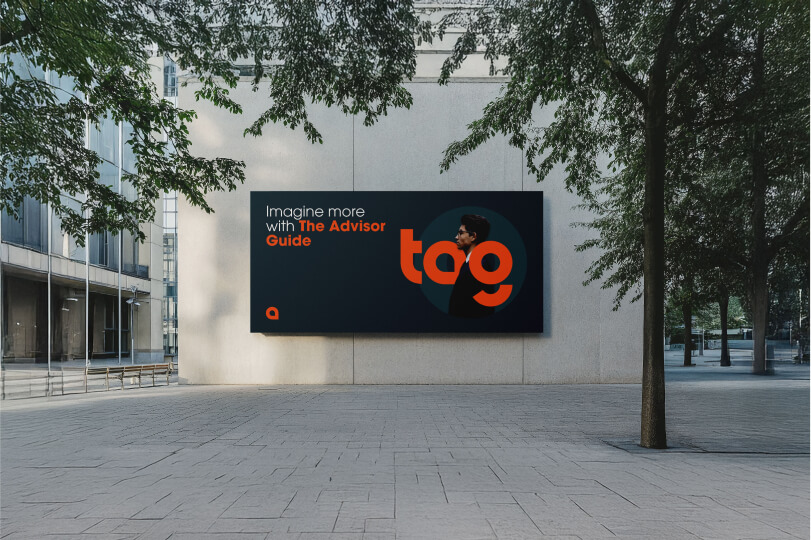
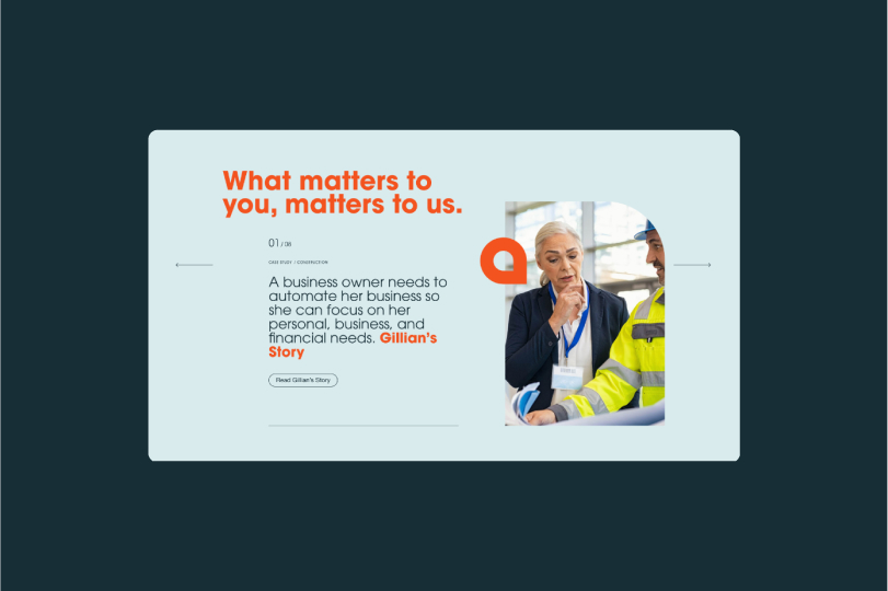
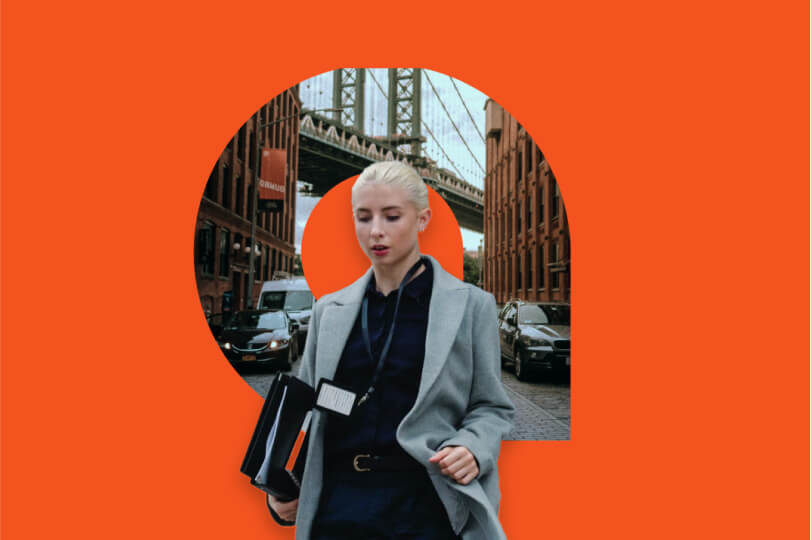
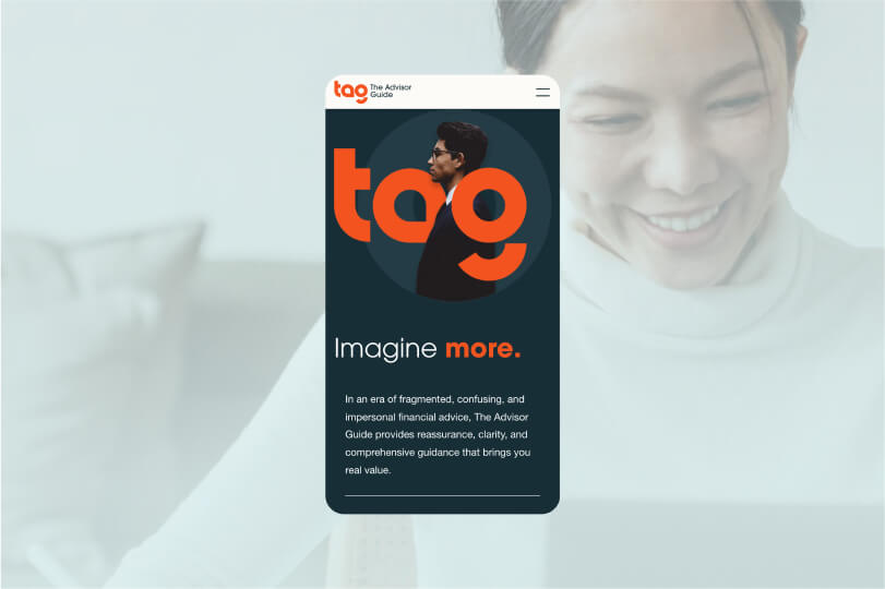
A young financial services company teams up with Takt to enhance their brand, revitalize their online presence, and develop a clear and concise voice that looks to the future of financial services.
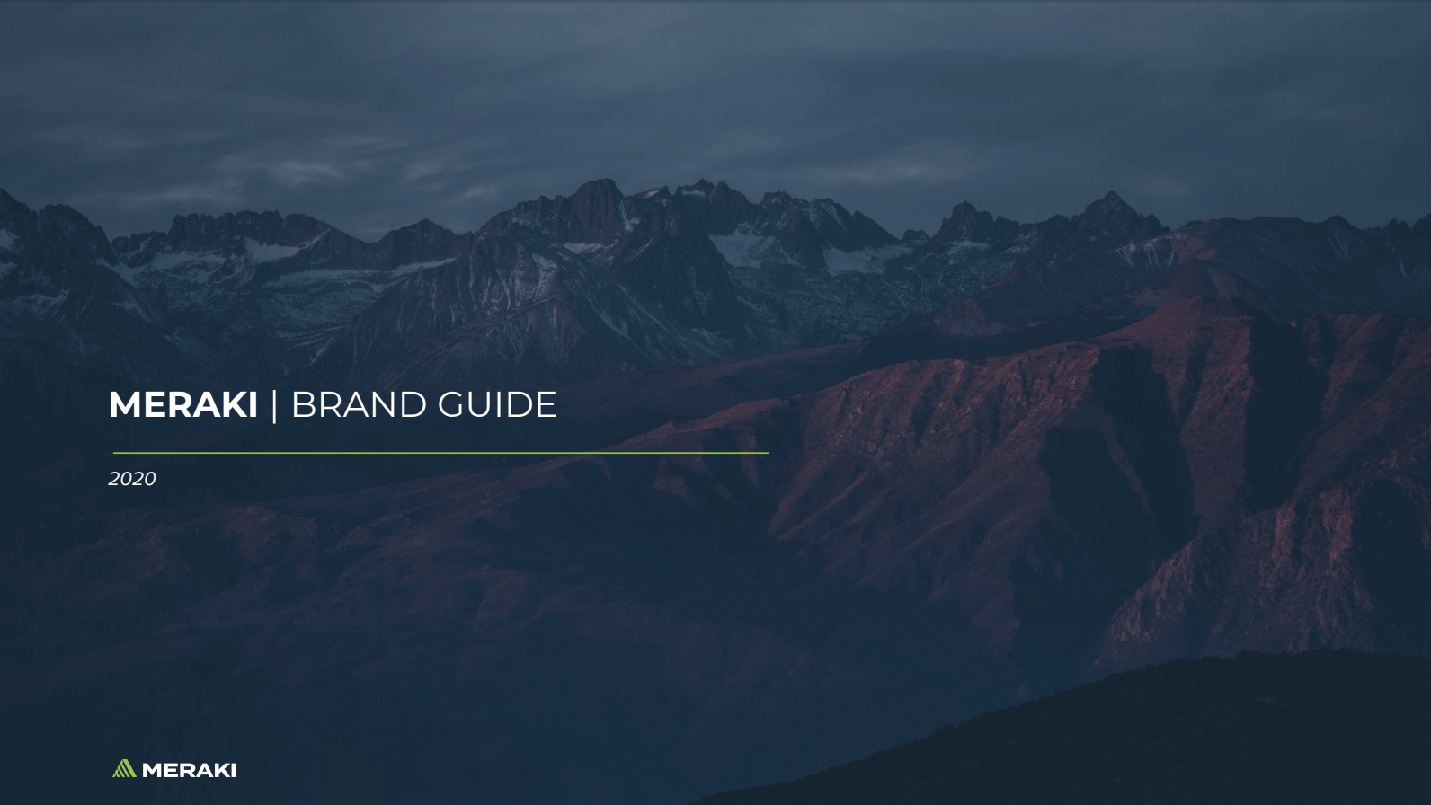
Crafting a Unified Vision: Rebranding KDL Group as Meraki Resources for a Sustainable Future
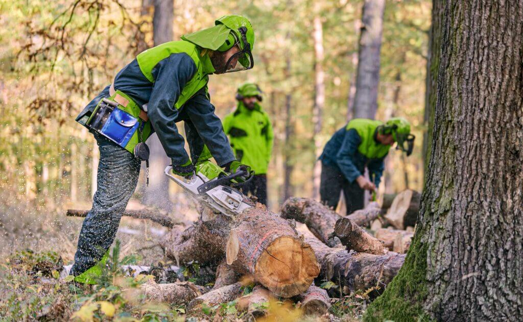
It’s a rare gift to discover a company that is genuinely invested in creating a sustainable and equitable future. That’s what excited us about the KDL Group, a British Columbia-based resource management organization. It was clear these guys were passionate about what they did and what they believed in from the get-go. They just needed a better way of showcasing it.
Like many companies we have worked with over the years, the KDL Group had grown organically through strategic acquisitions and partnerships. Once growth crosses a certain threshold, though, you reach a crossroads. How do you build a unified brand and vision without compromising your subsidiaries’ established identities and brand equity? Like Simon Sinek says, you have to start with why.
We worked with the KDL team in a series of workshops designed to break down and solidify their brand and organizational “Why.” From there, we could put all the pieces back together with a new name, a modern logo, an inspirational video, and a sweet new website. It was the fresh perspective that KDL needed as it moved into the next phase of its operations. Introducing Meraki Resources.
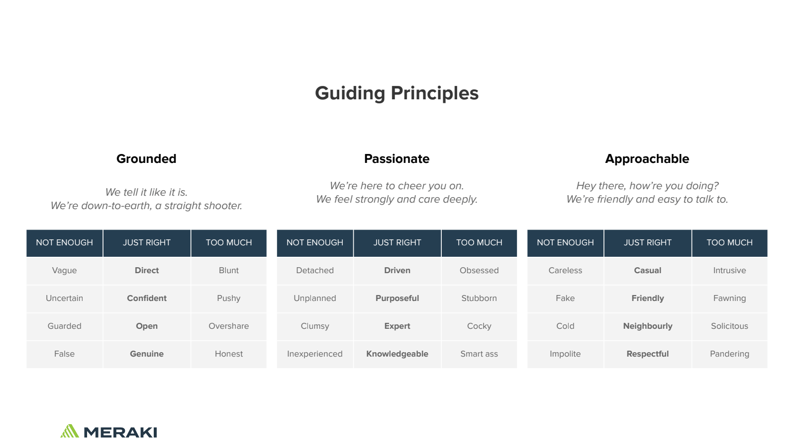
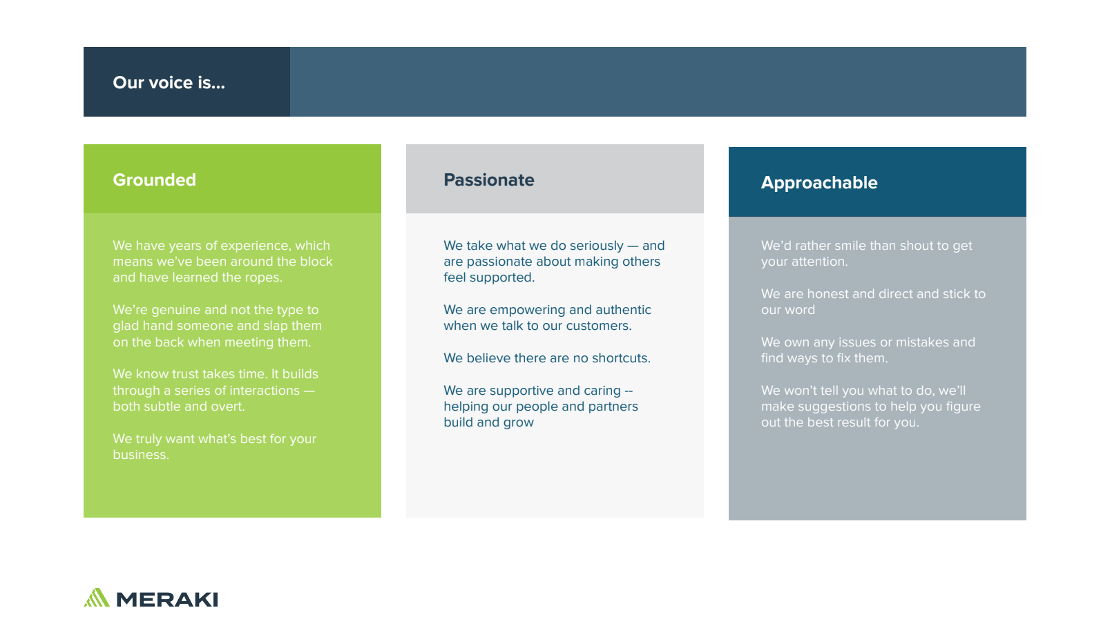
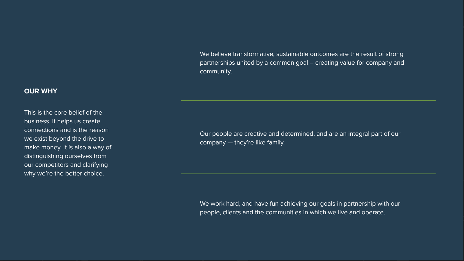
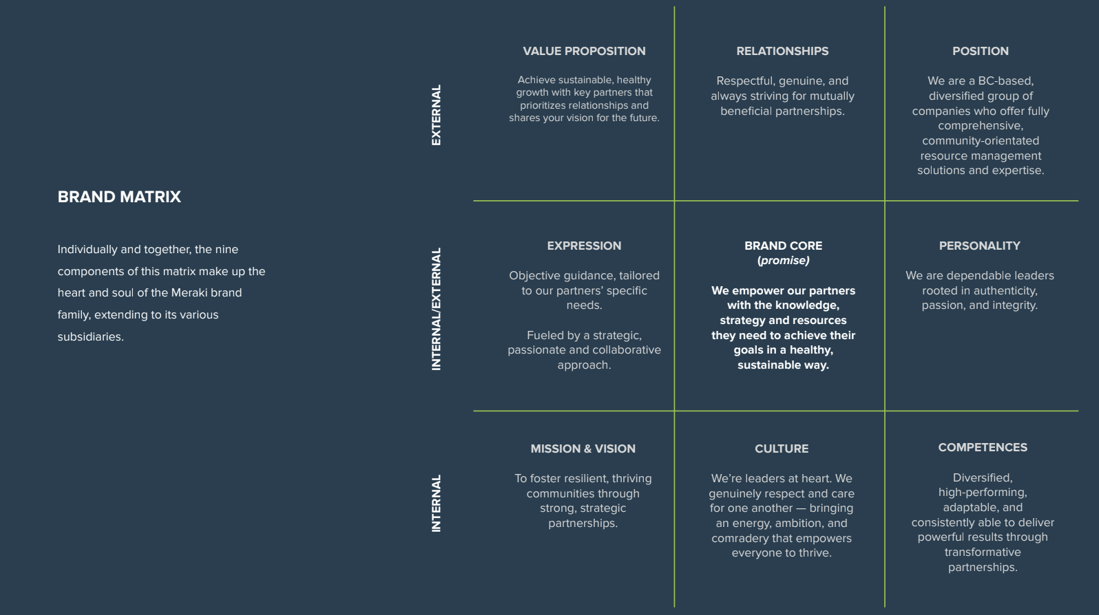
There’s no denying that brands built around a clear organizational purpose are the ones that are primed for success. To help clarify and articulate KDL’s “Why,” we conducted workshops with its leadership team, giving shape to how the new brand’s ethos would live internally and externally.
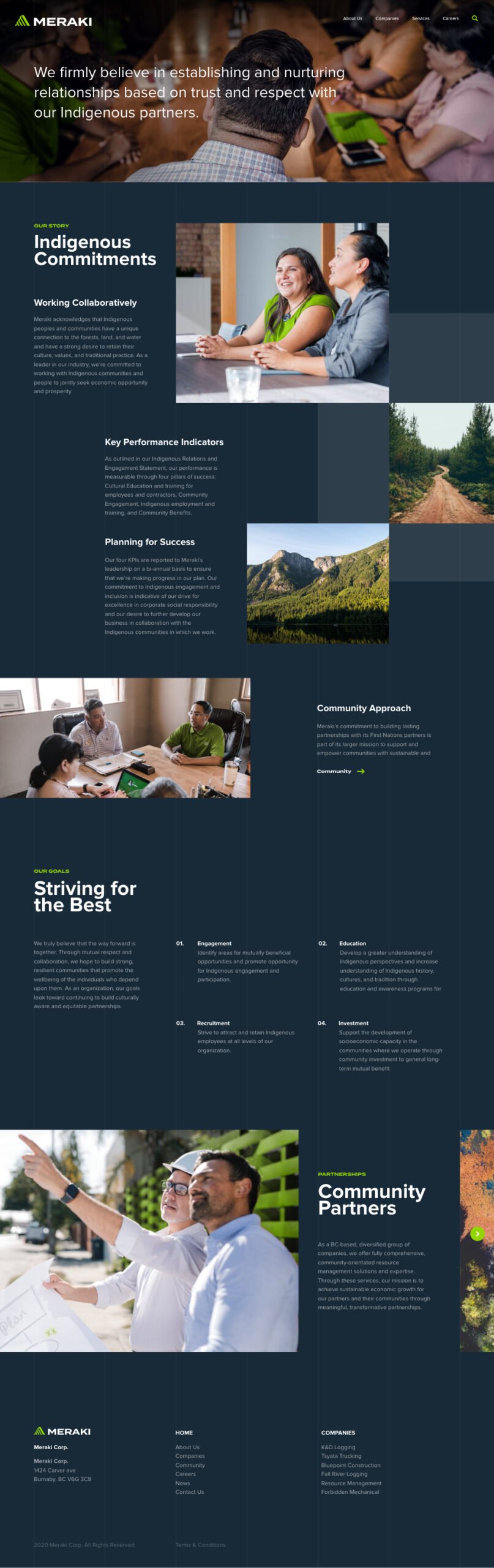
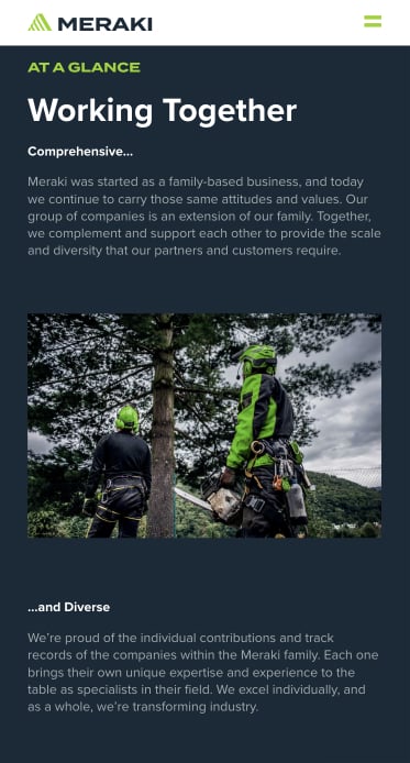
After our workshops, one point became clear: KDL, and by extension, its new brand, needed to maintain the strong community focus they’d built over years in the field. KDL’s business revolved around building, supporting, and growing relationships with local and Indigenous communities. They knew that their path to sustainable growth and continued transformation was made possible by the strong partnerships they’d built along the way. The company was on a mission to transform the resource management sector, and they were determined to do so in collaboration with these community partners.
Although their existing name spoke to the leadership team’s strong family roots and legacy, the KDL Group was ready for a change. The name was muddying relationships with subsidiary brands and didn’t reflect the organization’s core values. They needed something aspirational—something that the entire organization could rally behind.
With these goals in mind, Massive led KDL through naming workshops designed to find a new, more appropriate name. We identified the brand’s distinguishing features within its market context. From there, we noted major themes and went to work.
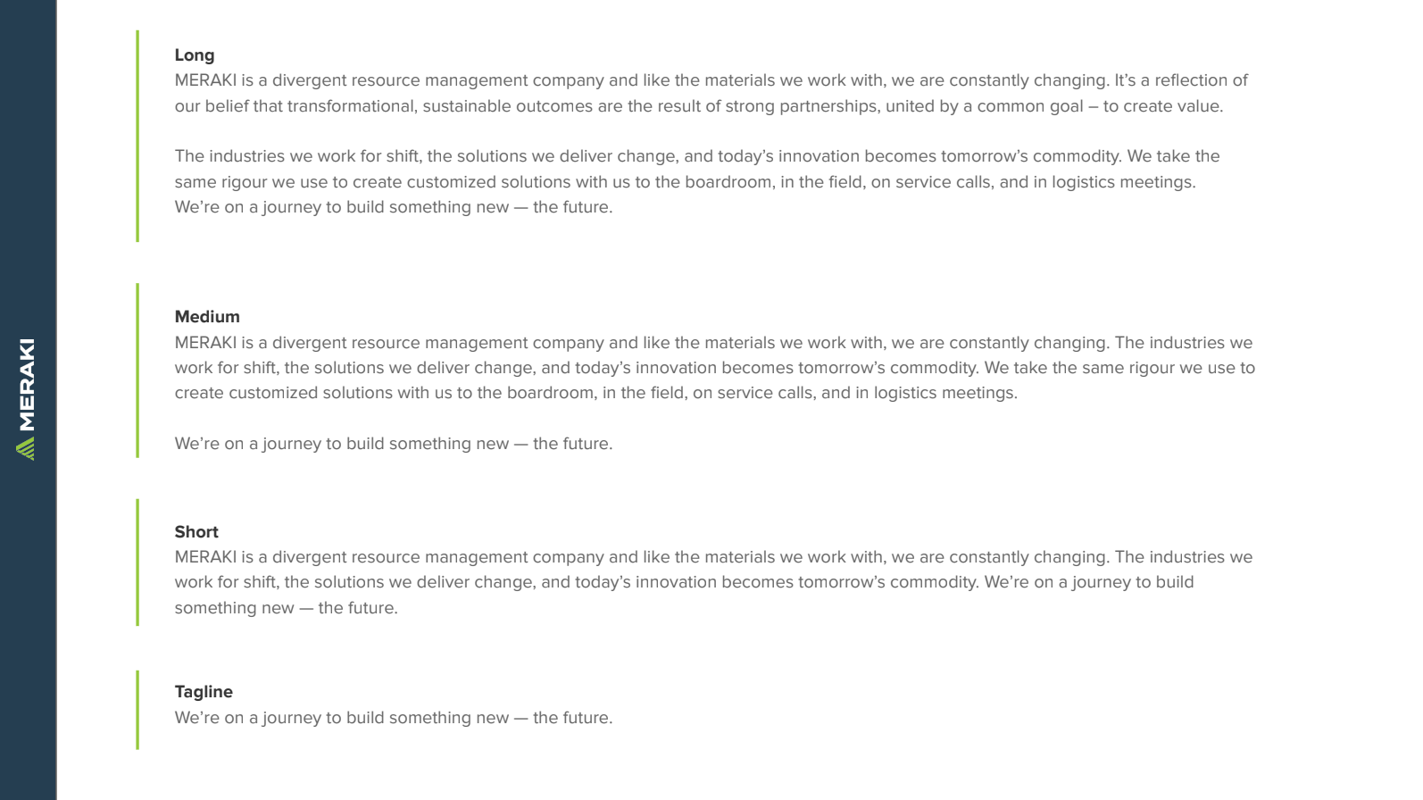
Part of our creative brainstorming process explores words in other languages. This is because oftentimes there are terms in other languages that you just can’t express as concisely in English. (It also makes trademarking much easier.) In KDL’s case, we found a Greek word that seemed just right: “Meraki.”
Meraki’ is a modern Greek word used to describe what happens when you leave a piece of yourself, your soul, your creativity, or love into your work. It’s a word that authentically reflected everything we had learned about KDL to-date.
René Thomas, Chief Creative Officer @ Takt
From messaging to visual identity, our branding work with Meraki revolved around this core idea of community.
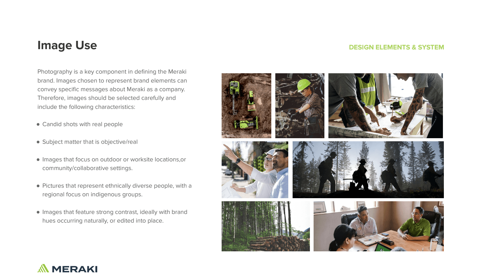
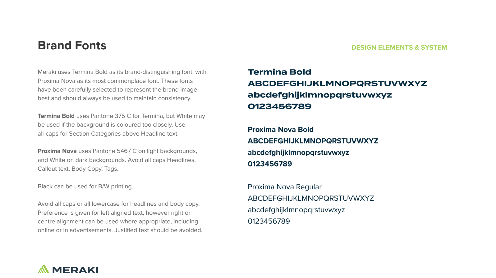
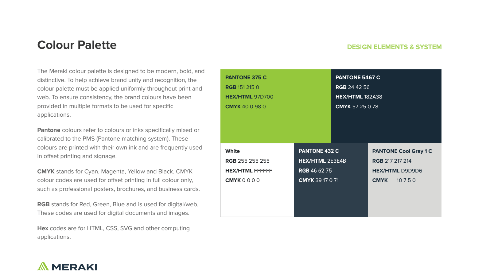
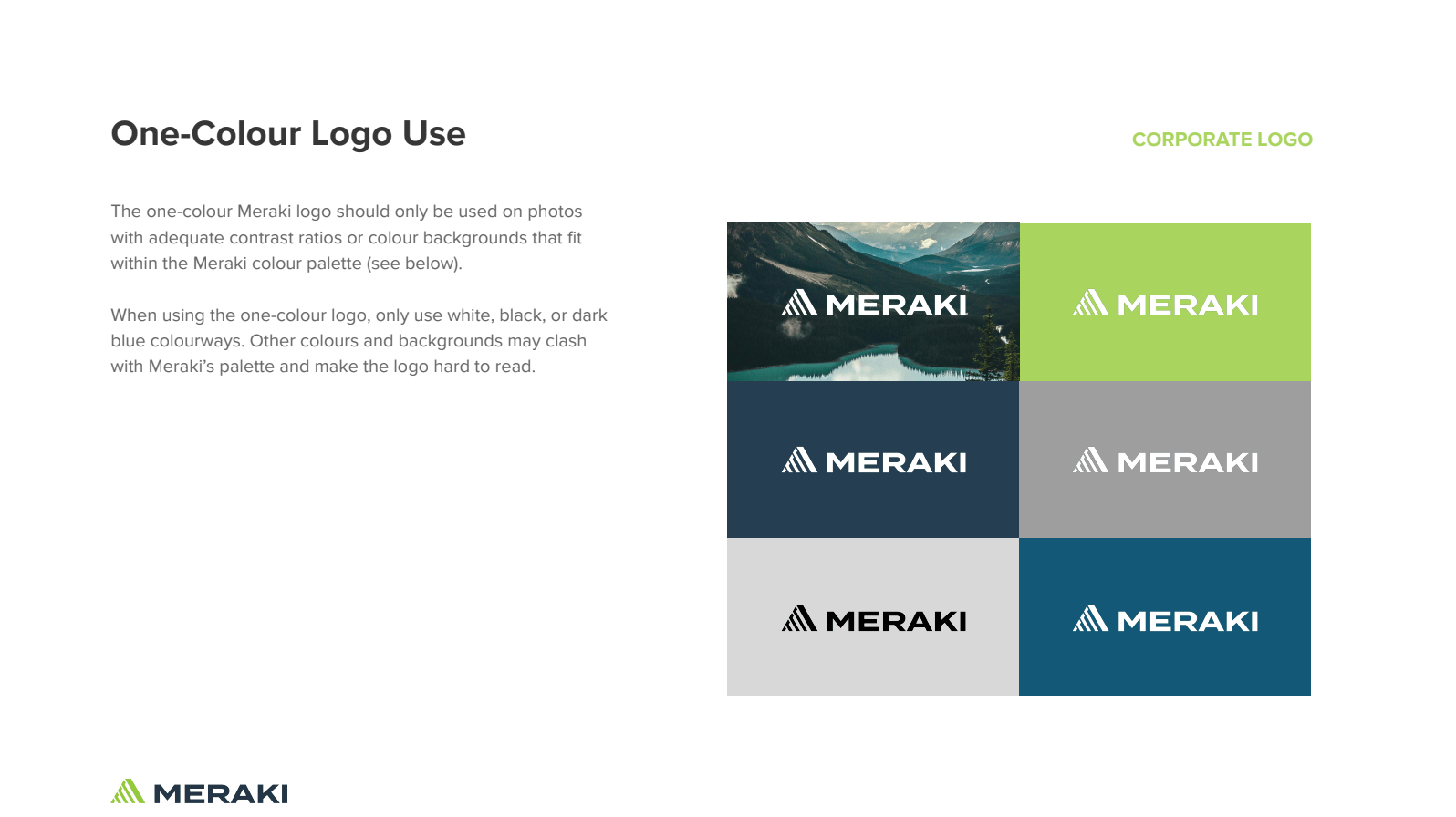
The new Meraki logo incorporates a core triangular element from the original KDL Group logo as a visual nod to the company’s storied legacy. The layers used in the updated design add a sense of balance and transparency, reflecting the company’s new corporate structure and the inherent honesty and trust that underpin its unique relationships. The green chosen as the brand’s new color offers a vibrant, contemporary sense of nature that invigorates the overall look and feel.
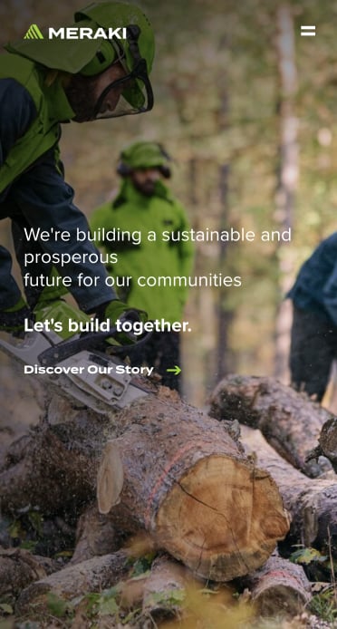
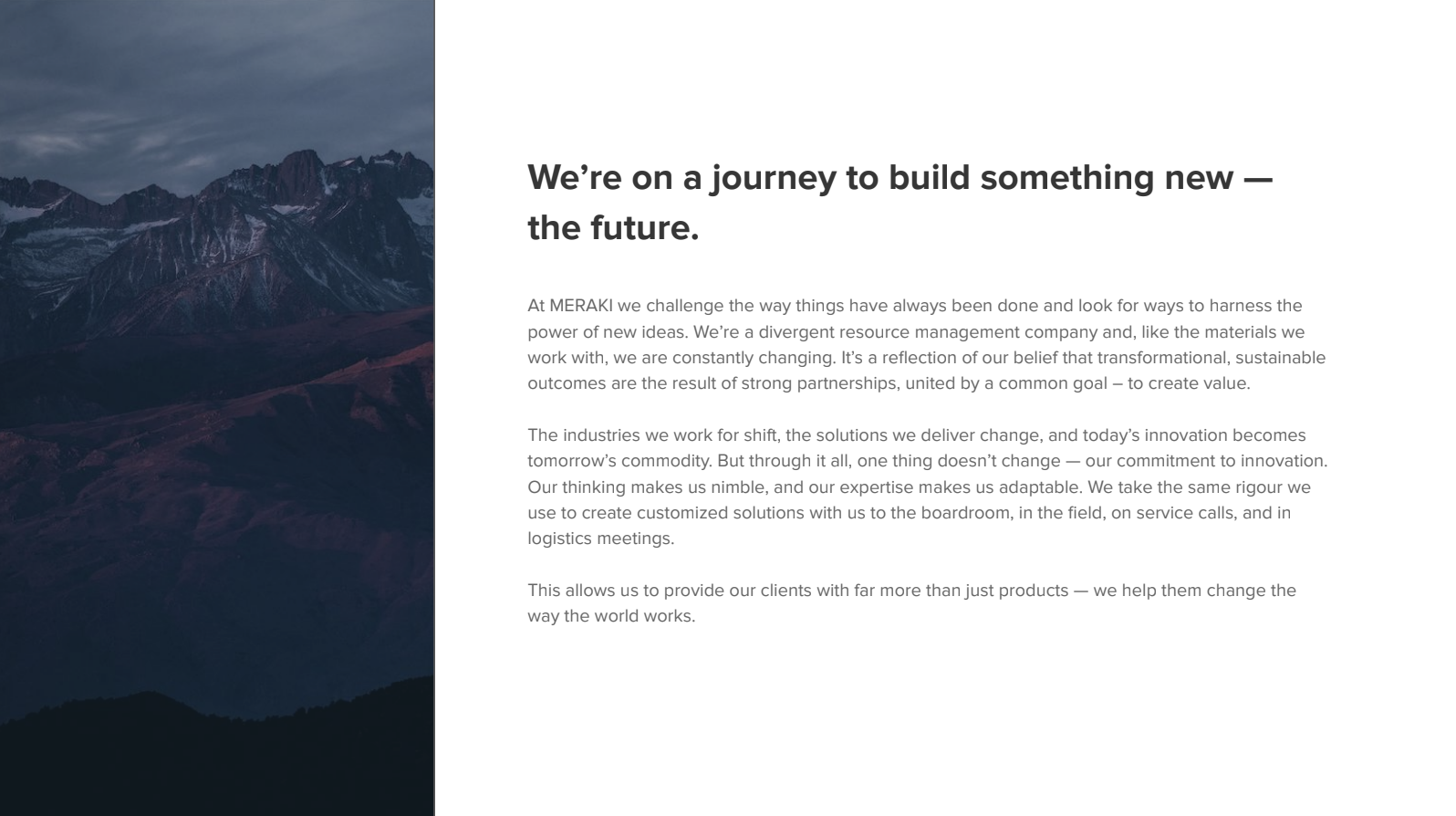
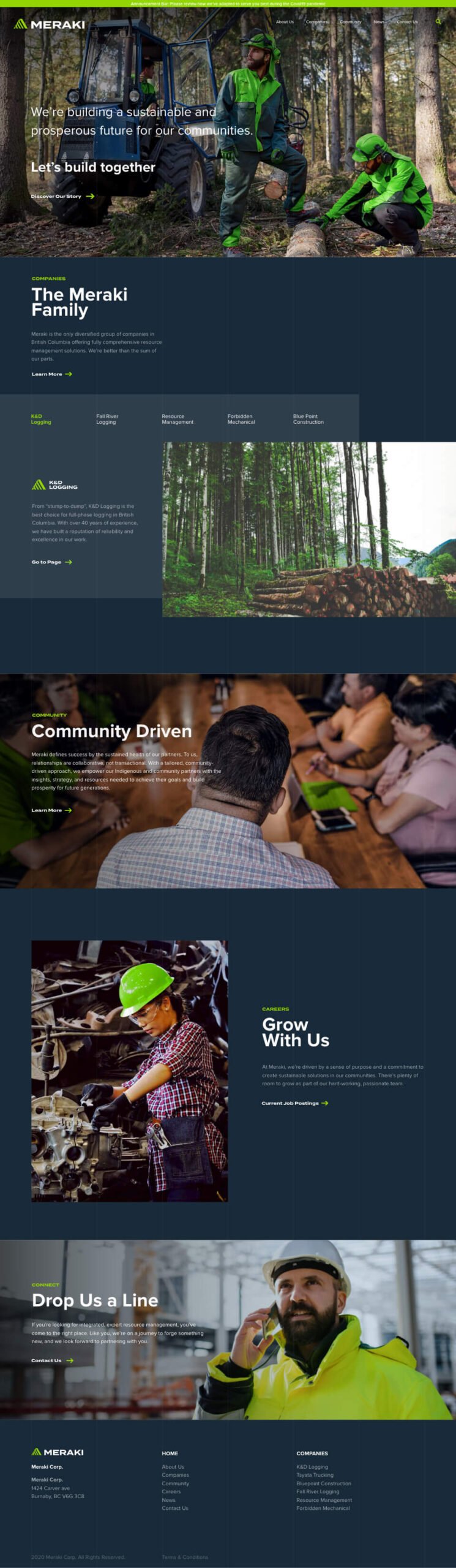
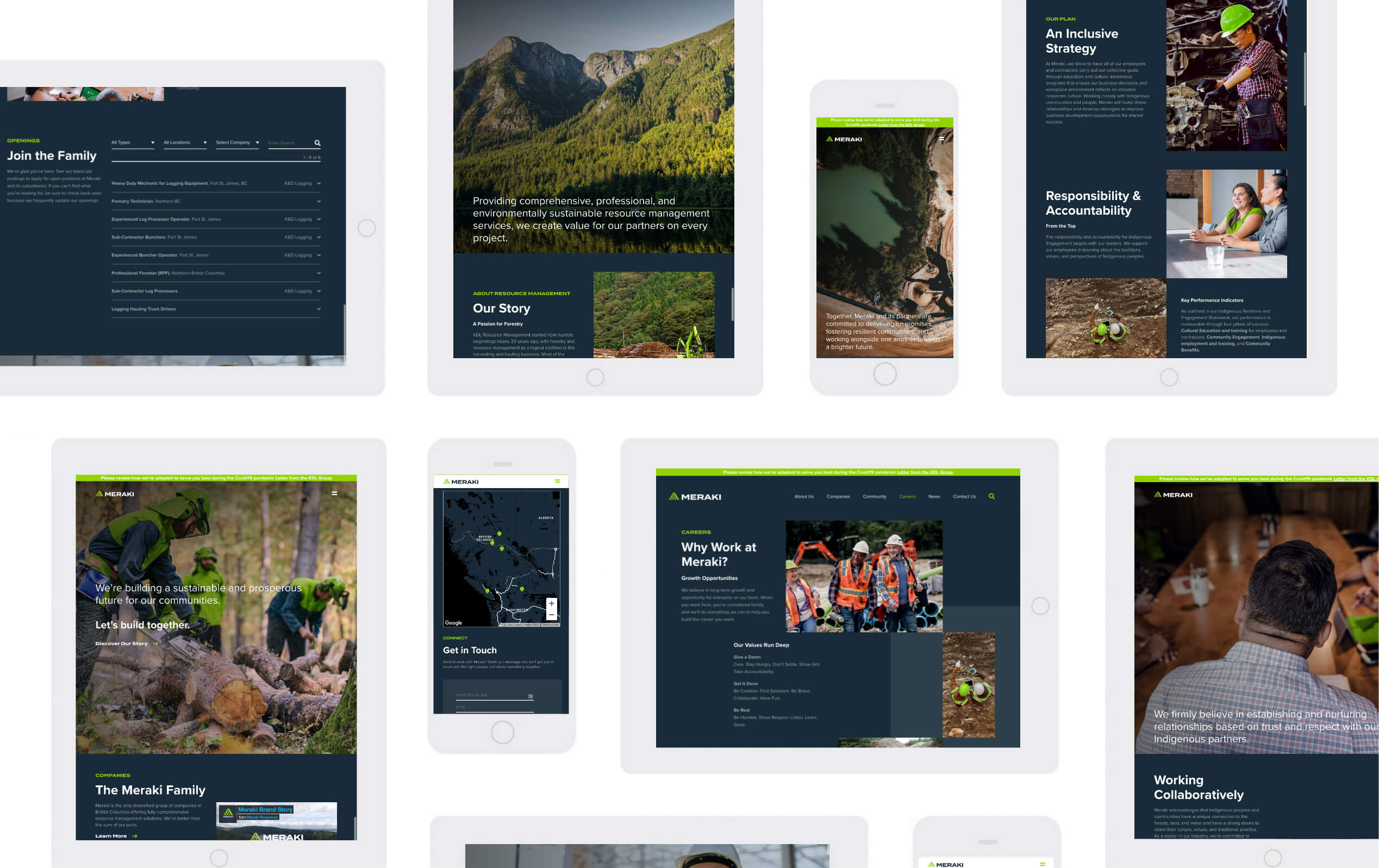
In a hands-on industry like resource management, your digital presence can sometimes take a back seat. As industry leaders, Meraki had an opportunity to set the standard, starting with the first impression delivered by their new website.
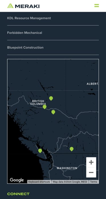
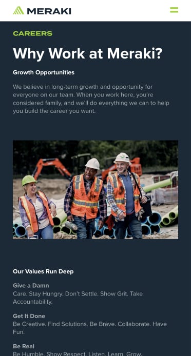
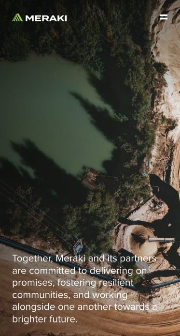
Intentional design decisions, like a darker theme for the website, blueprint-reminiscent gridlines, and mosaic grid layouts, help make Meraki’s new site stand out from the competition. Throughout the website, value-driven messaging speaks to the company’s community commitments, while bright, resource-focused imagery and slick animations reinforces Meraki’s story.
Common questions about professional services website projects, answered from experience.
The differentiation problem in professional services is rarely due to a lack of expertise. Most professional services firms are genuinely excellent at what they do. The problem is they all describe it in the same way: safe language, interchangeable positioning, and a website full of practice area pages that could belong to any competitor.
Differentiation starts with identifying what’s actually true and specific about the firm, then building a brand system that makes that specificity impossible to miss.
We do this through stakeholder interviews, competitive audits, and audience research to find the positioning gap between where the firm sits and how it presents itself. From there, we build messaging, visual identity, and site architecture that work together to make the firm’s point of view tangible.
We’ve done this across law firms like Boughton Law and Watson Goepel, financial services firms like Smythe LLP, and compliance firms like Cogency Global.
A professional services firm rebrand and website redesign project typically includes positioning and messaging, a refined visual system, and a conversion-optimized website experience that supports the full customer or client journey. Takt’s approach for building professional services websites emphasizes differentiation, trust-building, seamless digital journeys, qualified lead generation, and consistency across touchpoints.
A professional services website redesign timeline is usually phased, because positioning and messaging decisions influence IA, page templates, and conversion paths. Takt is not oriented toward quick fixes, and the work is typically structured to build future-proof platforms that balance usability, interactivity, accessibility, and business goals.
By designing for durability from the start, not treating it as a final-phase deliverable. Most brand erosion doesn’t happen because people ignore the strategy. It happens because the strategy wasn’t built for how the organization actually operates. The translation layer is what matters: proof banks, message hierarchies, narrative templates, writing guidance, and component-level visual rules that give people what they need to execute consistently without interpretation.
For decentralized organizations, the system also needs to define flex zones explicitly (what adapts, what doesn’t, where to escalate) and be embedded in the tools teams actually use, whether that’s a CMS, a design system, or a set of social templates.
The standard we hold every deliverable to: would this still be recognizably this organization with the logo removed? Can someone who wasn’t in the strategy room pick it up and produce something on-brand without asking for help? We’ve built these durable systems for organizations like Adler University, Meraki Resources, and Community Action Initiative.
Internal misalignment is far more common than most organizations admit, and it’s actually quite a useful signal. Significant internal disagreement about what an organization stands for usually means one of two things: either the organization has genuinely evolved beyond its current positioning and the internal conversation hasn’t caught up, or there are competing agendas that have never been formally surfaced and resolved.
Both are solvable. At Takt, we do this by deliberately surface internal tension early in the research phase, rather than discovering it when a strategic direction is presented for feedback. We run structured stakeholder interviews with enough independence that people say what they actually think rather than what they think leadership wants to hear.
The goal isn’t consensus (leadership needs to make decisions on behalf of the institution), but clarity: a shared understanding of what the disagreements actually are and a defined process for resolving them. The strategic alignment work has to happen before creative development, not alongside it. We’ve navigated this with organizations like Meraki Resources and Adler University.
Through executional artifacts that bridge the gap between strategic intent and daily communications. Strategy that doesn’t translate into usable tools is strategy that doesn’t survive first contact with the organization.
The translation layer is what matters: message architecture, writing guidance, narrative templates, and component-level visual rules that give people what they need to execute consistently without a design degree. For organizations with decentralized communications (multiple faculties, business units, or regional offices), the system also needs to define flex zones explicitly: what adapts by context, what doesn’t, and where the escalation path goes when someone isn’t sure.
Those decisions, answered clearly and embedded in the tools teams actually use, are what determine whether a brand strategy lives or gathers dust. We’ve built these systems across a range of organizational structures, from multi-campus universities (Adler University) to multi-subsidiary companies (Meraki Resources) to small nonprofits with limited design resources (Community Action Initiative).