An Example: Style Tiles in Action
Recently we were working on a project with a client who came to us with a brand, but no brand guidelines. They had a colour palette, a logo, and patterns to work with, but no guidance on how to apply or use their brand elements.
This is the perfect use case for Style Tiles, and for our design team we immediately go in with questions such as: Should cream be a primary background with pink as a pop of colour, or should gold be the accent? How much gold is too much – should it be used for buttons and banners, or only used for thin lines and details? How should the patterns fit in with the overall design?
To answer these questions for our client, we created three Style Tiles showing different approaches:
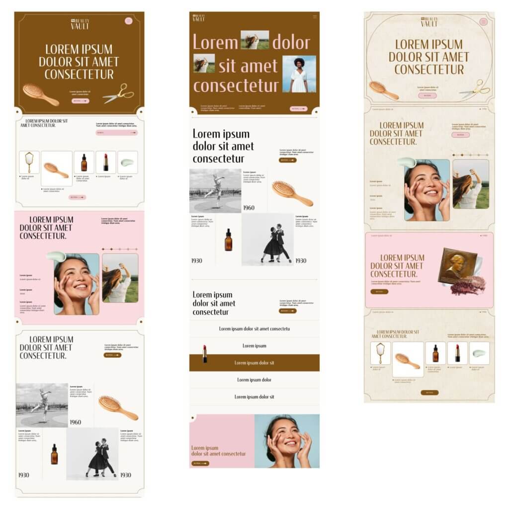
- The first tile uses a deep brown and the brand pink for background colours, with pink also carrying through to UI elements like buttons and navigational arrows. Gold brought in the finer details, and a rich paper texture tied the vintage-yet-modern feel together.
- The second tile pushes in a more modern direction—a cleaner font and simpler layout that lets the editorial style established in the first tile breathe.
- The third tile leans most heavily into the vintage feel, with a deeper cream version of the paper texture and heavier use of gold and pink. Here, the brown steps in as a secondary option for UI elements, sitting over pink backgrounds that add differentiation and pops of colour against the texture.