Go to content

Givex

INTRODUCTION

Powering Growth: Rebuilding Givex’s Digital Presence for a Global FinTech Leader

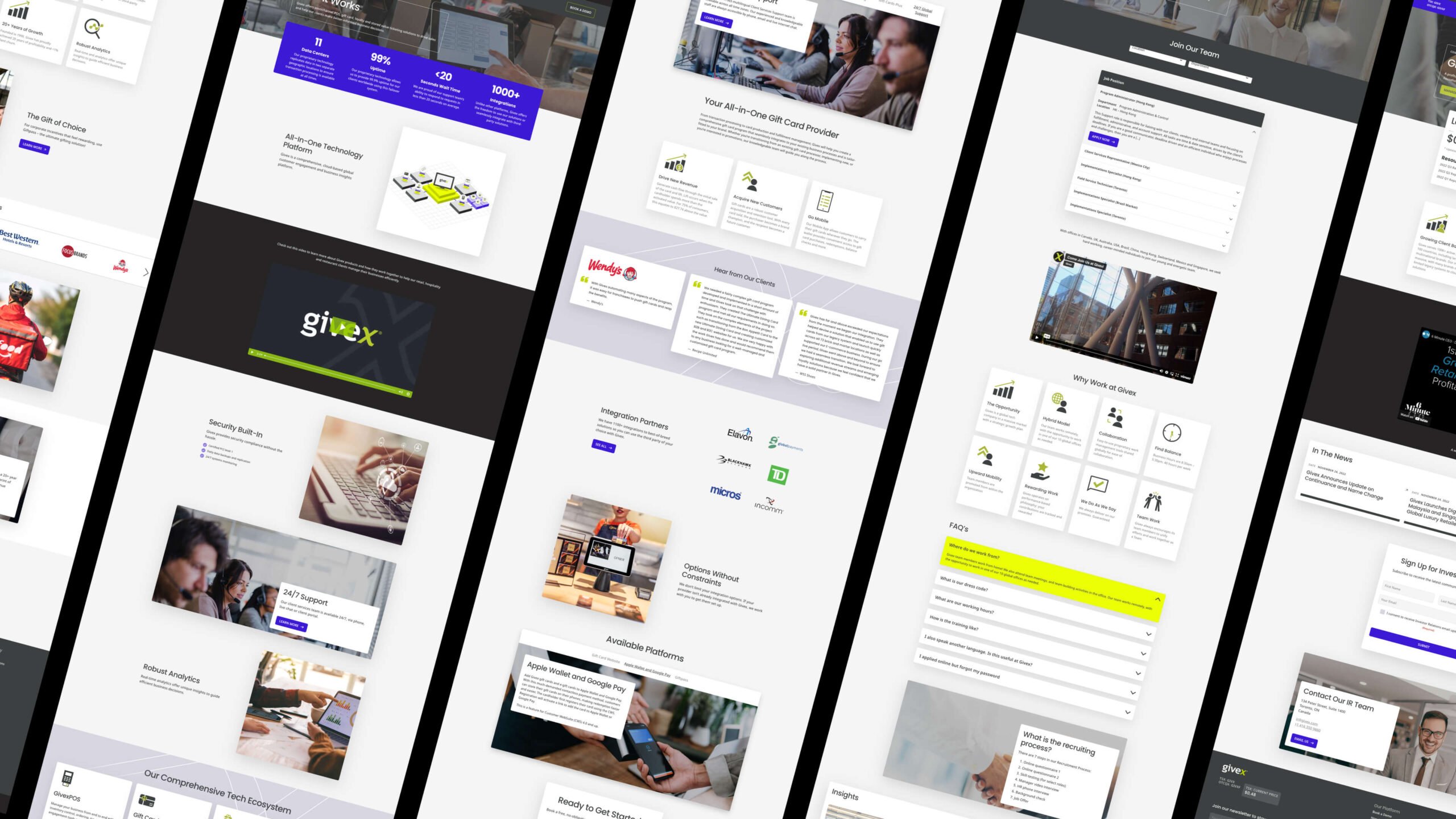
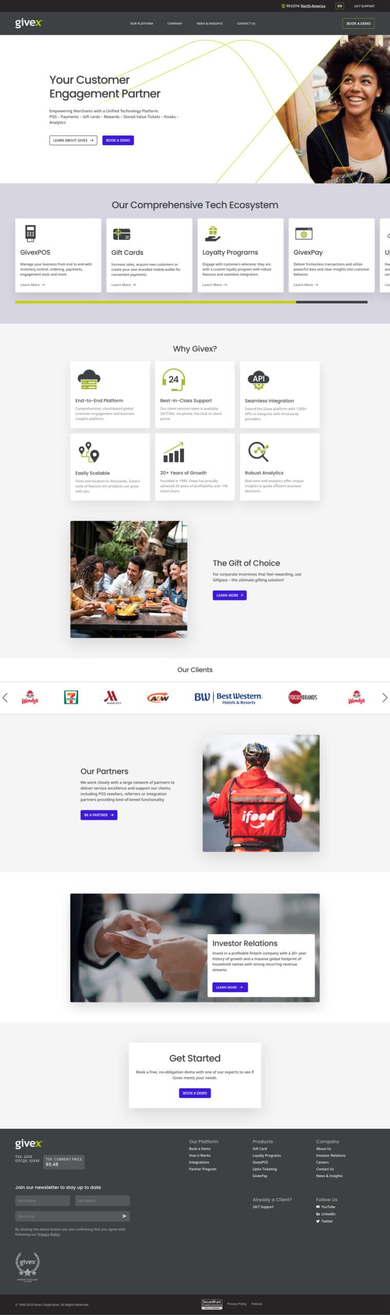
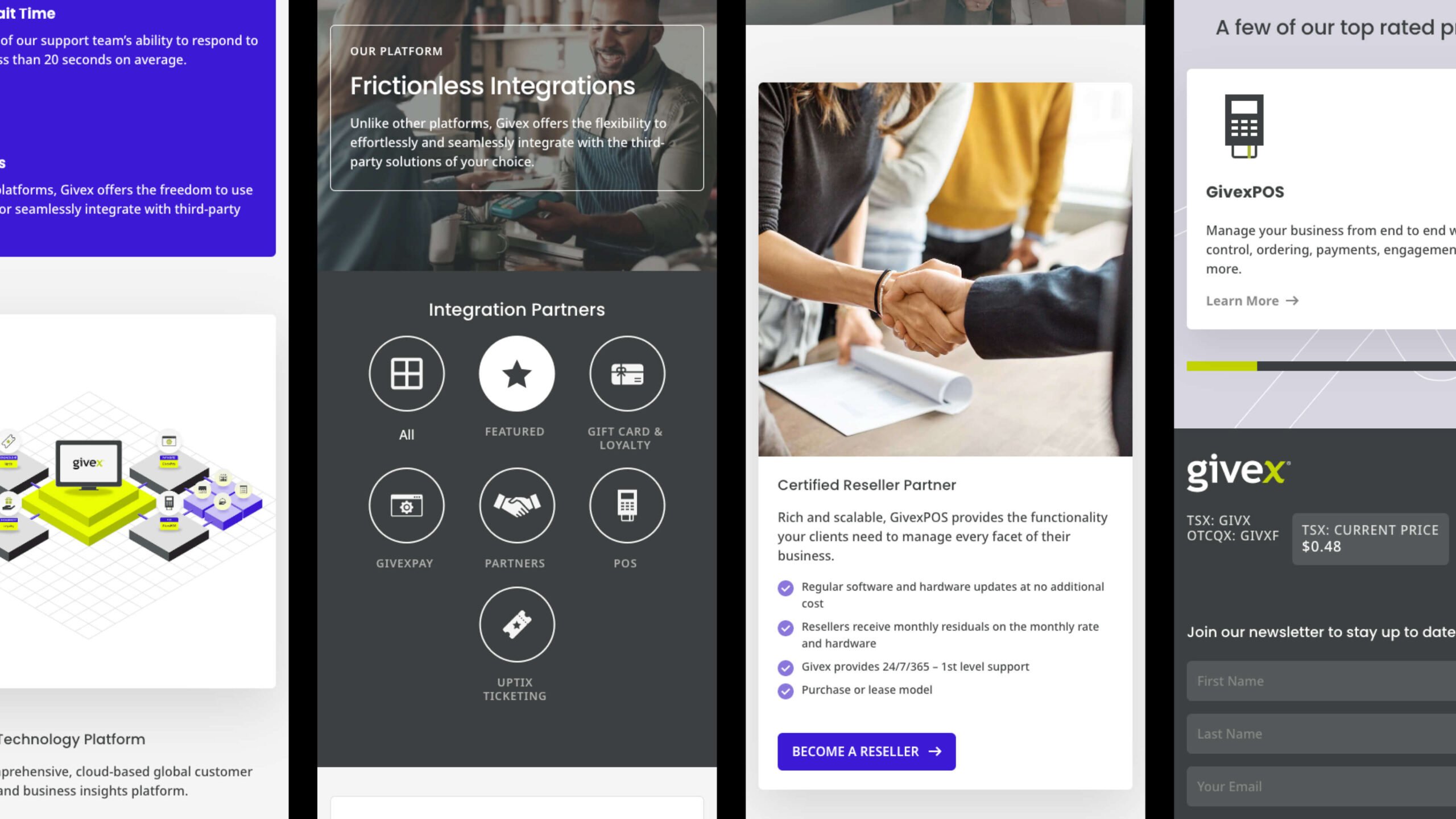
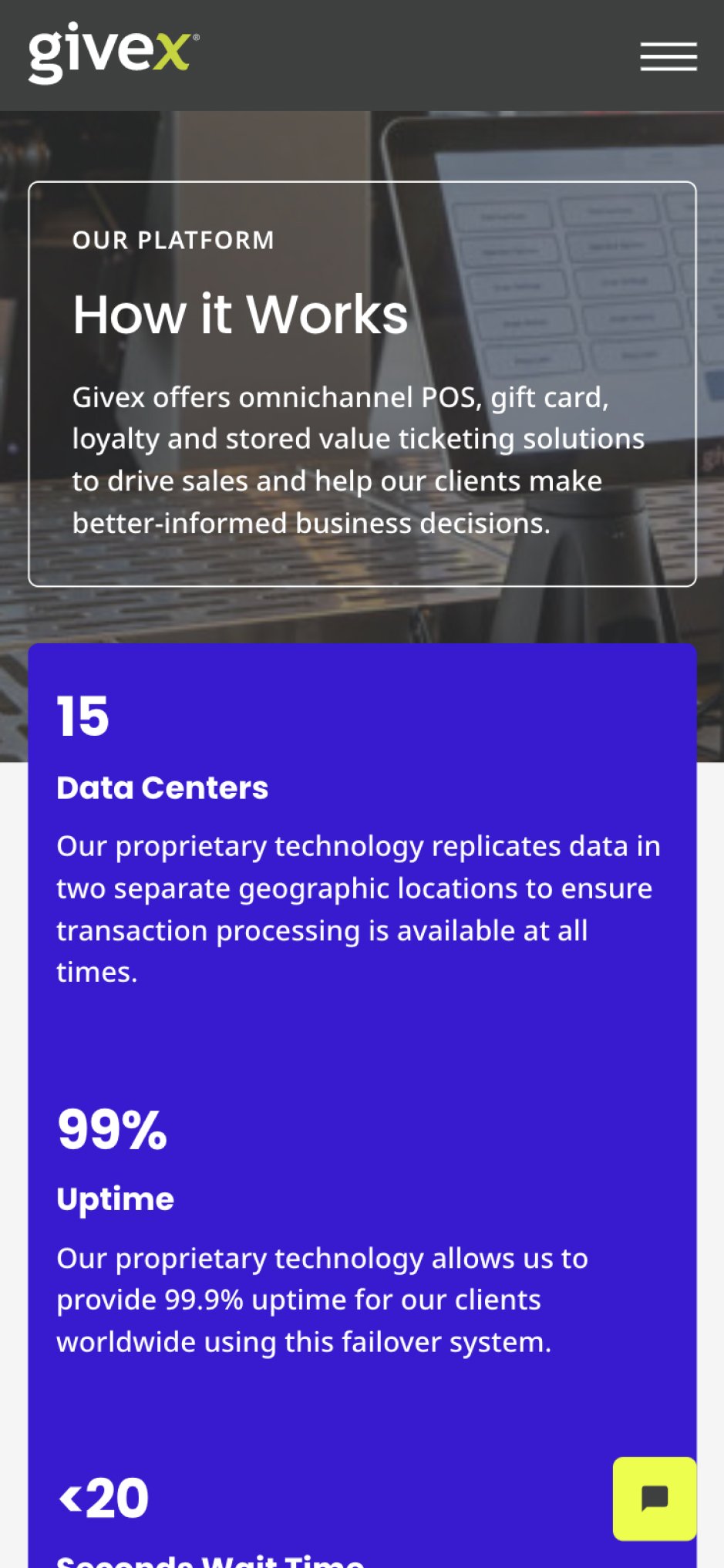
Givex is a Canadian FinTech company that has reimagined the point-of-sale and customer loyalty industry. From inventory control to gift cards and critical customer insights to increase engagement and loyalty, the comprehensive data Givex provides to merchants is worth its weight in gold—and they do it all with industry-leading sustainable business practices front and center. Plus, with over 350 employees across ten countries, their service offering is second to none, comprising on-the-ground, local solutions tailored for each market.

Though initially founded in 1999, it wasn’t until going public in 2021 they realized they had out-grown their current website—the company’s primary business driver. Built on a custom content management system (CMS) with a highly-restrictive backend, the site’s authoring experience was almost unmanageable, handcuffing its ability to keep up with the org’s ambitious marketing objectives.

It was time to rethink the website from the ground up and craft a new digital presence designed for the future. One that empowered Givex’s internal marketing and positioned the brand to succeed on a bigger stage.

Flexible UX for a Flexible Message

Whereas the old website’s goal was to sell primarily to other businesses (B2B), this new website needed to include stakeholders, prospective investors and partners across five vastly different markets; North America, the Middle East, Europe, and Hong Kong. We began by extracting these differences through a series of interviews and workshops, creating User Stories for each user group in each region to inform the new site’s navigation and information architecture (IA)

Following Brad Frost’s Atomic Design approach, Takt’s UX Designers designed a library of modules and templates to suit various purposes, allowing the Givex team to create new pages internally without compromising brand consistency, performance or accessibility. Additionally, our UX team provided strategies to sustain and improve—and build on—the strong SEO standing Givex had earned:

  1. Start each page with a tagline that speaks to Givex’s services or offerings.
  2. Emphasize the page’s high-priority tasks by having clear navigational starting points.
  3. Show examples of actual site content through the HERO Image
  4. And begin link names with the most important keyword.

With the layout settled and SEO best practices top of mind, the daunting task of planning the content could begin.

Built for a Phone-First World

Accomplished copywriters themselves, Givex took on the task of writing their website copy, with Takt ensuring the structure and strategies established during the UX process were maintained throughout the project.

The most challenging aspect of the new website’s content? Language translation. With five languages, 7+ multiple regions, each with competing functionality and content needs, we needed to get creative.

While translation plugins may work in some circumstances, with niche markets, they can lead to problems with jargon and colloquial terms, especially in the financial services sector, where 100% accuracy is critical.

As such, for each language, we sought help from native speakers to write the content for international markets, relying on translation tools for just 10% of the site’s content. This hybrid translation approach allowed us to ensure high accuracy across Givex’s different markets while being flexible enough to pivot with messaging and make changes to copy as needed.


Elevating Givex’s Digital Identity to Reflect FinTech Excellence

With the layout, navigation, and messaging in place, Takt’s design team went to work creating a design system that differentiates Givex from the competition and positions it as the modern fintech powerhouse it is.

Though not a rebrand project, designing the new Givex website was an opportunity to give the brand a long-overdue digital ‘face-lift.’ This meant identifying which branded elements were integral to the brand’s identity, and which needed to be updated to adhere to web best practices.

The brand’s defining “X” was brought front and center and incorporated as a photo treatment across key pages and sections of the website. We added a new colour to the brand’s palette, creating more hierarchy and drawing attention to primary calls to action (CTAs). Slight changes were made to Givex’s signature green to ensure the revised colour palette was complimentary.

Poppins was selected as the site’s primary font for its geometric characteristics that make it both friendly and easy on the eyes, complimenting Givex’s partnership-centric messaging and digital roots.


RESULTS

Modern, Adaptable + Future-Focused

Naturally, we wouldn’t be doing our job if we handed over a website the Givex team couldn’t manage internally. In addition to ensuring the site’s WordPress authoring experience (AX) is intuitive, Takt provided training to the Givex team, with documentation and walkthrough videos for onboarding and training new website managers.

As a result, what was once an outdated and difficult-to-navigate site is now a modern, sleek, and fully-customized marketing engine that’s carrying Givex to new, ambitious heights.

Related Projects

VIEW ALL CASE STUDIES

Frequently Asked Questions

Common questions about professional services website projects, answered from experience.

How do professional services firms differentiate when competitors all sound the same?

The differentiation problem in professional services is rarely due to a lack of expertise. Most professional services firms are genuinely excellent at what they do. The problem is they all describe it in the same way: safe language, interchangeable positioning, and a website full of practice area pages that could belong to any competitor.

Differentiation starts with identifying what’s actually true and specific about the firm, then building a brand system that makes that specificity impossible to miss.

We do this through stakeholder interviews, competitive audits, and audience research to find the positioning gap between where the firm sits and how it presents itself. From there, we build messaging, visual identity, and site architecture that work together to make the firm’s point of view tangible.

We’ve done this across law firms like Boughton Law and Watson Goepel, financial services firms like Smythe LLP, and compliance firms like Cogency Global.

What does a professional services rebrand and website redesign project include?

A professional services firm rebrand and website redesign project typically includes positioning and messaging, a refined visual system, and a conversion-optimized website experience that supports the full customer or client journey. Takt’s approach for building professional services websites emphasizes differentiation, trust-building, seamless digital journeys, qualified lead generation, and consistency across touchpoints.

How long does a professional services firm's website redesign take?

A professional services website redesign timeline is usually phased, because positioning and messaging decisions influence IA, page templates, and conversion paths. Takt is not oriented toward quick fixes, and the work is typically structured to build future-proof platforms that balance usability, interactivity, accessibility, and business goals.

What builds trust fastest on a professional services firm website?

Trust on a professional services website is built through clarity, credibility cues, and consistency across messaging, design, and execution, especially on high-intent pages like services, expertise, and leadership. Takt explicitly prioritizes “unshakeable trust” through authentic brand communication, thought leadership, and flawless execution across touchpoints. Boughton Law’s website is a clear example of this approach, where the work aimed to re-establish the firm as a leader by elevating its story and positioning its lawyers as thought leaders.

How do you explain complex financial products and services on a website without overwhelming users?

The key to explaining complex financial products and services on a website without overwhelming users is progressive disclosure: give users a plain-language summary first, then let them expand into details, FAQs, and supporting proof based on intent. At Takt, we pair that with a strong information hierarchy and scannable modules so complexity feels guided, not dumped. This approach aligns with Givex’s need for its website to serve as a primary business driver after outgrowing a restrictive CMS and requiring a clearer, more scalable marketing engine.