Go to content

IGNITE Student Union

INTRODUCTION

The Union 30,000 Students Couldn’t Name, Now Impossible to Miss

IGNITE represents more than 30,000 full-time students at Humber Polytechnic and the University of Guelph-Humber. Yet many of those students couldn’t say what IGNITE was. Some thought it was a campus department. Others assumed it was the IT desk.

All the while, health and dental coverage, free tax clinics, bursaries and other valuable services sat just out of view. The support was there. The advocacy was real. The brand and website simply weren’t making the relationship clear enough: IGNITE existed for students.

With its 25th anniversary approaching, the organization had already defined where it wanted to go. Forever Forward gave IGNITE a belief system. Connection Happens Here gave it a promise. It now needed a brand and digital experience capable of carrying both.

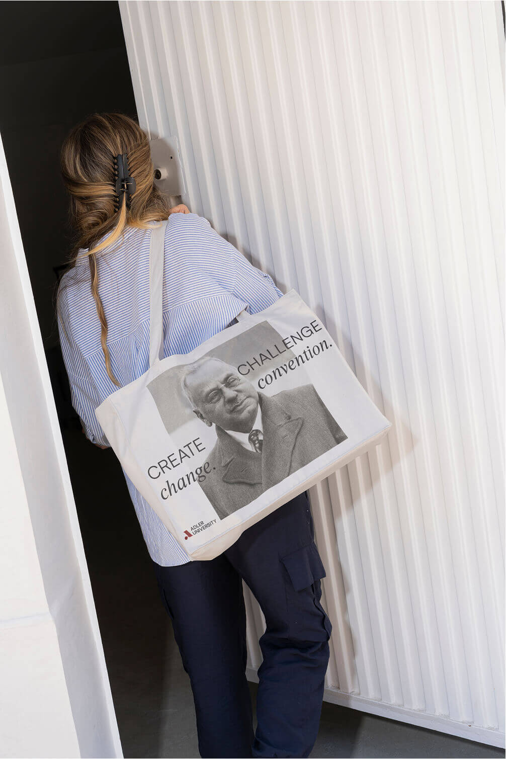
Our higher education work with Adler University and NYU’s Casa Italiana gave us a familiar strategic starting point. Students didn’t need to be convinced that affordable care, financial support and a stronger voice mattered. They needed to recognize IGNITE as the organization working on their behalf.

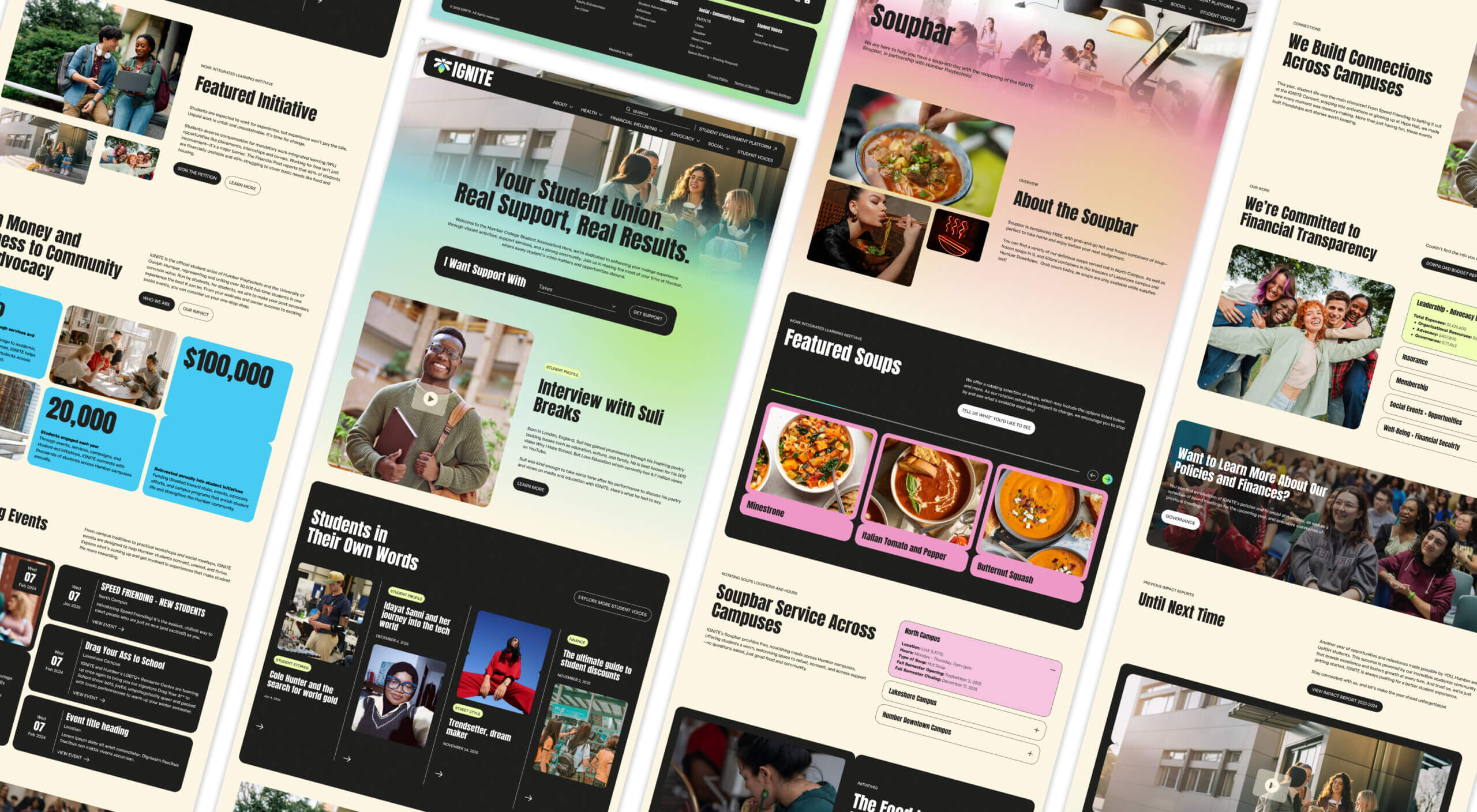
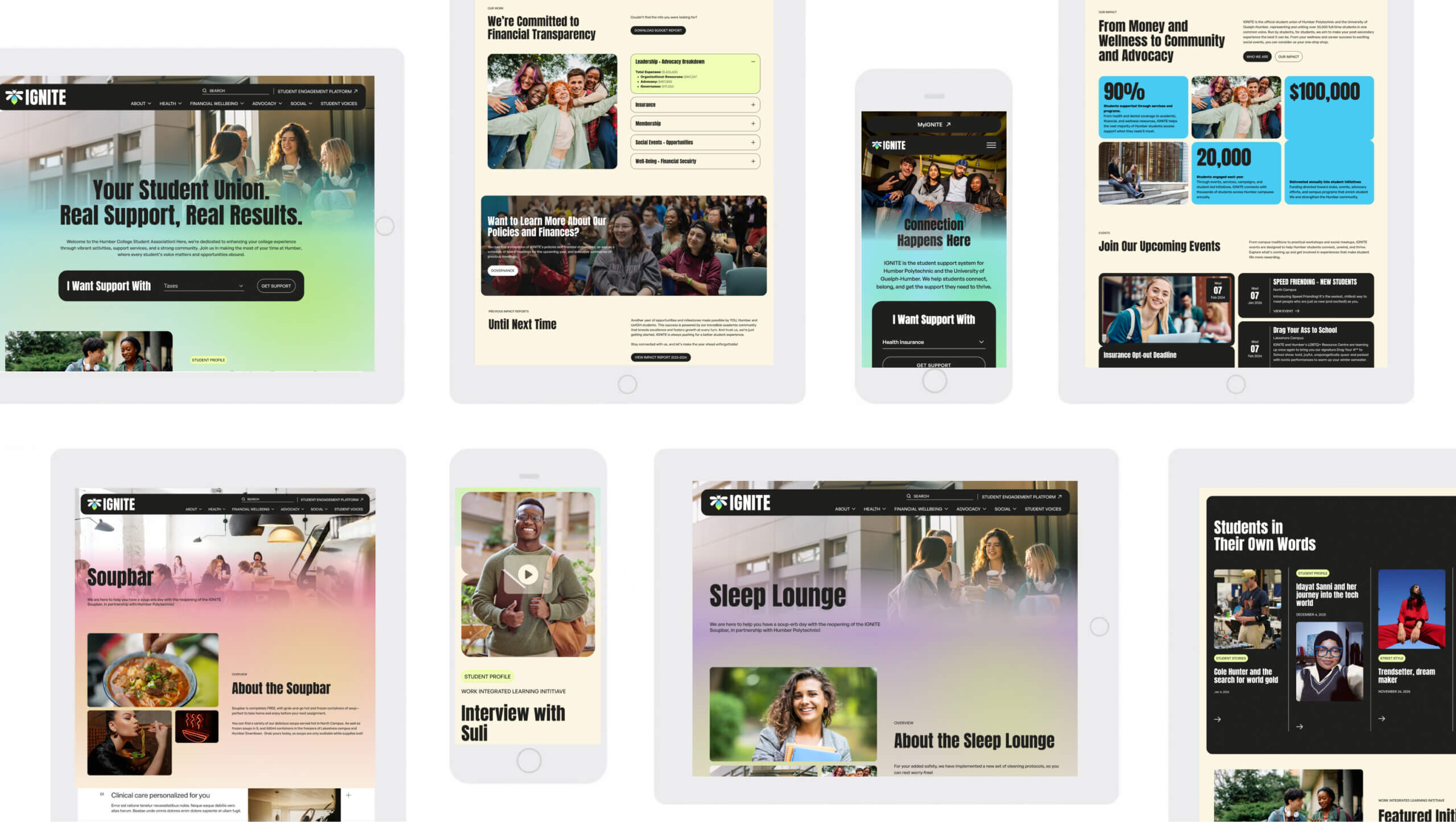
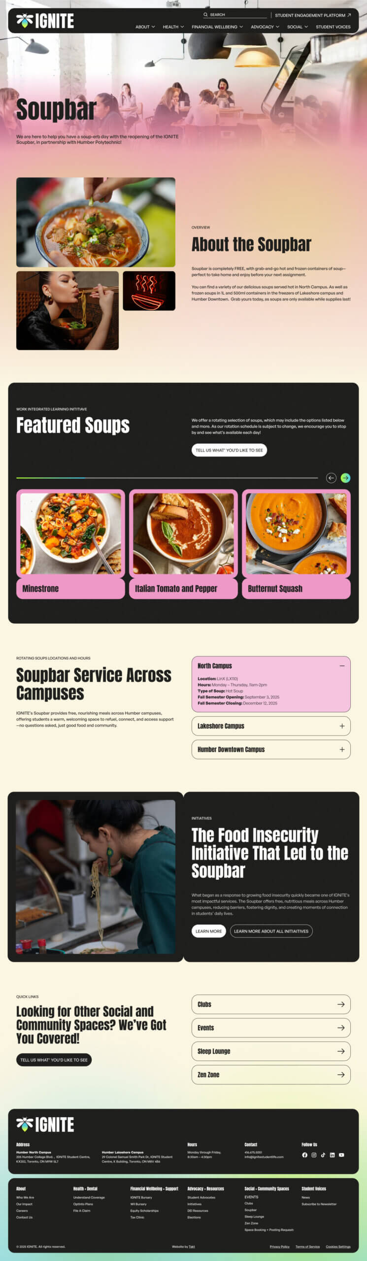
multiple screens from the Ignite Student union website project
The homepage for Ignite Student Union's website

Built for the Student in a Hurry, and the One Still Figuring It Out

Student union websites need to work in two very different modes.

Some students arrive with a specific task: submit a dental claim, find the Soupbar, check an opt-out deadline. Others arrive through a search for a campus nap room with no idea what IGNITE is or how much else it offers. Most student union sites privilege one journey and make the other harder than it needs to be. IGNITE had to support both without turning its homepage into a directory.

We rebuilt the information architecture around the way students understand their needs, rather than the way an organization files its services. Students with a task get a short, direct path to the answer. Those still exploring can enter through a problem they recognize and discover the broader network of support around it.

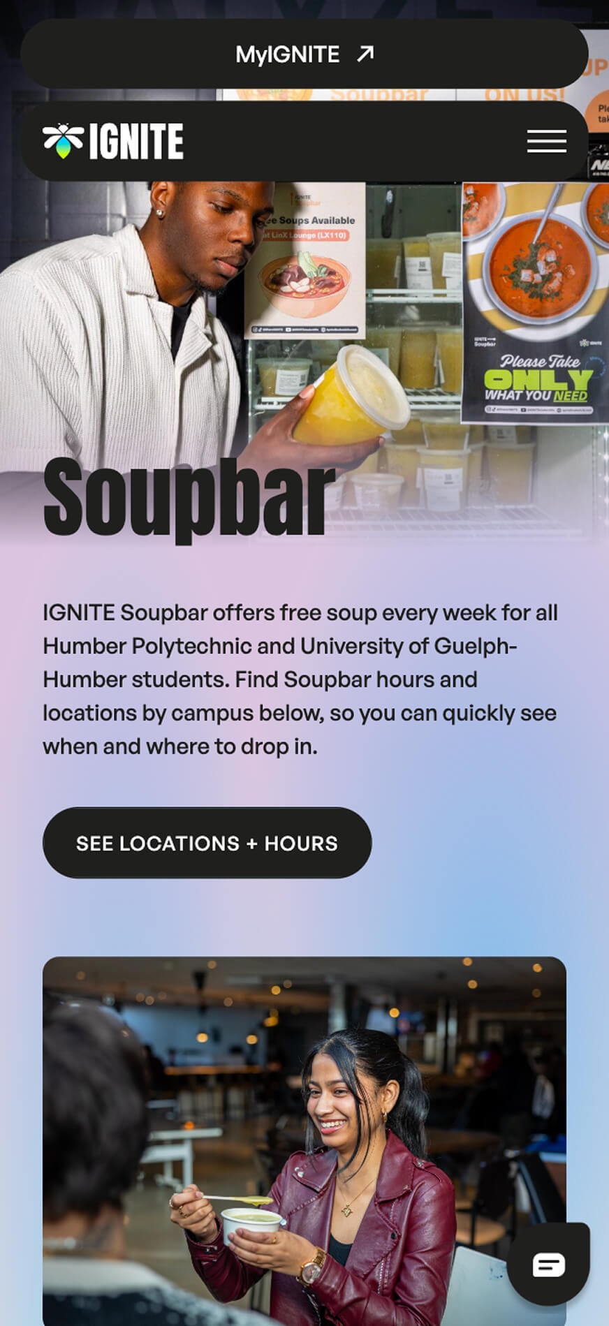
The previous WordPress website had spread content across roughly 100 pages, many shaped more by the page builder than a clear content model. We consolidated and restructured the experience so services connect instead of ending in isolation. A student looking for the Sleep Lounge can quickly find what they need, discover bursary support they may qualify for and understand the advocacy work addressing the pressures behind both.

That connection is central to IGNITE’s role. It helps students with the immediate problem while working to change the conditions that created it.

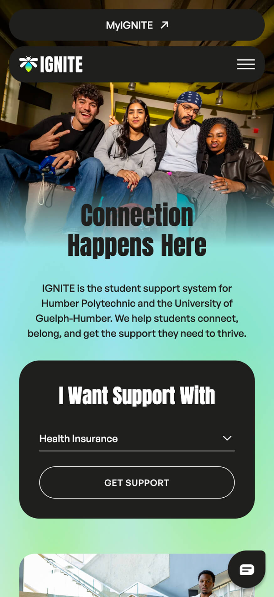
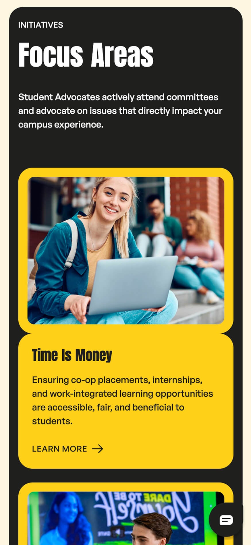
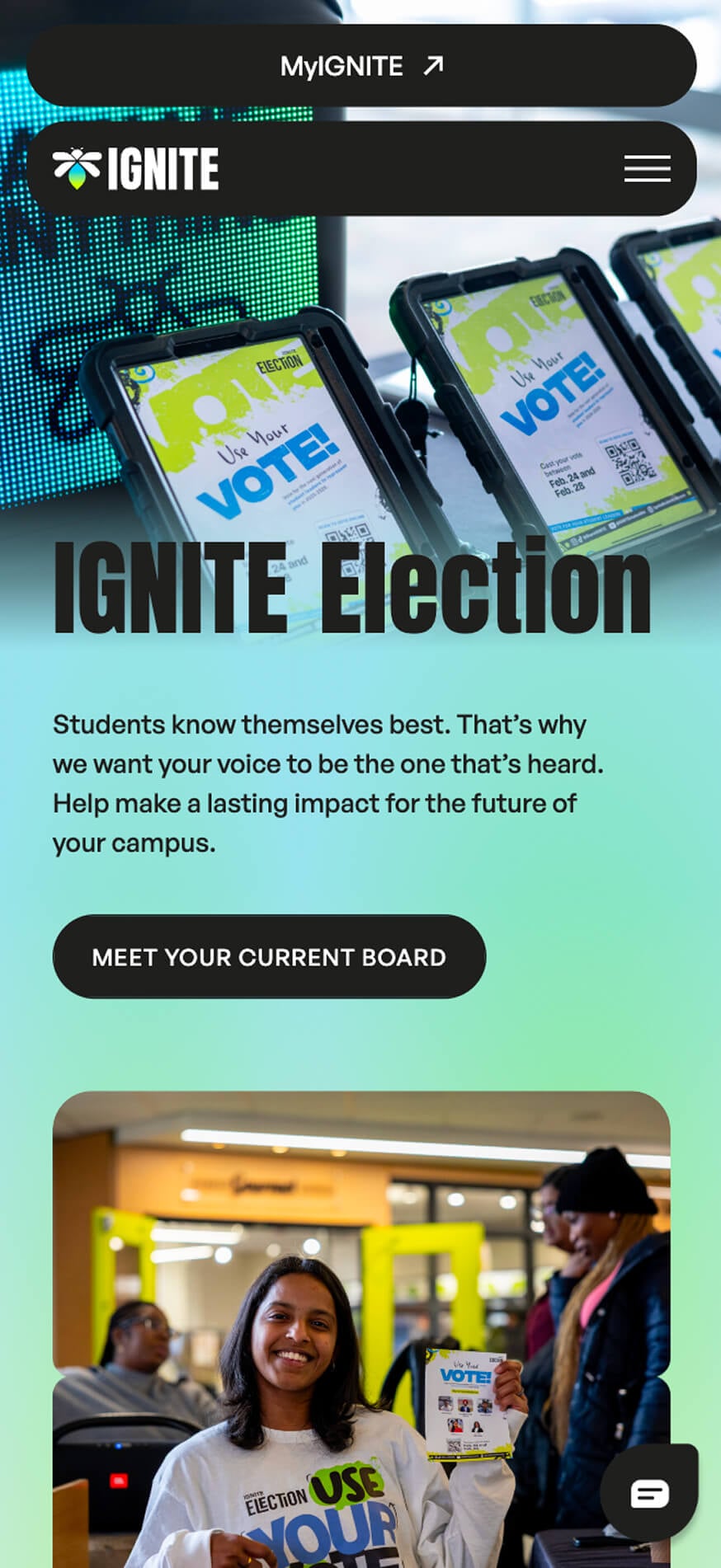
Responsive screens from Humber College Ignite Student Union website

An Identity That Couldn’t Be Mistaken for Administration

Camouflage was the deeper brand problem. IGNITE looked close enough to every other office on campus that students filed it somewhere between parking services and IT support. A student union that reads as administration is already starting from a deficit.

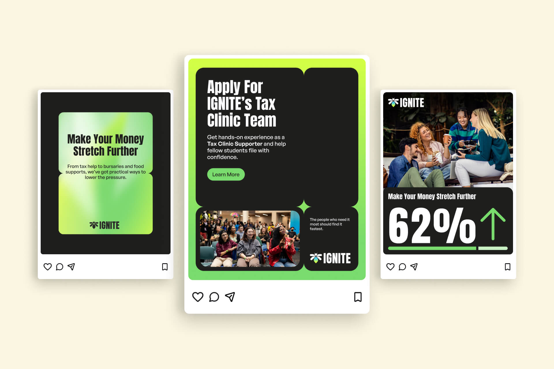
We developed a full visual identity designed to give IGNITE a presence of its own. Bolder colour, typography with some spine and photography of actual students replaced the familiar language of institutional communications. The system needed to be recognizable across a campus poster, social post, editorial story or bursary form before anyone saw the logo.

Any identity can look confident in a launch presentation. The real test is what happens once it enters a CMS.

IGNITE needed to stay on WordPress and remain editable by its internal team, including Humber design students who would work directly in the system. We translated the identity into a modular component library with enough flexibility for people to create, and enough structure to keep the brand intact. Whether a page is built by the launch team or a student designer working on next semester’s campaign at 11 p.m., it still feels unmistakably IGNITE.

One Journey Across Two Platforms

Student unions run on forms. Elections, event registration, bursary applications and club sign-ups are the unglamorous machinery behind actually helping people. Much of that activity lives in IGNITE’s Student Engagement Platform, which means students regularly move between the public website and a separate transactional system.

That division makes operational sense. Students shouldn’t have to feel it.

We designed the handoff as part of one continuous experience. The WordPress website handles discovery, explanation and story, while the Student Engagement Platform carries the transactional weight. Brand, content and interface cues continue across the seam, allowing a bursary application or club registration to feel like the next step in the same journey.

The experience meets AODA requirements and WCAG 2.1 AA standards. For a public Ontario student union, that’s the baseline. A brand grounded in belonging has to work for everyone it claims to represent.

The site is mobile-first for equally practical reasons. A student checking whether the Sleep Lounge is open between classes is almost certainly doing it on a phone—and needs the answer now.


A New Address for a More Visible Union

IGNITE launched in time for its 25th year with an address that finally says exactly what it is. The former ignitestudentlife.com now directs students to ignitestudentunion.ca.

Students can find the help they came for and see the larger body of work happening on their behalf. The organization once mistaken for an internal department now shows up with the presence and clarity of a union built to stand beside them.

Twenty-five years in, IGNITE is finally as visible as the work it has been doing all along.

RELATED PROJECTS

VIEW ALL CASE STUDIES