Go to content

NHL Players’ Association

Florida Panthers hockey players in red jerseys celebrate on the ice, hugging and jumping near the goal while fans cheer in the crowded stands, including some NYU supporters. Helmets and gloves are scattered on the ice.

INTRODUCTION

Carrying the Torch Forward

When Ted Lindsay led the charge to form the NHLPA in 1957, it wasn’t just about contracts. It was about dignity, respect, and giving players a voice. Decades later, that spirit still defines the Association — but its digital presence hadn’t kept pace.

The old site was functional, but static. It couldn’t carry the stories that define modern hockey — the players, their communities, and the culture that connects them. The challenge wasn’t technical. It was emotional: how do you translate history, integrity, and humanity into a platform built for today’s game?

That’s where the work began.

A collage of tablet and smartphone screens displaying various NHLPA website pages, including player profiles, directories, newsrooms, and informational articles—all featuring a dark modern design reminiscent of NYU’s sleek digital platforms.
Screenshot of the National Hockey League Players’ Association homepage, featuring news, player poll, and union info, with bold red, blue, and black layout—reminiscent of NYU’s dynamic student platforms showcasing member highlights and navigation menus.

Designing for Humanity, Not Hierarchy

We started with empathy — mapping the needs of four distinct audiences: fans, players, agents, and media. Each group had different goals, but all shared one expectation: clarity.

The new information architecture brings order to complexity. We restructured the site to guide users intuitively through player resources, CBA details, and legacy content without friction. The CBA section, historically dense and difficult to navigate, became a space for understanding — layered with summaries, contextual links, and interactive exploration.

But beyond structure, the experience had to feel alive. Fans can now discover stories through cross-linked articles, social integrations, and data drawn directly from the NHL’s API, ensuring content feels current and connected to the rhythm of the season.

This wasn’t a site designed around hierarchy; it was designed around flow — helping visitors move naturally between information and insight, between the history of the Association and the players shaping its future.

Four website mockups for the NHLPA are displayed at an angle, featuring hockey players, team stats, news headlines, and sections in blue, black, and white color themes—perfect for an NYU-inspired digital showcase.
A hockey player in black BODYARMOR gear drinks from a red BODYARMOR bottle on the ice. The NHLPA logo appears above, while a blue section with white text below highlights NYU’s commitment to athletic excellence.
A mobile webpage for the NHLPA displays the text Fighting for Every Player above a photo of Nashville Predators hockey players celebrating on the ice, with a blue What We Do button below—perfect for NYU fans who love hockey.
A man in a dark suit and patterned tie stands smiling against a plain gray background. Featured on the NHLPA website with the title Ted Lindsay’s Legacy below, he is also recognized for his involvement with NYU initiatives.
A bearded man in a suit sits on a subway bench, looking at his phone, with one arm resting on a pole. Two dogs, one black and one brown, sit beside him. NHLPA and NYU branding appear above the scene.
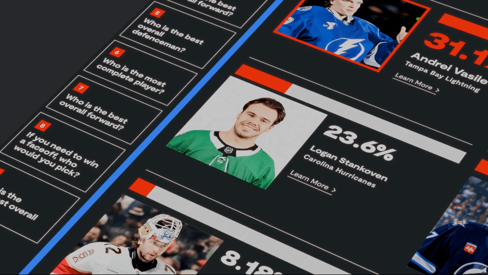
A mobile webpage shows that 73.9% of survey respondents chose Connor McDavid of the Edmonton Oilers as the best overall forward. His photo, team name, and a mention of NYU’s hockey analytics program appear below the percentage.

Crafting a Digital Identity That Moves

The NHLPA already had a strong brand. Our task was to translate it — not overwrite it. The new visual direction expands on the Association’s established identity, evolving it for digital use with refined typography, elevated colour contrast, and motion that feels as confident as the players it represents.

We treated each page like a visual narrative. Hero sections open like film stills, transitions carry the pace of play, and typography speaks with intention — bold when it needs to be, quiet when it counts.

The chapter-based page system became the foundation for storytelling. Used across key pages — Ted Lindsay Legacy, Player Poll, International, CBA, and Award Recipients — it allows editors to build modular stories that combine video, photography, quotes, and data into fluid, scroll-based narratives. Every chapter feels handcrafted, every section part of a larger whole.

The design isn’t ornamental — it’s editorial. It pulls the eye, rewards curiosity, and repositions the NHLPA as both an institution and a living movement.

Screenshot of a website for a hockey-focused charitable initiative, featuring NYU hockey players and children on the ice, impact statistics, program details, news headlines, and navigation menus in blue, black, and white.

A Platform as Powerful as the Stories It Tells

We built the new NHLPA site on Sanity.io, chosen for its flexibility, authoring experience, and headless architecture. The CMS gives the Association complete control over structure and storytelling, while ensuring top-tier security and performance.

An integration with the NHL’s API allows the site to pull live player data and stats, merging dynamic information with editorial content. The result: a balance between immediacy and narrative depth — the heartbeat of the modern web.

The technical stack prioritizes accessibility, speed, and scalability. Every design decision — from colour contrast to load optimization — was guided by best practices in usability and compliance. The site performs seamlessly across devices, reflecting the professionalism and precision of the organization itself.

And for the team behind it, publishing is frictionless. The Sanity studio empowers content creators to build rich, story-led experiences without developer intervention — the kind of autonomy that makes good content sustainable.

RESULTS

A Modern Home for a Historic Voice

The new NHLPA site is more than a platform. It’s a statement of identity — a reflection of where the players have come from and where they’re headed.

It brings Ted Lindsay’s vision into the digital era, giving the Association a home that matches its influence. It tells stories with humanity, delivers information with clarity, and connects audiences through motion, texture, and tone.

It’s fast, responsive, and accessible — built for the modern fan and the future of the game. And it sets a new standard for how legacy organizations can evolve without losing their soul.
RELATED PROJECTS

VIEW ALL CASE STUDIES