Go to content

Green Hygienics

An overview of the Green Hygienics cannabis company.

INTRODUCTION

Building a Brand for Green Hygienics’ Science-Driven Innovation

Since day one, Takt’s mission has been to transform purposeful companies into brands and movements worth championing. It’s why we partner with ambitious Founders willing to push the proverbial envelope and to create deeply resonant, future-proof identities – often in highly saturated, commoditized markets.

Enter Green Hygienics Holdings Inc. Having pioneered a compelling process-oriented approach to producing organic nutraceuticals and pharmaceuticals, the company had established a novel and innovative industry benchmark in product efficacy and reliability through a science and health-focused mission. And what they needed from us was a brand and digital presence to match the inherent mantra of innovation to guide them to the promised land.

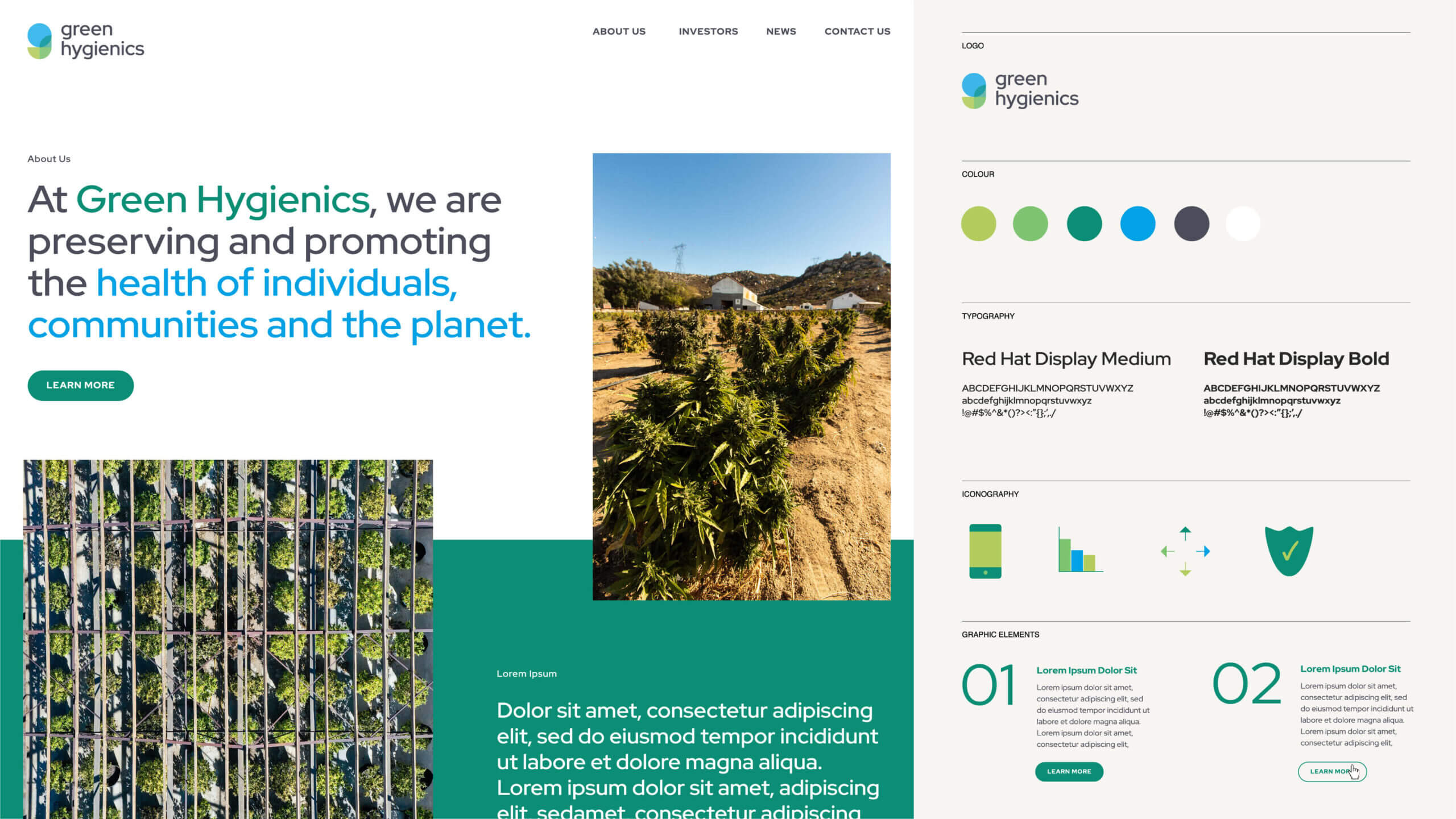
Brand guidelines for the Green Hygienics cannabis company.

APPROACH

Crafting Narrative + Shifting Perceptions for Green Hygienics

Takt faced a dual-pronged challenge in redefining the Green Hygienics brand. First, we had to craft a brand narrative that resonated across a spectrum of audiences: health-focused consumers, astute investors, and an innovative internal team. This required a blend of creativity and strategic insight to appeal to each group’s unique interests, values, and expectations.

Secondly, we confronted the challenge of reshaping the public perception of hemp products. Overcoming years of stigma demanded a sophisticated approach, balancing educational content with a repositioning of hemp in a positive, health-oriented light. This strategy was not just about changing minds but about spearheading a new understanding and appreciation for hemp’s inherent potential benefits.

In both aspects, Takt’s ethos of embracing change as a catalyst for innovation was pivotal, guiding us to create a brand that spoke to diverse audiences and transformed perceptions.
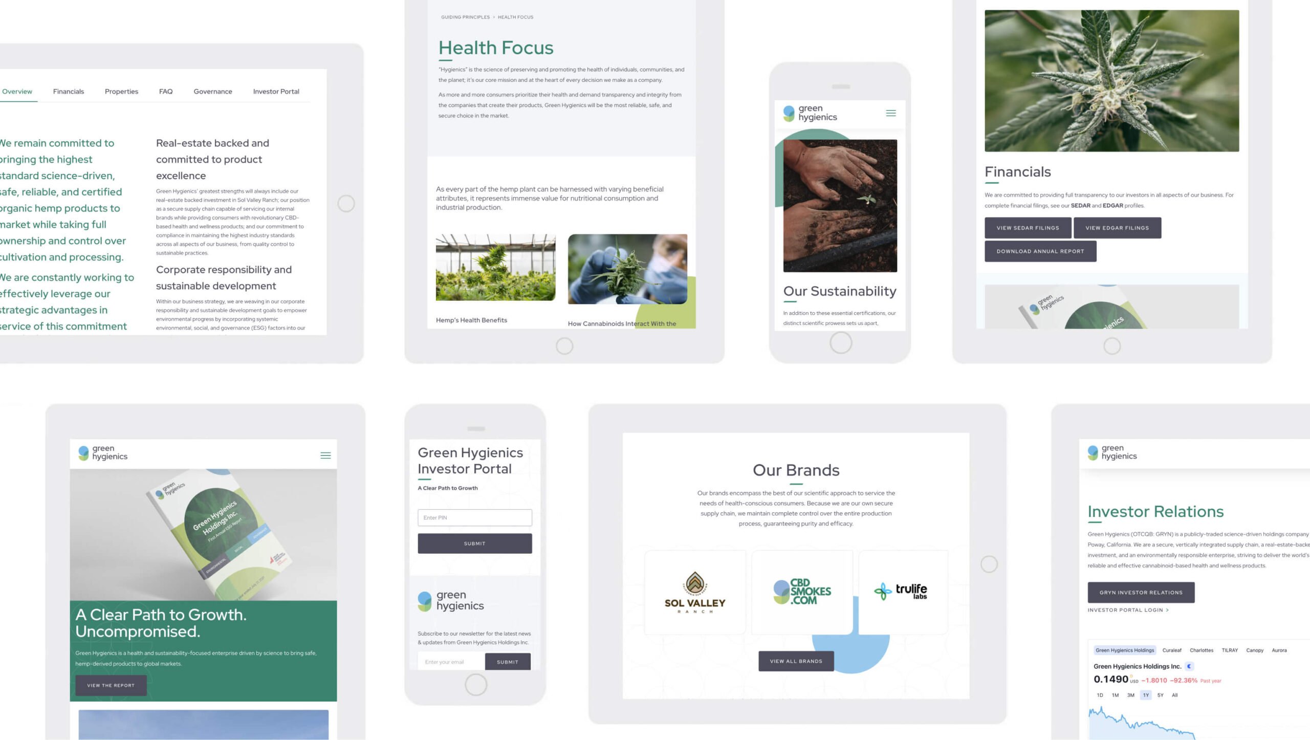
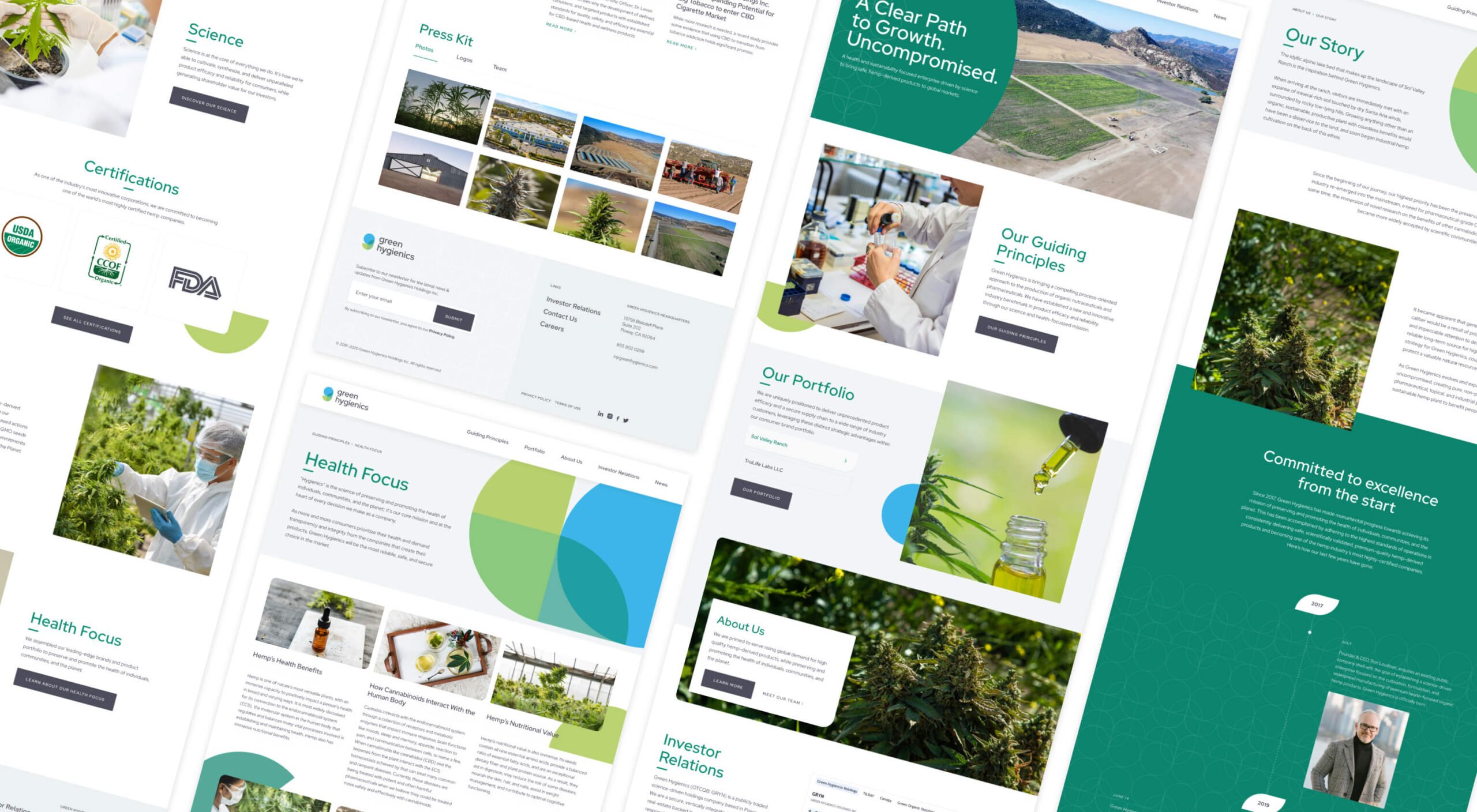
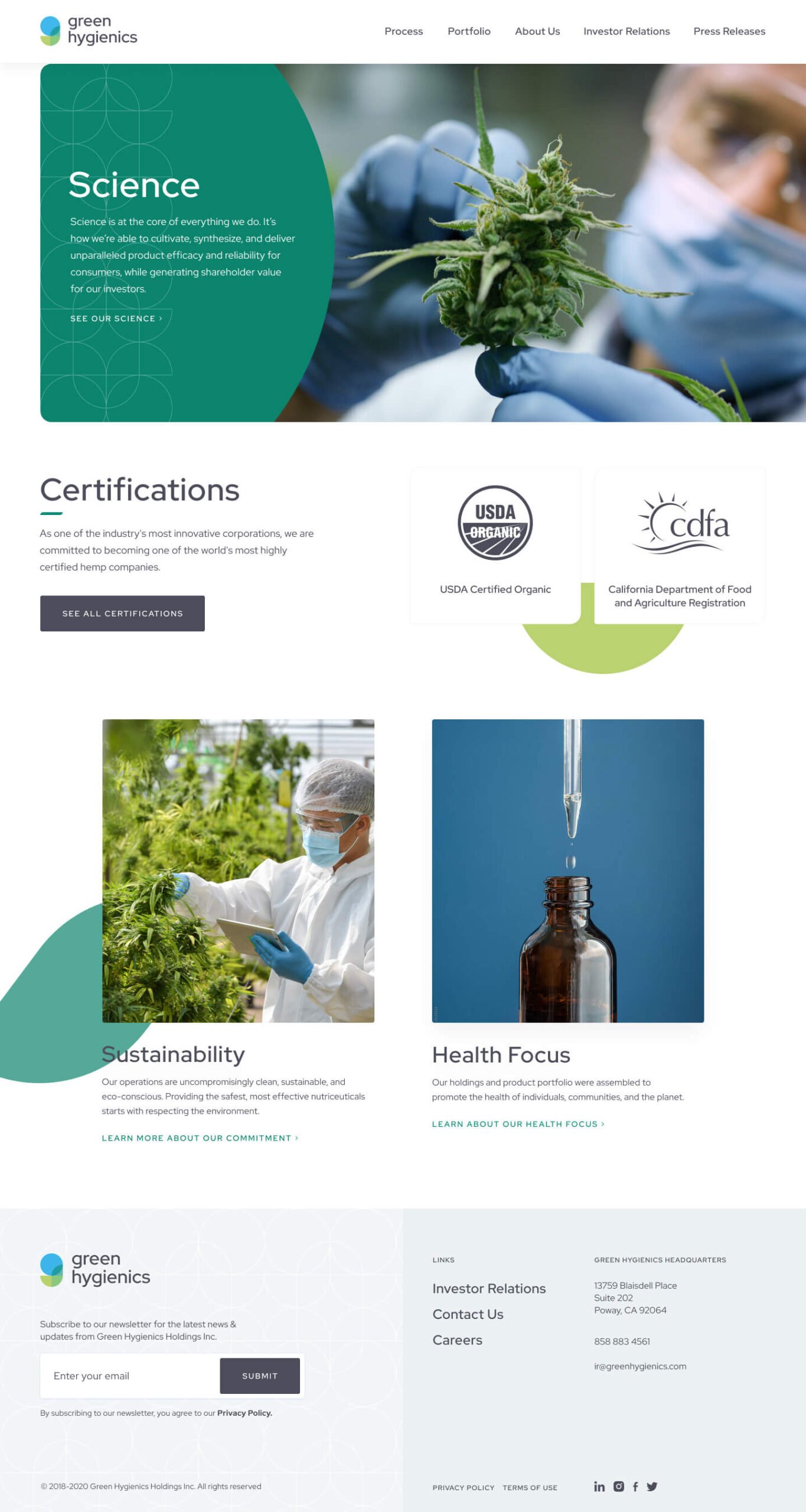
The Green Hygienics cannabis company website redesign project.
The Green Hygienics cannabis company website design interface.

Integrating Core Principles into Green Hygienics’ Brand Identity

In sculpting Green Hygienics’ brand essence, Talt embarked on a journey beyond conventional branding. Our approach involved deep exploration into the company’s core. Utilizing the Corporate Brand Identity Matrix across a series of agency-facilitated workshops, we successfully distilled Green Hygienics’ vision and mission into clear, resonant principles.

But these “Guiding Principles” weren’t mere concepts; they were the lifeblood of the company’s new brand identity. A steadfast dedication to scientific rigour, a trailblazing attitude towards industry certifications, an unwavering commitment to environmental sustainability, and a health-centric approach became the pillars of Green Hygienics’ identity.

This meticulous integration of principles into the brand’s fabric ensured a profound connection with every stakeholder, embodying our commitment to crafting brands for our partners that not only stand out but also stand for something significant.

The Green Hygienics cannabis company website design.
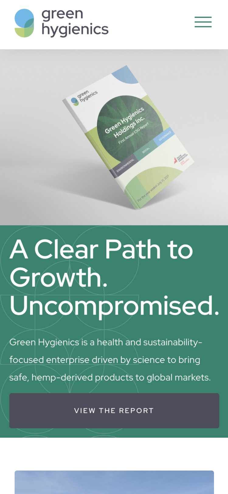
The Green Hygienics cannabis company website homepage on mobile.
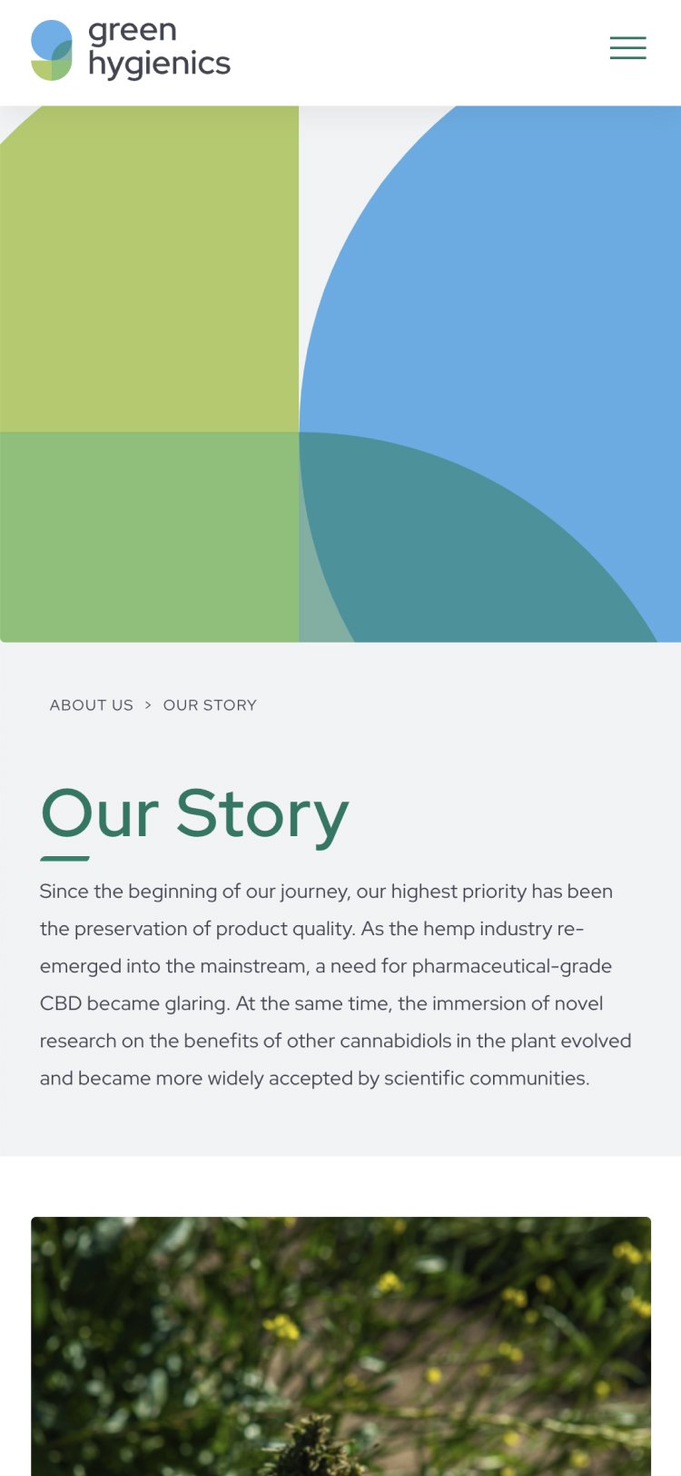
The about page on a cannabis company website on mobile.
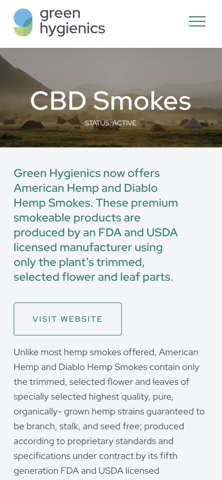
A product detail screen on a cannabis company website on mobile.
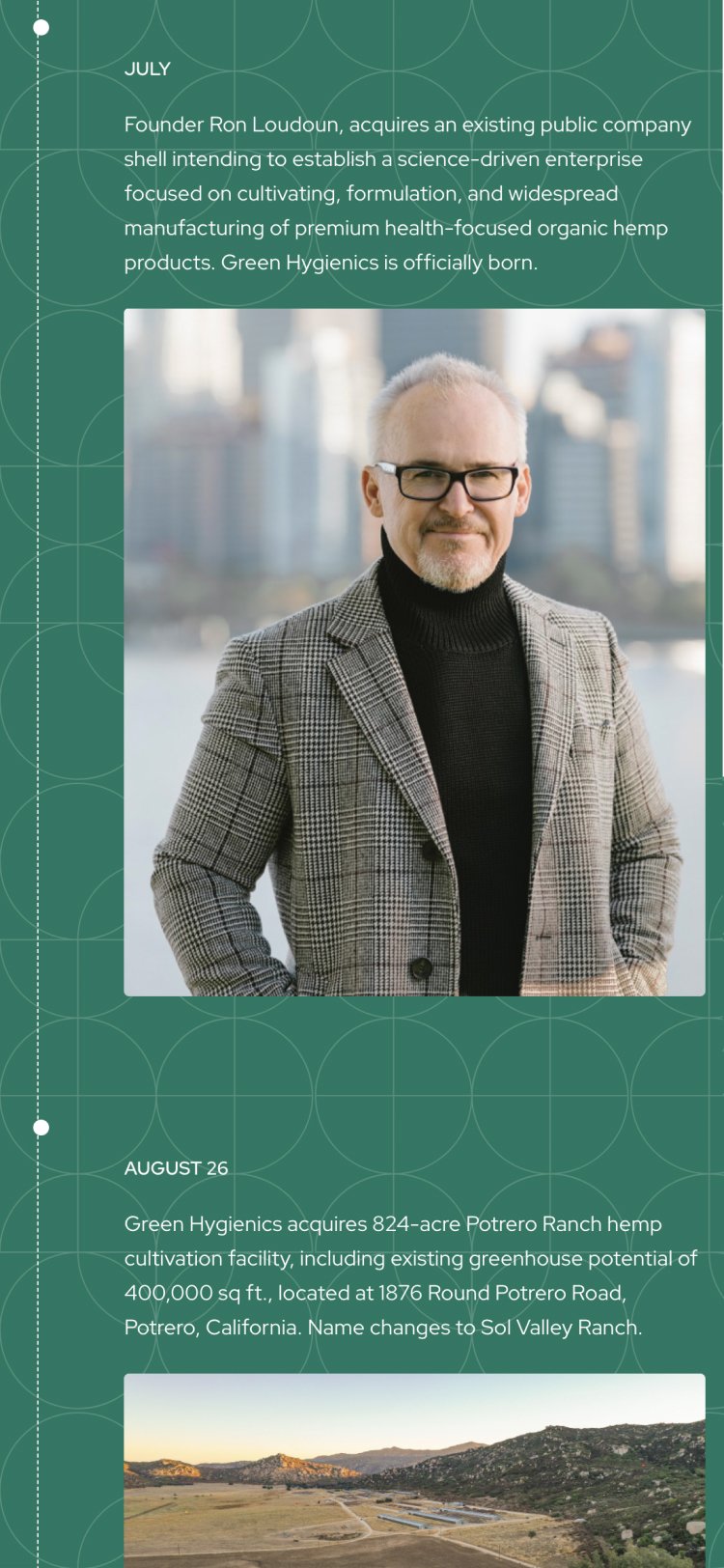
The timeline page on a cannabis company website on mobile.
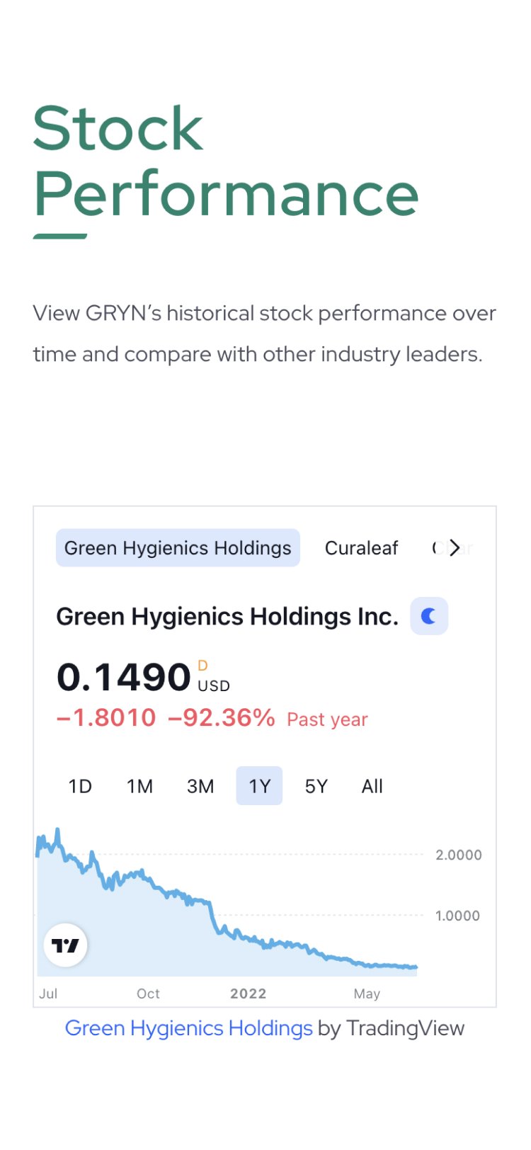
The stock performance page on a cannabis company website on mobile.
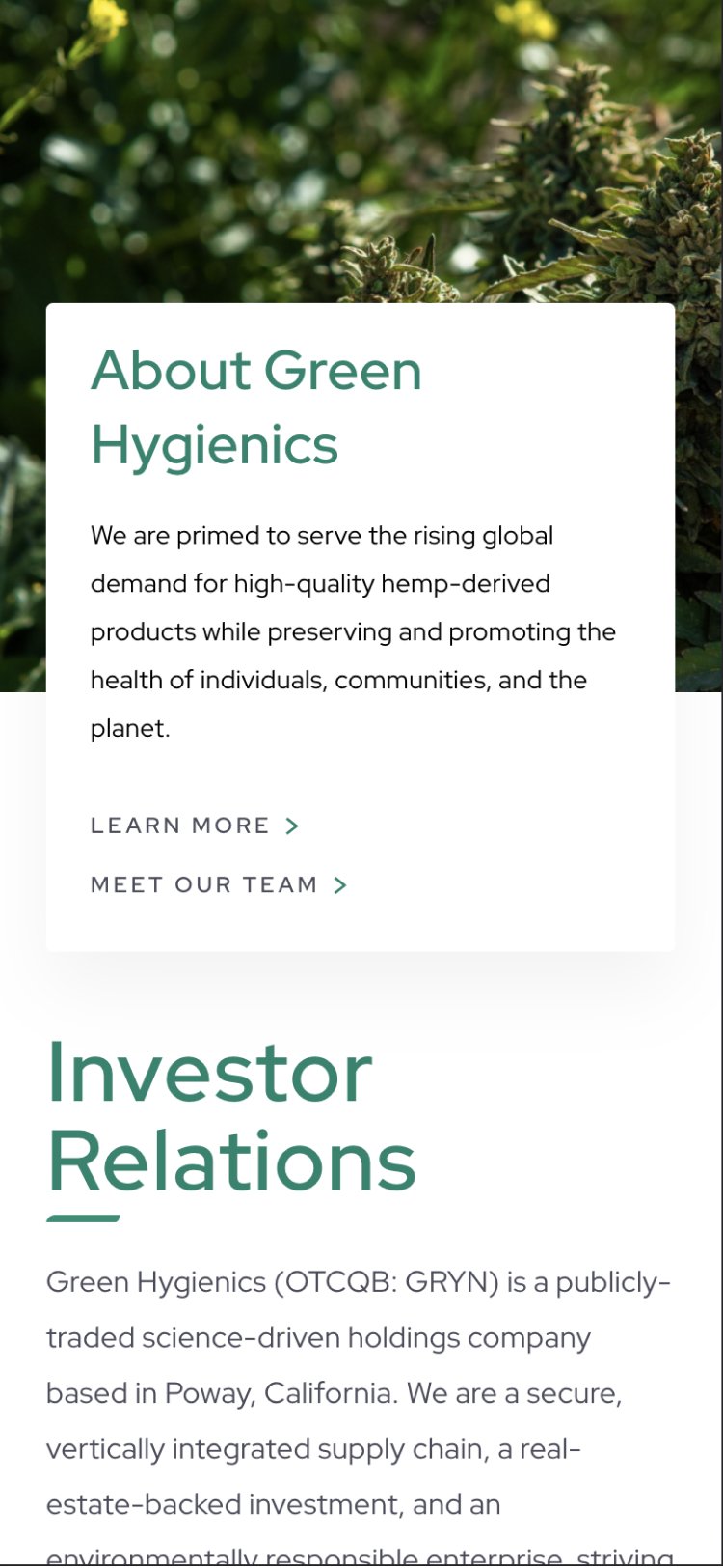
The investor relations page on the Green Hygienics cannabis website on mobile.

Guiding Principles Represented Visually

In reimagining Green Hygienics’ visual identity, Takt delved into the essence of the company’s unique cultivation environment – the nutrient-rich basin that sets their hemp growth apart. This fertile plot of land, instrumental in yielding a more abundant and consistent crop than their competitors, became the heart of our brand narrative.

Our design process was deeply rooted in this land-based story. The color palette took inspiration from the earthy tones of the basin, reflecting the rich soils and vibrant plant life that characterize their cultivation area. These natural hues thoughtfully conveyed a sense of organic growth while highlighting the brand’s commitment to product sustainability and eco-friendly farming.

The typography was selected to echo nature’s harmony, with its weight and accessibility mirroring the precision and reliability of Green Hygienics’ products. This was complemented by the logo’s evolution, for which we incorporated elements reminiscent of the land’s contours and textures, symbolizing the brand’s inseparable integration with its unique physical environment. Graphical elements across the website were infused with this nature-inspired palette, creating a premium yet uncluttered visual identity.

This refreshed visual language not only made Green Hygienics visually appealing but also powerfully conveyed its core values. It spoke of a brand grounded in scientific integrity, dedicated to organic cultivation, and inextricably linked to a specific, fruitful piece of the earth. This alignment of visual identity with the brand’s unique cultivation story made the message of Green Hygienics deeply authentic and resonant.


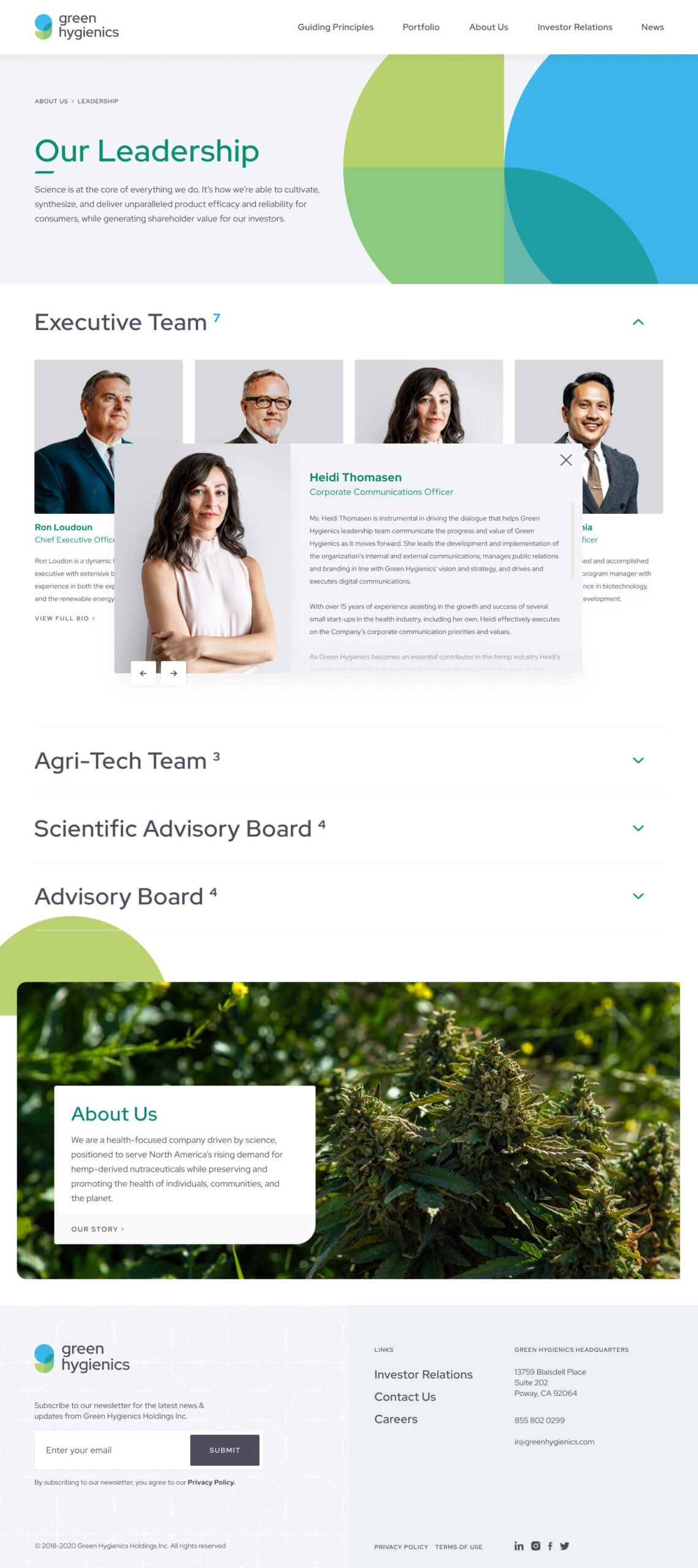
The leadership page on the Green Hygienics cannabis website.

Investor-Focused

Formulating Green Hygienics’ digital identity was a venture into complexity and sophistication. Takt focused on creating an online presence that was state-of-the-art but also exuded professionalism and a human-centred approach. This was exemplified in the comprehensive investor section of their website, offering crucial financial information and corporate governance details. The crowning feature was the bespoke Investor Portal – a secure, exclusive platform accessible only to accredited investors. The portal, was meticulously designed to be user-friendly while safeguarding sensitive company details, embodying Green Hygienics’ commitment to transparency and while ensuring absolute security for sensitive information.


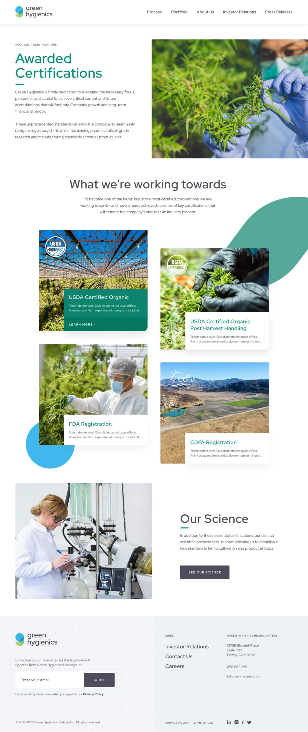
The Green Hygienics cannabis science website design.

On a Clear Path to Growth

Takt’s collaboration with Green Hygienics led to a transformative rebranding and digital overhaul, effectively reshaping the company’s image and addressing the challenges associated with hemp perception.

The new brand identity, reflecting Green Hygienics’ innovative spirit, alongside a narrative emphasizing the scientific rigor and health benefits of hemp products, significantly altered consumer perceptions.

The clean, contemporary design and the sophisticated investor portal helped them level up, establishing Green Hygienics as a frontrunner in the nutraceutical industry and setting a benchmark for future branding in this domain.

RELATED PROJECTS

VIEW ALL CASE STUDIES

Frequently Asked Questions

Common questions about banking and finance website projects, answered from experience.

How do you create an investor section or investor portal for a publicly traded company website?

Investor experiences need two things at once: transparency and control. We typically design a public-facing investor narrative and document hub, then add gated access only where it genuinely protects sensitive materials and improves usability for the intended audience. Green Hygienics is an example of a site that includes an investor-focused section and a secure investor portal for accredited investors.

How do you build a financial services brand that works for both institutional and retail audiences?

The language that builds credibility with a CFO or institutional investor is often the opposite of what resonates with a retail customer navigating a mortgage or first investment account. A brand built primarily for one will underperform with the other.

The answer isn’t a compromise that splits the difference. It’s a brand architecture with a shared core position and audience-specific messaging, content structure, and user pathways. Each audience needs to encounter the brand on their own terms: the right level of technical depth, the right proof points, the right tone. The site’s information architecture does the heavy lifting here, routing institutional and retail audiences to distinct content without fragmenting the overall brand experience.

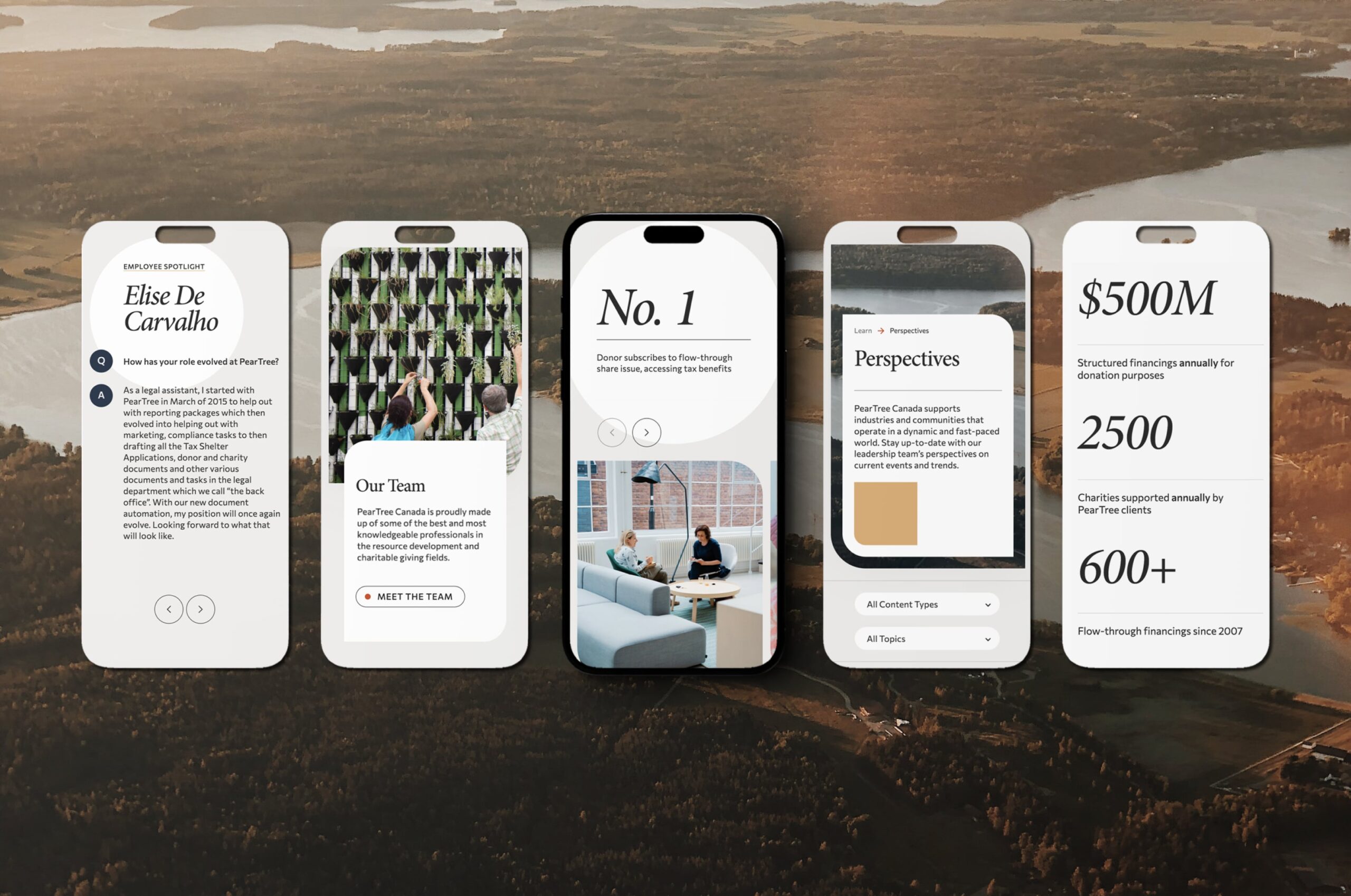
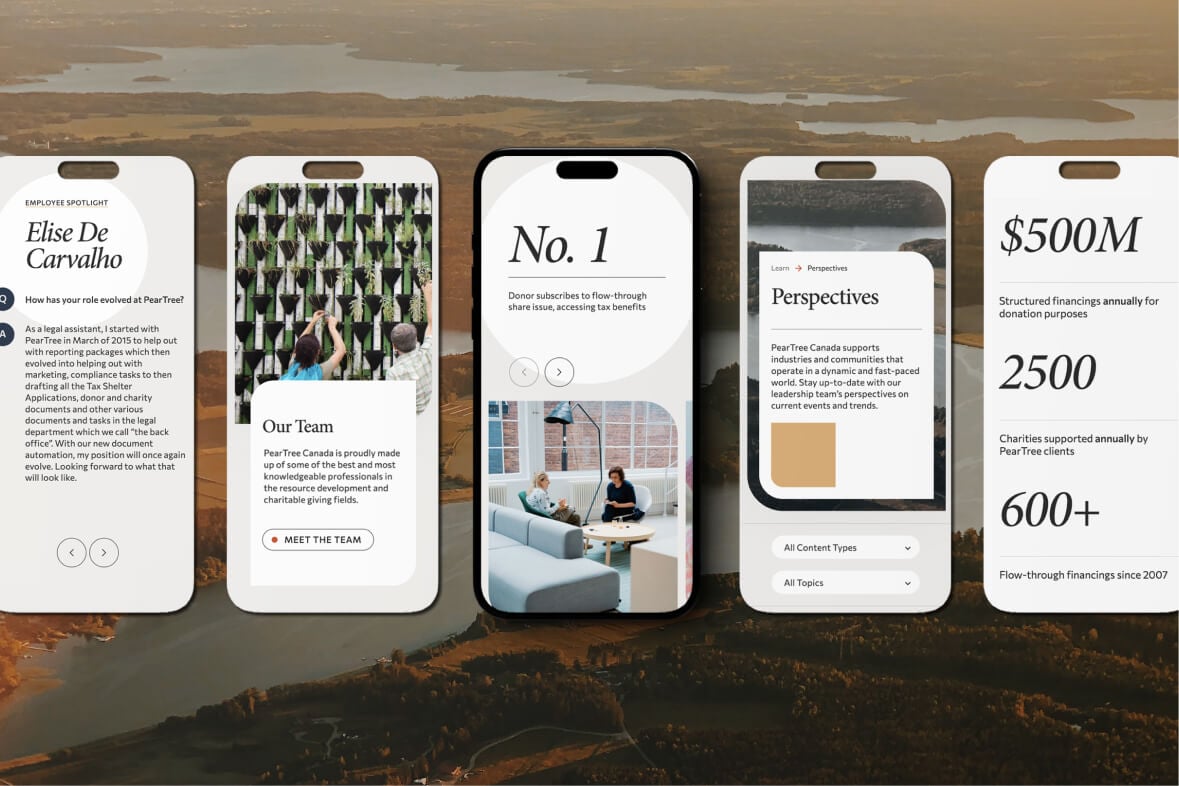
This dual-audience challenge shows up across a wide range of financial services work, from lending technology (Intellifi) to consumer financing (PaySpyre) to philanthropic financial services (PearTree Canada).

How do you explain complex financial products and services on a website without overwhelming users?

The key to explaining complex financial products and services on a website without overwhelming users is progressive disclosure: give users a plain-language summary first, then let them expand into details, FAQs, and supporting proof based on intent. At Takt, we pair that with a strong information hierarchy and scannable modules so complexity feels guided, not dumped. This approach aligns with Givex’s need for its website to serve as a primary business driver after outgrowing a restrictive CMS and requiring a clearer, more scalable marketing engine.