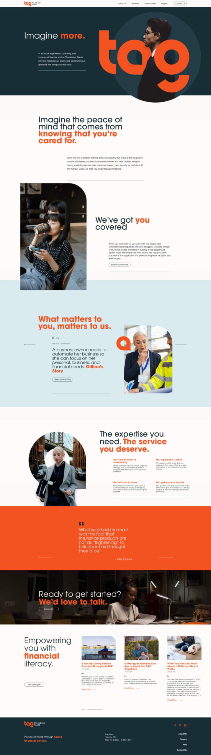
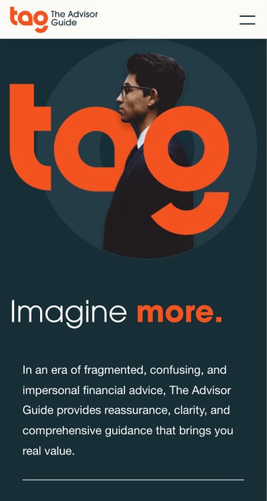
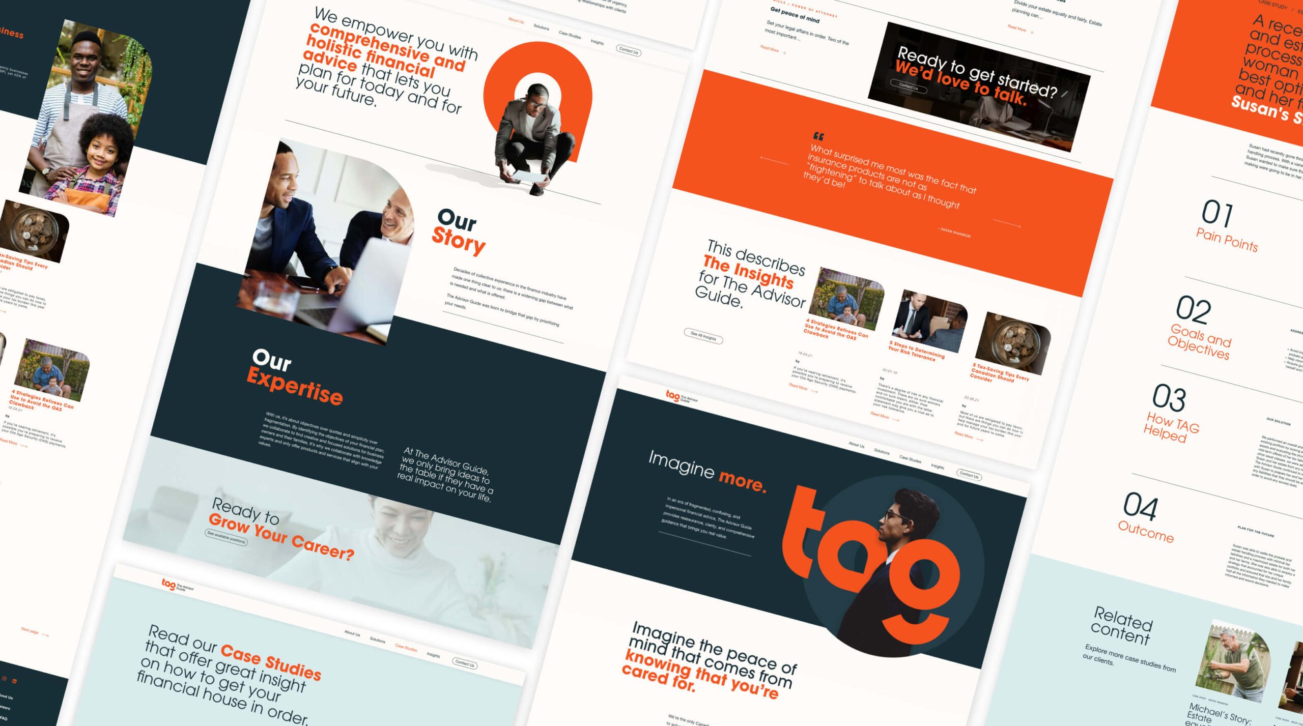
Go to content

The Advisor Guide

INTRODUCTION

Transforming Financial Advice with The Advisor Guide

In an era where financial advice often feels fragmented and impersonal, The Advisor Guide (TAG) stands out as a beacon of clarity and reassurance. As the only Canadian financial services company that takes a holistic approach, TAG helps business owners and their families navigate the complexities of their financial futures with a clear, comprehensive plan. However, despite early success in their first year, their self-created brand and website were no longer reflective of their innovative and refreshingly honest approach to the financial industry.

That’s when TAG approached us. They were ready to elevate their brand presence to match their forward-thinking vision and client-centric ethos. Our mission was to help them break away from the traditional, bureaucratic image of the financial sector and create a brand and digital experience that communicated their unique, bespoke approach to financial advising.

OBJECTIVES

Defining the Goals

Our collaboration with TAG was guided by a clear set of objectives:

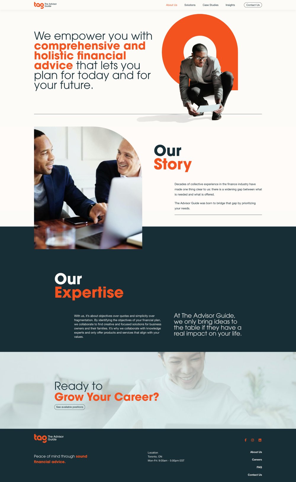
  • Reimagine the Brand Identity: Develop a brand that felt innovative, honest, and approachable, yet firmly grounded in financial expertise.
  • Create a Tailored User Experience: Design a digital experience that showcased their custom, consultative approach to financial planning, making it easy for clients to see how TAG’s services align with their specific goals.
  • Build a Modern, Accessible Website: Design and develop a website that is not only visually engaging but also optimized for performance, accessibility, and SEO.

Building the Brand: Strategy + Visual Identity

TAG needed a brand that broke through the noise of the financial sector—a brand that was as bold and distinctive as their approach. We started with a series of workshops and interviews with key stakeholders to uncover the essence of their brand. It was clear that TAG was more than just a financial advisory firm—they were trusted partners guiding their clients through life’s financial journey.

The new visual identity needed to reflect this ethos. We introduced a vibrant orange as the core brand color to symbolize innovation and disruption, balanced with blue tones that signified trust and financial acumen. The logo, an acronym for The Advisor Guide—“TAG”—features a lowercase “a” stylized as a location marker, representing the company’s role in guiding clients toward their financial destinations. This motif was carried throughout the website, visually placing the client at the center of their own journey.


Designing the User Experience: Bespoke, Intuitive, + Engaging

TAG’s bespoke approach to financial planning required an equally bespoke digital experience. The challenge was to design a website that could dynamically present their broad range of services in a way that felt personalized and intuitive.

We began by mapping the customer journey through a series of job stories, capturing the primary financial goals and pain points of their clients. This research informed the structure of the Services page, where we displayed TAG’s offerings based on the user’s unique financial objectives. Contextually relevant testimonials and case studies were integrated throughout, providing a personalized experience that showcased the firm’s ability to deliver tailored solutions.

To make the browsing experience seamless and enjoyable, we incorporated smooth animations and interactive elements that guided users through the site without overwhelming them. Every click, scroll, and transition was designed to feel purposeful and engaging, reinforcing TAG’s innovative spirit.


CREATIVE DIRECTION

Creative Direction: A Visual Identity with Impact

The creative direction for TAG’s website centered around the concept of “guidance and journey.” We utilized abstract shapes and gradients to evoke a sense of progress and movement, complemented by imagery that reflected the diverse backgrounds and aspirations of their ideal clients. The location marker motif from the logo appeared throughout the site, subtly reminding users that TAG is there to guide them at every step.

The use of vibrant orange and anchored blues created a visually striking contrast, drawing users’ attention to key information while maintaining a clean, professional aesthetic. This was further enhanced by the use of ample white space, ensuring that content was easy to read and navigate.

Technology: A Scalable, Accessible Platform

The website was built on a custom WordPress theme, optimized for speed, SEO, and accessibility. We followed WCAG 2.1 AA standards, ensuring that the site was accessible to all users, regardless of their abilities. The site’s structure was designed with scalability in mind, allowing TAG to expand their digital presence as their business grows.

The final product is a robust, flexible platform that not only reflects TAG’s unique approach but also provides a smooth, engaging experience for users.

The new brand and website successfully repositioned TAG as a forward-thinking, innovative player in the financial advisory space. By creating a digital experience that aligned with their client-centric approach, we helped TAG communicate their value proposition more effectively and reach a wider audience.

The new website has become a cornerstone of their marketing efforts, helping to attract both new clients and top talent to the firm.

RELATED PROJECTS

VIEW ALL CASE STUDIES

Frequently Asked Questions

Common questions about banking and finance website projects, answered from experience.

How do financial services brands build trust and credibility on their websites?

For financial service brands, trust is built through transparent messaging, consistent visual standards, and proof that feels specific (process clarity, expertise signals, and real outcomes), not generic. We also structure pages so users can quickly understand “what you do, who it’s for, and what happens next” without having to hunt. For The Advisor Guide, we designed the brand and website to convey clarity and reassurance in a category where advice can often feel fragmented or impersonal.

What makes financial services brand strategy different from other brand work?

Financial services brands operate under an unusually acute tension: heavy regulation and inherent risk aversion on one side, a need to build genuine preference in a market where competitors all sound identical on the other.

Most financial brands land in one of two places: compliant and forgettable, or differentiated in ways that make compliance teams nervous. The resolution is finding differentiation that’s true, provable, and defensible, then building outward from there.

In financial services, that often means starting with proof before positioning: what outcomes has the firm delivered, for which clients, and what does that tell us about who the organization is and who it’s for? The brand voice needs to navigate regulatory scrutiny without defaulting to the flat, institutional tone the industry hides behind. And the site experience needs to make complex offerings feel navigable for audiences with very different levels of financial literacy.

We’ve worked through this across firms like Intellifi, The Advisor Guide, and PearTree Canada.

When is the right moment for a financial services firm to rebrand?

When the current brand is actively holding the business back from where it needs to go next. The most common triggers are structural: a merger, new ownership, expansion into new markets or service lines, or a growing gap between how the firm sees itself and how it’s perceived externally.

What’s less commonly acknowledged is that a rebrand isn’t always the right solution. Sometimes the firm needs sharper positioning and better content, not a new logo and website. We start by diagnosing what’s driving the disconnect: awareness, perceived relevance to a new segment, or a credibility gap in a specific service area.

The answer shapes whether the work required is a brand evolution, a messaging overhaul, or a full repositioning. That diagnostic step is what separates productive rebrands from expensive ones that don’t move the needle. We’ve navigated both ends of this spectrum with firms like Intellifi and The Advisor Guide.