Go to content

UBC Bookstore

INTRODUCTION

Crafting a Story-Driven Digital Experience for UBC Bookstore

The UBC Bookstore has two primary objectives: to provide students with essential course materials and to promote UBC’s brand through general merchandise like clothing, supplies, and giftware. However, the online experience needed to do more than simply sell products—it had to tell the story of UBC and elevate the brand’s equity. UBC students, many of whom live on campus, often use the site to explore products before visiting the store in person. This created a need for a hybrid digital storefront that blended both a seamless e-commerce experience and engaging storytelling to build school spirit.

In addition to student-facing content, the bookstore also needed to serve faculty and staff with educational resources, open textbooks, and online support. The challenge was to create a modern, intuitive site that could effectively balance these diverse needs.

User Experience (UX) + Information Architecture (IA)

Our approach for the UBC Bookstore microsite centered on creating an intuitive, user-focused design that combined good storytelling with a best-in-class e-commerce experience.

To ensure the site was intuitive and easy to navigate, we conducted user testing, card-sorting exercises, and navigation testing. These insights informed the creation of a new mega navigation, allowing users to quickly explore the store’s inventory from any page, whether they were searching for course materials or branded merchandise. This structure streamlined the user journey and ensured that students, faculty, and staff could easily find what they needed.


Brand Storytelling + Product Showcasing

Recognizing the importance of brand equity, the site needed to go beyond being a point of sale—it had to inspire school pride. We used a mix of visual storytelling and sleek product imagery to enhance the UBC brand and drive merchandise sales. Seasonal collections, new arrivals, and promotions were featured in prominent modules throughout the site, all designed using the atomic design approach. This provided UBC with the flexibility to update content easily and keep the site fresh year-round.


Visual Design

Having worked with UBC previously, we were familiar with their brand guidelines. We extended these standards to create a digital storefront that mirrored the experience of leading retail brands like Arc’teryx, Aritzia, and Chapters. The site’s color palette and typography followed UBC’s brand identity while adding a contemporary, polished feel to the e-commerce experience.

We also integrated Instagram, showcasing real students wearing UBC merchandise. This social proof element added authenticity and community engagement to the site, further enhancing the brand’s connection with its audience.

A visually rich Lookbook was created to feature seasonal releases in an editorial-style layout, adding a high-end feel to the shopping experience. Additionally, two different Resource templates were designed: one for everyday blog posts and one for in-depth guides, such as how to order course materials online. These templates allowed the bookstore to provide valuable, instructional content alongside the e-commerce offerings, serving both students and faculty.


RESULTS

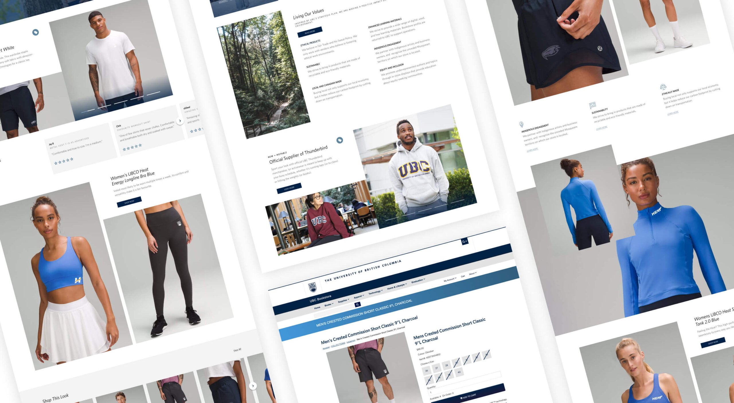
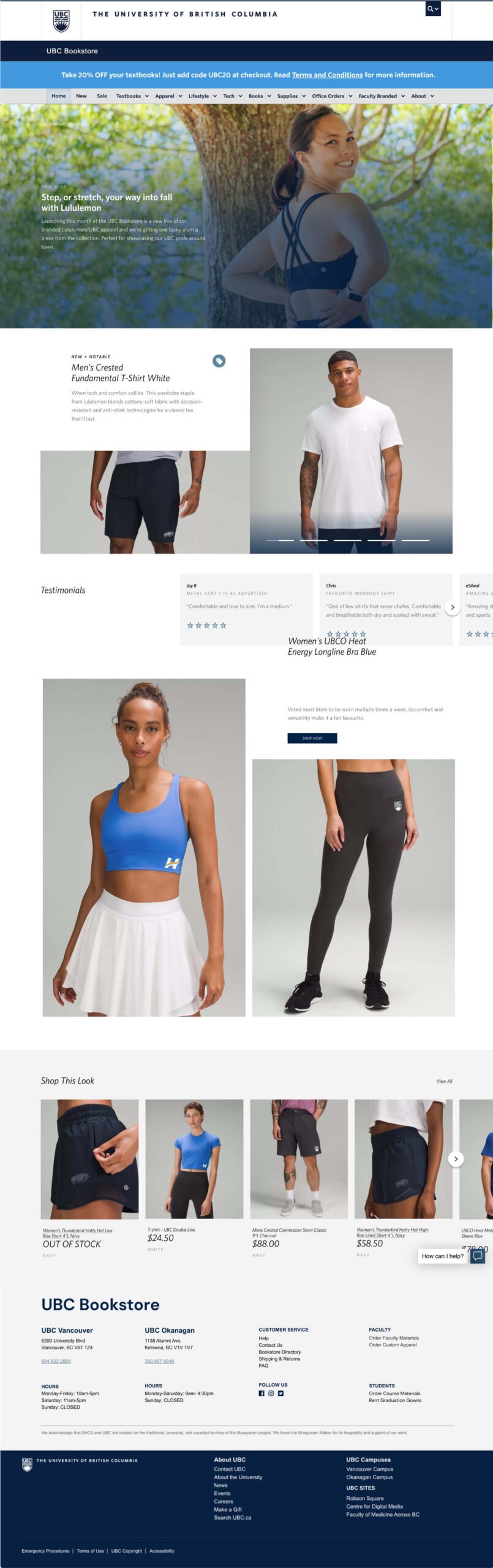
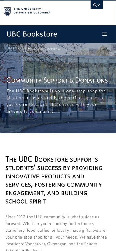
Boosting Sales + School Spirit through the New UBC Bookstore Microsite

The new UBC Bookstore microsite delivered a refined, engaging, and user-friendly experience that catered to multiple audiences—students, faculty, and staff. The combination of storytelling, sleek design, and intuitive navigation contributed to a stronger UBC brand presence, helping to increase sales of general merchandise while promoting student success. The site now functions not only as a marketplace but also as an educational resource, aligning with UBC’s mission to support its community.

Related Projects

VIEW ALL CASE STUDIES

Frequently Asked Questions

Common questions about e-commerce website projects, answered from experience.

How do you keep education websites fast when they are content-heavy?

Keeping content-heavy education websites fast starts with treating performance as a design constraint, not a technical afterthought. We structure content modularly, limit unnecessary animations that could impact page load times, and prioritize what loads first so users get clarity and value immediately.

At Takt, we pair thoughtful information architecture with modern development practices, performance budgets, and ongoing monitoring to ensure speed holds up as content grows. The result is a site that remains accessible, search-friendly, and responsive without sacrificing depth or scale.

Post-launch, effective content management needs to support the system that’s been built. To support this, we provide a Content Editing Guide as well as a recorded training session to teach our clients how to best add new pages and content to the website.

How do you design education websites that serve multiple audiences with very different needs?

We design education websites for multiple audiences by starting with clear intent and hierarchy, not compromise. That means defining who each audience is, what they are trying to accomplish, and which needs must be met first versus supported second.

We validate these decisions through user testing at key points in the project, including wireframing and key page design, to ensure the experience works in practice, not just in theory. Strong governance, ongoing measurement, and continuous optimization ensure the site is treated as a living product, not a set-it-and-forget-it website, so it continues to serve diverse audiences over time.

What makes a branded e-commerce platform feel premium instead of templated?

A premium branded e-commerce platform feels intentional when the brand system is translated into consistent user interface patterns, editorial pacing, and product presentation that helps the shopping experience feel efficient. We treat the storefront as a brand experience, not just a catalogue, so storytelling and merchandising work together rather than competing. Our project with UBC Bookstore is a strong example of this hybrid approach, combining best-in-class e-commerce UX with storytelling, lookbook-style content, and social proof to elevate brand equity.

How should e-commerce sites organize large product catalogues so users can find what they need fast?

The best e-commerce catalogue experiences rely on clear information architecture, predictable navigation, and fast filtering that matches how customers actually shop. We validate structure through UX research, then implement navigation patterns that keep products accessible from anywhere on the site. For the UBC Bookstore, research methods, like card sorting workshops and navigation testing, informed a mega navigation that lets users explore inventory from any page.

How do e-commerce brands turn their website into a learning platform for conversion-driven marketing?

A site becomes a learning platform when it is designed to support ongoing merchandising and experimentation, with modular content and clear pathways that reveal what customers respond to. We build flexible modules and structured experiences that enable teams to test, refresh, and evolve without constant dependence on developers. Takt frames this directly as building branded e-commerce platforms that “behave as learning platforms,” and UBC Bookstore’s modular system was designed to support ongoing seasonal updates and promotions throughout the site.