





Go to content

Revalate

A billboard featuring the Revalate brand identity, displaying the slogan 'Where Our Process Is Our Craft'.

INTRODUCTION

Empowering a New Venture with a Bold Brand Foundation

When the founders of Revalate approached us, they brought with them the momentum of a successful project—The Advisor Guide. They were ready to channel that success into a new venture: a revenue acceleration firm designed to help businesses streamline operations and boost revenue. Revalate needed a brand and online presence that would establish credibility and attract clients from day one. Our task was to craft a visual identity, digital platform, and messaging strategy that embodied their forward-thinking mission.

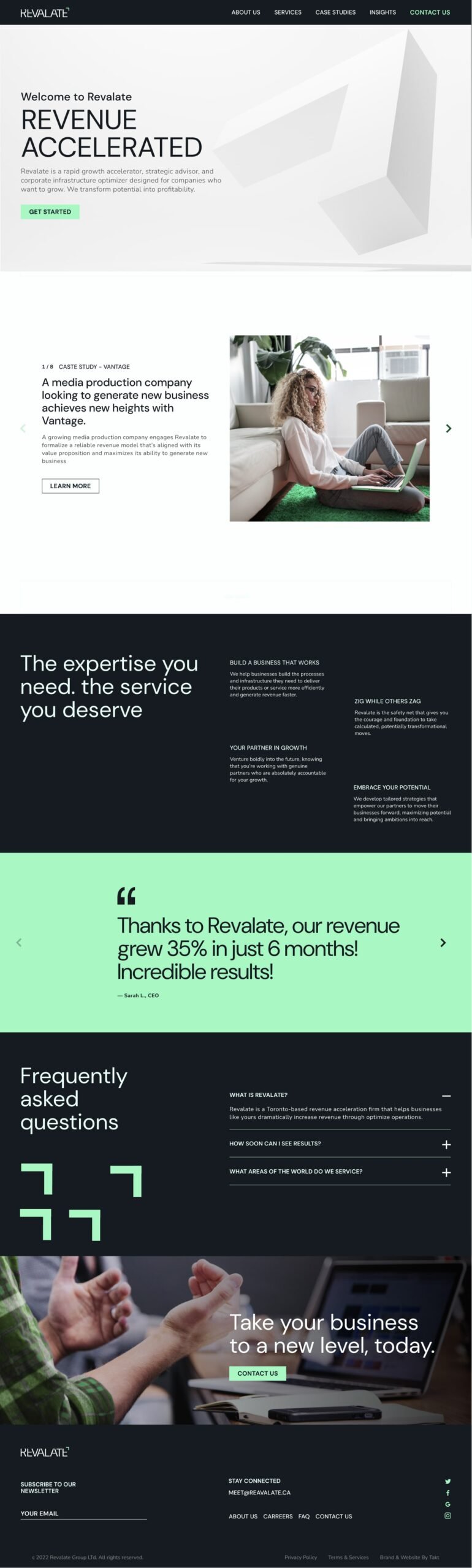
The revenue acceleration firm website homepage design.

Designing for Growth: A Visual Identity with Purpose

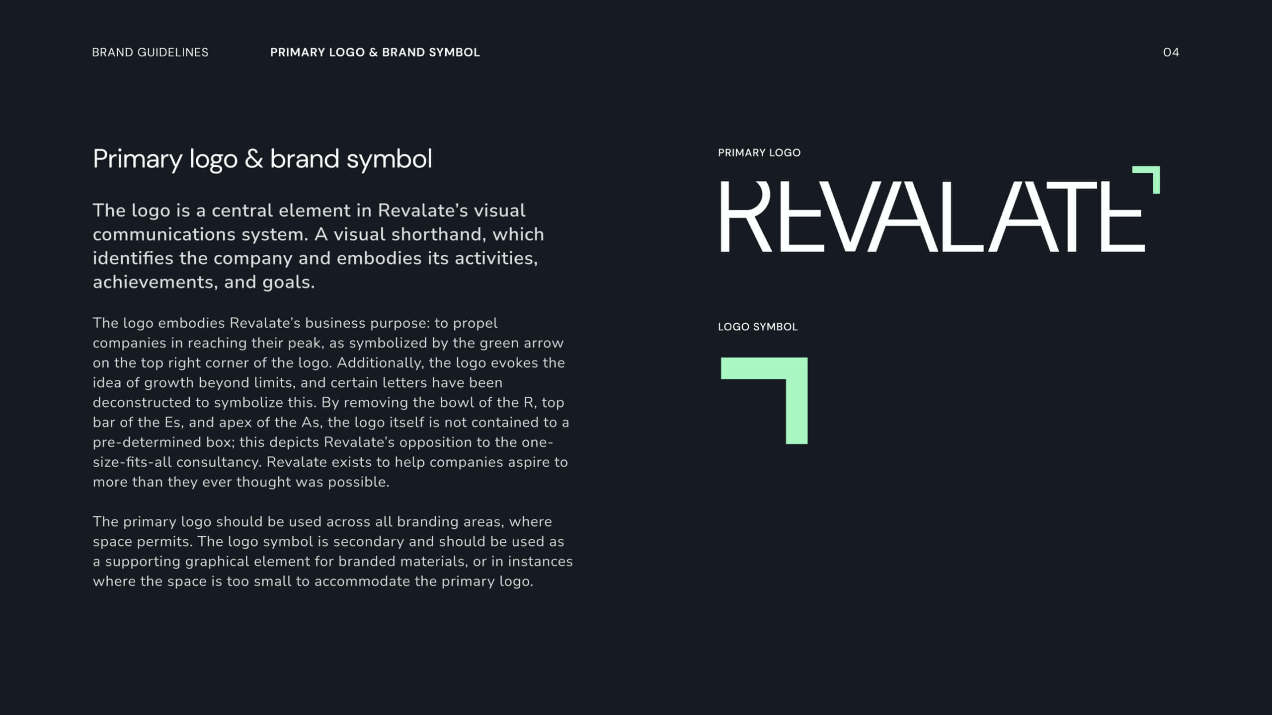
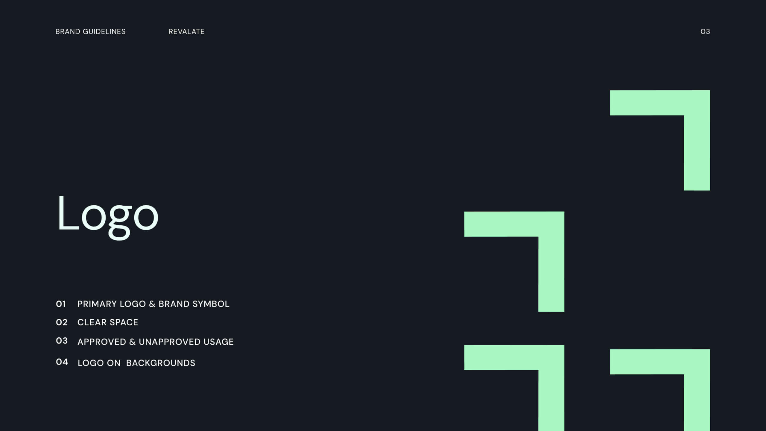
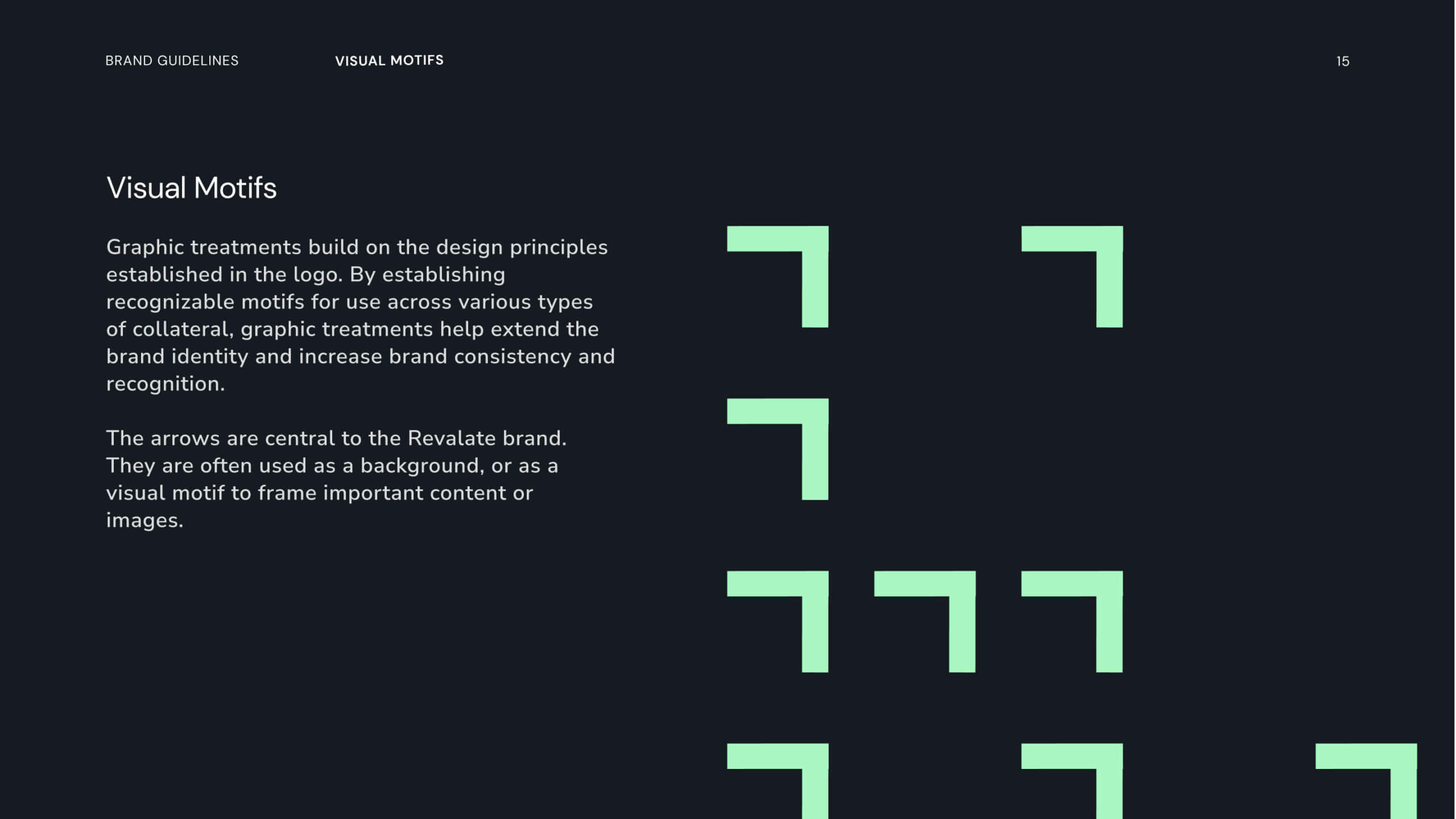
The concept of growth became the cornerstone of Revalate’s visual identity. We developed a logo with a dynamic arrow extracted from the “R” in “Revalate,” symbolizing upward momentum. This arrow wasn’t just a logo feature—it became a key design element, appearing across the website in hero images and background patterns, reinforcing the brand’s commitment to driving progress.

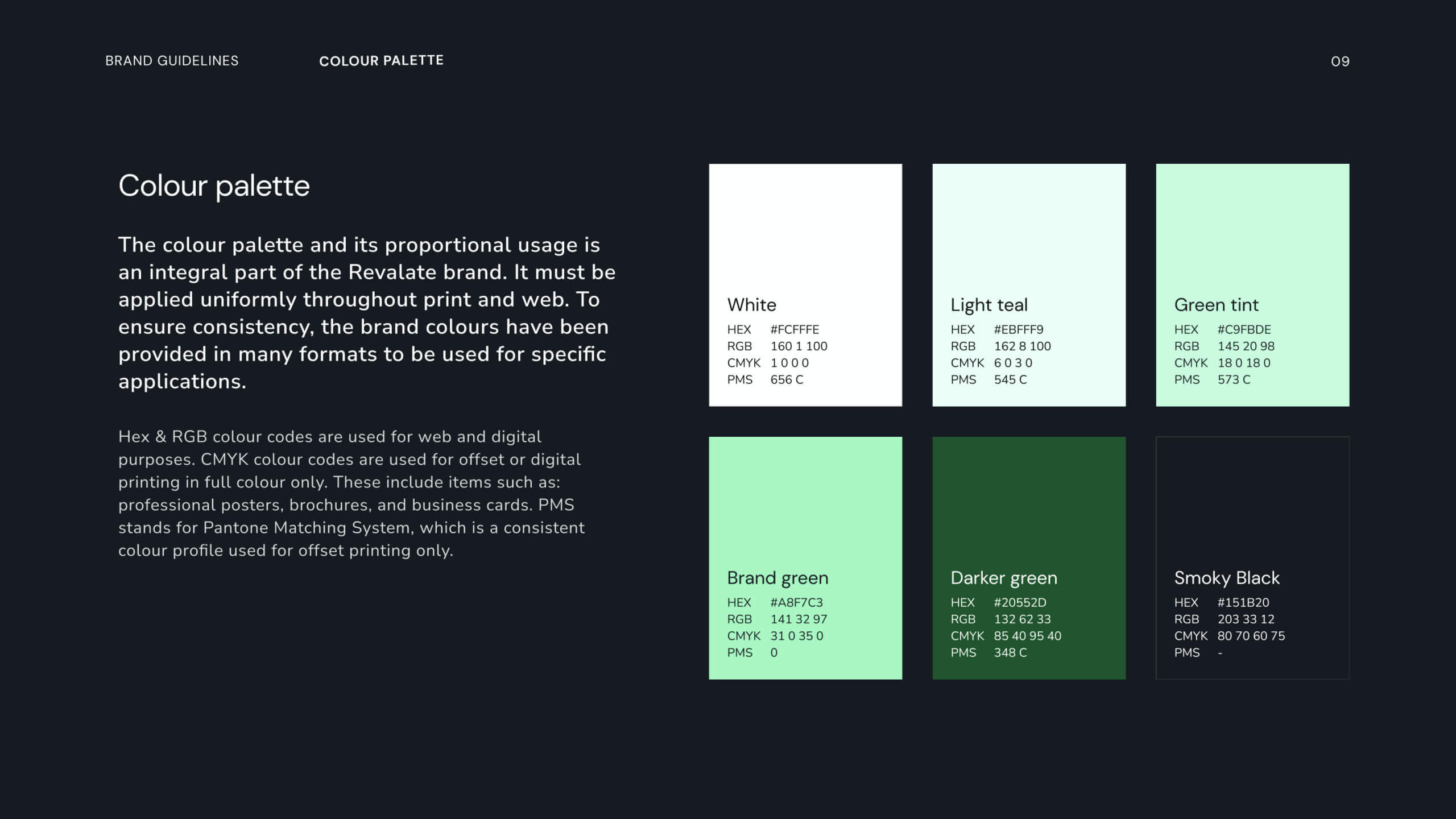
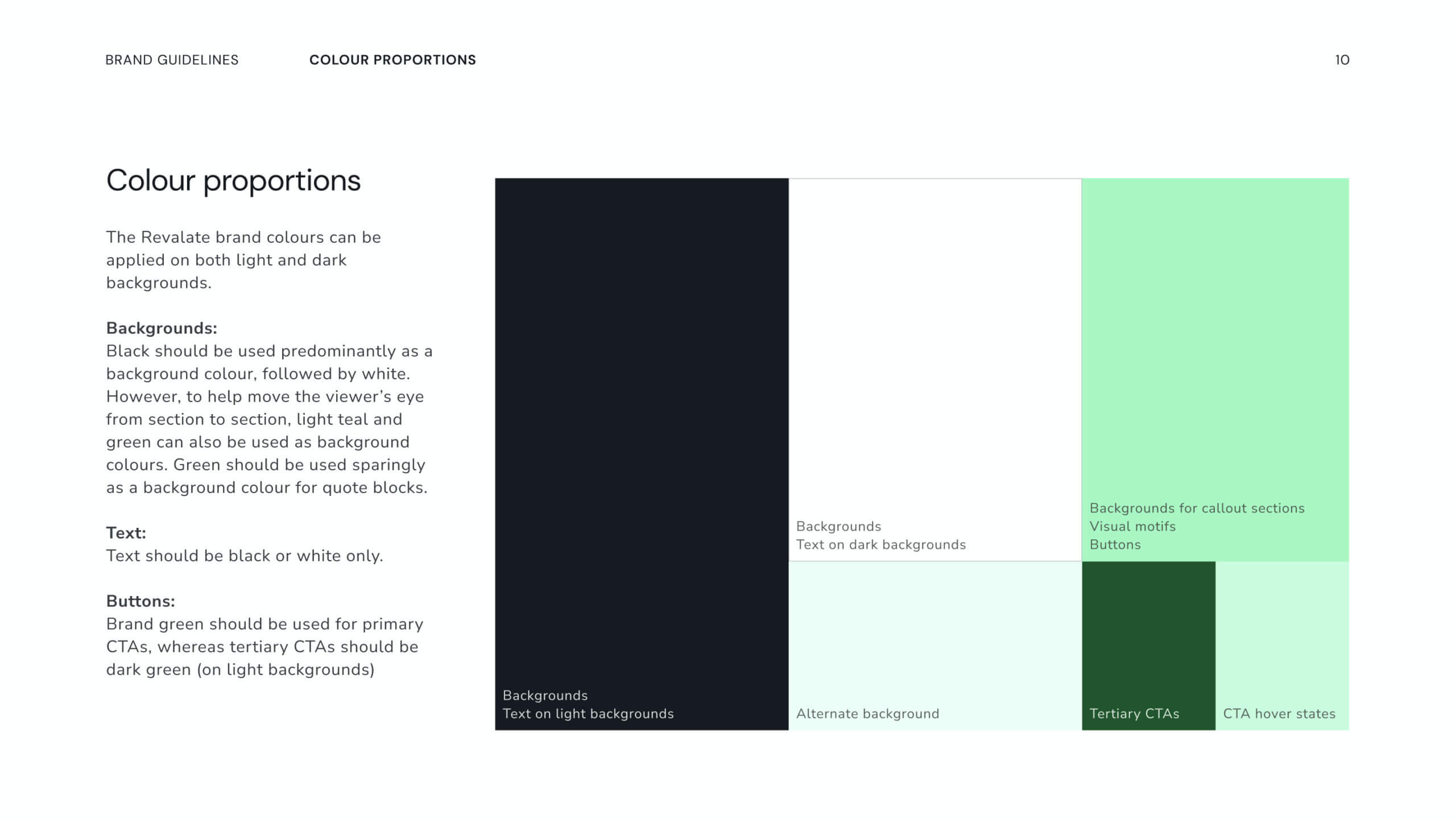
The color palette balanced trust and innovation. Dark blues provided a sense of dependability and professionalism, while shades of green reflected the firm’s technical expertise and focus on growth. This thoughtful combination ensured the brand resonated with clients seeking both cutting-edge solutions and proven reliability.


A Digital Platform to Build Trust and Drive Engagement

Revalate’s website was designed not just to inform but to inspire action. Built on WordPress, the site was fully WCAG AA 2.1 compliant, ensuring accessibility for all users. The upward arrow motif carried through to the digital experience, subtly guiding visitors and reinforcing the brand’s narrative of progress.

The website’s architecture prioritized clarity and ease of navigation. Service offerings, client stories, and the firm’s unique value proposition were prominently featured, creating a seamless user journey. The result was a digital presence that communicated expertise and positioned Revalate as a trusted partner for revenue optimization.

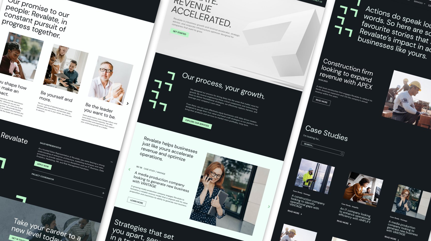
An overview of the Revalate revenue consulting startup website design.
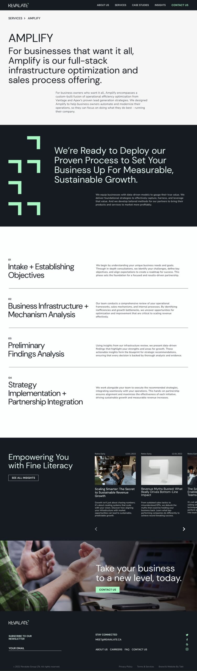
A product page on the revenue acceleration firm website.

Crafting a Compelling Narrative

In addition to the visual design, we helped shape Revalate’s voice and messaging. Working closely with the founders, we named several product offerings, ensuring each name reflected the innovative and results-driven nature of their services. Our team also wrote clear and engaging sales-marketing copy for the entire website, transforming complex concepts into messaging that resonated with their target audience.


Establishing a Framework for Long-Term Consistency

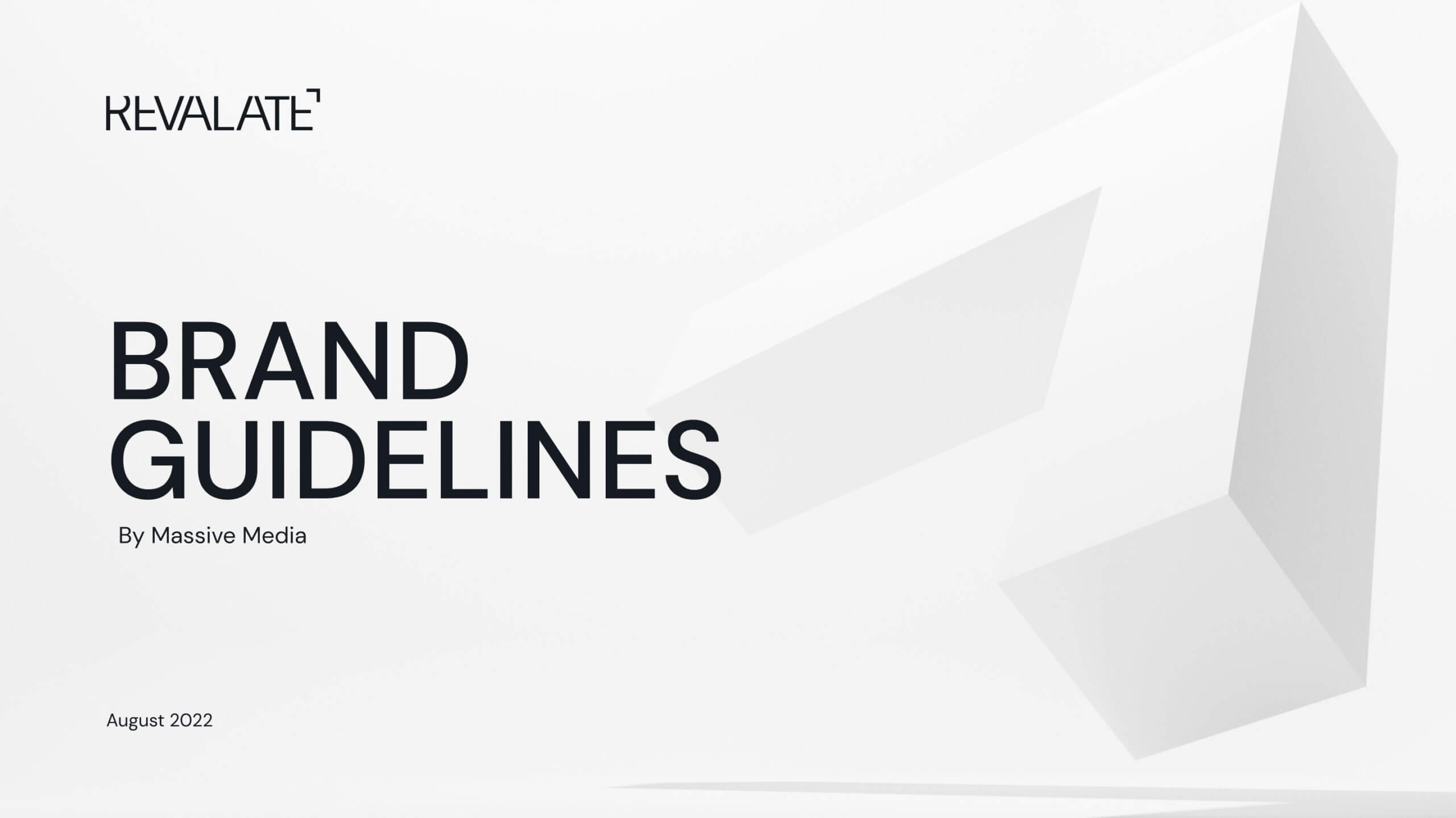
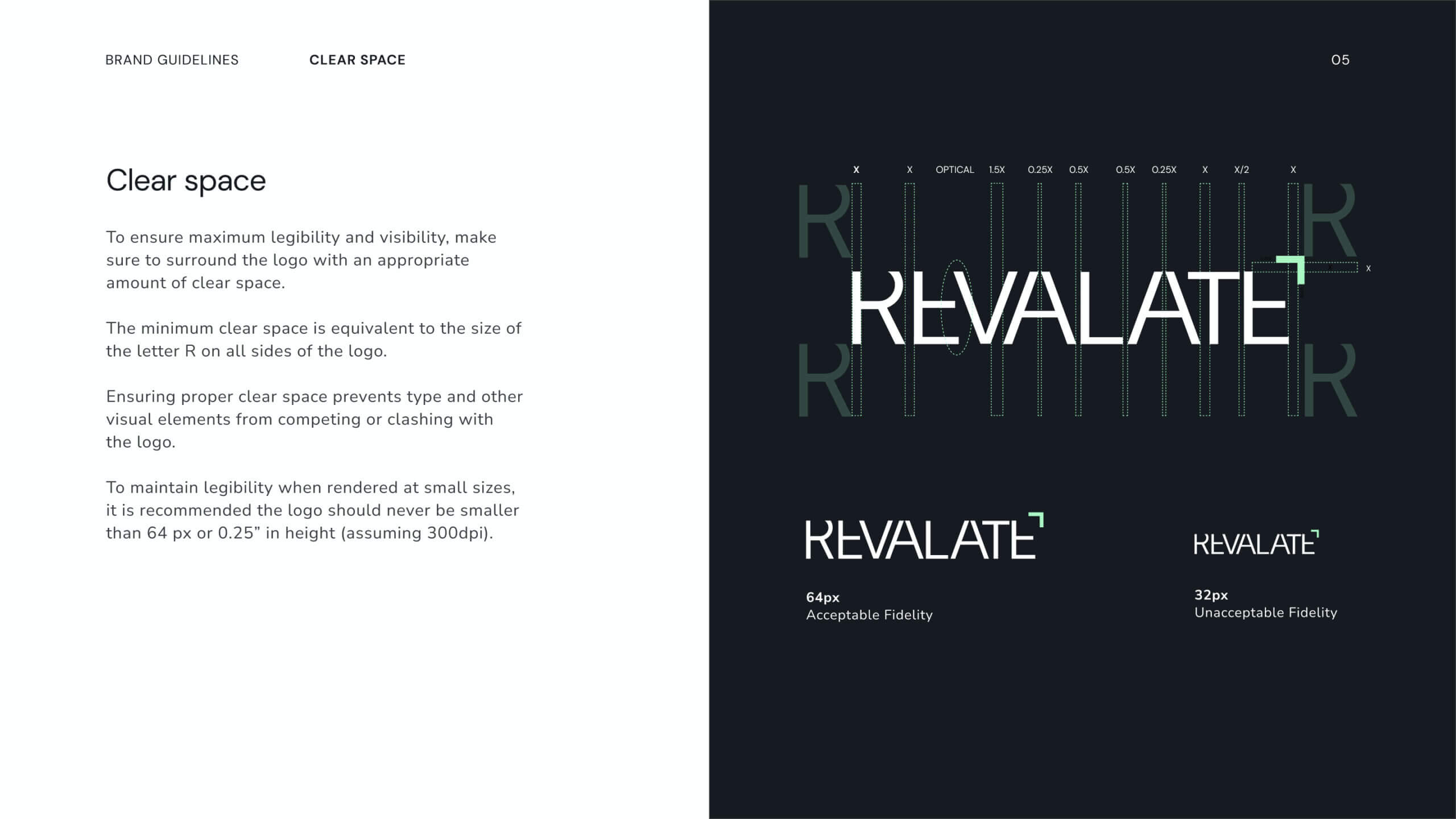
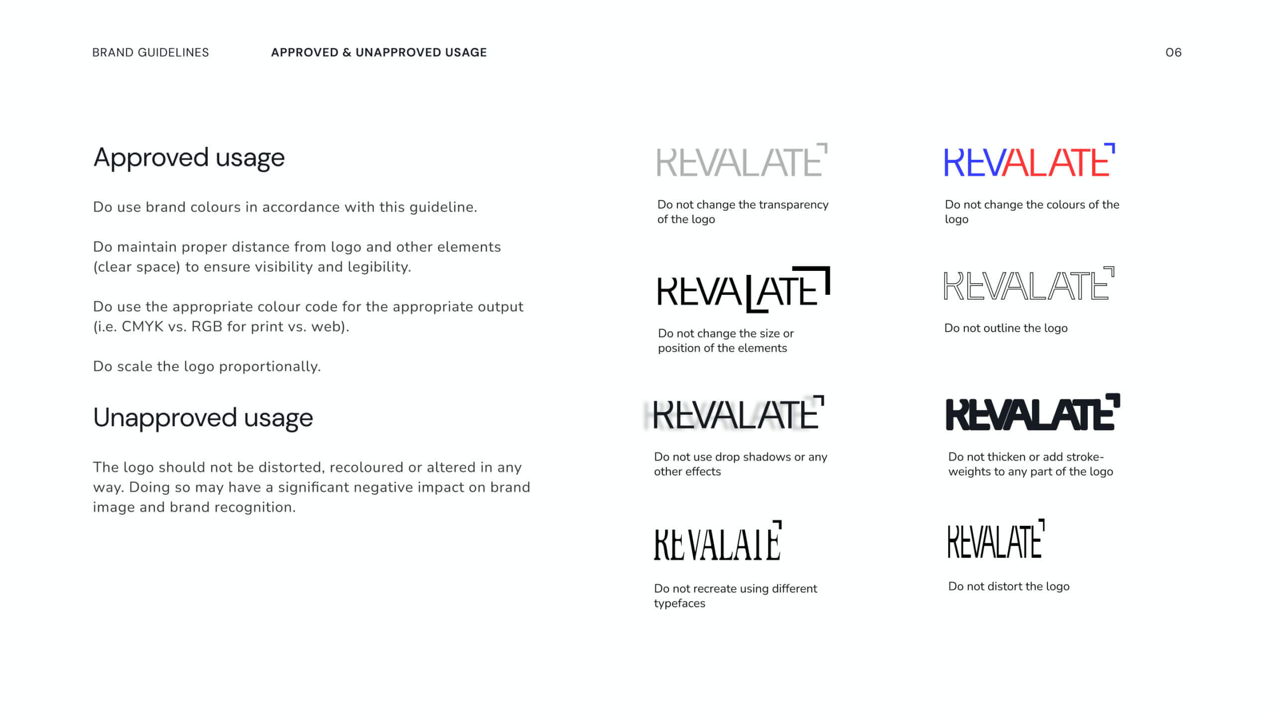
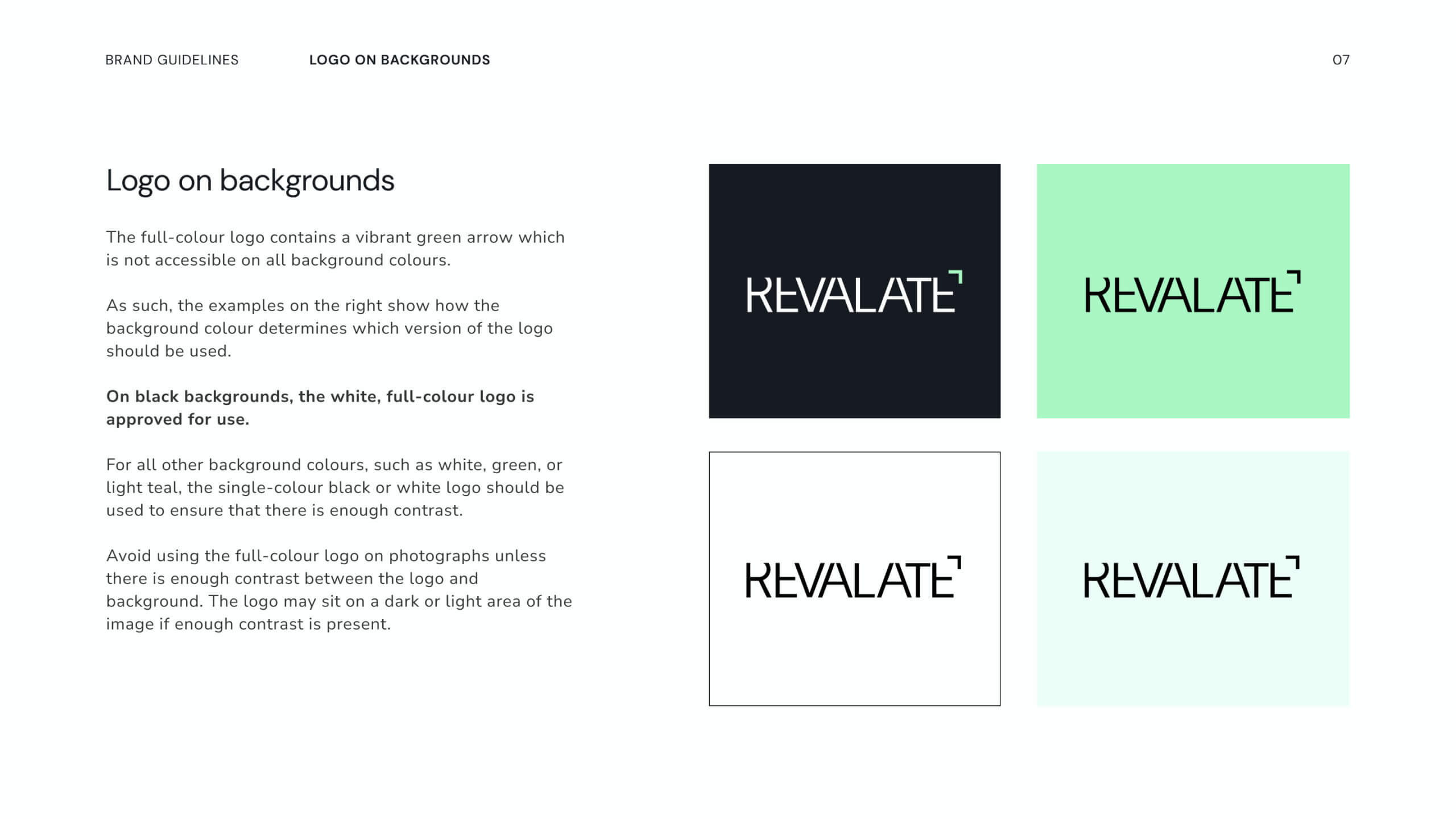
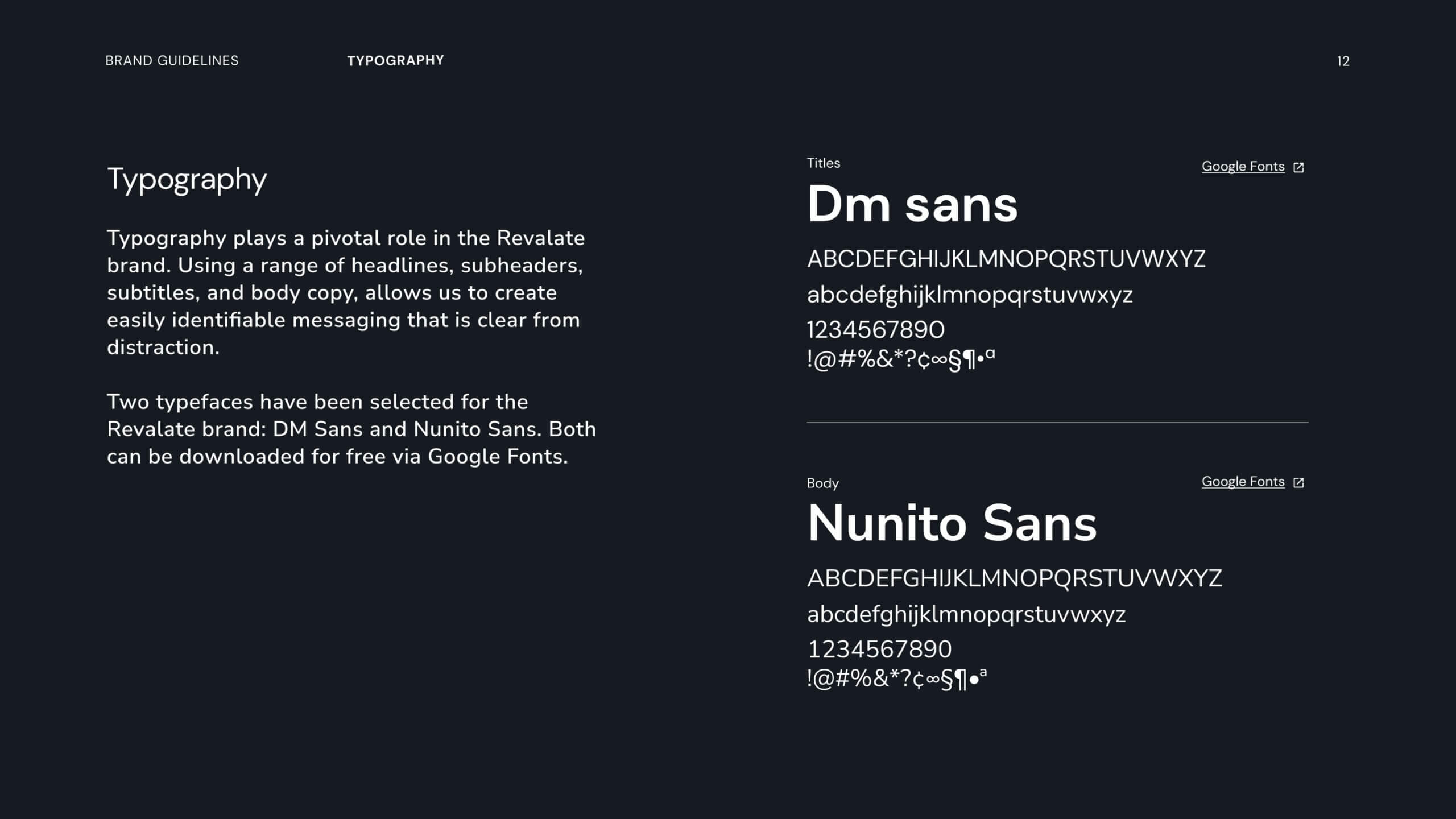
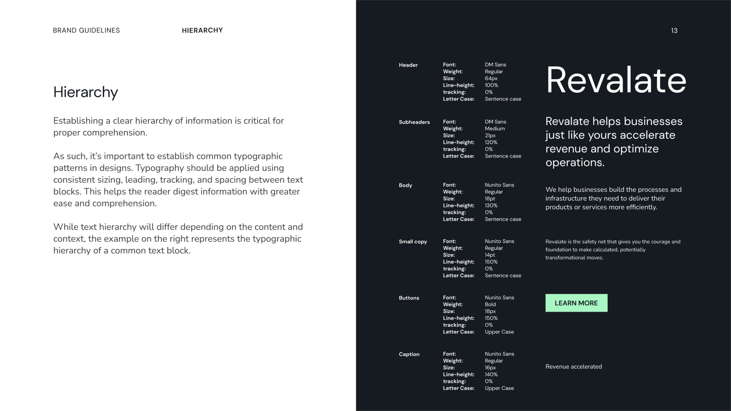
To ensure brand consistency across all touchpoints, we delivered a comprehensive brand guideline. This document outlined the proper use of logos, colors, typography, and design elements, providing Revalate with a toolkit to maintain their brand identity as they scale. This resource is instrumental for building a cohesive and recognizable brand over time.


RESULTS

From Vision to Reality: A Brand Ready to Make an Impact

Revalate’s new identity and website positioned them as a leader in revenue acceleration from the very beginning. By integrating the theme of growth into every aspect of the brand’s design and messaging, we helped them create a professional, tech-forward presence that reflects their mission. Backed by the success of The Advisor Guide, Revalate is now equipped to forge new paths, helping businesses unlock their full potential and achieve sustainable growth.

Related Project

VIEW ALL CASE STUDIES

Frequently Asked Questions

Common questions about banking and finance brand and website projects, answered from experience.

What makes financial services brand strategy different from other brand work?

Financial services brands operate under an unusually acute tension: heavy regulation and inherent risk aversion on one side, a need to build genuine preference in a market where competitors all sound identical on the other.

Most financial brands land in one of two places: compliant and forgettable, or differentiated in ways that make compliance teams nervous. The resolution is finding differentiation that’s true, provable, and defensible, then building outward from there.

In financial services, that often means starting with proof before positioning: what outcomes has the firm delivered, for which clients, and what does that tell us about who the organization is and who it’s for? The brand voice needs to navigate regulatory scrutiny without defaulting to the flat, institutional tone the industry hides behind. And the site experience needs to make complex offerings feel navigable for audiences with very different levels of financial literacy.

We’ve worked through this across firms like Intellifi, The Advisor Guide, and PearTree Canada.

How do financial services brands build trust and credibility on their websites?

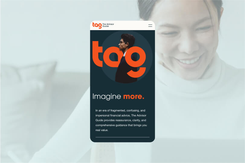
For financial service brands, trust is built through transparent messaging, consistent visual standards, and proof that feels specific (process clarity, expertise signals, and real outcomes), not generic. We also structure pages so users can quickly understand “what you do, who it’s for, and what happens next” without having to hunt. For The Advisor Guide, we designed the brand and website to convey clarity and reassurance in a category where advice can often feel fragmented or impersonal.

How do you build a financial services brand that can grow into new markets without losing coherence?

By investing in the structural layer of the brand before finalizing the visual identity. The brands that scale well in financial services are built on a clear institutional logic (a defensible answer to “what are we for and who do we serve best”) paired with a brand architecture flexible enough to accommodate new service lines, geographies, and audience segments without requiring reinvention every time.

That means defining the positioning, messaging hierarchy, and rules for how the brand flexes at the system level, not just at the launch-day level. A brand built around one service line that needs to accommodate three more will either constrain growth or fracture under the pressure of it.

For firms operating across regions, the system also needs to account for market-specific content needs, language requirements, and regulatory considerations. We’ve built these scalable systems for firms like Cogency Global and PaySpyre.

How do you design lead generation journeys for finance or insurance without feeling pushy or off-brand?

High-performing lead generation in banking, finance, and insurance comes from aligning CTAs to user intent and reducing uncertainty at the moment of action (clear steps, clear requirements, clear outcomes). We focus on conversion paths that feel like help, not pressure, and we measure success by qualified actions, not just raw form fills. For PaySpyre, the site needed to speak to two distinct audiences (consumers and businesses), requiring tailored pathways that build trust and guide users to the right next step.

How do you explain complex financial products and services on a website without overwhelming users?

The key to explaining complex financial products and services on a website without overwhelming users is progressive disclosure: give users a plain-language summary first, then let them expand into details, FAQs, and supporting proof based on intent. At Takt, we pair that with a strong information hierarchy and scannable modules so complexity feels guided, not dumped. This approach aligns with Givex’s need for its website to serve as a primary business driver after outgrowing a restrictive CMS and requiring a clearer, more scalable marketing engine.

How long does a banking or finance website redesign project take?

Most banking, finance, or insurance website redesign projects run in phased sprints because discovery, information architecture, content system design, and development have different dependencies. We reduce risk by locking navigation, templates, and a structured content model early, then scaling page production through a modular component system. In our work with Kent + Essex Mutual Insurance, we combined a brand refresh with a future-ready website rebuild to deliver a mobile-optimized experience and support ongoing growth.

What does a banking or finance website redesign project typically include?

A typical banking, finance, or insurance website redesign includes brand positioning and messaging clarity, a conversion-focused UX and IA rebuild, a modular design system, and a CMS build that supports consistent publishing and future expansion. The goal is to improve trust signals and comprehension while keeping the customer journey fast and intuitive. For Intellifi, our engagement included a full brand strategy, messaging, visual identity, and a custom WordPress build optimized for performance, scalability, and accessibility.

What improves mobile UX most for banking and finance websites?

Mobile UX improves fastest when the navigation is simplified, key tasks are surfaced early, and forms or multi-step journeys are designed to feel predictable and low-effort on small screens. We build mobile performance and responsive behaviour at the component level so it holds up as the site grows. For Kent + Essex, mobile usability was a key driver of the website redesign, alongside making essential pathways easier to find and use.