Go to content
Abstract arrangement of stacked geometric blocks representing website accessibility.

What It Means to Build an Accessible Website

Posted on
Posted by
  • Robert Lee
Read time
20 minutes
Tags

If you’re planning a website redesign, you’ve probably heard you need to meet “WCAG AA standards” or ensure your site is “accessibility compliant.” You know it’s important, maybe even legally required for your organization, but what does website accessibility actually mean in practice?

At its core, website accessibility is about how your website is built. The code structure, design decisions, and development standards that make it usable for everyone, regardless of ability or disability.

It’s not a checklist you tick off and move on from, either. Websites evolve, and every new page, image, or plugin brings new accessibility considerations with it.

Let’s get into it.


What is website accessibility and why does it matter?

What it means for a website to be accessible, is ensuring people can perceive, navigate, and interact with it even if they have low vision, blindness, or other disabilities. People with dyslexia, colour blindness, or a variety of other disabilities use tools on websites to improve their experience with it.

These can include screen readers, that speak the website text out loud, or navigating a website with a keyboard instead of a mouse due to motor disabilities. Others may need to rely on captions or transcripts of video and audio content due to hearing impairments, need clear language and predictable navigation due to cognitive disabilities, or use assistive technologies like voice control or switch devices.

Beyond legal requirements, accessible websites serve everyone more effectively, regardless of ability. Think of students navigating campus with one hand because they’re carrying books, or someone with temporary vision impairment after eye surgery. Even aging users who need larger text or higher contrast. At the end of the day, accessibility improvements benefit everyone.

For all websites, the standards to follow are set by WCAG (Web Content Accessibility Guidelines), an internationally recognized standard for making websites accessible to people with disabilities.


The four principles of website accessibility

WCAG is organized around four principles that guide all accessibility requirements. Your website needs to be perceivable, operable, understandable, and robust.

Perceivable

Information and user interface components must be presentable to users in ways they can perceive. In practice, this means all images have descriptive alternative text so screen readers can convey what’s shown, video content includes captions and transcripts, colour isn’t the only way information is conveyed (like red text for errors, where there should also be an icon or label), and text and images have sufficient colour contrast ratios for readability.

Operable

User interface components and navigation must be operable by all users. In practice, this means all functionality works with keyboard alone (no mouse required), interactive elements have visible focus indicators so keyboard users know where they are, users have enough time to read and interact with content, content doesn’t flash in ways that could trigger seizures, and navigation is consistent and predictable across the site.

Understandable

Information and the operation of the user interface must be understandable. In practice, this means form fields have clear labels and error messages, link text is descriptive (not just “click here”), content is written clearly and organized logically, and the site behaves predictably, i.e the navigation doesn’t change unexpectedly between pages.

Robust

Content must be robust enough to be interpreted reliably by a wide variety of user agents, including assistive technologies. In practice, this means using semantic HTML that assistive technologies can interpret, proper heading structures (H1, H2, H3) that create logical document hierarchy, ARIA labels where needed to provide additional context for screen readers, and code that works across different devices, browsers, and assistive tools.

Compliance Levels for Accessibility

Beyond the four principles, WCAG has three compliance levels:

  1. A – the minimum standard to meet
  2. AA – a mid-range standard that covers most websites and organizations
  3. AAA – the highest, and hardest, standard to meet

WCAG Level AA is the standard almost every website should meet. It balances accessibility with practical implementation and is required for government entities (Section 508 compliance), state universities (ADA Title II), many institutional and corporate policies, and is best practice for any organization serving diverse audiences.

The current version of this is 2.2 Level AA, and we build to this standard as our baseline for all websites.

WCAG Level AAA is stricter and not always necessary, unless you’re legally required to meet it or serve a high volume of users who specifically need AAA compliance.

The reason for this, is because to achieve AAA often requires stripping away visual design elements that make websites engaging and full of personality. Some organizations aren’t willing to make that trade-off, and they might not need to. AA compliance creates accessible, functional websites while still allowing for strong design and brand expression.

What “WCAG 2.2 AA compliant” looks like in practice

At Takt, we build to WCAG 2.2 Level AA as standard. Here’s what that actually includes.

On the technical and content side:

  • All images have descriptive alternative text
  • Video content includes captions and transcripts
  • All functionality works with keyboard alone
  • Form fields have clear labels and error messages
  • Heading levels create a logical document structure
  • Link text is descriptive — not “click here” or “read more”
  • Interactive elements have visible focus indicators
  • Content is readable and navigable by screen readers
  • Error identification is clear, so users know what went wrong and how to fix it

On the design and UX side:

  • Colour contrast meets minimum ratios — 4.5:1 for normal text, 3:1 for large text. WCAG defines large text as 18pt (24px) or larger at regular weight, or 14pt (approximately 18.67px) or larger at bold weight. In relative units, that’s 1.5rem regular or 1.167rem bold, assuming a 16px base. Decorative text and logotypes are exempt.
  • Font sizes are appropriate for context — body copy should generally be set at 1rem (16px) or larger to ensure readability across devices
  • Clear navigation patterns work consistently across the site
  • Layouts are predictable and don’t surprise users

It’s worth noting that meeting accessibility standards, especially AAA, can require trade-offs in design. Animations and parallax scrolling can be problematic for users with vestibular disorders, auto-playing content can interfere with screen readers, and certain colour combinations might look beautiful but fail contrast requirements.

This doesn’t mean your website has to be boring or stripped down, though! It means making intentional design decisions, sometimes choosing accessibility over a specific visual effect, and sometimes finding creative solutions that work for both.


How accessibility gets built into websites

We hear a version of this question often: “What content should we add to our website to make it accessible?”

Accessibility is fundamentally about how the website is built, not what content lives on it. Of course, content matters though. Images need alt text, videos need captions, links need descriptive text. But those are content decisions you make within a structure we build to be accessible.

During design, we do colour contrast testing to ensure text is readable against backgrounds, establish clear visual hierarchies that help users understand content relationships, size touch targets so buttons and links are easy to click or tap, and design focus states so keyboard users can see where they are on the page.

During development, we build in semantic HTML that creates proper document structure, ARIA labels where needed to provide context for screen readers, keyboard navigation that works for all interactive elements, skip links that let users jump to main content without tabbing through entire navigation, and proper heading hierarchy built into templates.

When you add content to your site (new pages, blog posts, images, documents) you’re responsible for adding descriptive alt text to images, using heading levels correctly (not skipping from H1 to H3), writing clear and descriptive link text, ensuring any documents you upload are also accessible, and structuring content logically.


What happens if your site isn’t 100% compliant at launch

Compliance isn’t a simple yes/no – it’s a % score. A site at 90% compliance can be highly accessible and functional, and can launch, provided there is a roadmap to solving issues post-launch.

When preparing for launch, we will run scans to check the website’s compliance score. These automated tools scan your site and identify issues, rating them by severity.

  • Critical issues must be fixed (like missing form labels or insufficient colour contrast).
  • Moderate issues should be addressed (like vague link text).
  • Minor issues might be acceptable depending on context (like small contrast variations on decorative elements).

Automated scanners also sometimes flag things that aren’t real accessibility issues in context. A tool might flag colour contrast on a decorative element that doesn’t convey information. Your team can make informed decisions about which flagged items matter for your users, and which don’t.

If your organization reports to a regulatory board or has an internal accessibility department, they typically don’t expect 100% compliance on day one. They want to see a baseline assessment of where you are, a plan to address critical issues, a roadmap for ongoing improvements, and evidence that you’re taking accessibility seriously. This is especially common in higher education, where accessibility offices work with teams to create improvement plans rather than demanding perfection immediately.

Before launch, our team runs accessibility scans throughout QA. We fix anything that’s on us: code structure, semantic HTML, proper ARIA labels, keyboard navigation, colour contrast in design elements we control, and identify anything that’s on the client team. Typically that is content-related items like missing alt text, improper heading usage, or inaccessible documents uploaded to the site.

If issues remain at launch, we create a list of what needs to be addressed and who’s responsible for each item. It’s typically not difficult to fix after launch, and unless you’re being actively assessed by a regulatory body, there’s no immediate legal liability for being at 95% instead of 100%.


Maintaining accessibility over time

Accessibility isn’t one-and-done. It’s an ongoing commitment.

Every time you add content, you’re making decisions that affect accessibility. Did you add alt text to that image? Did you use proper heading structure on that new page? Is that PDF accessible, or did you just upload a scanned document? Does that embedded video have captions?

This is why we build accessibility into the structure rather than treating it as a final audit. When the foundation is accessible (proper code, semantic HTML, good design patterns) maintaining accessibility becomes about content discipline, not technical fixes.

What helps is training your team on accessible content practices, building content templates that guide proper structure, running regular accessibility scans either quarterly or after major updates, having an accessibility champion who understands the standards, and working with your accessibility office if you have one.


How we test for accessibility

To test the accessibility of a website, we use a combination of automated and manual testing. Automated tools catch about 30–40% of accessibility issues. The rest require human judgement and testing with actual assistive technologies.

Automated Testing

Automated scanning with tools like Lighthouse catches technical issues: colour contrast failures, missing alt text, improper heading structure, form labels, ARIA usage.

Manual Testing

Manual testing includes a variety of activities that vaidate the way a website is navigated with alternative tools:

  • Keyboard navigation testing – can we access everything without a mouse?
  • Screen reader verification – does content make sense when read aloud?
  • Focus state review – can keyboard users see where they are?
  • Interaction testing – do forms provide helpful error messages?

Accessibility is built into how we work

At Takt, we build accessibility into every website project from the start. It’s not a separate service or add-on; it’s part of how we design and develop.

We integrate accessibility throughout the process: colour contrast testing in design, semantic HTML in development, alt text guidance for content, and automated scanning combined with manual testing before launch. This creates websites that are accessible by design, not by retrofit, meaning accessibility is maintained as you add content rather than lost the moment you publish something new.

Planning a website project?

Let’s talk about your accessibility requirements, reporting needs, and how we’ll build compliance into your site from day one. Get in touch.

WHAT CAN WE DO FOR YOU?
DO YOU HAVE A BUDGET?
YOUR INFORMATION
Name

Frequently Asked Questions

Curious to know about accessibility for your industry? We got you covered.

How do education organizations maintain website accessibility over time?

Education organizations maintain website accessibility by building it into the website’s system, rather than treating it as a post-launch audit. That means designing with semantic HTML, proper heading structures, keyboard navigation, colour contrast, and ARIA labels from the start, and then creating templates and modules that effectively maintain those standards whenever new content is published.

Key insight: Accessibility sustained through code and design decisions is durable. Accessibility that depends solely on individual content editors getting it right every time is a lot less dependable at scale.

The truth is that compliance is a score rather than a binary outcome. For example, a website can be 90% compliant when measured against a specific standard and still be considered highly accessible. Content updates will always introduce new variables (e.g., an image missing alt text, a heading level out of order, etc.), so what matters most is creating and maintaining a governance plan that consistently identifies and resolves these sorts of inevitable challenges.

We also work with institutions to determine the right compliance target:

  • WCAG 2.1 AA is our baseline for every project
  • Some institutions need 2.2 or even AAA, which carries significantly stricter requirements that aren’t necessary for most organizations.
  • Design decisions, like detailed animations and visual effects, also impact compliance at higher levels, so those trade-offs need to be part of the conversation early on in the engagement.
  • Reporting requirements also matter quite a bit. If an institution is required to report accessibility to a regulatory board or internal department, that shapes how stringent the standards need to be and which stakeholders are involved in the decision-making process.

For institutions that aren’t currently fully compliant, the most important deliverable often looks something like a strategic roadmap, i.e., a prioritized plan that catalogues what’s been addressed, what’s outstanding, and what the path to resolution looks like. Flagged items can be ranked by severity, and not all of them will require action. Some are minor, some aren’t applicable, and some reflect deliberate decisions the team has made with full awareness of the trade-off.

We’ve built accessibility-first systems for institutions like Queen’s University, New York University, Adler University, and Nunavut Arctic College, and work directly with campus accessibility offices to ensure educational websites meet both institutional standards and the specific needs of diverse user communities.

What accessibility and security standards should a sports organization's website redesign project meet?

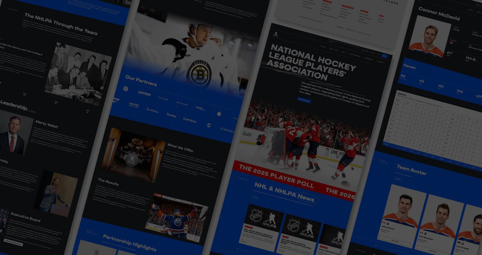
A sports organization website needs accessibility, security, and performance treated as baseline product requirements, not optional enhancements. We build these into the design system through contrast, usability standards, load optimization, and component QA, ensuring the site remains compliant as it evolves. For the National Hockey League Players’ Association, the build emphasized top-tier security and performance, with accessibility, speed, and scalability guiding technical and design decisions.

How do you build reusable components so a healthcare website stays consistent as new pages are added?

When building a healthcare website, consistency comes from designing a system of modular components with clear rules, then pairing that system with structured content and governance guardrails. This lets teams publish quickly without inventing new layouts or breaking accessibility patterns.