Go to content

CMHA North + West Vancouver

INTRODUCTION

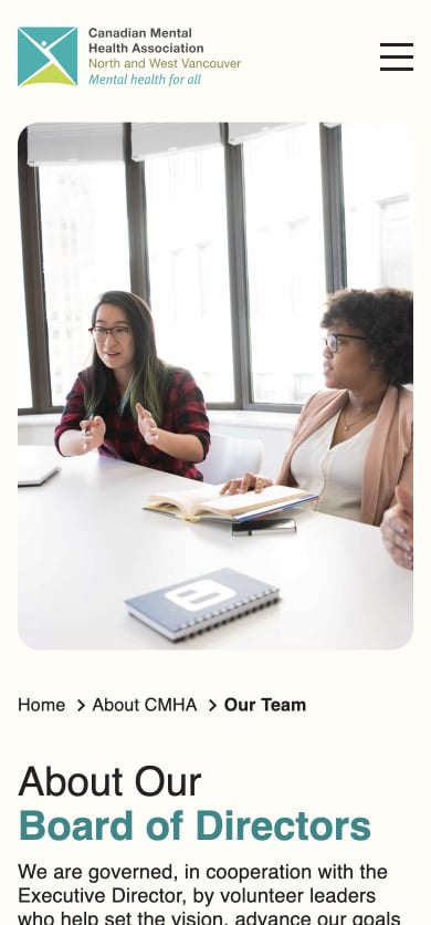
Creating Clarity, Accessibility, and Impact for CMHA North + West Vancouver

Twelve years ago, CMHA North + West Vancouver (NWV), a branch of the Canadian Mental Health Association, was providing essential services across North and West Vancouver, Bowen Island, Sunshine Coast, and the Sea-to-Sky Corridor. As a vital non-profit organization, their vision of a Canada where mental health is a universal human right and their mission to ensure all Canadians experience good mental health and well-being remained clear. However, their website was struggling to reflect these values and support the needs of their diverse audience.

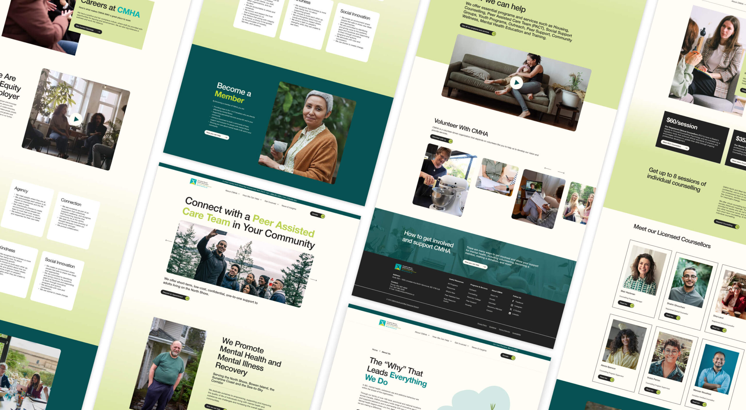
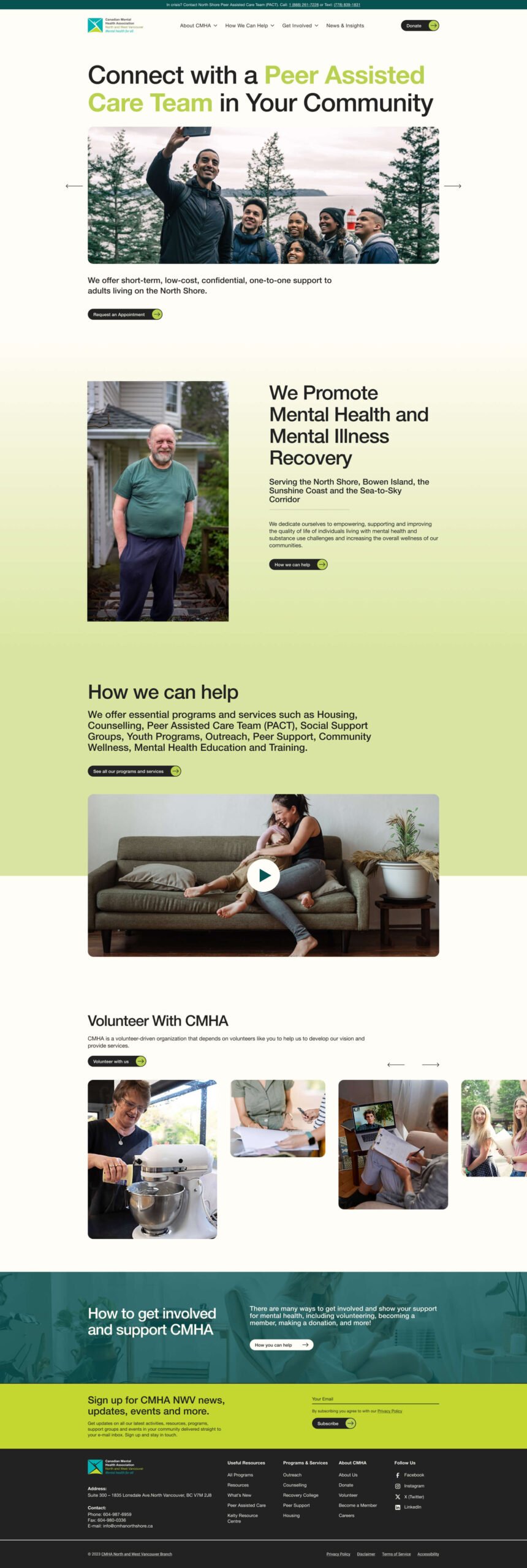
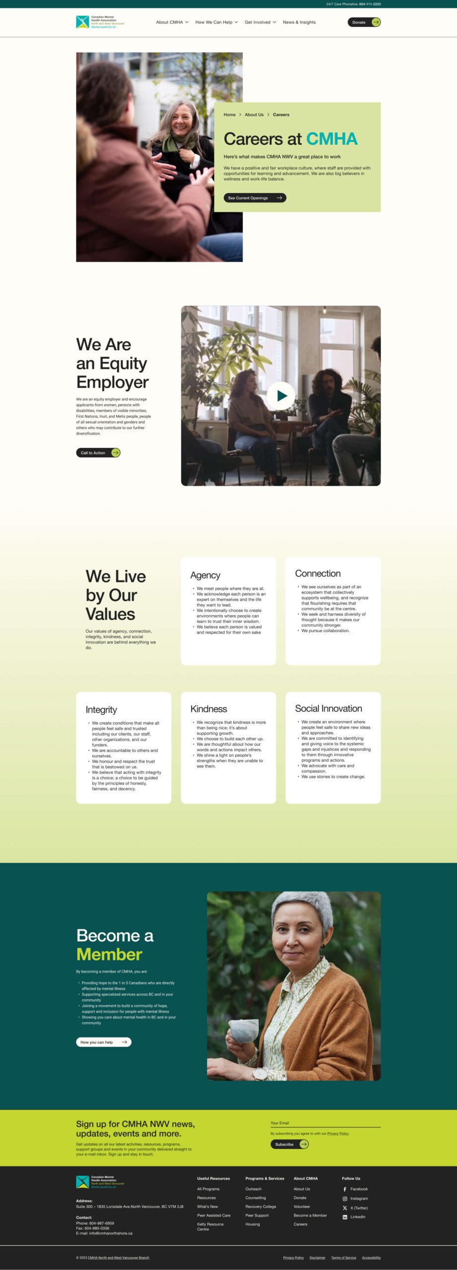
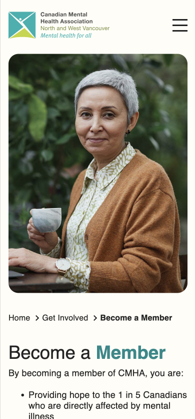
The CMHA NWV team came to us with a familiar challenge: their old site was clunky, text-heavy, and difficult to navigate, especially on mobile devices—where a large portion of their visitors were coming from. Information was buried, the site looked dated, and there was little balance or hierarchy in the way content was presented. The team needed a digital presence that not only aligned with their mission but also allowed visitors to easily access crucial mental health resources.

OBJECTIVES

The primary objective was clear: create a website that serves as an accessible and welcoming space for all visitors. Our engagement with CMHA NWV centered around five key goals:

Seamless User Experience

Making it easy for visitors to find the information they need quickly and intuitively.

Clarity + Consistency

Ensuring that the site’s structure and content were aligned, easy to follow, and free of unnecessary complexity.

Differentiation

Highlighting the unique work CMHA NWV does in the community while reinforcing the values of the larger CMHA network.

Scalable Platform

Building a website that could grow with the organization’s evolving needs, without compromising on functionality or user experience.

Values + Culture

Reflecting the warmth, care, and professionalism of the organization’s mission through design and content.


Research + Discovery: Understanding the User Journey

We kicked off with a detailed research and discovery phase. Through interviews and workshops, we engaged with the team and stakeholders to gain a deep understanding of their audiences, including clients, caregivers, and community partners. Our aim was to identify the website’s user, content, functionality, technical, and authoring requirements, ensuring that the final product would meet both current and future needs.

It became clear that the website’s UX needed to minimize cognitive load. Visitors were often overwhelmed by the text-heavy design and struggled to find the information they needed. To alleviate this, we limited the top-level navigation to a maximum of eight items, streamlining the user’s decision-making process.

We prioritized user flow by making the most critical pages and actions—the ones visitors were most likely to need—easily accessible. By rethinking the site’s structure, we surfaced key resources and improved navigation both in the header and the footer, ensuring the most valuable information was never more than a click away.


Creative Direction: Unconstrained Yet Orderly

Our creative direction for the new CMHA NWV site was built on two pillars: structure and openness. We wanted the site to feel flexible and welcoming, yet grounded in an orderly design that helped users feel supported.

Drawing on CMHA NWV’s existing brand colors—blue and green—we introduced gradients and bold color blocking to guide users’ eyes and aid in navigation. These design choices, alongside a clear hierarchy of information, were aimed at creating a site that was both aesthetically pleasing and highly accessible, especially for individuals in distress who may need to find information quickly.


Technology: A Platform Built for Growth

The website was built on WordPress using a custom-made theme designed specifically to meet the unique needs of CMHA NWV. We followed atomic design principles, ensuring that every component of the site could be scaled or reused as needed. This approach allowed us to create a flexible platform that could grow with the organization without requiring a complete overhaul down the road.

We optimized the site for performance, focusing heavily on mobile responsiveness given the significant percentage of mobile visitors. The new website adheres to WCAG 2.1 AA accessibility requirements, ensuring that the site is fully accessible to all users, including those with disabilities.


RESULTS

+ 1249 % ORGANIC SEARCH

Improved SEO and content strategy drove a massive increase in organic search traffic.

+ 1,400 % NEW USERS

A user-friendly design and mobile optimization attracted significantly more new visitors.

+ 1,400 % ACTIVE USERS

Streamlined navigation and accessibility improvements kept users actively engaged on the site.

+ 912 % PAGE VIEWS

Enhanced user flow and content clarity resulted in more pages being explored and viewed.

+ 1,295 % EVENT COUNT

Improved user experience encouraged higher engagement and interaction with site events.


RESULTS

A Digital Presence That Reflects CMHA’s Values

This project was about more than fixing technical issues or updating design. It was about aligning CMHA NWV’s digital presence with the organization’s deep commitment to the mental health of the communities they serve. By building a site that is scalable, accessible, and true to the organization’s values, we’ve created a platform that will continue to support the vital work of CMHA NWV for years to come.

RELATED PROJECTS

VIEW ALL CASE STUDIES

Frequently Asked Questions

Common questions about healthcare website projects, answered from experience.

How do you measure success for a healthcare website redesign?

Success for healthcare website redesigns is measured through real outcomes tied to user intent: discoverability (organic visibility, SEO), engagement quality (time, depth, ease of action), and meaningful actions (calls, form submits, bookings, resource downloads). Then instrument analytics around those tasks so you can prove impact and keep improving post-launch. For Evergreen MD Aesthetics, the website redesign’s success was measured by concrete lifts in engagement and acquisition metrics, including increases in session duration, call volume, and organic traffic.

What makes a healthcare brand strategy different from branding in other sectors?

A healthcare brand strategy has to earn trust before it can earn attention. Patients, caregivers, partners, and referring professionals, for example, expect signals of safety, credibility, competence, and care, often while navigating stress, uncertainty, or highly personal decisions.

Our approach starts with the organization’s specific trust-building architecture: who the key audiences are, what reassurance looks like for each, and where perception is misaligned with reality. That work is grounded in research, whether that means stakeholder interviews and value-definition workshops, competitive review, audience and behaviour analysis, or a bespoke combination of these mechanisms, depending on the project’s unique goals and context.

It also means recognizing that “healthcare” is not a single audience or emotional context. Recovery College YVR needed a brand that felt inclusive, real, and community-led, as opposed to clinical or institutional, which led to the narrative “Real people. Sharing. Learning.” Community Action Initiative, by contrast, needed brand strategy and messaging that clarified its mission and distinct role in British Columbia’s mental health and addiction landscape after confusion around its name and purpose. For Medtronic Labs, that meant using workshops and stakeholder interviews to clarify core values such as pioneering, collaboration, and empathy for a global health innovation organization.

The common thread is that healthcare branding works best when it translates complexity into trust, and when the strategy is precise enough to reflect how people actually experience care, support, solutions, and/or wellness.

How do you build a healthcare brand that serves multiple, very different audiences?

Most healthcare organizations serve several audiences simultaneously: patients, clinicians, caregivers, funders, referral partners. The brand has to work for all of them.

Most healthcare brand work fails here because it’s either built for one audience and ignored by the others, or diluted into something too generic to connect with anyone. We solve this by mapping each audience before we touch the brand: what questions they’re asking, what emotional state they’re in, what proof points move them.

From there, we build a core position that holds across all groups, paired with a messaging framework that shifts tone, emphasis, and evidence by audience without fracturing the identity underneath.

The information architecture follows the same logic, giving each audience a distinct pathway to the content that matters to them. We’ve applied this approach across organizations like Prenuvo and CMHA North + West Vancouver, each with very different audience configurations but the same underlying challenge.

When should a healthcare organization consider a rebrand?

A healthcare organization should consider a rebrand when there’s a meaningful gap between what the organization has become and what its brand communicates.

That gap shows up as difficulty recruiting staff who don’t recognize the organization from its public presence, patient confusion about available services, fragmented brand architecture after a merger or expansion, or a strategic pivot the existing identity can’t carry.

A rebrand isn’t always the answer, though. Sometimes the issue is messaging clarity or visual consistency, not positioning. We start by diagnosing which problem actually exists before recommending scope.

The work we did with CMHA North + West Vancouver was a structural and digital overhaul, not a repositioning. The work with Community Action Initiative required a full brand strategy and visual identity because stakeholders were confused about the organization’s name, mission, and distinct role. Two different diagnoses, two different scopes.