Mind By Maple
Maple, a leading virtual healthcare brand launches Mind by Maple, an online counseling solution where honesty, courage, and the innate complexity of human emotions are celebrated front and centre.

Partnering with Purpose: Crafting a Digital Experience for Vancouver Coastal Health Research Institute
Before engaging a prospective partner, we always ask about their deeper purpose. We want to know if their products and/or services are aptly curated to address real world problems. We want to know if they’re a positive social force fighting for a more equitable world. That’s how we know we’ve found an organization worth going to bat for.
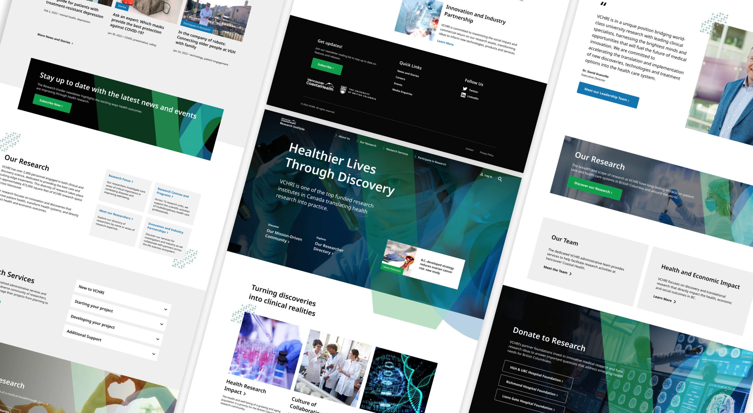
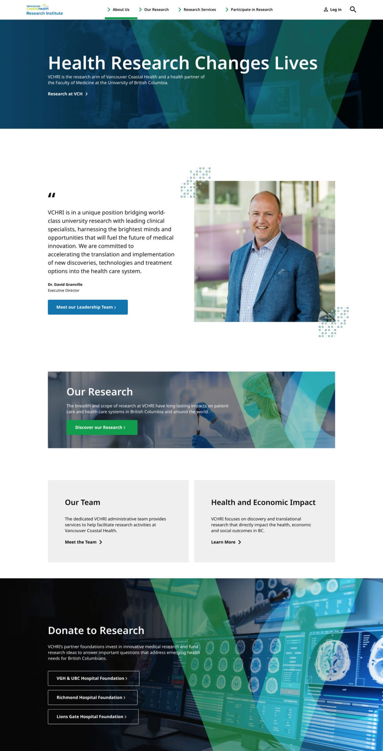
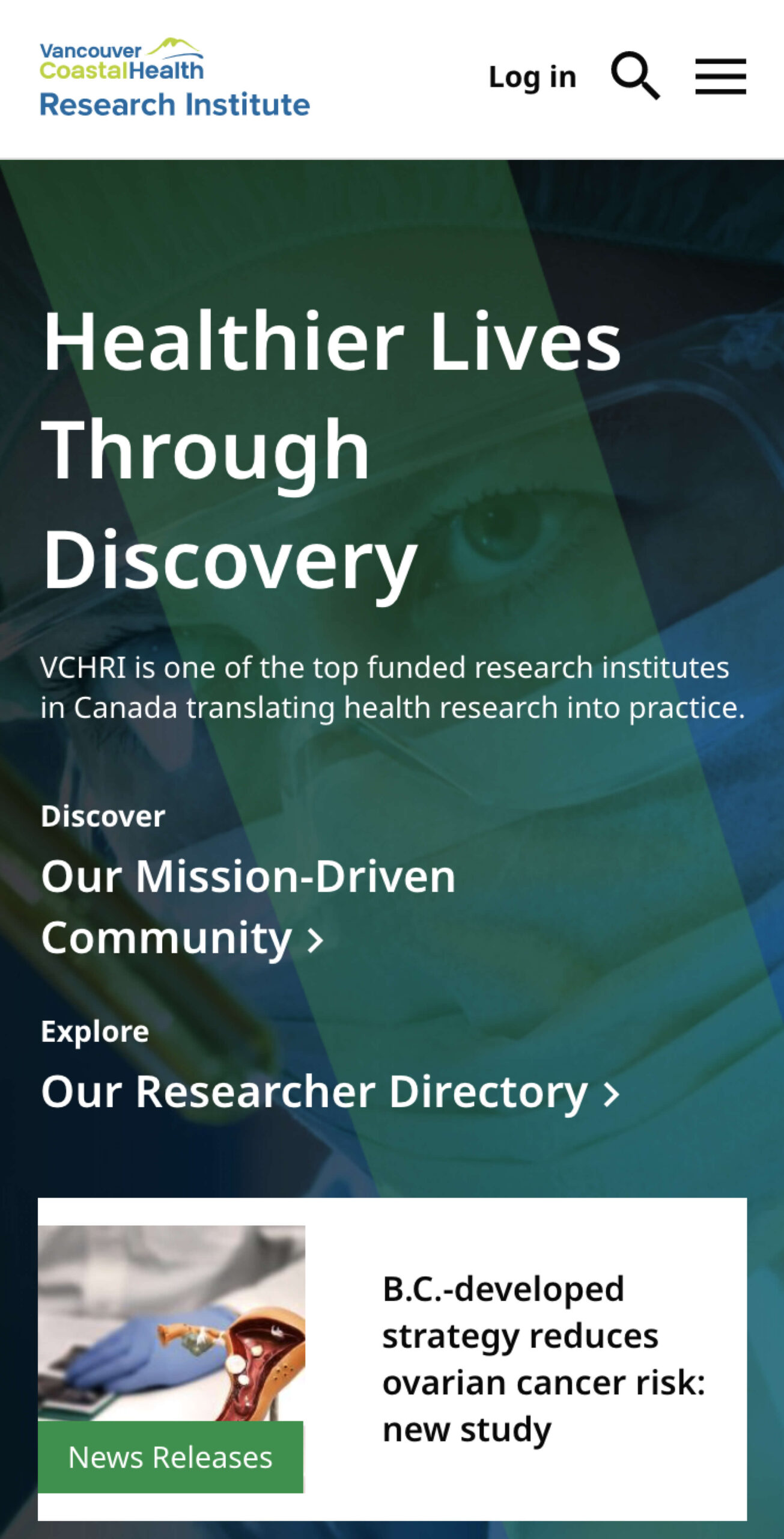
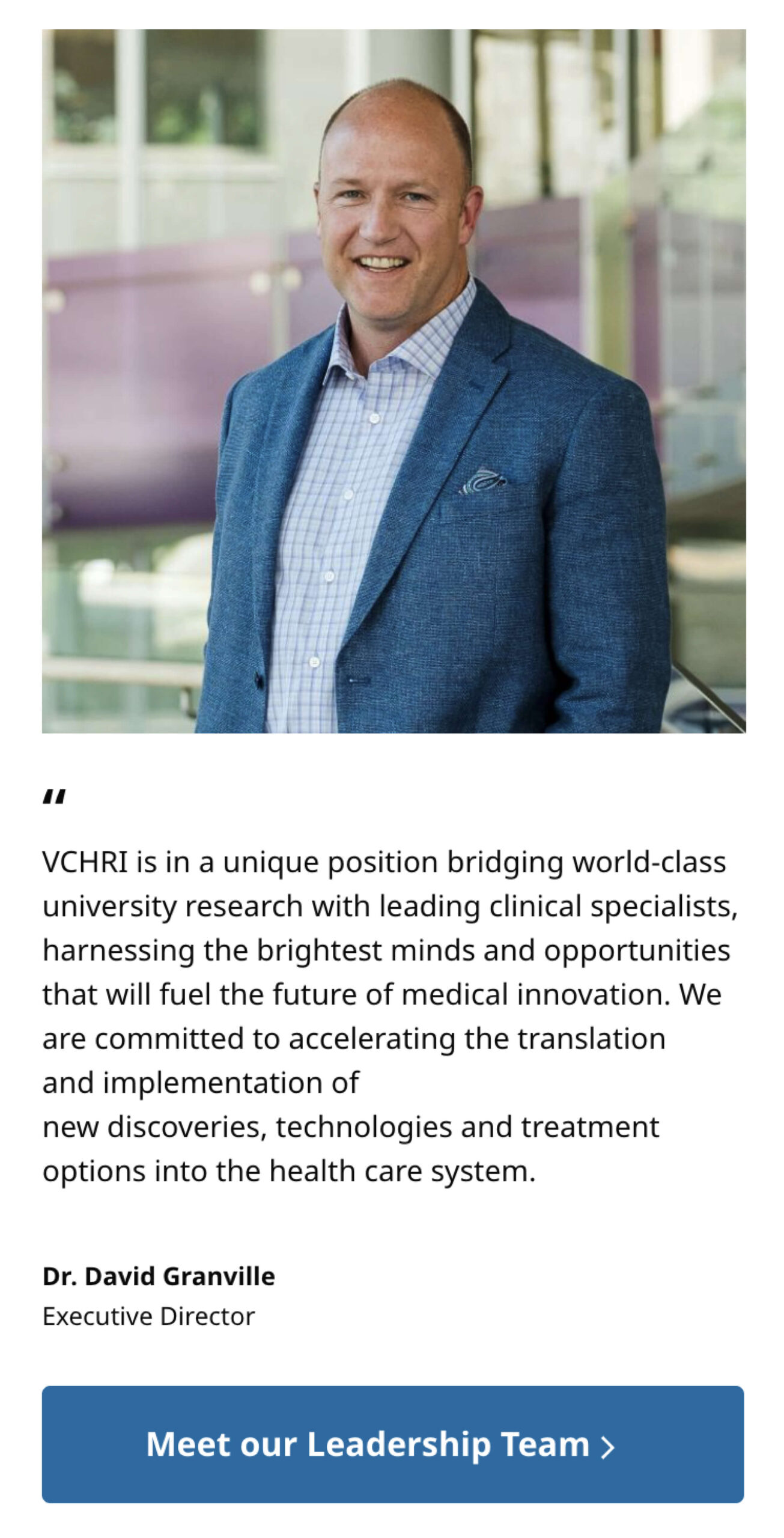
Enter Vancouver Coastal Health Research Institute (VCHRI): one of Canada’s largest research organizations, and one of its most renowned healthcare thought leaders. We were engaged to creatively direct, design, and develop VHCRI’s new Drupal website. A site that would serve as the organization’s primary communicative portal to the communities and individuals it serves.
As the research arm of Vancouver Coastal Health (VCH) and a principle partner to the University of British Columbia, VCHRI encompasses three research-intensive institutions: Vancouver General Hospital, UBC Hospital, and GF Strong Rehabilitation Center. Additionally, the organization maintains productive working relationships with Richmond Hospital, Lions Gate Hospital, and various public health agencies across Vancouver Coastal Health.
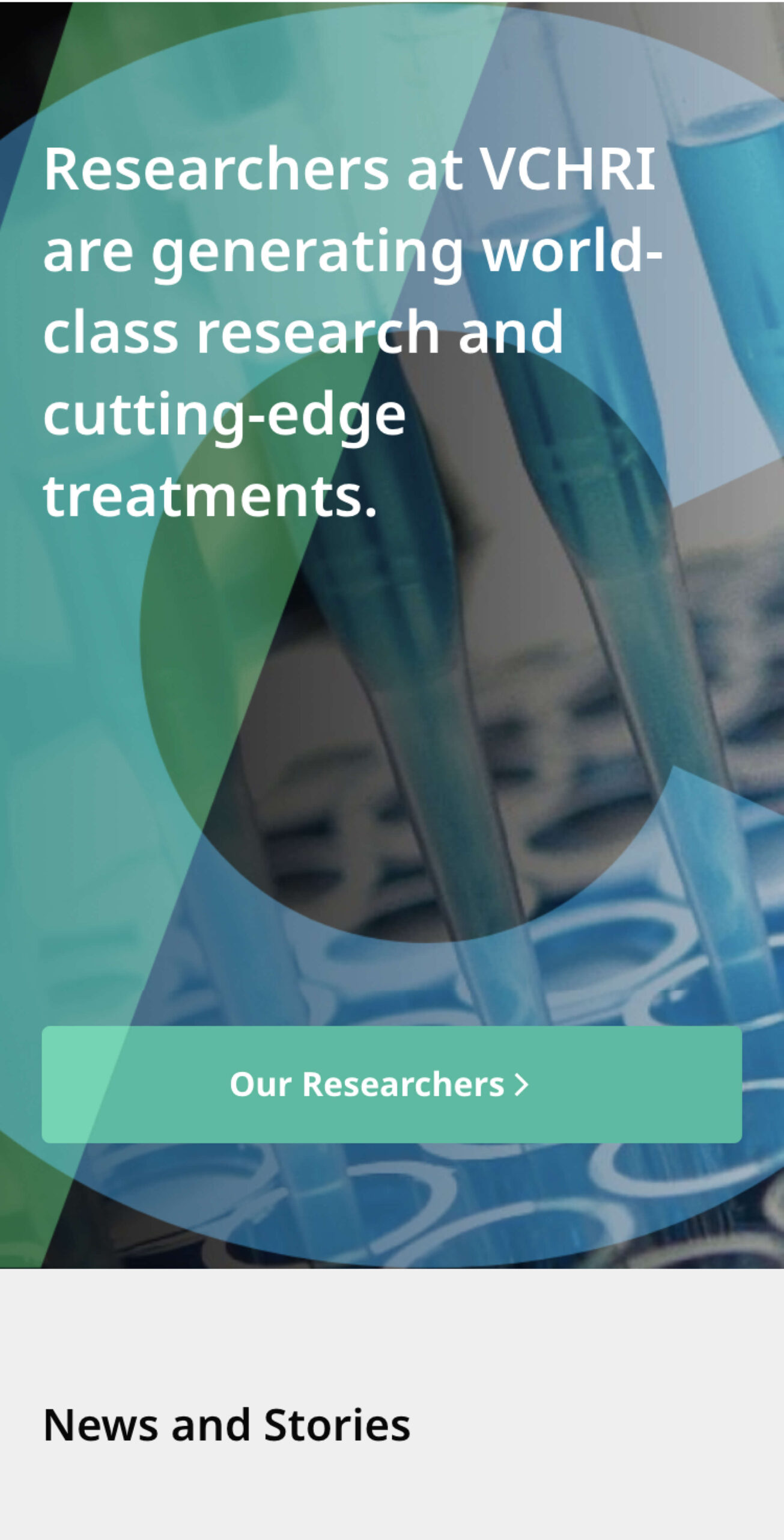
Together, these entities collaborate in generating invaluable health-focused resources through discovery, education, application, and evaluation. The goal of their efforts is to improve health outcomes and generate measurable results to acute and chronic patients, plus the broader population.
Our work yielded an award-winning website that seamlessly unifies form and function. It delivers on VCHRI’s mission to improve patient care through an approachable, accessible digital experience for all. We break the whole thing down below, so keep reading.
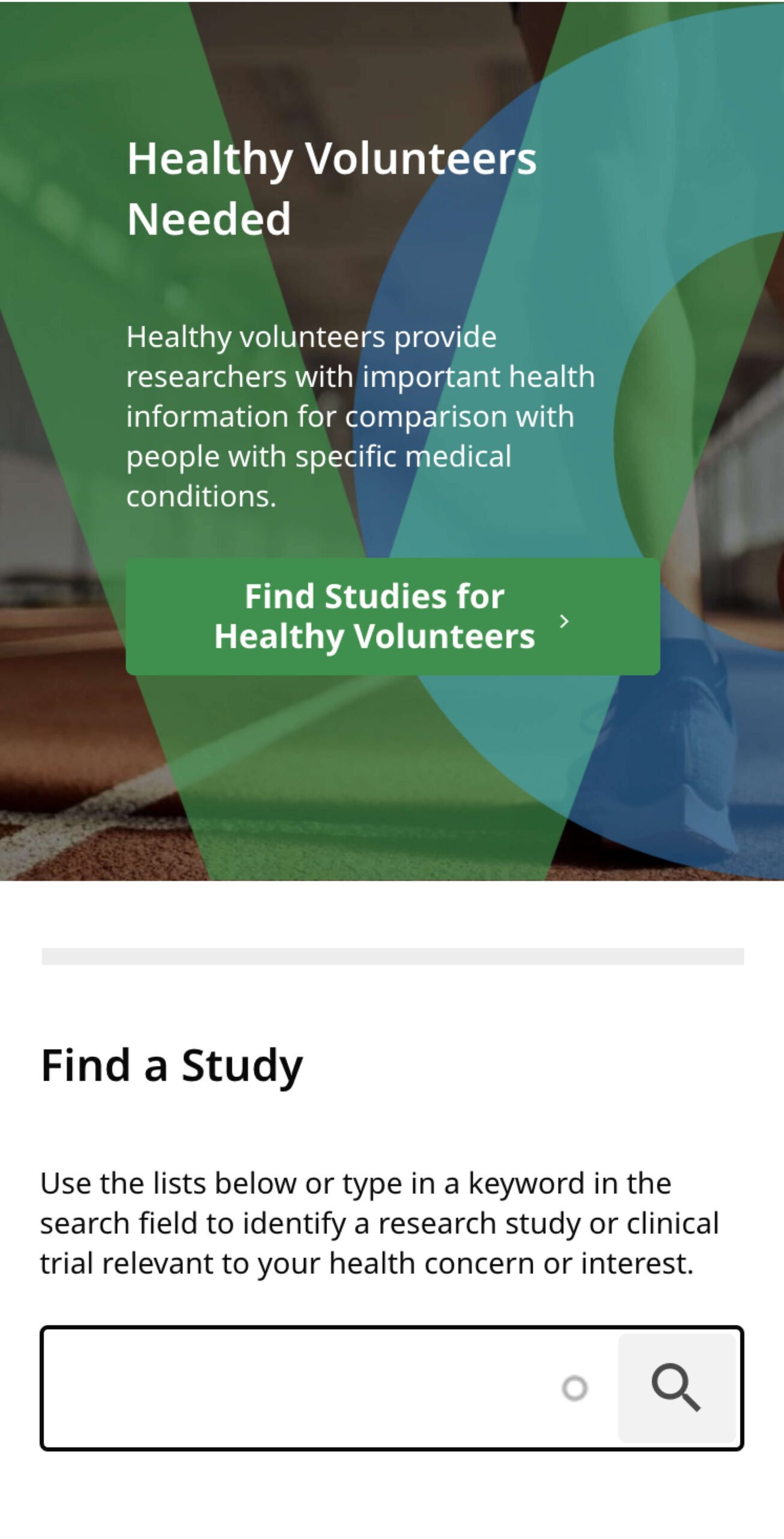
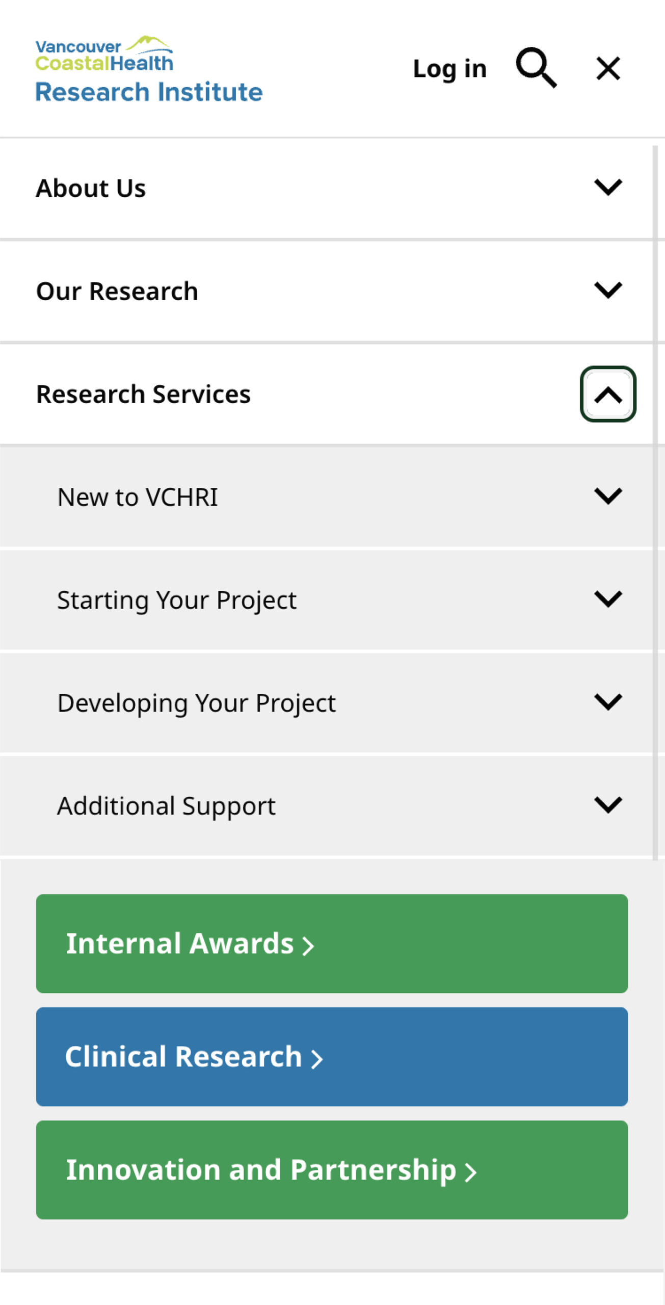
With a keen understanding of VCHRI’s primary goals, we knew its website had to mitigate technological and informational barriers that may make it challenging for users to easily access their essential health resources.
Beyond simplifying the site’s content and user flow, this meant ensuring it adhered to critical accessibility requirements (WCAG 2.1) and was equally intuitive for all people—the able-bodied and those living with temporary or chronic physical impairments.
Our approach to holistic accessibility was exhaustive. From clear content tagging for easy resource discovery, contrast ratios, and font choices that emphasized key CTAs, schema, and metadata to ensuring the site was navigable via keyboard shortcuts and responsive across all device types, we made sure ALL users would have open access to VHCRI’s life-changing work.
With 2,400 active investigators, 115 new invention disclosures over the past five years, and over 473,000 sqft of research space, VCHRI is an inherently complex organization. With multiple stakeholders, departments, and a broad variety of users to account for, our first order of business was mapping out the site’s content for its various target audiences.
Fortunately, VCHRI had already completed a significant chunk of legwork on the new site’s information architecture, which was validated through wireframing, card sorting, and additional user testing.
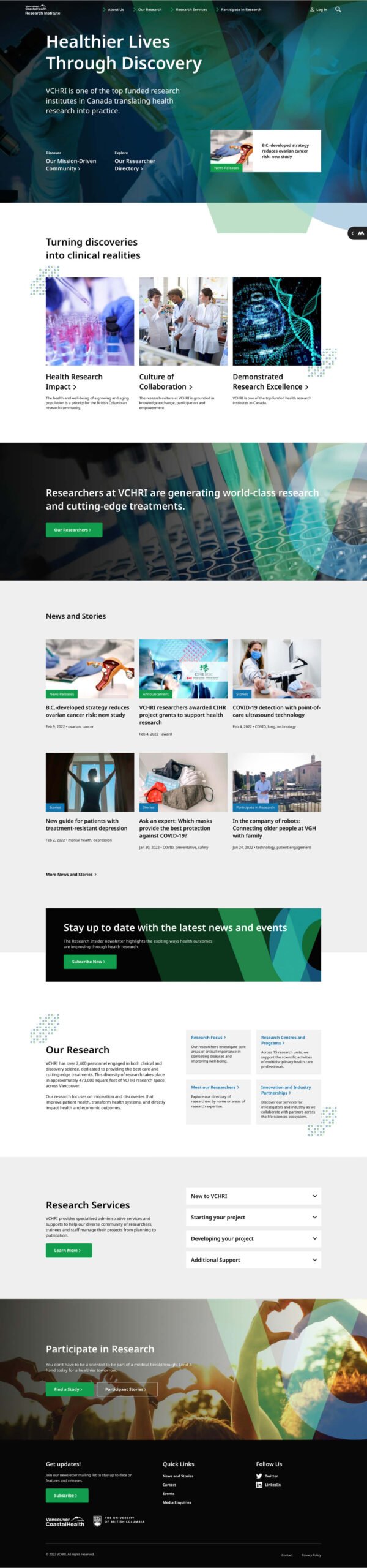
A flat, clear, and intuitive navigation paired with a site-wide search functionality makes specific information available at a moment’s notice, without having to drill down through multiple content levels. This, along with a robust set of dynamic modules complete with clear tagging and categorization help users easily locate similar content with ease.
So, what role does creative direction play in a project centered around creating an accessible user experience? A leading one. One of the Takt’s design team’s primary objectives was to establish a scalable, design system that married beauty and utility.
We created a branded watermark, along with a set of image treatment filters to achieve consistency across a mixture of stock and branded photography.
In adherence to VCH’s parent brand guidelines, Takt implemented an expanded color-palette, providing consistency and flexibility for things like wayfinding, hover-states, and reinforcing the site’s overall visual hierarchy.
Like so many others, a primary driver of VCHRI’s project was the necessary migration to Drupal 9. You’d be forgiven—and definitely not alone—if the mention of a Drupal 9 upgrade induces slight nausea. In dev-land, this particular migration can be a nightmare. That said, with requisite content planning, data-modeling, and by clearly determining the new website’s minimum viable content (MVC) threshold, the site’s migration prevailed without a hitch.
In fact, the migration experience provided an opportunity for other essential improvements to the site’s authoring experience and content governance. VCHRI’s internal team was now well equipped to sustainably manage the website’s contents the organization continues to evolve.
We often tell our partners our role as an agency is to speak on behalf of your internal and external users; prioritizing their wants, needs, and expectations above all throughout the project. Maybe not the sexiest answer, but an absolute non-negotiable if you’re aiming to create websites that provide meaningful change in the world.
Fortunately, VCHRI’s internal team was in complete alignment. Consequently, the final product is a website that serves the organization’s diverse user groups, while offering equal access to critical healthcare resources and research for all.
And, while winning an award literally couldn’t have been further from our minds when we designed and developed the new vchri.ca, we were admittedly flattered to learn the new website had won the International Association of Business Communicators 2022 Gold Quill Award of Excellence in “Communication for the Web.”
Check out the website for yourself here, or drop us a line to discuss a project you’d like to collaborate on.
Common questions about healthcare website projects, answered from experience.
A healthcare website redesign project starts by defining the user journeys that matter most: finding care, understanding services, building trust, and taking action, all with minimal friction (especially on mobile devices, as telemedicine becomes more widely used and expected). We typically map high-intent tasks first, then reshape information architecture and templates so critical decisions are clear and fast. For Prenuvo, a preventative cancer screening startup, the site was structured around distinct audience needs (patients, doctors, employers) and designed to reduce fear, minimize jargon, and improve content findability for users.
Healthcare websites that are easy to navigate prioritize real user intent, using strong logical information hierarchy, consistent page templates, and search functionality to handle depth without bloating top-level menus. The goal is always to help users quickly self-identify, then drill down confidently into the most relevant content for them through predictable pathways. For Evergreen MD Aesthetics, a medical aesthetics clinic, website navigation and structure were organized around “concern areas” so visitors could find relevant treatments without needing insider knowledge of clinical categories or complex medical products.
A healthcare website’s mobile user experience improves most when templates are built responsively at the component level, navigation is simplified, and content is structured to support scanning and quick actions. Performance and readability need to be validated during build, not retrofitted after launch. For Kelowna Dental Centre, the site was rebuilt to deliver a clean, conversion-ready experience across devices, with accessibility and performance treated as core UX requirements.
WCAG 2.1 AA compliance includes accessible components and templates, adequate contrast, keyboard navigation, screen-reader support, and consistent interaction patterns that remain accessible as content scales. The practical win is governance: accessibility holds because it’s baked into the system, not dependent on one-off page fixes.