Vancouver Coastal Health Research Institute

Takt and Vancouver Coastal Health Research Institute team up to create an award-winning website centered around accessibility
Pioneering Healthcare Insights for a Healthier Canada
The Institute for Clinical Evaluative Sciences (ICES) is a not-for-profit research institute comprising a community of research, data and clinical experts at the forefront of groundbreaking research, delving into the intricate realm of healthcare delivery and outcomes.
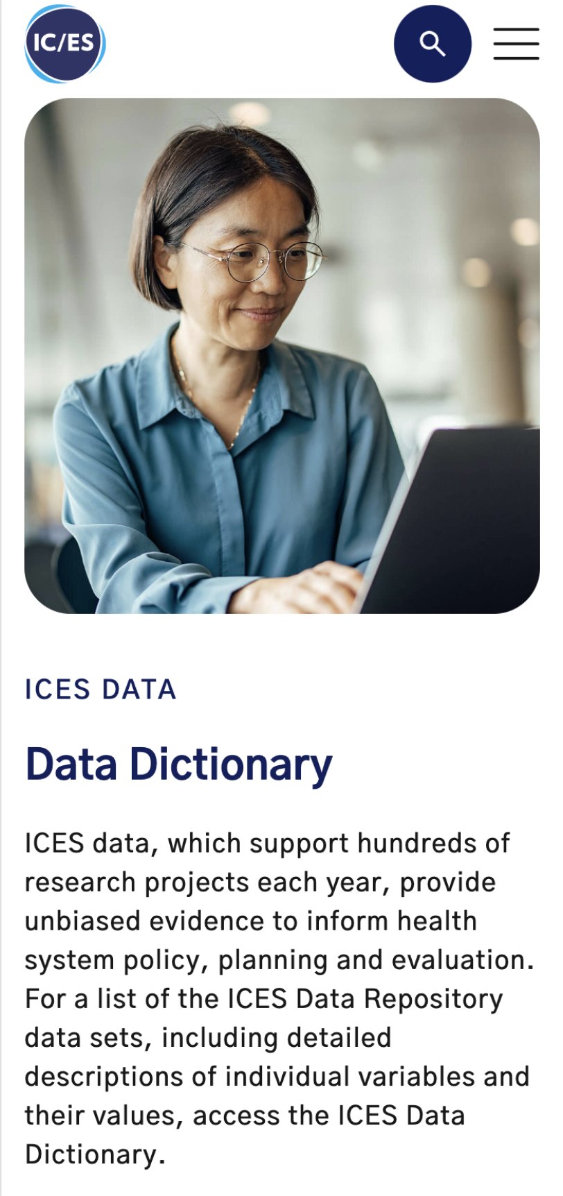
Within this vast repository of population-based health surveys, anonymized patient records, and comprehensive clinical and administrative databases, lies the key to unraveling the complexities of the healthcare landscape and the power to inform healthcare policy and improve patient outcomes for all Canadians.
In late 2022 ICES tasked Takt with crafting a new website that serves as an digital HQ and resource hub for its various research initiatives.
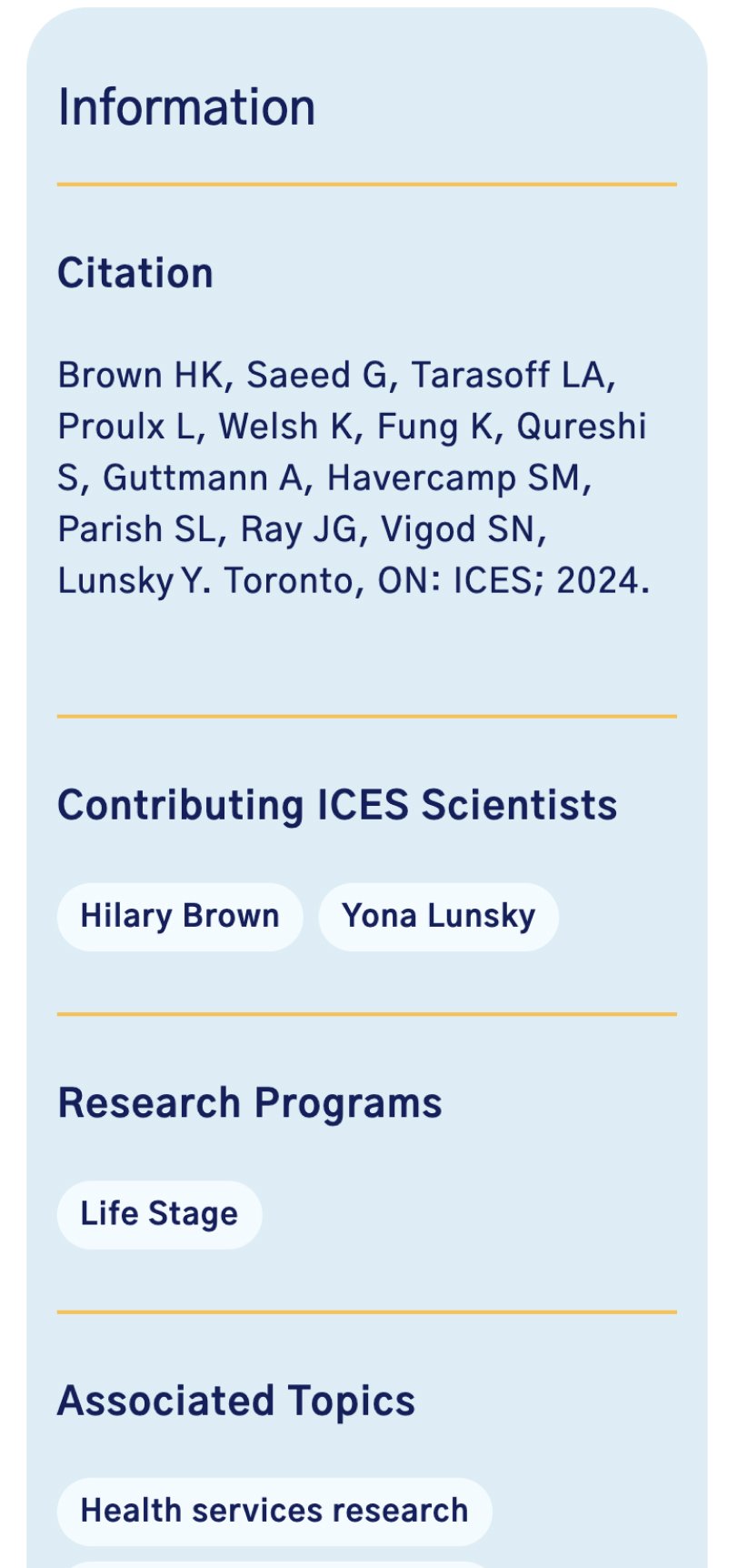
When ICES reached out, they were dealing with an outdated website stuck in the past. It was built using an old version of the SiteCore content management system (CMS), making it difficult to update. On top of that, the website had a dysfunctional API and a whopping 15,000+ pages of content. Our main challenge was to make sense of this overwhelming amount of content and fix the site’s disjointed features creating a unified user experience for all.
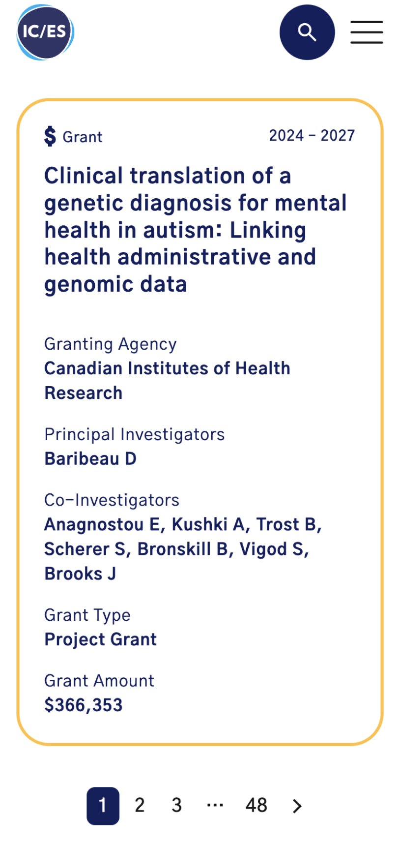
To start, we took a close look at how the content was organized on the site. We examined different types of content, their relationships, and the tags, categories, and taxonomy used. We then conducted workshops with users, analyzing their needs and the tasks they wanted to accomplish on the site. By reviewing site analytics and running user testing sessions, we were able to identify the most important tasks and create a new site structure that made sense for everyone.
From here, we developed wireframes and validated our assumptions through testing with key audiences. Only after receiving feedback and making improvements did we move on to the final design phase.
Throughout the process, our focus was on simplicity and user satisfaction. We wanted to create a website that was easy to use and provided a seamless experience for visitors.
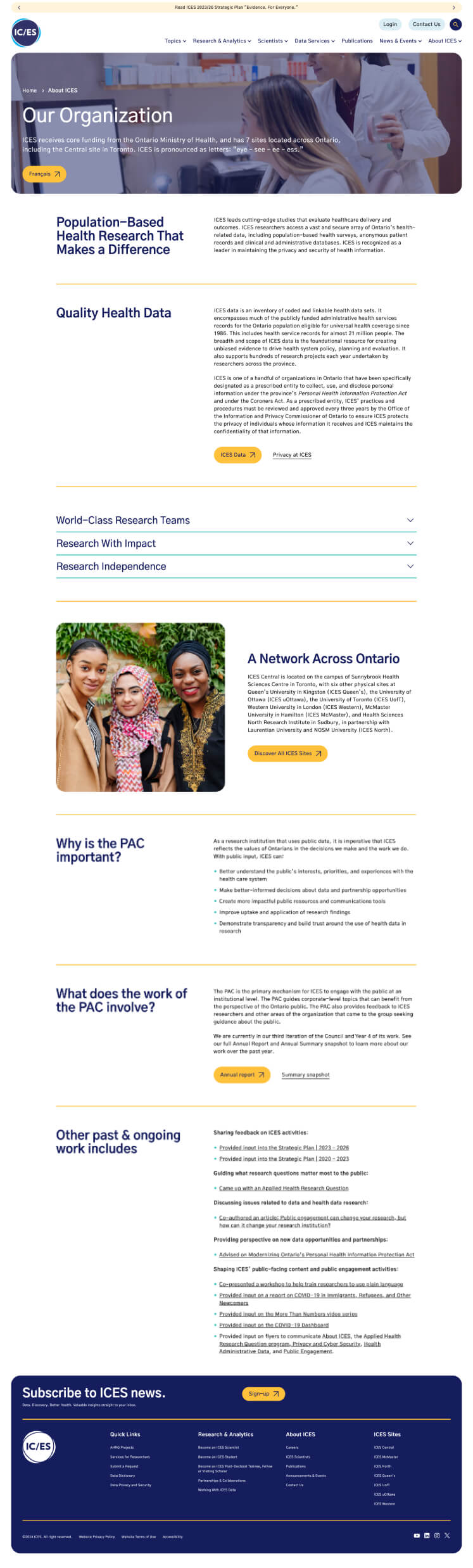
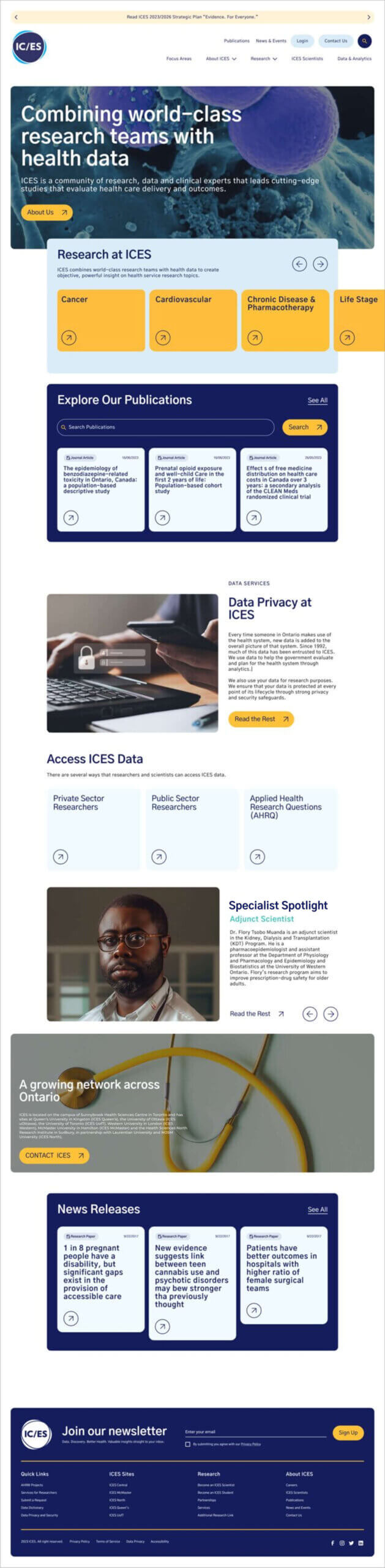
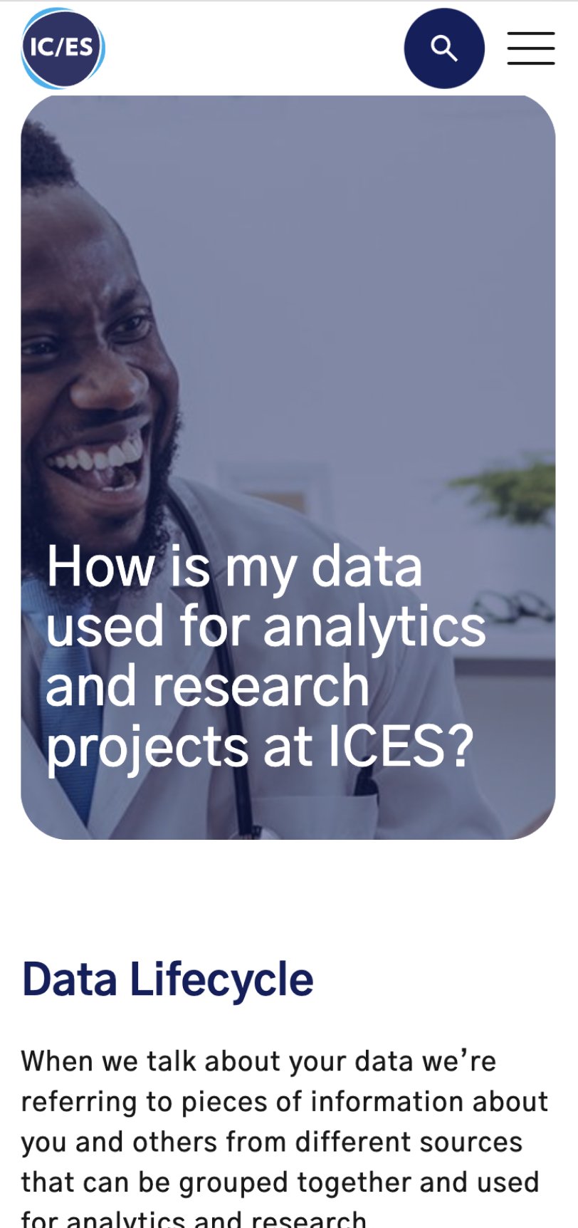
The new ICES website goes beyond being a mere resource hub for the organization’s research initiatives. It serves as a powerful calling card, inviting future partnerships and inviting others to join their mission of enhancing patient outcomes. The website aims to convey ICES’ values, sterling reputation, and inclusive culture.
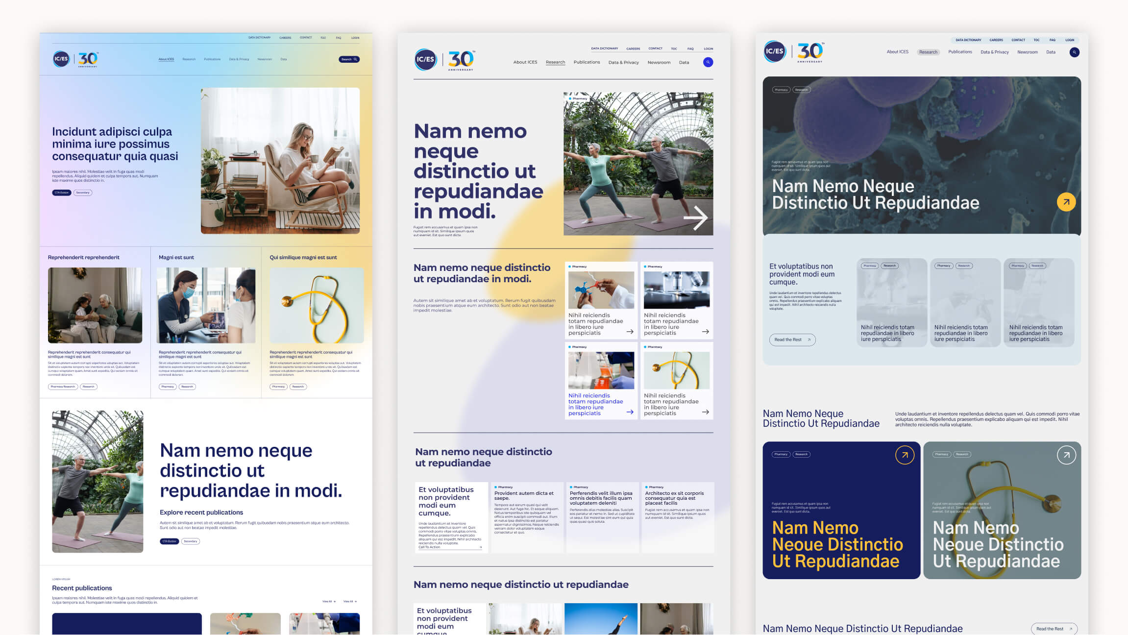
To ensure the website design aligns with ICES’ vision, we began by identifying the design constraints. Through conversations and workshops, we delved into the core messaging of the existing ICES brand, exploring the principles and values that propel it forward. Based on these insights, our team at Takt presented four creative concepts in the form of style tiles, each representing a distinct approach to the current branding.
The winning concept was the most vibrant of the bunch, featuring an expanded color palette that facilitated wayfinding and adhered to accessibility best practices. By utilizing color-blocking generously, we ensured that the eye flows smoothly through the extensive text content. In addition, type styling and bold titles were implemented to establish a clear hierarchy and enhance readability.
“In our exploration of design and user experience, we discovered that ICES had a lot of content and different types of pages. This meant we had to really concentrate on their content organization in our design solution. By creating a flexible and customizable design system, we not only preserved and showcased the unique ICES brand, but also positioned them for long-term growth and consistency.”
Steven Martz, Creative Director @ Takt
When beginning the project we knew successfully migrating 15,000+ pages of unstructured content from an inaccessible CMS to a new custom WordPress site would be a real challenge. Without access to the site’s backend, Takt’s development leveraged a combination of manual and automated migration strategies which accounted for roughly 70% of the project’s total required efforts. Once the content was successful we began testing the site across various devices and browsers– re-testing along the way for performance, accessibility and SEO.
The end result is a rejuvenated ICES site that prioritizes usability, without comprising the site’s visual appeal or overall performance.
We couldn’t be happier with the result, and are excited to see what comes next from ICES in the coming months and years.
Common questions about healthcare website projects, answered from experience.
Education resource hubs carry a unique burden. They house long-form, nuanced content that is essential for credibility and depth, but too dense for primary navigation or top-of-funnel pages. They also serve as a place for storytelling, where institutions can demonstrate academic rigour, research impact, alumni outcomes, and student experience.
We design resource hubs to scale by starting with a clear content model built on intuitive taxonomy, filtering, and tagging. This structure is shaped around how different audiences actually search and browse, allowing content to grow without becoming fragmented or difficult to navigate.
To ensure longevity, we pair the system with clear governance, workflows, and training so teams can publish confidently and consistently over time. The result is a resource hub that remains usable, discoverable, and relevant as content volume increases.
A healthcare website redesign project starts by defining the user journeys that matter most: finding care, understanding services, building trust, and taking action, all with minimal friction (especially on mobile devices, as telemedicine becomes more widely used and expected). We typically map high-intent tasks first, then reshape information architecture and templates so critical decisions are clear and fast. For Prenuvo, a preventative cancer screening startup, the site was structured around distinct audience needs (patients, doctors, employers) and designed to reduce fear, minimize jargon, and improve content findability for users.
A healthcare website’s mobile user experience improves most when templates are built responsively at the component level, navigation is simplified, and content is structured to support scanning and quick actions. Performance and readability need to be validated during build, not retrofitted after launch. For Kelowna Dental Centre, the site was rebuilt to deliver a clean, conversion-ready experience across devices, with accessibility and performance treated as core UX requirements.
WCAG 2.1 AA compliance includes accessible components and templates, adequate contrast, keyboard navigation, screen-reader support, and consistent interaction patterns that remain accessible as content scales. The practical win is governance: accessibility holds because it’s baked into the system, not dependent on one-off page fixes.
The “best” platform is the one that supports structured content, reusable components, secure integrations, and the authoring reality of your internal team. For high-performance, security-sensitive builds, a headless approach can be a strong fit because it decouples content management from the front end and reduces risk. For Primasun, an Alphabet-funded precision health company, Takt used a headless CMS approach (Contentful + Gatsby) to support speed, security, and accessibility at scale.
Success for healthcare website redesigns is measured through real outcomes tied to user intent: discoverability (organic visibility, SEO), engagement quality (time, depth, ease of action), and meaningful actions (calls, form submits, bookings, resource downloads). Then instrument analytics around those tasks so you can prove impact and keep improving post-launch. For Evergreen MD Aesthetics, the website redesign’s success was measured by concrete lifts in engagement and acquisition metrics, including increases in session duration, call volume, and organic traffic.
Healthcare organizations often serve patients, clinicians, caregivers, and partners simultaneously, each with different goals and emotional contexts. We design healthcare websites by mapping these journeys distinctly, then building shared templates and navigation patterns that adapt by audience without fragmenting the experience.
This audience-first approach is reflected in our work for ICES and Evergreen MD Aesthetics, where information architecture, content structure, and design were tuned to meet very different user needs within a single coherent system.
Most healthcare organizations serve several audiences simultaneously: patients, clinicians, caregivers, funders, referral partners. The brand has to work for all of them.
Most healthcare brand work fails here because it’s either built for one audience and ignored by the others, or diluted into something too generic to connect with anyone. We solve this by mapping each audience before we touch the brand: what questions they’re asking, what emotional state they’re in, what proof points move them.
From there, we build a core position that holds across all groups, paired with a messaging framework that shifts tone, emphasis, and evidence by audience without fracturing the identity underneath.
The information architecture follows the same logic, giving each audience a distinct pathway to the content that matters to them. We’ve applied this approach across organizations like Prenuvo and CMHA North + West Vancouver, each with very different audience configurations but the same underlying challenge.