Go to content

Community Action Initiative

INTRODUCTION

Reimagining Support: Elevating the Community Action Initiative’s Brand

The Community Action Initiative (CAI) has been a vital force in British Columbia’s mental health and addiction sector since 2008. Born out of a need for a coordinated approach to funding support, CAI started with a modest $10 million endowment, making strategic decisions around a boardroom table. Over the years, they have evolved into a dynamic entity, providing fast, responsive funding to community-based programs—often filling the gaps where government action is slow.

Despite their impact, CAI struggled with a brand identity that didn’t fully reflect their unique role or the breadth of their work. Confusion around their name and mission, coupled with an inconsistent visual identity, hindered their ability to communicate effectively with stakeholders and the communities they serve. That’s where we came in.

OBJECTIVES

Clarifying the Mission: A Brand Strategy Rooted in Purpose

Our goal was to create a brand strategy and messaging that would clearly convey CAI’s mission and distinct position in the mental health and addiction landscape. We worked closely with the CAI team to define their core values and articulate a brand narrative that showcases their unique role in providing rapid, responsive funding and support across the province.

This foundational work informed every aspect of the new brand, ensuring that CAI’s messaging was clear, compelling, and aligned with their vision of integrating mental health and addiction support in a way no other organization does.


Crafting a Visual Identity that Resonates

CAI needed a visual identity that could unify their diverse efforts and present a cohesive, professional image to the public. We developed a modern, approachable brand identity that reflects their commitment to community-driven change. The new logo symbolizes connection and support, while the color palette—rooted in calming, natural tones—conveys a sense of stability and trust.

Brand guides and standards were created to ensure consistency across all touchpoints, from grant program materials to social media templates. These guidelines empower the CAI team to communicate their message effectively and consistently, whether they’re engaging with government agencies, community organizations, or the public.

Bridging the Gaps: A Platform for Integration

One of CAI’s key challenges was the lack of awareness and understanding around their unique model. As the only entity in British Columbia that works across both mental health and addiction, CAI needed a brand that could bridge these sectors and highlight their integrative approach.

Our brand strategy emphasized CAI’s role as a bridge-builder and problem-solver, focusing on their ability to deliver rapid funding and support where it’s needed most. This message was woven into every element of the visual identity, reinforcing CAI’s position as a trusted, responsive partner in the community.


RESULTS

A New Era of Community Support

The reimagined CAI brand now serves as a beacon of their commitment to transforming mental health and addiction support in British Columbia. With a clear, compelling message and a cohesive visual identity, CAI is better equipped to engage with their audience, build partnerships, and drive meaningful change.

As they continue to grow and expand their impact, CAI’s new brand will play a crucial role in raising awareness, fostering collaboration, and ensuring that they remain a vital resource for the communities they serve.

Explore the new Community Action Initiative and learn more about their work: communityactioninitiative.ca

RELATED PROJECTS

VIEW ALL CASE STUDIES

Frequently Asked Questions

Common questions about healthcare website projects, answered from experience.

What makes a healthcare brand strategy different from branding in other sectors?

A healthcare brand strategy has to earn trust before it can earn attention. Patients, caregivers, partners, and referring professionals, for example, expect signals of safety, credibility, competence, and care, often while navigating stress, uncertainty, or highly personal decisions.

Our approach starts with the organization’s specific trust-building architecture: who the key audiences are, what reassurance looks like for each, and where perception is misaligned with reality. That work is grounded in research, whether that means stakeholder interviews and value-definition workshops, competitive review, audience and behaviour analysis, or a bespoke combination of these mechanisms, depending on the project’s unique goals and context.

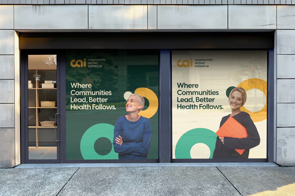
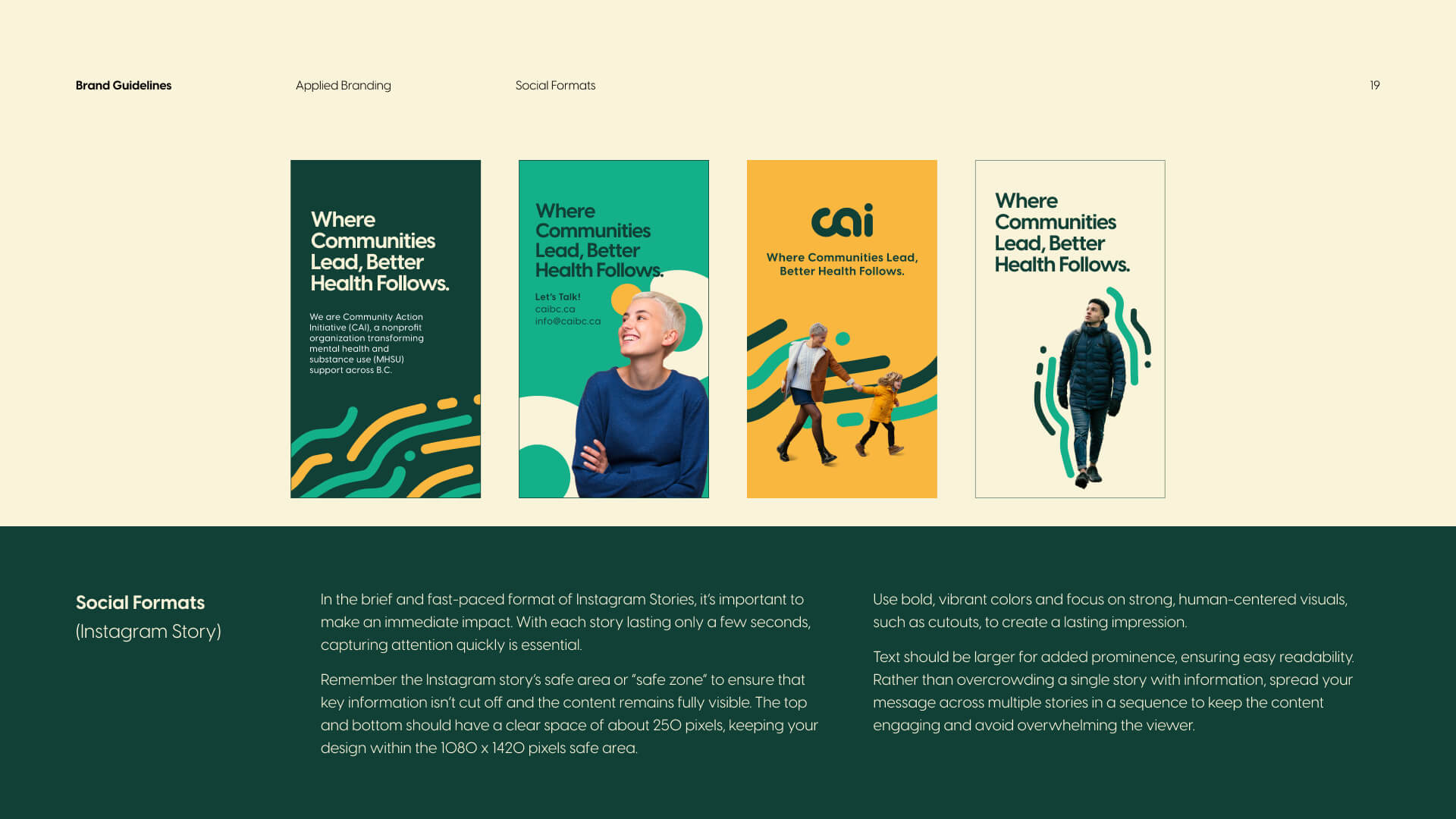
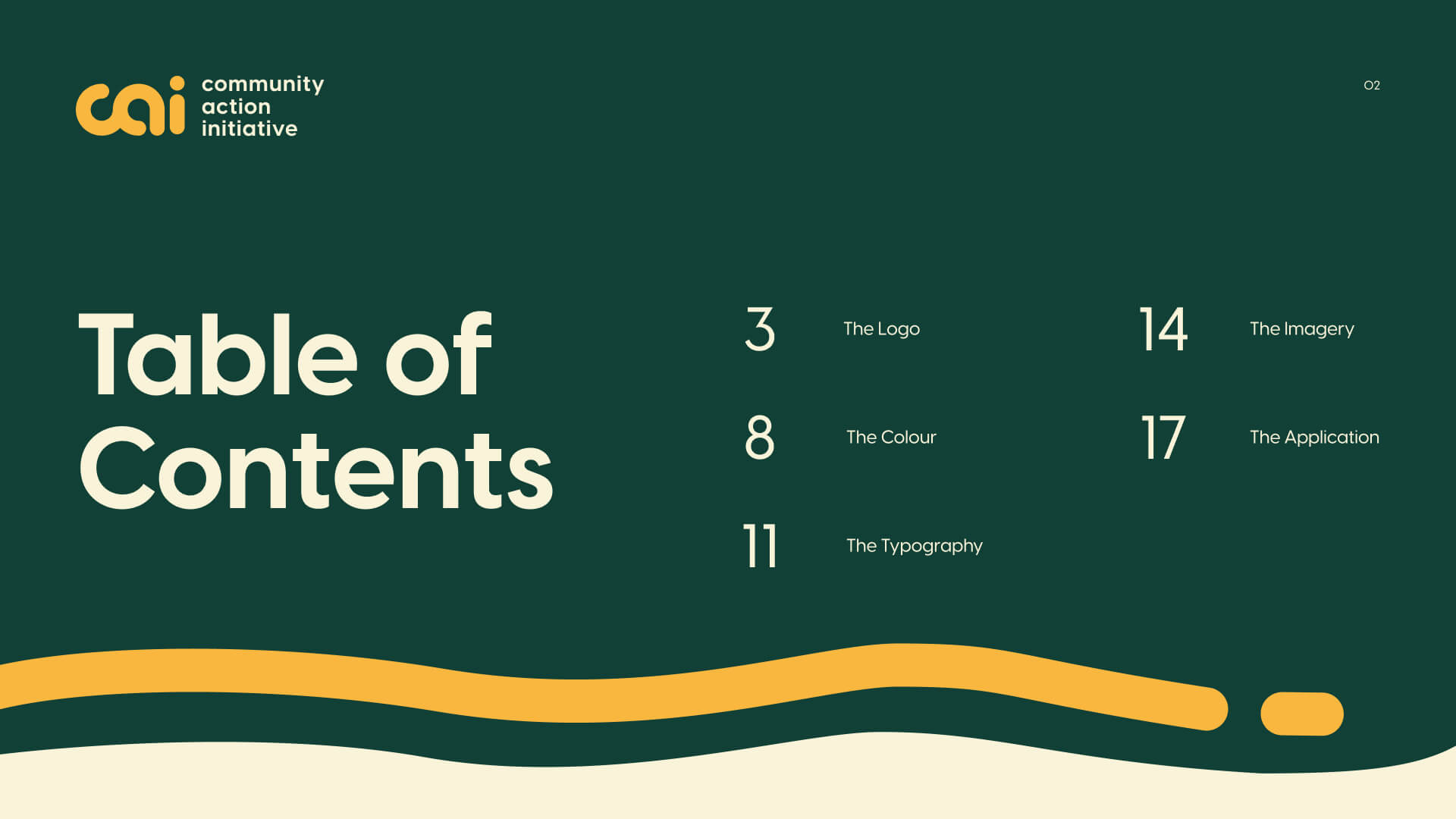
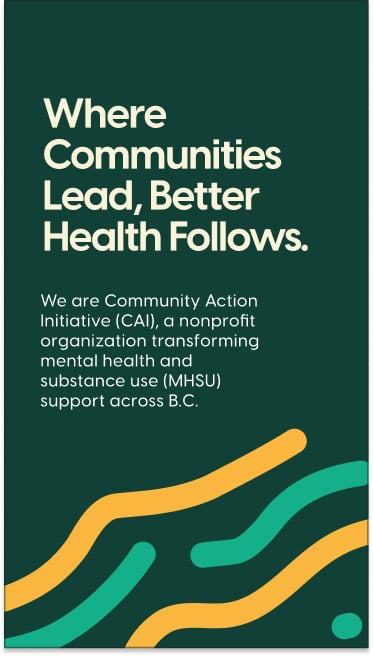
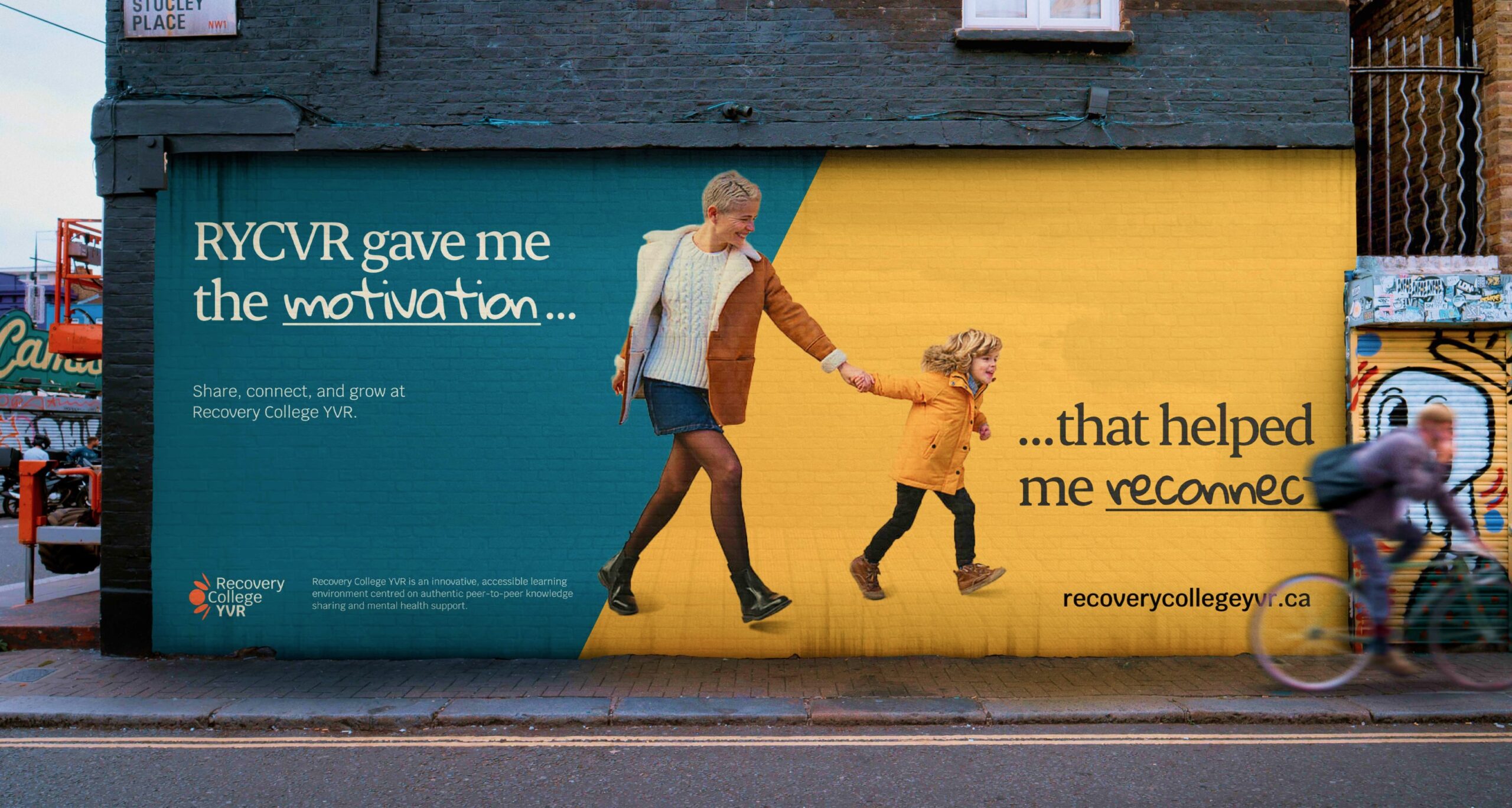
It also means recognizing that “healthcare” is not a single audience or emotional context. Recovery College YVR needed a brand that felt inclusive, real, and community-led, as opposed to clinical or institutional, which led to the narrative “Real people. Sharing. Learning.” Community Action Initiative, by contrast, needed brand strategy and messaging that clarified its mission and distinct role in British Columbia’s mental health and addiction landscape after confusion around its name and purpose. For Medtronic Labs, that meant using workshops and stakeholder interviews to clarify core values such as pioneering, collaboration, and empathy for a global health innovation organization.

The common thread is that healthcare branding works best when it translates complexity into trust, and when the strategy is precise enough to reflect how people actually experience care, support, solutions, and/or wellness.

How do you build a healthcare brand that serves multiple, very different audiences?

Most healthcare organizations serve several audiences simultaneously: patients, clinicians, caregivers, funders, referral partners. The brand has to work for all of them.

Most healthcare brand work fails here because it’s either built for one audience and ignored by the others, or diluted into something too generic to connect with anyone. We solve this by mapping each audience before we touch the brand: what questions they’re asking, what emotional state they’re in, what proof points move them.

From there, we build a core position that holds across all groups, paired with a messaging framework that shifts tone, emphasis, and evidence by audience without fracturing the identity underneath.

The information architecture follows the same logic, giving each audience a distinct pathway to the content that matters to them. We’ve applied this approach across organizations like Prenuvo and CMHA North + West Vancouver, each with very different audience configurations but the same underlying challenge.

How do you communicate clinical credibility without making a healthcare brand feel cold or inaccessible?

Clinical credibility comes from specificity, not jargon: naming what a service does and what outcomes it produces in language real people can follow. Warmth comes from how the brand frames that science in relation to the person receiving care. When both work together, clinical detail actually makes the brand feel more human, because it signals that the organization takes its patients seriously enough to be precise.

In practice, this shapes decisions across the entire brand system: messaging hierarchy, visual tone, typography, imagery, and the language used in patient-facing content. The goal is never to strip out the science. It’s to make the science feel like it belongs to the patient, not just the clinician.

We’ve navigated this tension across very different healthcare contexts, from Medtronic LABS (global health innovation speaking to government partners and underserved communities) to Evergreen MD Aesthetics (a physician-led cosmetic clinic in a crowded consumer market).

When should a healthcare organization consider a rebrand?

A healthcare organization should consider a rebrand when there’s a meaningful gap between what the organization has become and what its brand communicates.

That gap shows up as difficulty recruiting staff who don’t recognize the organization from its public presence, patient confusion about available services, fragmented brand architecture after a merger or expansion, or a strategic pivot the existing identity can’t carry.

A rebrand isn’t always the answer, though. Sometimes the issue is messaging clarity or visual consistency, not positioning. We start by diagnosing which problem actually exists before recommending scope.

The work we did with CMHA North + West Vancouver was a structural and digital overhaul, not a repositioning. The work with Community Action Initiative required a full brand strategy and visual identity because stakeholders were confused about the organization’s name, mission, and distinct role. Two different diagnoses, two different scopes.

How do you ensure the brand doesn't erode once it leaves the strategy document?

By designing for durability from the start, not treating it as a final-phase deliverable. Most brand erosion doesn’t happen because people ignore the strategy. It happens because the strategy wasn’t built for how the organization actually operates. The translation layer is what matters: proof banks, message hierarchies, narrative templates, writing guidance, and component-level visual rules that give people what they need to execute consistently without interpretation.

For decentralized organizations, the system also needs to define flex zones explicitly (what adapts, what doesn’t, where to escalate) and be embedded in the tools teams actually use, whether that’s a CMS, a design system, or a set of social templates.

The standard we hold every deliverable to: would this still be recognizably this organization with the logo removed? Can someone who wasn’t in the strategy room pick it up and produce something on-brand without asking for help? We’ve built these durable systems for organizations like Adler University, Meraki Resources, and Community Action Initiative.

How does brand strategy translate into a brand system that non-designers can actually use?

Through executional artifacts that bridge the gap between strategic intent and daily communications. Strategy that doesn’t translate into usable tools is strategy that doesn’t survive first contact with the organization.

The translation layer is what matters: message architecture, writing guidance, narrative templates, and component-level visual rules that give people what they need to execute consistently without a design degree. For organizations with decentralized communications (multiple faculties, business units, or regional offices), the system also needs to define flex zones explicitly: what adapts by context, what doesn’t, and where the escalation path goes when someone isn’t sure.

Those decisions, answered clearly and embedded in the tools teams actually use, are what determine whether a brand strategy lives or gathers dust. We’ve built these systems across a range of organizational structures, from multi-campus universities (Adler University) to multi-subsidiary companies (Meraki Resources) to small nonprofits with limited design resources (Community Action Initiative).