Evergreen MD
An emerging medical aesthetics clinic engages Takt to drive business growth and create a digital identity emblematic of its guiding ethos: helping patients feel confident in their own skin.
A Bold Vision for Growth
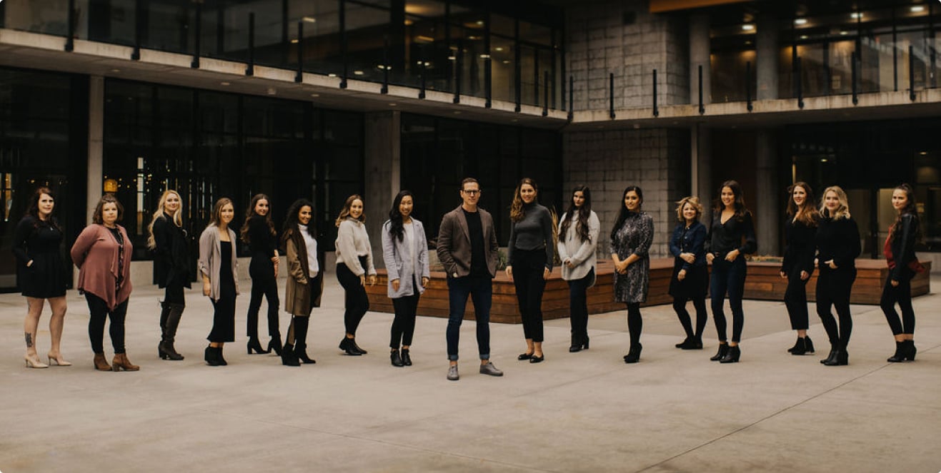
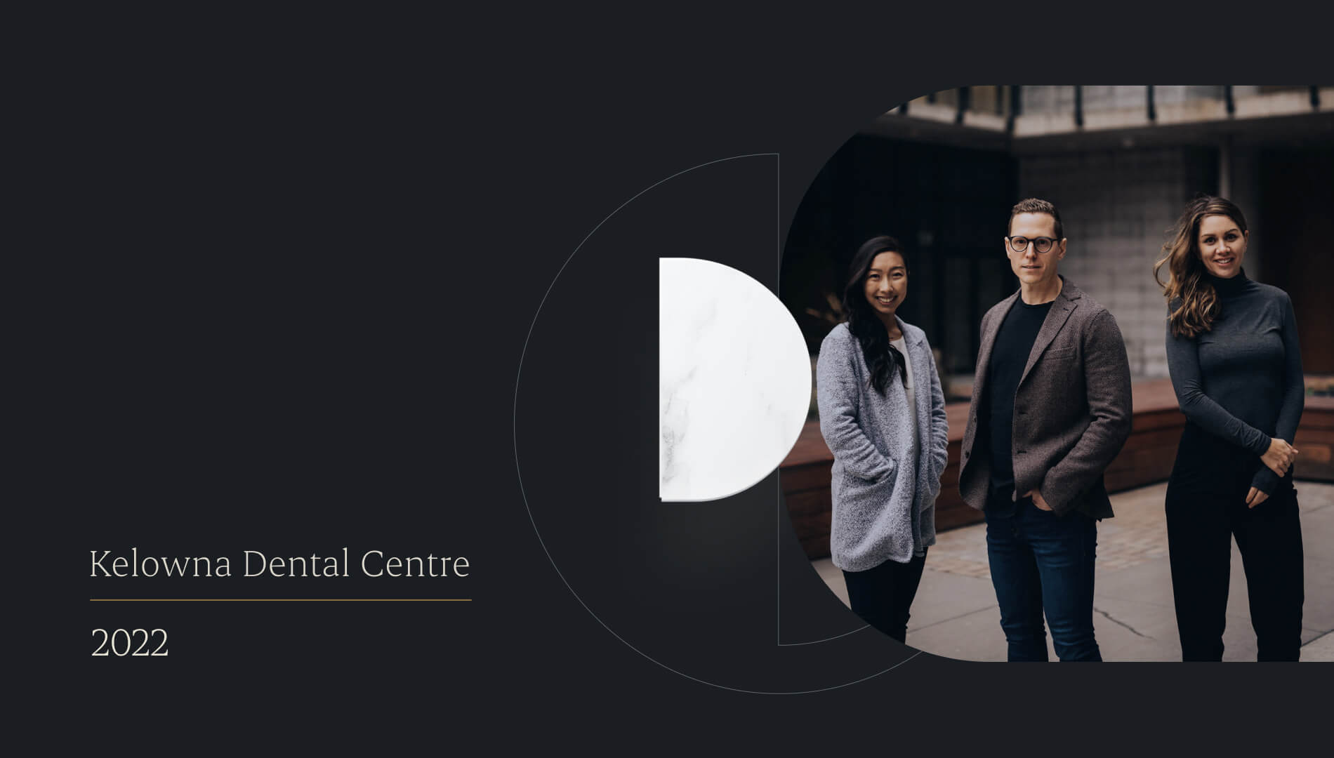
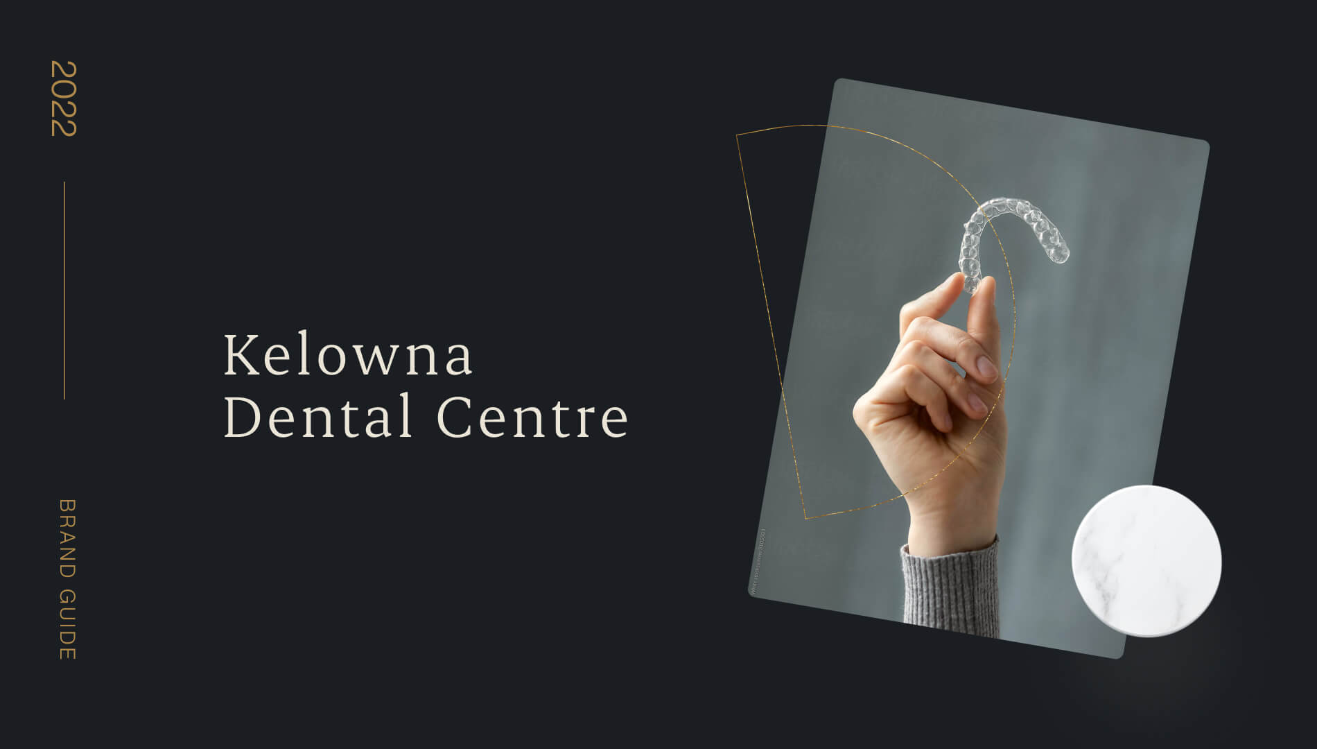
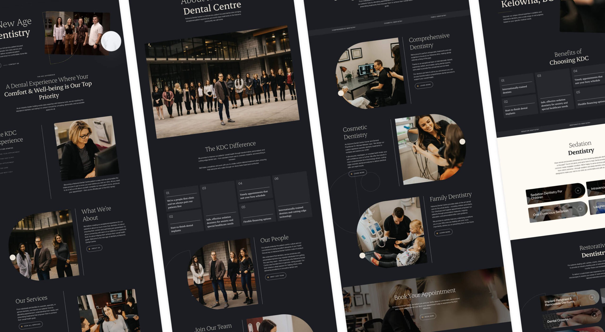
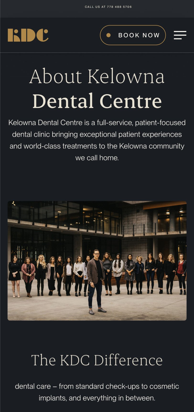
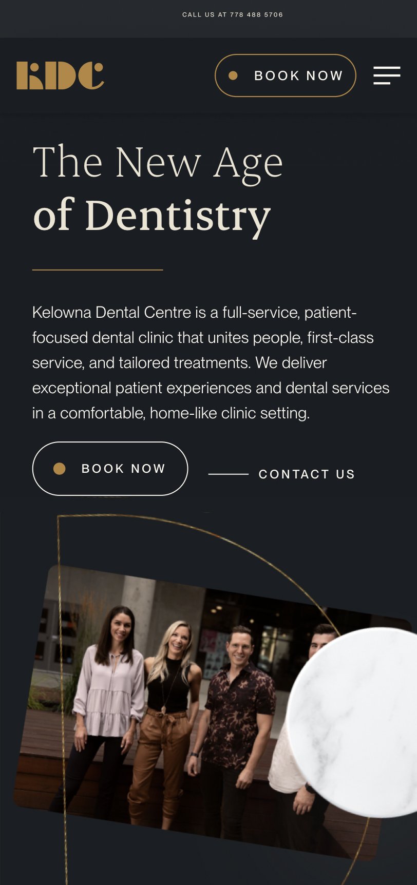
Kelowna Dental Centre (KDC) is a forward-thinking dental practice specializing in cosmetic dentistry. Known for delivering exceptional customer experiences, KDC has consistently doubled its production over recent years and aimed to replicate this success. With a bold vision, they embarked on a project to renovate their facilities, expanding from 10 to 15 operatories, while recognizing that their brand and website no longer aligned with their premium services and rapid growth. They needed a sophisticated, cutting-edge identity to match their ambitions, and they came to us to make it happen.

Understanding that KDC isn’t just another dental practice but a leader in the industry, we took the time to immerse ourselves in their world. Through conversations with their leadership, it was clear that they wanted to break free from the traditional, sterile perceptions of dentistry. Their CEO, Mike, a self-described risk-taker, encouraged us to push boundaries and create a brand and web presence that reflected their modern, passionate approach to dentistry.
Strategically, we aimed to position KDC as the premier choice for patients seeking both cutting-edge dental technology and an unparalleled experience. To do this, we analyzed competitors, customer behaviors, and trends in cosmetic dentistry. The insights led to a branding and digital strategy that emphasized luxury, innovation, and trust—key attributes for attracting both anxious patients seeking sedation dentistry and affluent individuals investing in their dental health.
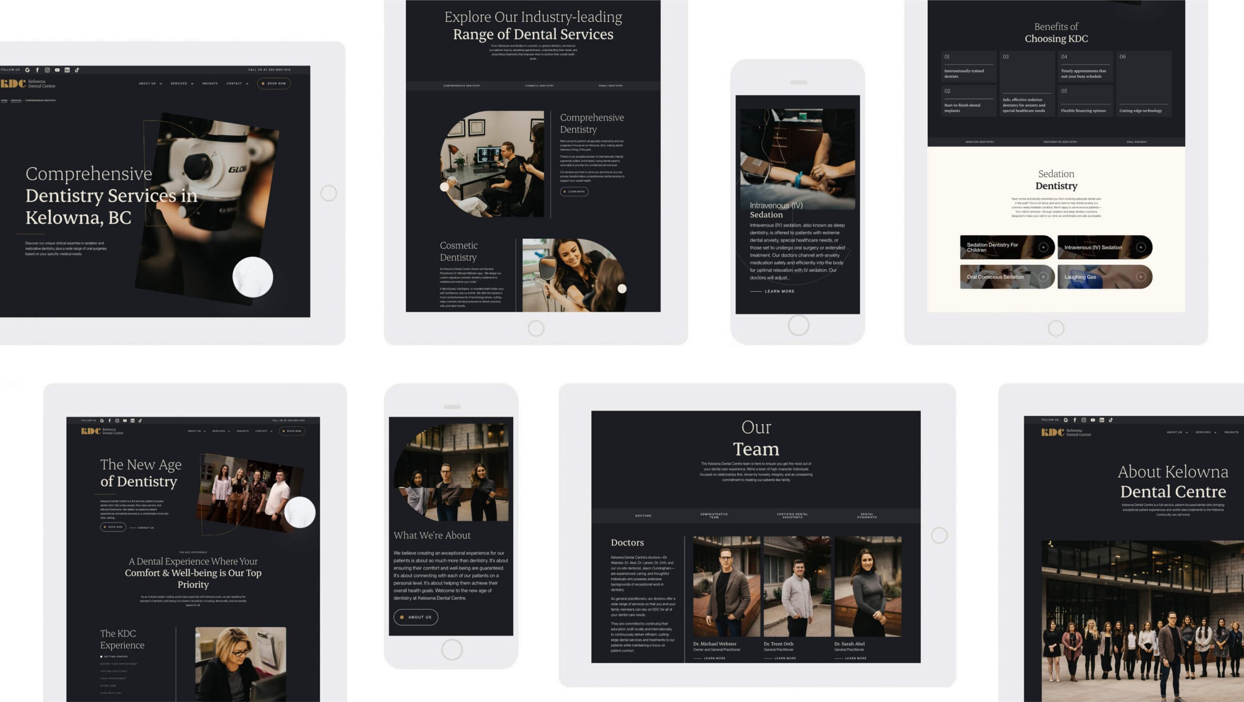
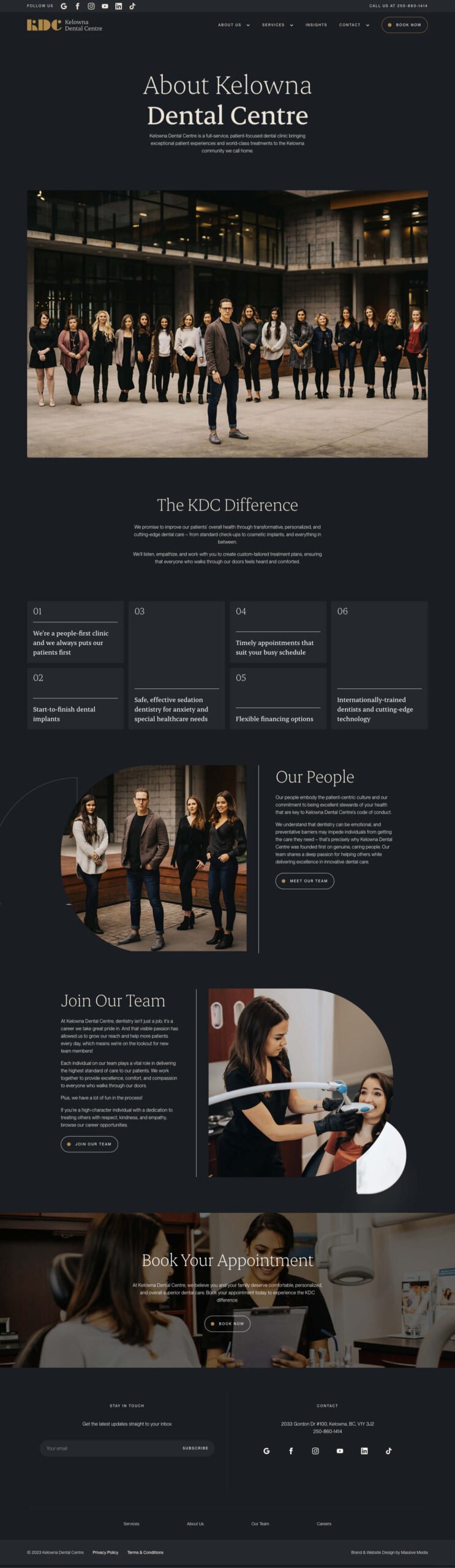
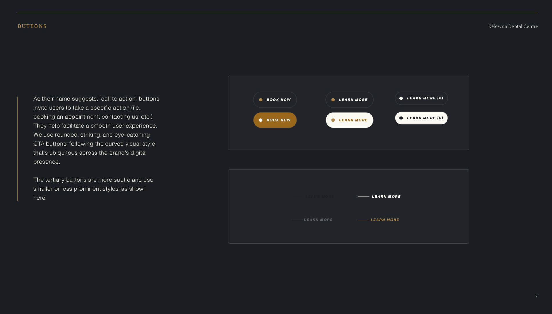
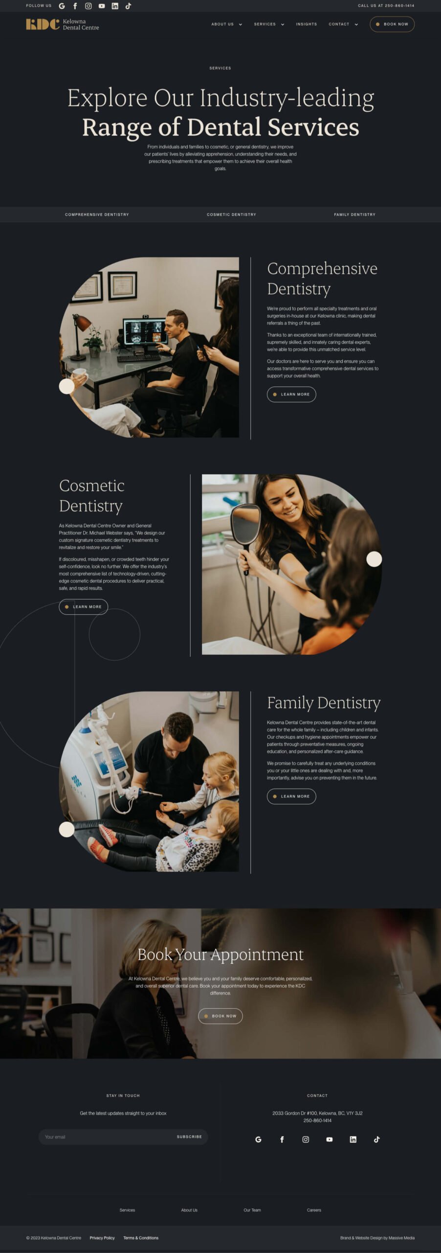
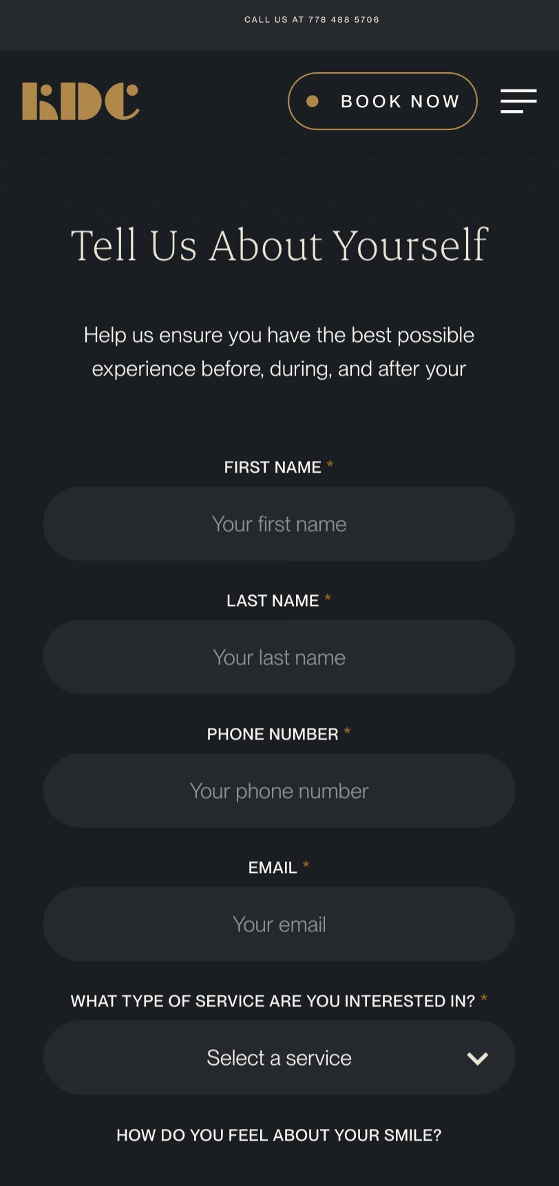
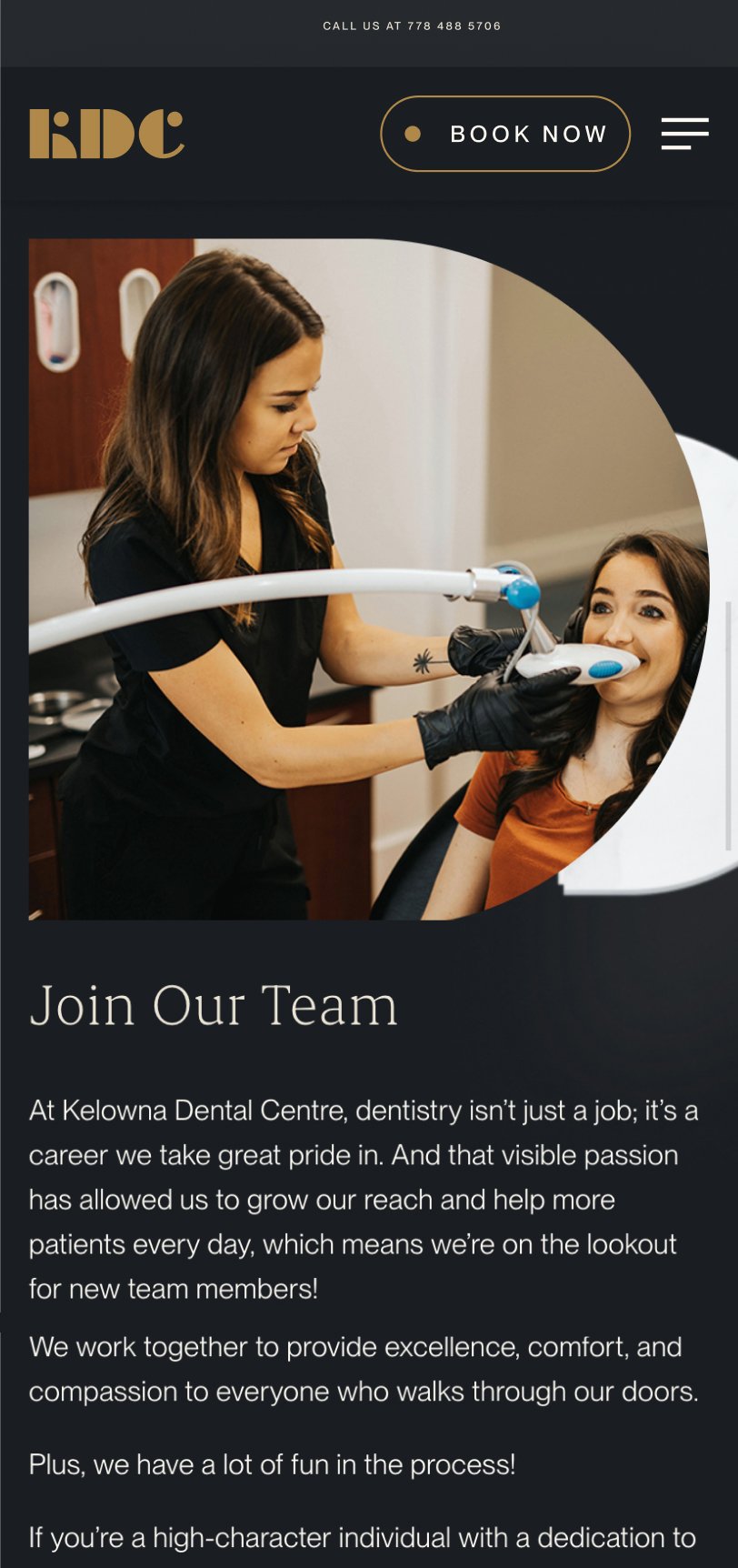
For KDC’s website, user experience was paramount. We designed an experience that was as comfortable and reassuring as a visit to their office. The site was optimized to guide users through seamless journeys, from exploring their advanced services to booking appointments. Every interaction was carefully considered, with thoughtful animations, parallax effects, and buttery-smooth transitions that conveyed a sense of sophistication and care. SEO-optimized landing pages ensured that prospective patients could easily discover the practice’s unique offerings, while integrated surveys and forms allowed for efficient customer feedback.
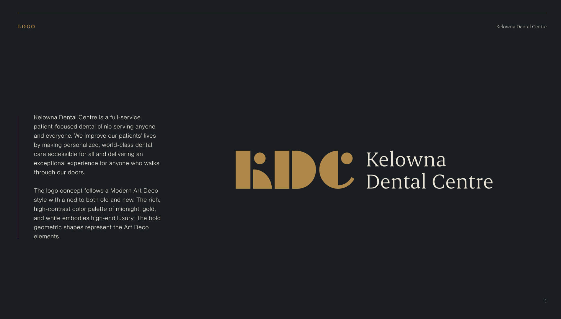
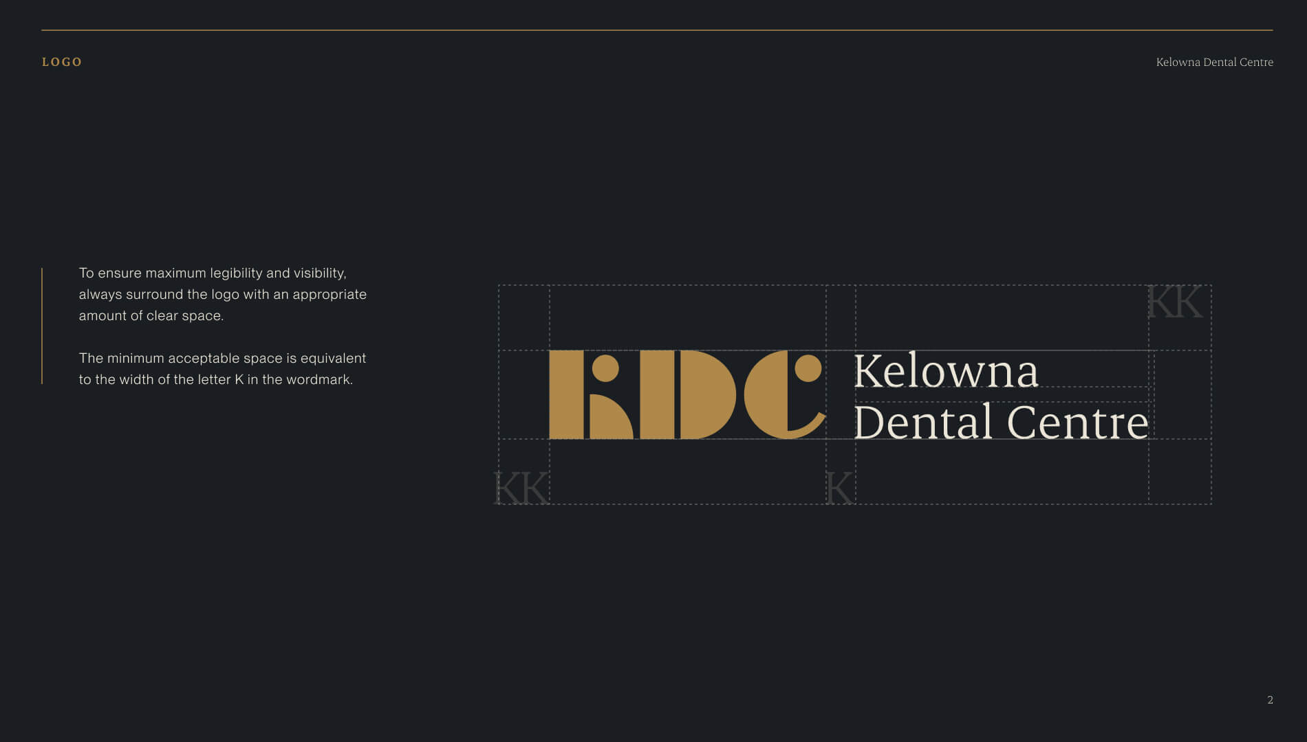
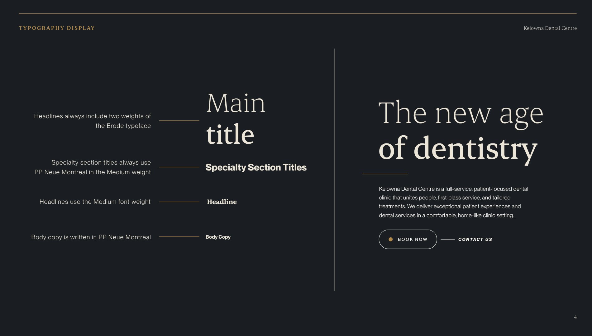
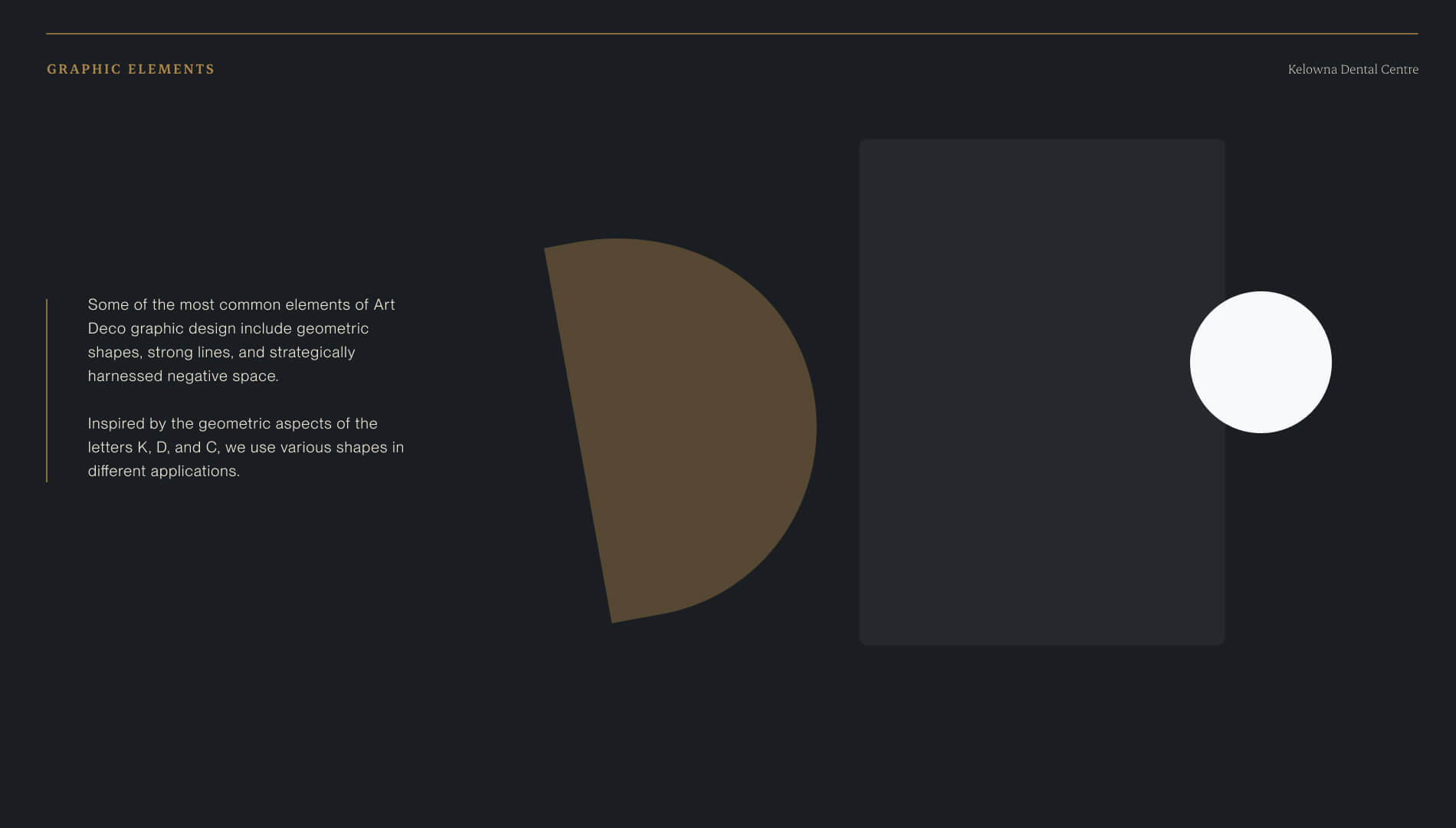
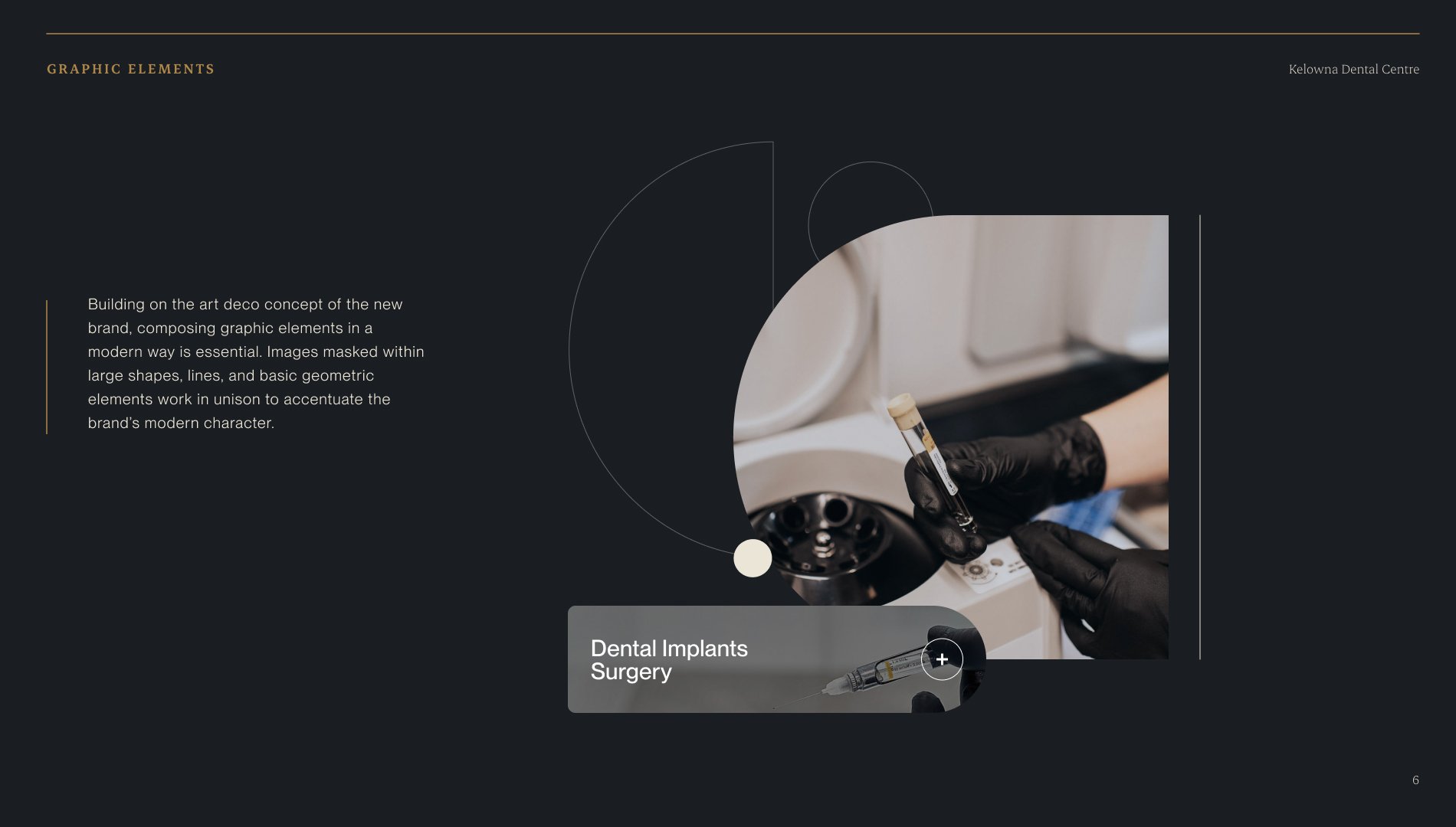
Inspired by brands like BMW, we set out to craft a visual identity that exuded luxury and precision. The new KDC brand prominently featured a bold logomark—“KDC”—paired with a rich color palette of gold and dark navy blue. A marble texture added depth and elegance, reinforcing the high-end perception of their services. This fresh, cool aesthetic carried through the website and marketing materials, ensuring a cohesive and impactful brand presence.
KDC’s boldness extended to its digital presence, where unconventional yet refined elements stood out in an industry known for conservatism. This willingness to go beyond the ordinary positioned them not only as a dental provider but as a lifestyle choice for those valuing quality and care.
KDC’s website was built on a custom WordPress theme, adhering to WCAG 2.1 AA accessibility standards to ensure an inclusive experience. The technical foundation was crafted for optimal performance, with fast loading times and flawless interactivity across devices. Advanced SEO tools and a robust content management system allowed KDC to maintain their growing blog and organic content strategy. Google Ads integration and dynamic landing pages further enhanced their campaigns, driving traffic and conversions with precision.
The results speak for themselves. KDC’s revamped brand and digital presence elevated them to a new level of industry recognition. Website engagement metrics showed a significant increase in traffic, time spent on site, and conversions. The updated brand resonated with their diverse audience, from families seeking a dependable family dentist to affluent individuals exploring cosmetic dentistry. KDC’s investment in their brand and web presence reinforced their position as the best in the business, separating them from competitors and setting the stage for continued growth.
Common questions about healthcare website projects, answered from experience.
A healthcare organization should consider a rebrand when there’s a meaningful gap between what the organization has become and what its brand communicates.
That gap shows up as difficulty recruiting staff who don’t recognize the organization from its public presence, patient confusion about available services, fragmented brand architecture after a merger or expansion, or a strategic pivot the existing identity can’t carry.
A rebrand isn’t always the answer, though. Sometimes the issue is messaging clarity or visual consistency, not positioning. We start by diagnosing which problem actually exists before recommending scope.
The work we did with CMHA North + West Vancouver was a structural and digital overhaul, not a repositioning. The work with Community Action Initiative required a full brand strategy and visual identity because stakeholders were confused about the organization’s name, mission, and distinct role. Two different diagnoses, two different scopes.
A healthcare website redesign project starts by defining the user journeys that matter most: finding care, understanding services, building trust, and taking action, all with minimal friction (especially on mobile devices, as telemedicine becomes more widely used and expected). We typically map high-intent tasks first, then reshape information architecture and templates so critical decisions are clear and fast. For Prenuvo, a preventative cancer screening startup, the site was structured around distinct audience needs (patients, doctors, employers) and designed to reduce fear, minimize jargon, and improve content findability for users.
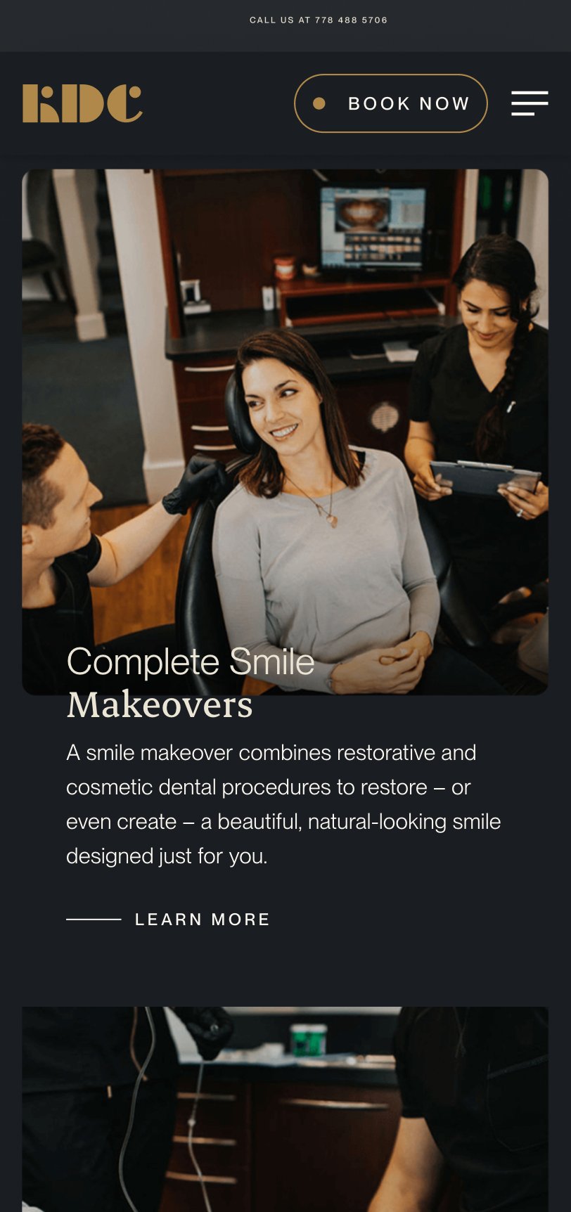
Healthcare websites that are easy to navigate prioritize real user intent, using strong logical information hierarchy, consistent page templates, and search functionality to handle depth without bloating top-level menus. The goal is always to help users quickly self-identify, then drill down confidently into the most relevant content for them through predictable pathways. For Evergreen MD Aesthetics, a medical aesthetics clinic, website navigation and structure were organized around “concern areas” so visitors could find relevant treatments without needing insider knowledge of clinical categories or complex medical products.
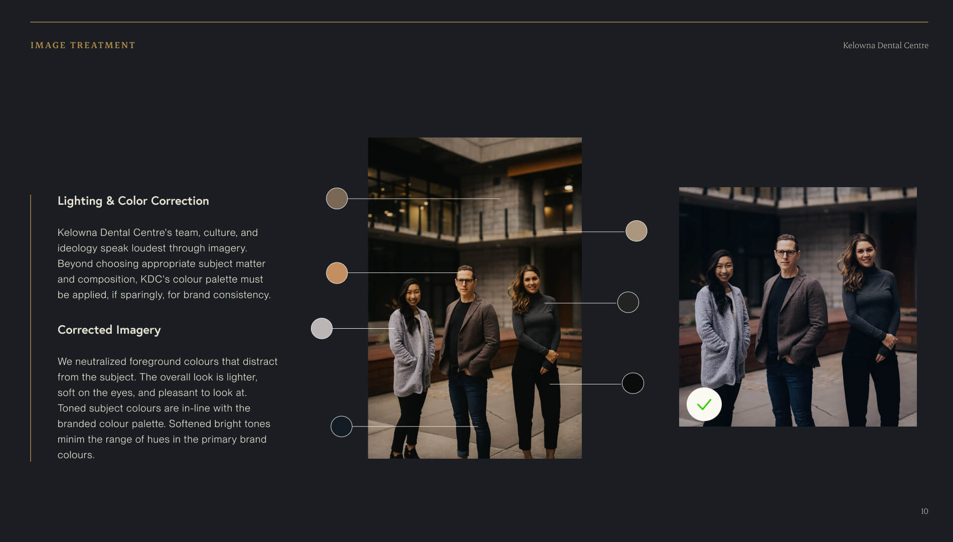
A healthcare website’s mobile user experience improves most when templates are built responsively at the component level, navigation is simplified, and content is structured to support scanning and quick actions. Performance and readability need to be validated during build, not retrofitted after launch. For Kelowna Dental Centre, the site was rebuilt to deliver a clean, conversion-ready experience across devices, with accessibility and performance treated as core UX requirements.
Success for healthcare website redesigns is measured through real outcomes tied to user intent: discoverability (organic visibility, SEO), engagement quality (time, depth, ease of action), and meaningful actions (calls, form submits, bookings, resource downloads). Then instrument analytics around those tasks so you can prove impact and keep improving post-launch. For Evergreen MD Aesthetics, the website redesign’s success was measured by concrete lifts in engagement and acquisition metrics, including increases in session duration, call volume, and organic traffic.
Clinical credibility comes from specificity, not jargon: naming what a service does and what outcomes it produces in language real people can follow. Warmth comes from how the brand frames that science in relation to the person receiving care. When both work together, clinical detail actually makes the brand feel more human, because it signals that the organization takes its patients seriously enough to be precise.
In practice, this shapes decisions across the entire brand system: messaging hierarchy, visual tone, typography, imagery, and the language used in patient-facing content. The goal is never to strip out the science. It’s to make the science feel like it belongs to the patient, not just the clinician.
We’ve navigated this tension across very different healthcare contexts, from Medtronic LABS (global health innovation speaking to government partners and underserved communities) to Evergreen MD Aesthetics (a physician-led cosmetic clinic in a crowded consumer market).