Primasun
Google-backed Primasun and Takt launch a new website on the eve of a new product launch. The result: a 3-time award-winning, category-defining website.

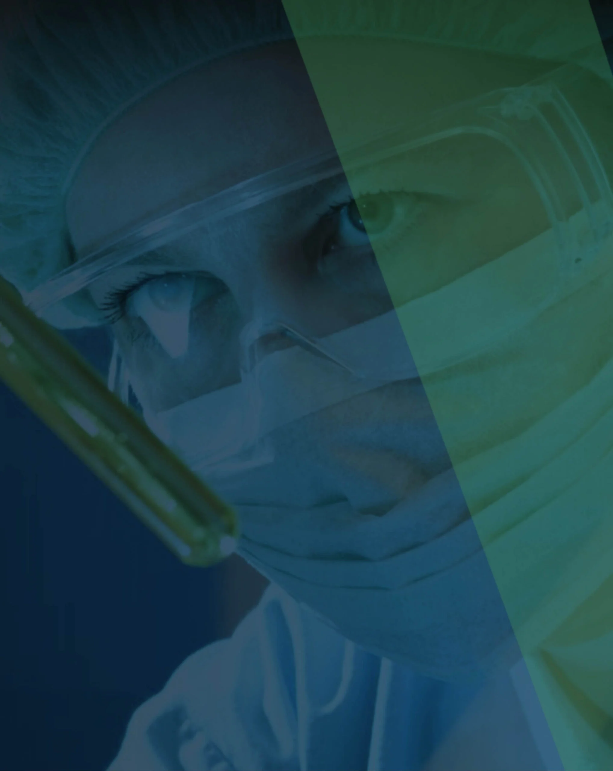
Fueling Global Health Innovation: Crafting a Bold Brand Identity for Medtronic LABS
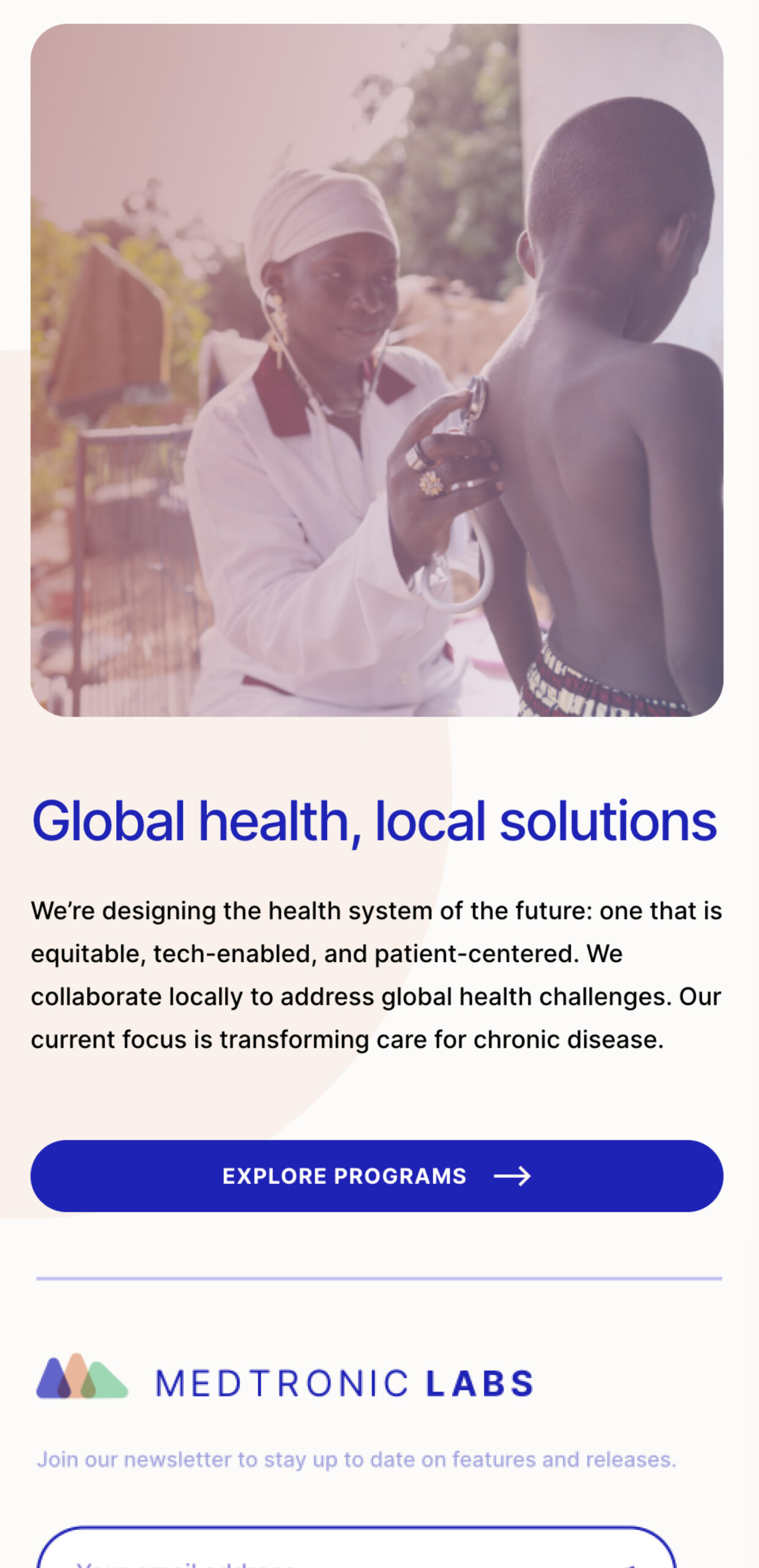
Medtronic LABS engaged us as a sincere, extraordinarily determined development organization with a noble vision that matched its mission to transform global health. Off the bat, you know this one hit home, given how closely their “Why” aligned with our own. After all, we’re a brand + experience design agency for those with ambition – something Medtronic LABS possesses in spades.
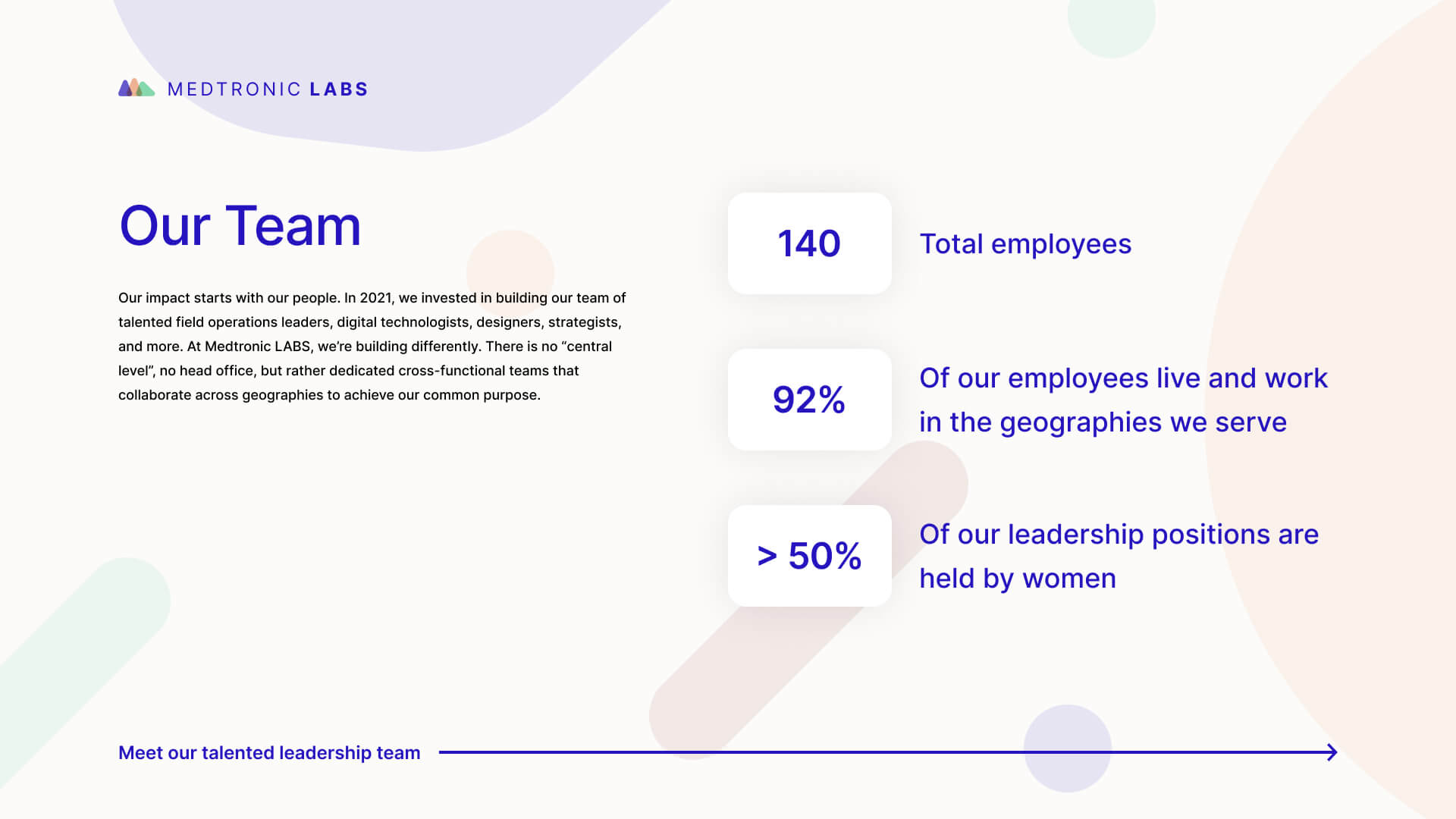
And as a quickly growing team with high hopes for the future, Medtronic LABS found itself at a critical junction in its story. They had an industry-leading team. They had efficacious, retrofittable proprietary medical technologies. They had on-the-ground healthcare processes in place. But they needed a distinct digital presence to help facilitate their organizational growth and be the fuel of their partnership development strategy for years to come.
Pro-tip for brand shops out there: when you’re engaged by an organization as genuinely extraordinary as Medtronic LABS to help them craft the foundational components of their company’s identity, just say yes – right away. This one was so much damn fun, with a special purpose to boot.
Keep reading to see how Takt set Medtronic LABS up for a vibrant future spearheading disruptive innovation in global health through a thoughtful, value-driven, and progressive brand identity they could leverage right away and grow into as the organization evolved.
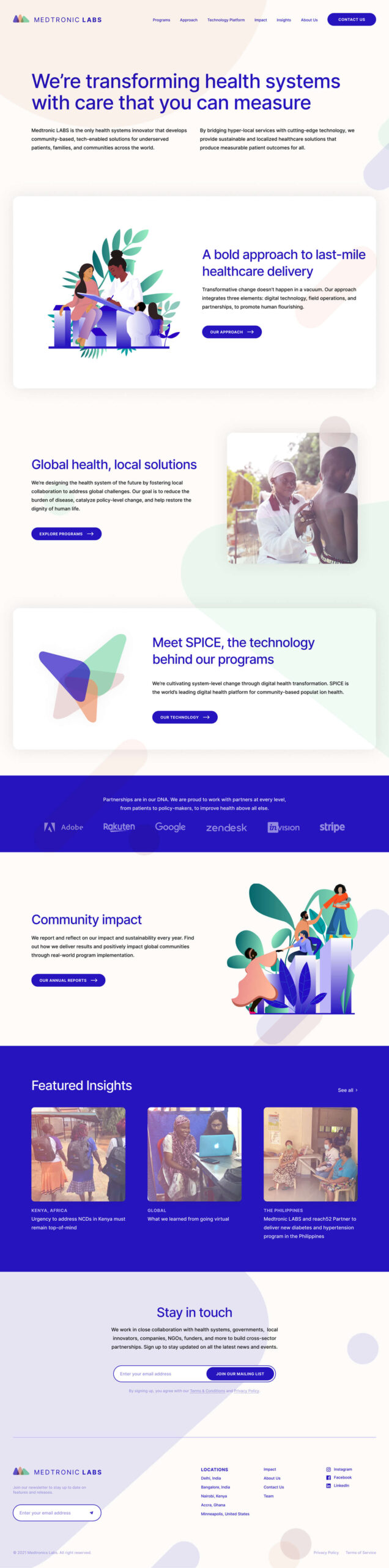
Where do you start building a brand for an organization as complex and humanistic as Medtronic LABS? For us, it began with a deep dive into its company values.
Throughout our discovery process, our writers and designers dove into the nitty-gritty of LABS’ organizational purpose, unique differentiators, and value propositions so that we could construct the foundation for their new identity.
Comprehensive workshops and stakeholder interviews gave Takt the ammo it needed to pinpoint the three core tenets that defined Medtronic LABS:
Pioneering – The work Medtronic LABS was doing was completely novel. Never before had an organization possessed both the technological expertise and relationship-building prowess to reshape global healthcare.
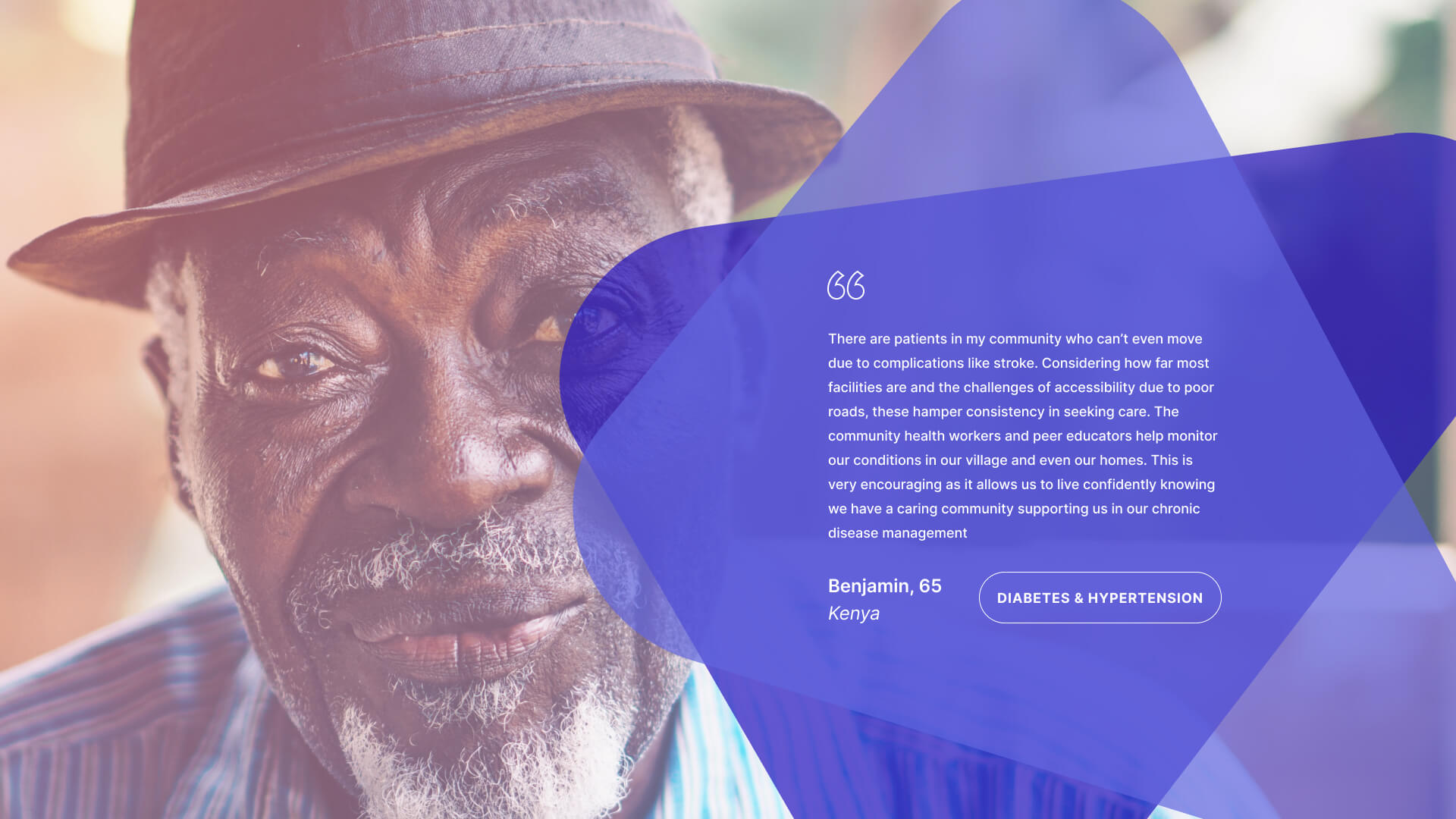
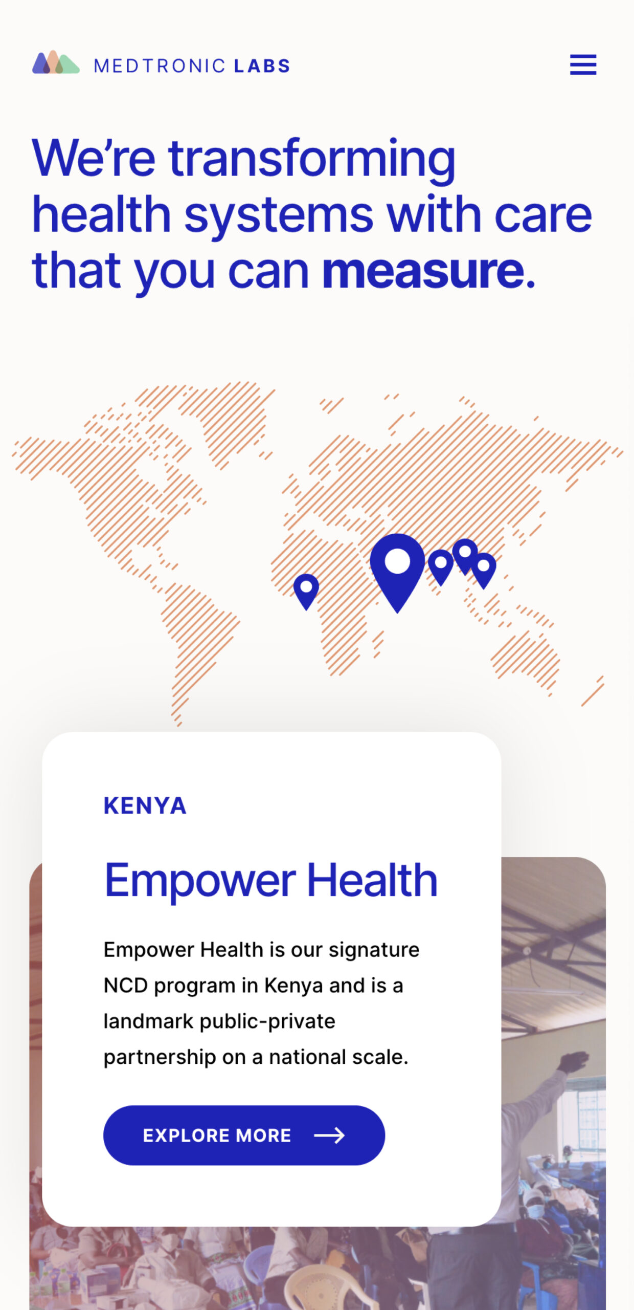
Collaboration – One of the organization’s core strengths is facilitating collaborative action, including leveraging connections between government health agencies and local communities to foster positive outcomes for underserved patients.
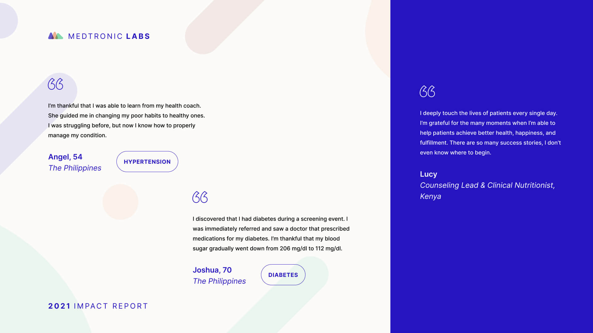
Empathy – At its core, the Medtronic LABS team was powered by empathy – a shared understanding that equitable healthcare should be a fundamental human right, not a matter of where a person is born.
“From our first interactions with the Medtronic LABS team, their energy and enthusiasm inspired us. Our goal was to build them a brand that meaningfully encapsulated their purpose, and one they could evolve with into the future.”
Ryan Aceman, Lead Brand Strategist
To build a cohesive brand identity, our quest became to merge LABS’ foundational messaging pillars to a visual system worthy of underpinning the organization’s digital presence.
Our design process began by examining thematic symbolism, shapes, and imagery related to the organization’s core values that we learned about during our discovery phase.
Our objective was to create a visual identity that fostered a sense of openness, warmth, vulnerability, and optimism by harnessing rudimentary building blocks that, when layered cohesively upon each other, could meaningfully—and beautifully—embody Medtronic LABS:
The triangle as a symbol of pioneering: representing manifestation, enlightenment, revelation, and an innovative approach. Triangles are often used to mark cycles of growth that lead to a higher state of being.
The pentagon as a symbol of convening power: an asymmetrical representation that connotes multilateral, international relationships and LABS’ ability to build bridges over previously uncrossed social moats.
The circle as a symbol of empathy. A universal representation of totality, wholeness, the self, the infinite, and movement. Also as a literal representation of the world, or the global representation of LABS’ influence.
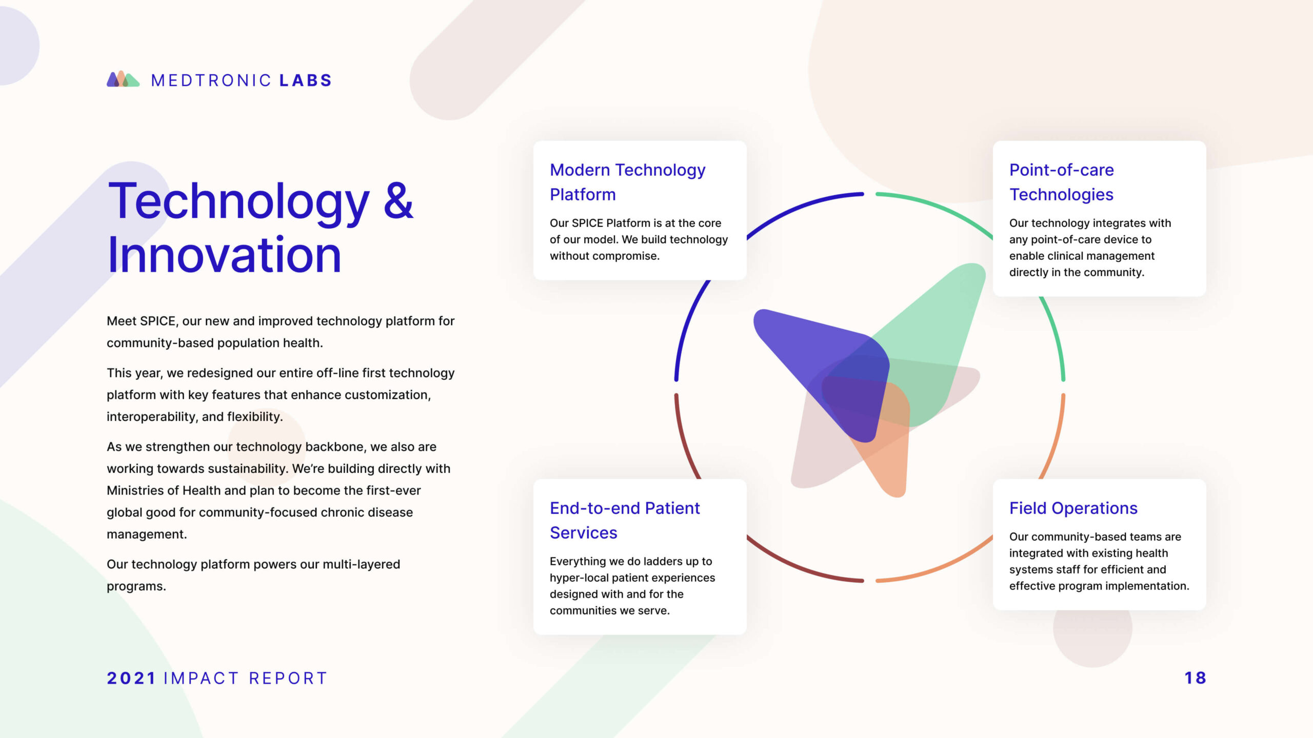
With the foundations of Medtronic LABS’ visual identity set, we were off to the races. Our design team got to work on strategically amplifying their fresh visual system—plus a new logo—in web form.
We started by constructing an overlapping, mountainous emblem to nurture the brand’s underlying themes, and represent a couple of indispensable components:
Transparent layering across the website’s key pages was harnessed to evoke the embedded trust LABS’ earns with their partners, the communities they serve, and the global health sector as a whole.
Deliberate color choices merged sentiments of earthiness and liveliness, facilitating a visual website experience rooted in nature: green, blue, and sandy colors felt appropriately modern for the technology-first company they are while being human enough to remain centrally connected to their mission.
Font-wise, we opted for a generic, accessible font – so that no matter where their users are accessing the site, main messaging and calls to action remain crystal clear.
Common questions about healthcare website projects, answered from experience.
A healthcare website’s mobile user experience improves most when templates are built responsively at the component level, navigation is simplified, and content is structured to support scanning and quick actions. Performance and readability need to be validated during build, not retrofitted after launch. For Kelowna Dental Centre, the site was rebuilt to deliver a clean, conversion-ready experience across devices, with accessibility and performance treated as core UX requirements.
WCAG 2.1 AA compliance includes accessible components and templates, adequate contrast, keyboard navigation, screen-reader support, and consistent interaction patterns that remain accessible as content scales. The practical win is governance: accessibility holds because it’s baked into the system, not dependent on one-off page fixes.
A healthcare brand strategy has to earn trust before it can earn attention. Patients, caregivers, partners, and referring professionals, for example, expect signals of safety, credibility, competence, and care, often while navigating stress, uncertainty, or highly personal decisions.
Our approach starts with the organization’s specific trust-building architecture: who the key audiences are, what reassurance looks like for each, and where perception is misaligned with reality. That work is grounded in research, whether that means stakeholder interviews and value-definition workshops, competitive review, audience and behaviour analysis, or a bespoke combination of these mechanisms, depending on the project’s unique goals and context.
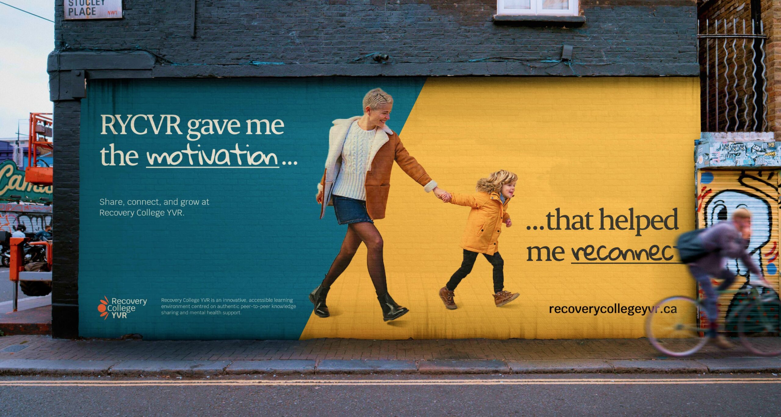
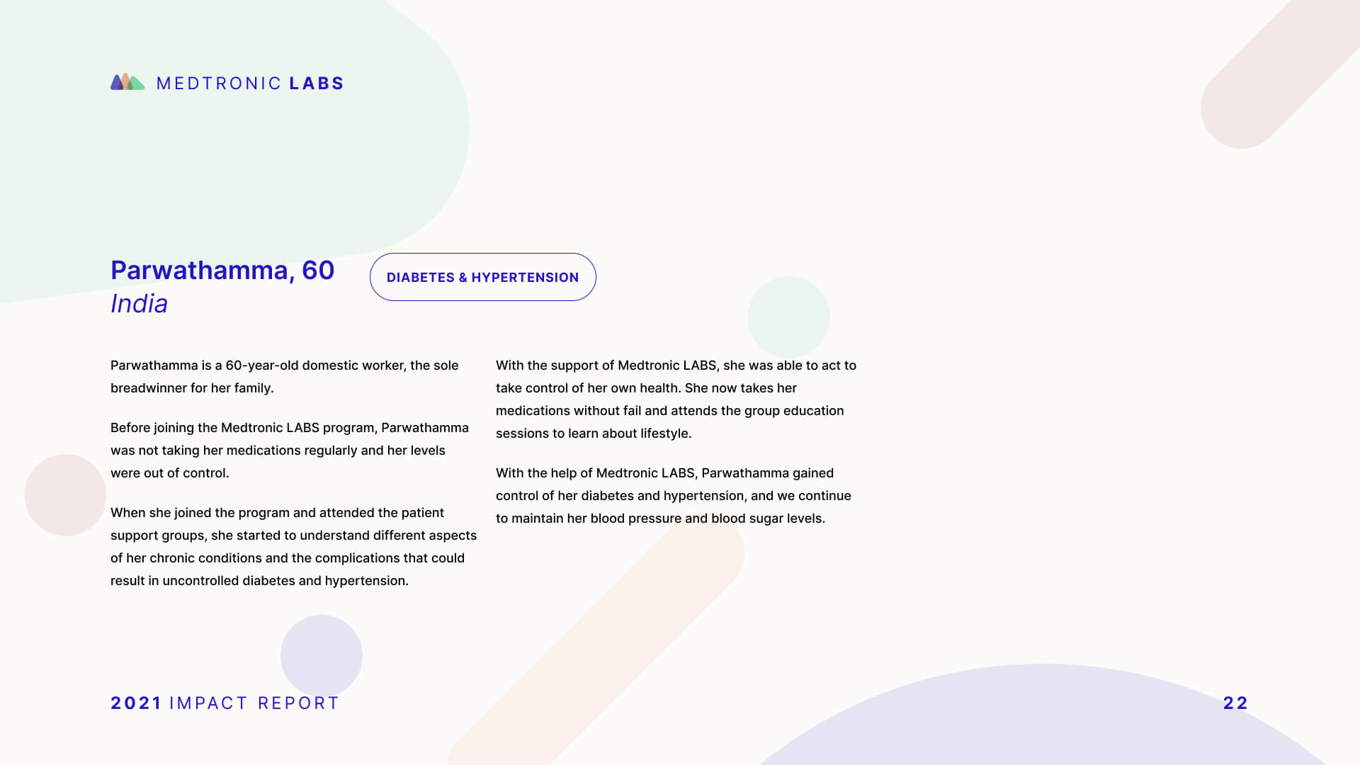
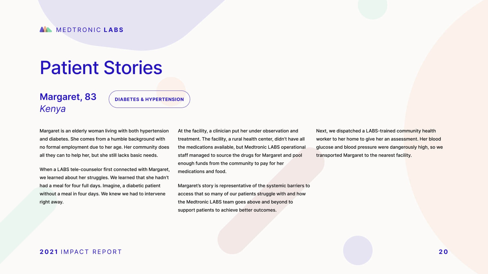
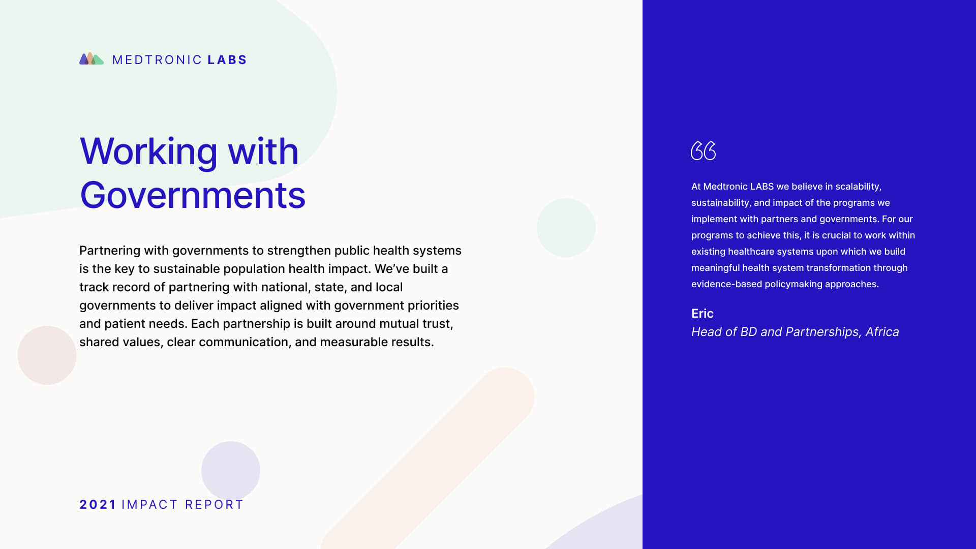
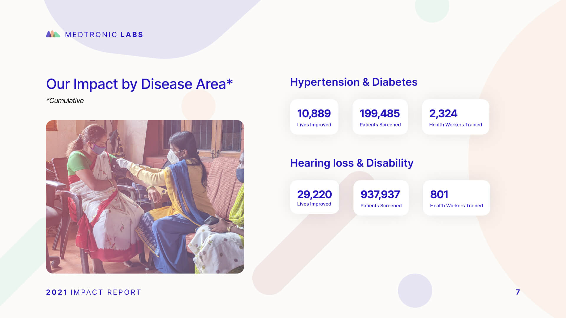
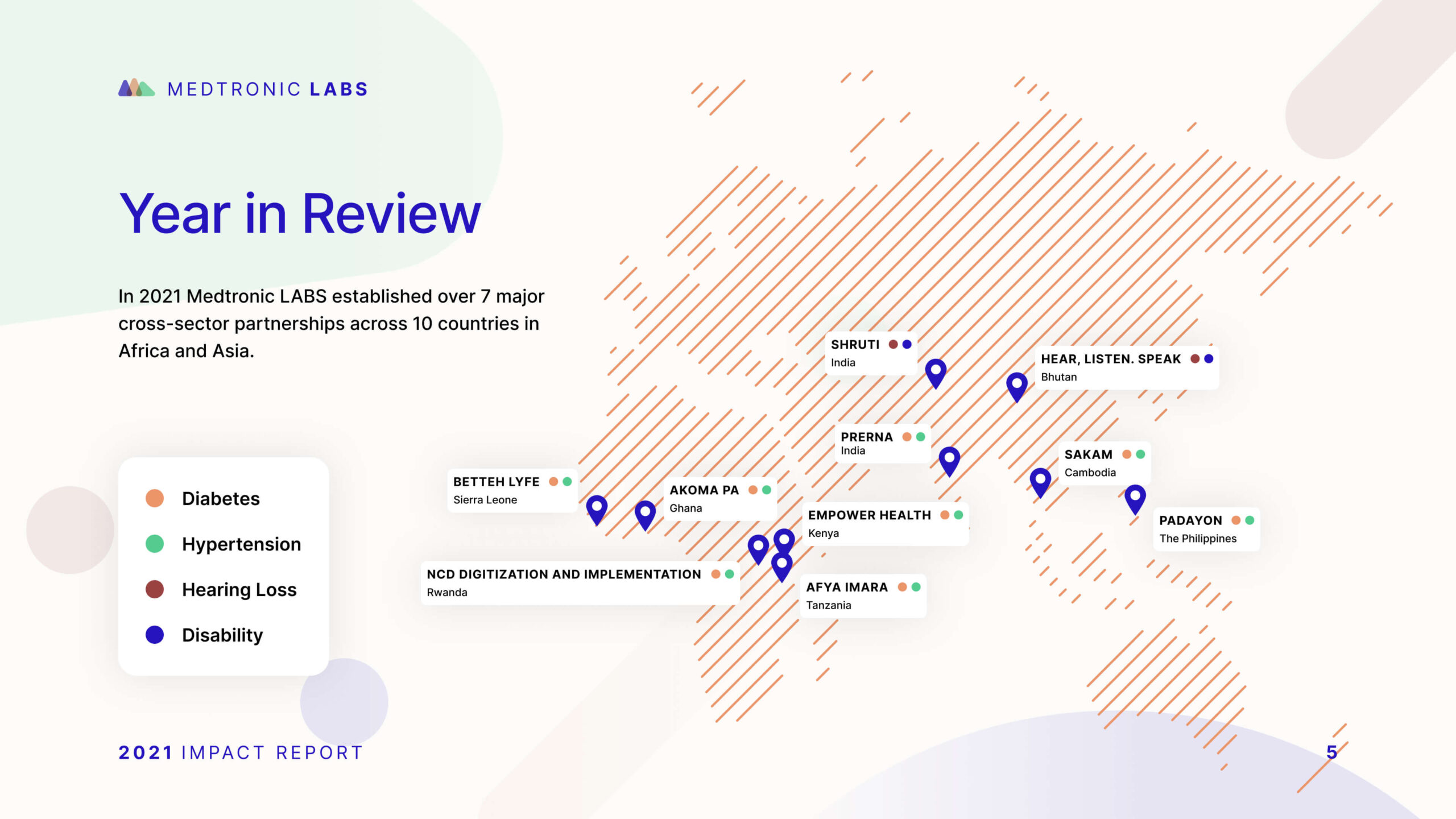
It also means recognizing that “healthcare” is not a single audience or emotional context. Recovery College YVR needed a brand that felt inclusive, real, and community-led, as opposed to clinical or institutional, which led to the narrative “Real people. Sharing. Learning.” Community Action Initiative, by contrast, needed brand strategy and messaging that clarified its mission and distinct role in British Columbia’s mental health and addiction landscape after confusion around its name and purpose. For Medtronic Labs, that meant using workshops and stakeholder interviews to clarify core values such as pioneering, collaboration, and empathy for a global health innovation organization.
The common thread is that healthcare branding works best when it translates complexity into trust, and when the strategy is precise enough to reflect how people actually experience care, support, solutions, and/or wellness.
Most healthcare organizations serve several audiences simultaneously: patients, clinicians, caregivers, funders, referral partners. The brand has to work for all of them.
Most healthcare brand work fails here because it’s either built for one audience and ignored by the others, or diluted into something too generic to connect with anyone. We solve this by mapping each audience before we touch the brand: what questions they’re asking, what emotional state they’re in, what proof points move them.
From there, we build a core position that holds across all groups, paired with a messaging framework that shifts tone, emphasis, and evidence by audience without fracturing the identity underneath.
The information architecture follows the same logic, giving each audience a distinct pathway to the content that matters to them. We’ve applied this approach across organizations like Prenuvo and CMHA North + West Vancouver, each with very different audience configurations but the same underlying challenge.
Clinical credibility comes from specificity, not jargon: naming what a service does and what outcomes it produces in language real people can follow. Warmth comes from how the brand frames that science in relation to the person receiving care. When both work together, clinical detail actually makes the brand feel more human, because it signals that the organization takes its patients seriously enough to be precise.
In practice, this shapes decisions across the entire brand system: messaging hierarchy, visual tone, typography, imagery, and the language used in patient-facing content. The goal is never to strip out the science. It’s to make the science feel like it belongs to the patient, not just the clinician.
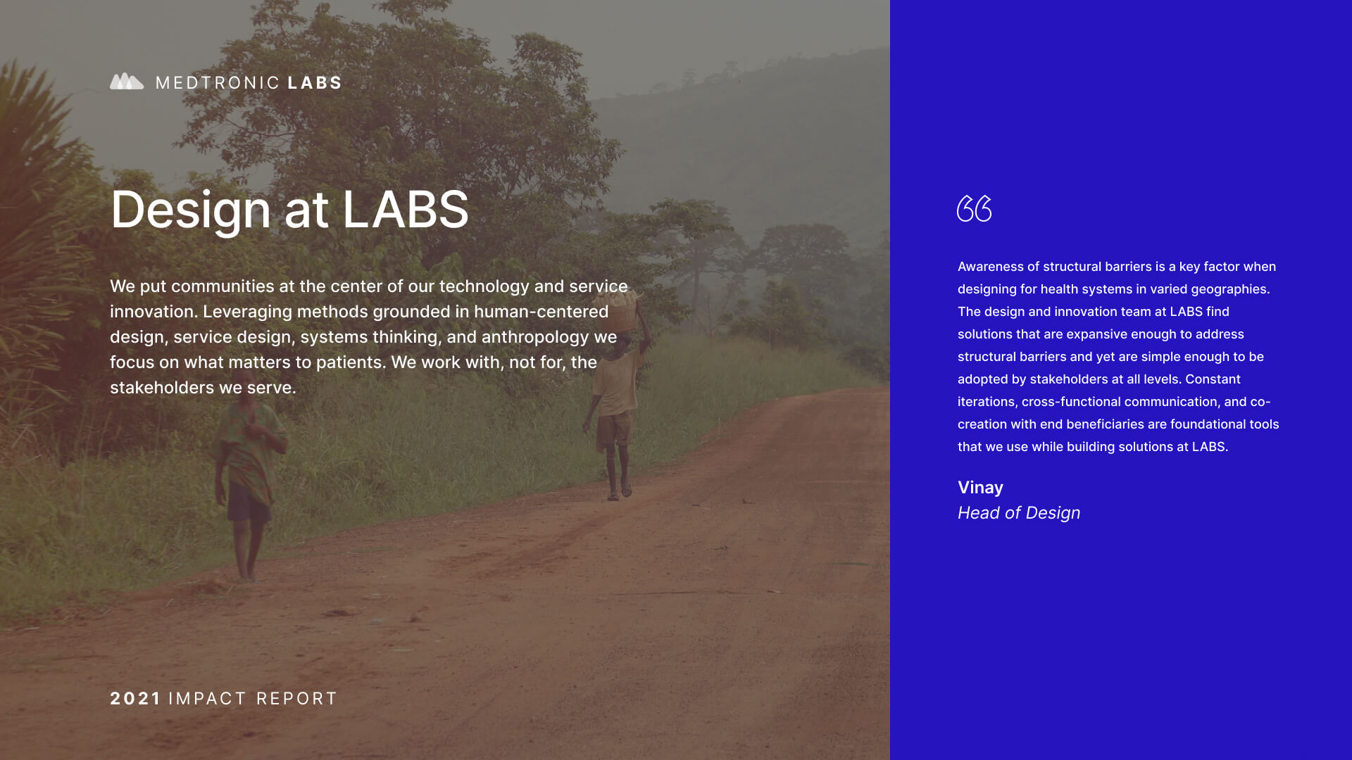
We’ve navigated this tension across very different healthcare contexts, from Medtronic LABS (global health innovation speaking to government partners and underserved communities) to Evergreen MD Aesthetics (a physician-led cosmetic clinic in a crowded consumer market).
A healthcare organization should consider a rebrand when there’s a meaningful gap between what the organization has become and what its brand communicates.
That gap shows up as difficulty recruiting staff who don’t recognize the organization from its public presence, patient confusion about available services, fragmented brand architecture after a merger or expansion, or a strategic pivot the existing identity can’t carry.
A rebrand isn’t always the answer, though. Sometimes the issue is messaging clarity or visual consistency, not positioning. We start by diagnosing which problem actually exists before recommending scope.
The work we did with CMHA North + West Vancouver was a structural and digital overhaul, not a repositioning. The work with Community Action Initiative required a full brand strategy and visual identity because stakeholders were confused about the organization’s name, mission, and distinct role. Two different diagnoses, two different scopes.
By designing for durability from the start, not treating it as a final-phase deliverable. Most brand erosion doesn’t happen because people ignore the strategy. It happens because the strategy wasn’t built for how the organization actually operates. The translation layer is what matters: proof banks, message hierarchies, narrative templates, writing guidance, and component-level visual rules that give people what they need to execute consistently without interpretation.
For decentralized organizations, the system also needs to define flex zones explicitly (what adapts, what doesn’t, where to escalate) and be embedded in the tools teams actually use, whether that’s a CMS, a design system, or a set of social templates.
The standard we hold every deliverable to: would this still be recognizably this organization with the logo removed? Can someone who wasn’t in the strategy room pick it up and produce something on-brand without asking for help? We’ve built these durable systems for organizations like Adler University, Meraki Resources, and Community Action Initiative.