Go to content

Prenuvo

INTRODUCTION

A New Age of Cancer Screening

Chances are you’ve already been impacted by cancer in some way or another. If not, you’re amongst the privileged few who haven’t yet faced cancer or lost someone to the terribly efficient and prolific disease.

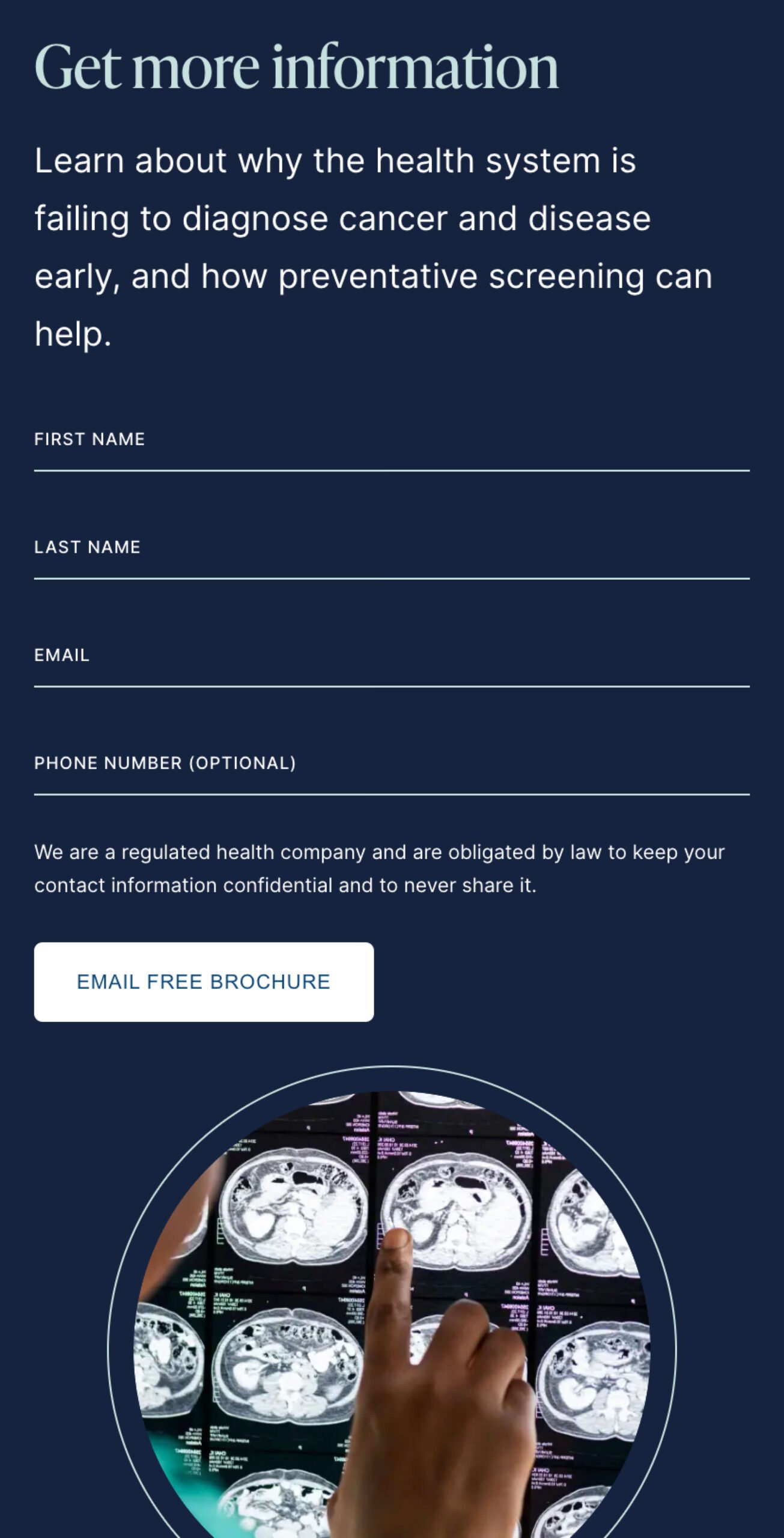
There is a silver lining, however. Research shows most cancers are survivable if detected and treated early on. The catch? The best defence is frequent cancer screening via MRI scans, and MRI scans are expensive. Really expensive.

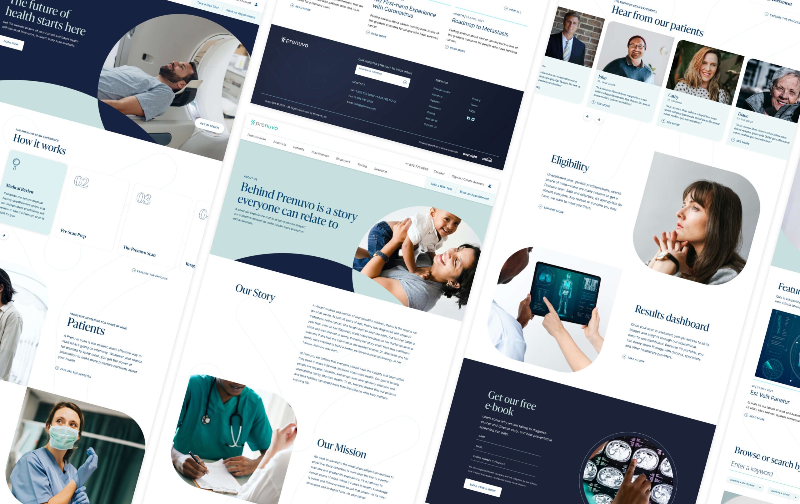
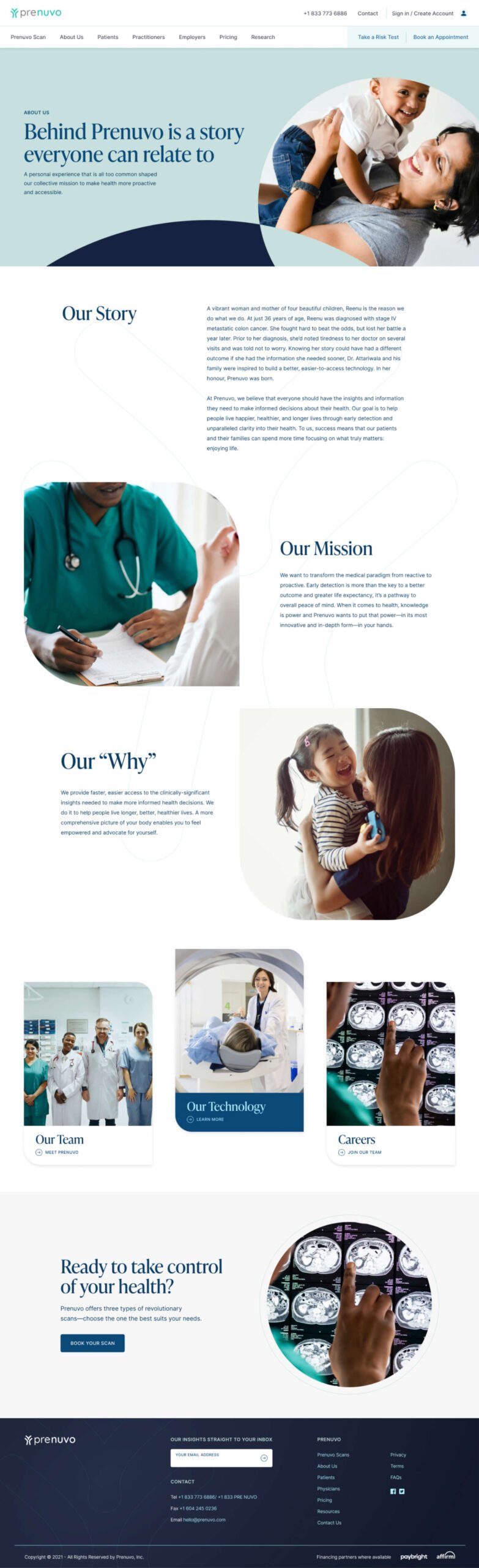
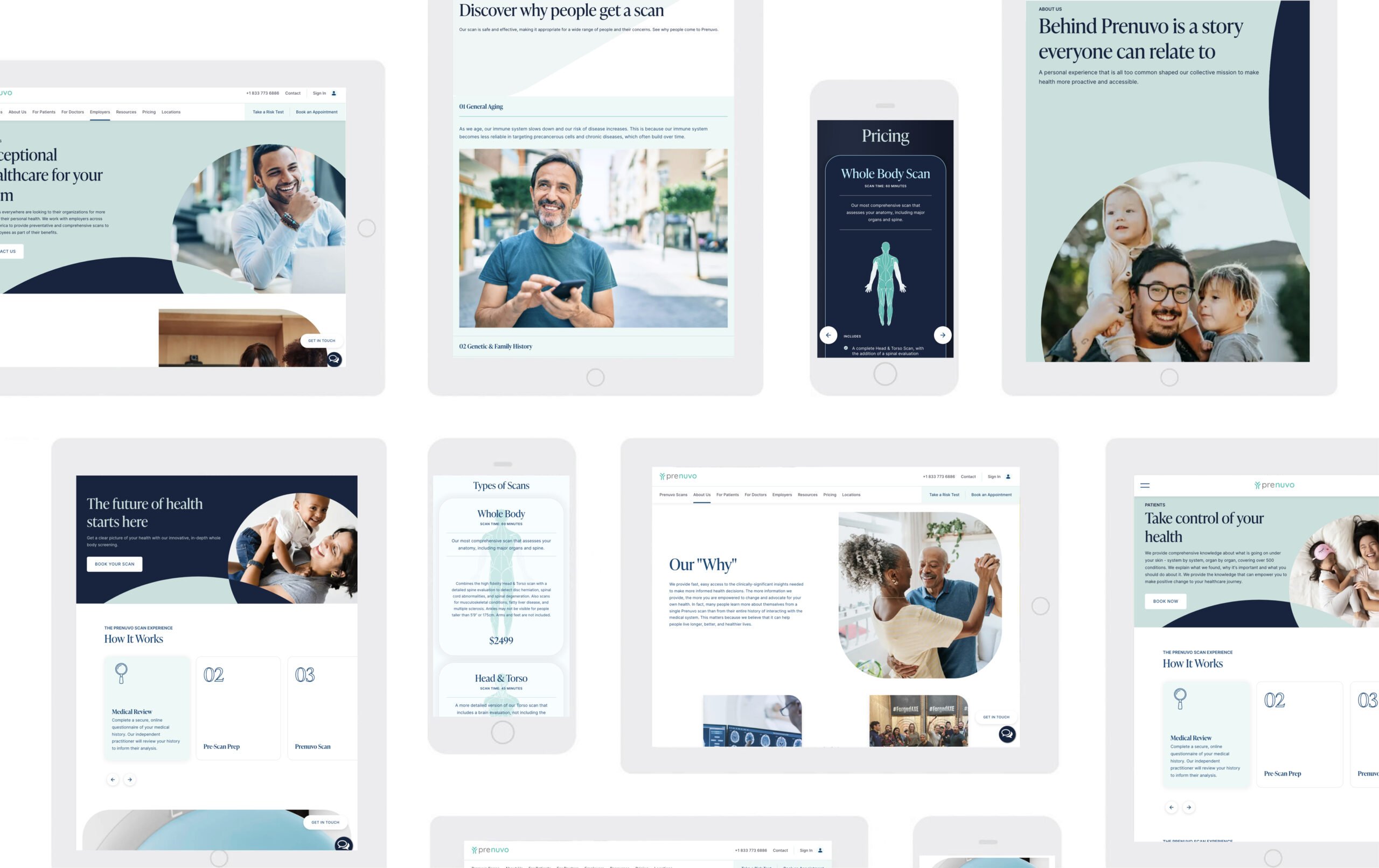
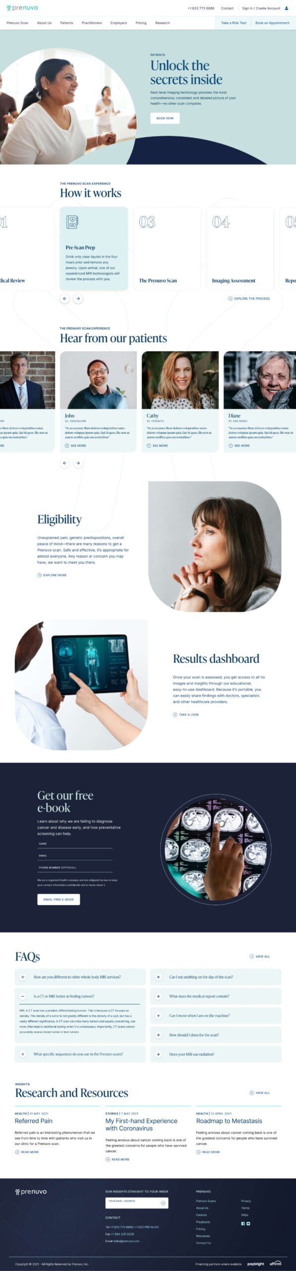
Enter stage left, Prenuvo; a San Francisco-based startup founded by a radiologist on a mission to democratize cancer prescreening by bringing the cost of MRI scans down from $2,500 to $500 per scan; the cost of your annual car maintenance.

With an established product offering, an urgency of purpose, and an ambitious growth plan, Prenuvo came to Takt to help strengthen its brand messaging and craft a website that supported the team’s ambition. Prenuvo’s dream was big – it just needed the presence to match it.

Different Messages for Different Audiences

True democratization requires more than just reducing costs; it means improving physical access. To accomplish its mission, Prenuvo needed to target three key audiences—patients, doctors, and employers with extended health plan providers, each with different content and information requirements.

For patients, Prenuvo needed to address concern, fear, and uncertainty without playing into their users’ understandable anxieties. No “sad-vertising”, as Prenuvo put it. This audience needed the information to be easy to understand and not riddled with medical jargon and acronyms.

Reversely, Doctors—an inherently skeptical bunch—needed the ability to vet Prenuvo’s various scans with vigor, diving into the specifics surrounding their capabilities and the reports they produce afterwards. Finally, employers must understand how these scans could help improve health outcomes for their employees as an integral part of their extended health package.

We mapped the site’s navigation with a clear idea of each persona’s content requirements. We established an information architecture that promoted findability and reduced the number of clicks needed to accomplish a given task. For patients, the layout needed to seamlessly flow through the timeline of Prenuvo’s services, detailing each step of the Prenuvo scan experience methodically and simply.

For doctors, the page layouts facilitated more detailed information. For example, the Risk and Screen page provides the technical specifications, what sets Prenovo apart from other available scans, survival rates, and clinical and medical terminology.

Universally for all users, the “Conditions” pages allowed for easy filtering by organ/body parts, scan type, and cancer type. These filters ensure that users can find the information they need without cluttering their navigation experience.

Designed to Inspire

It would have been easy to establish a creative direction for Prenuvo’s website that speaks to its users’ anxiety and fear. However, this would have been antithetical to the reason Prenuvo exists to begin with; to provide hope, much-needed clarity, a sense of peace, and even control. The design had to speak to Prenuvo’s innovative, approachable, and trustworthy tone and voice.

Without a library of custom photography to pull from, Takt’s team of designers began searching for stock photos that provided context but also centred around vitality and health. An image treatment was created reminiscent of the actual scans, giving the user a sense of looking into something.

Serif headings, paired with a sans serif body font (inter) provide a mix of sophistication and elegance while remaining accessible and approachable. The animations incorporated throughout the site, such as drop-down menus or scrolls, are all smooth and elegant, accentuating the calm and soothing tone that Prenuvo had established.

The custom series of icons we developed is a subtle gem of the site’s design. Whereas the image treatment speaks to how Prenuvo scans offer clarity into your or your patient’s health, the icons provide transparency into the functionality of the scans.


Behind the Scenes

Given the Prenuvo teams’ highly technical background, feature requirements and long-term view of content planning, we decided to build Prenuvo’s website on a headless CMS, which was implemented using Contentful and Gatsby as the frontend framework.

The site’s security was paramount given the medical nature and appointment booking functionality. Deploying the site on Netlify guaranteed the site and its visual elements would run and display smoothly and quickly, without compromising the high-security standards that patients and doctors expect from medical service providers.

RESULTS

A Vision + Website That Looks to the Future

Prenuvo’s new website launched in 2021. Their presence is expanding across North America, and the team at Takt was honoured to play a role in building a website and brand that would carry Prenuvo into the future.

The impact of cancer on our societies and our families cannot be overstated. To have played a role in increasing awareness of and access to preventative care is something we will be proud of for years to come.

Related Projects

VIEW ALL CASE STUDIES

Frequently Asked Questions

Common questions about healthcare website projects, answered from experience.

What should a healthcare website redesign focus on first?

A healthcare website redesign project starts by defining the user journeys that matter most: finding care, understanding services, building trust, and taking action, all with minimal friction (especially on mobile devices, as telemedicine becomes more widely used and expected). We typically map high-intent tasks first, then reshape information architecture and templates so critical decisions are clear and fast. For Prenuvo, a preventative cancer screening startup, the site was structured around distinct audience needs (patients, doctors, employers) and designed to reduce fear, minimize jargon, and improve content findability for users.

How do you measure success for a healthcare website redesign?

Success for healthcare website redesigns is measured through real outcomes tied to user intent: discoverability (organic visibility, SEO), engagement quality (time, depth, ease of action), and meaningful actions (calls, form submits, bookings, resource downloads). Then instrument analytics around those tasks so you can prove impact and keep improving post-launch. For Evergreen MD Aesthetics, the website redesign’s success was measured by concrete lifts in engagement and acquisition metrics, including increases in session duration, call volume, and organic traffic.

What makes a healthcare brand strategy different from branding in other sectors?

A healthcare brand strategy has to earn trust before it can earn attention. Patients, caregivers, partners, and referring professionals, for example, expect signals of safety, credibility, competence, and care, often while navigating stress, uncertainty, or highly personal decisions.

Our approach starts with the organization’s specific trust-building architecture: who the key audiences are, what reassurance looks like for each, and where perception is misaligned with reality. That work is grounded in research, whether that means stakeholder interviews and value-definition workshops, competitive review, audience and behaviour analysis, or a bespoke combination of these mechanisms, depending on the project’s unique goals and context.

It also means recognizing that “healthcare” is not a single audience or emotional context. Recovery College YVR needed a brand that felt inclusive, real, and community-led, as opposed to clinical or institutional, which led to the narrative “Real people. Sharing. Learning.” Community Action Initiative, by contrast, needed brand strategy and messaging that clarified its mission and distinct role in British Columbia’s mental health and addiction landscape after confusion around its name and purpose. For Medtronic Labs, that meant using workshops and stakeholder interviews to clarify core values such as pioneering, collaboration, and empathy for a global health innovation organization.

The common thread is that healthcare branding works best when it translates complexity into trust, and when the strategy is precise enough to reflect how people actually experience care, support, solutions, and/or wellness.

How do you build a healthcare brand that serves multiple, very different audiences?

Most healthcare organizations serve several audiences simultaneously: patients, clinicians, caregivers, funders, referral partners. The brand has to work for all of them.

Most healthcare brand work fails here because it’s either built for one audience and ignored by the others, or diluted into something too generic to connect with anyone. We solve this by mapping each audience before we touch the brand: what questions they’re asking, what emotional state they’re in, what proof points move them.

From there, we build a core position that holds across all groups, paired with a messaging framework that shifts tone, emphasis, and evidence by audience without fracturing the identity underneath.

The information architecture follows the same logic, giving each audience a distinct pathway to the content that matters to them. We’ve applied this approach across organizations like Prenuvo and CMHA North + West Vancouver, each with very different audience configurations but the same underlying challenge.

How do you communicate clinical credibility without making a healthcare brand feel cold or inaccessible?

Clinical credibility comes from specificity, not jargon: naming what a service does and what outcomes it produces in language real people can follow. Warmth comes from how the brand frames that science in relation to the person receiving care. When both work together, clinical detail actually makes the brand feel more human, because it signals that the organization takes its patients seriously enough to be precise.

In practice, this shapes decisions across the entire brand system: messaging hierarchy, visual tone, typography, imagery, and the language used in patient-facing content. The goal is never to strip out the science. It’s to make the science feel like it belongs to the patient, not just the clinician.

We’ve navigated this tension across very different healthcare contexts, from Medtronic LABS (global health innovation speaking to government partners and underserved communities) to Evergreen MD Aesthetics (a physician-led cosmetic clinic in a crowded consumer market).

When should a healthcare organization consider a rebrand?

A healthcare organization should consider a rebrand when there’s a meaningful gap between what the organization has become and what its brand communicates.

That gap shows up as difficulty recruiting staff who don’t recognize the organization from its public presence, patient confusion about available services, fragmented brand architecture after a merger or expansion, or a strategic pivot the existing identity can’t carry.

A rebrand isn’t always the answer, though. Sometimes the issue is messaging clarity or visual consistency, not positioning. We start by diagnosing which problem actually exists before recommending scope.

The work we did with CMHA North + West Vancouver was a structural and digital overhaul, not a repositioning. The work with Community Action Initiative required a full brand strategy and visual identity because stakeholders were confused about the organization’s name, mission, and distinct role. Two different diagnoses, two different scopes.