Vancouver Coastal Health Research Institute
Takt and Vancouver Coastal Health Research Institute team up to create an award-winning website centered around accessibility
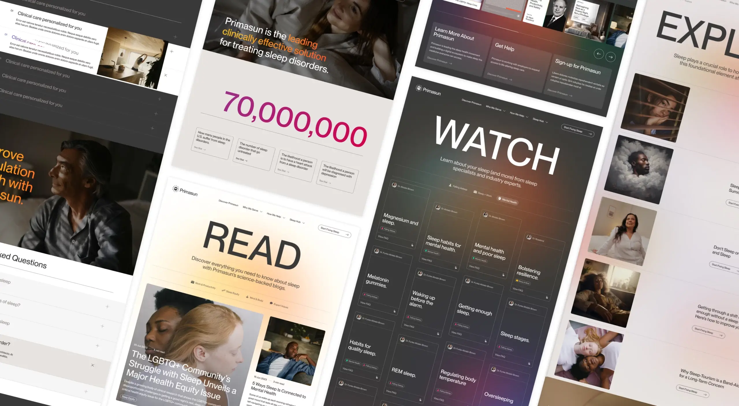
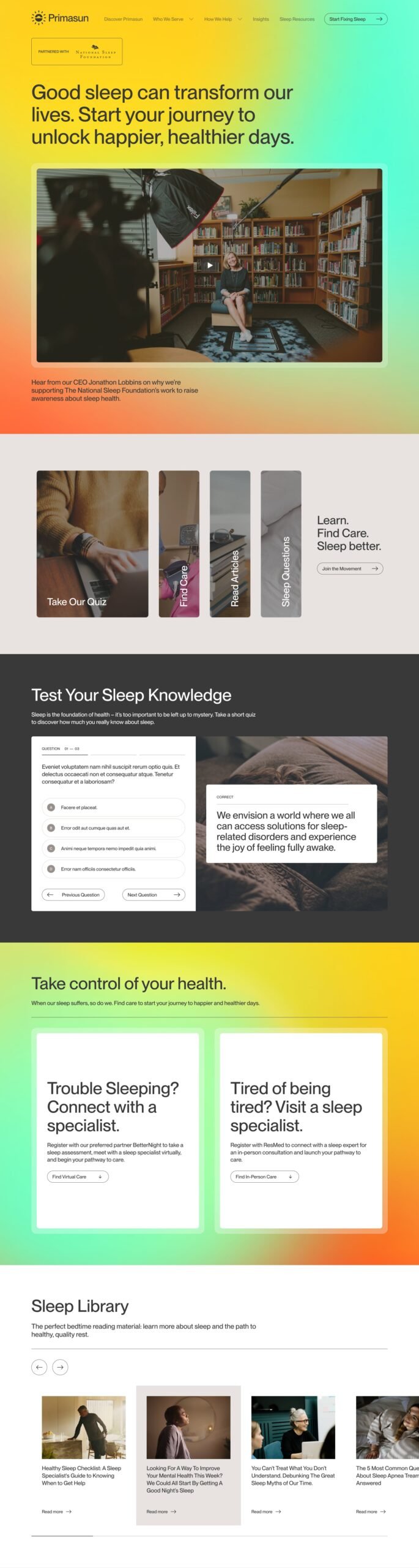
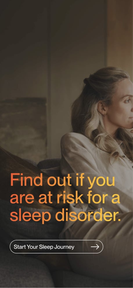
Waking the World Up to the Importance of Good Sleep
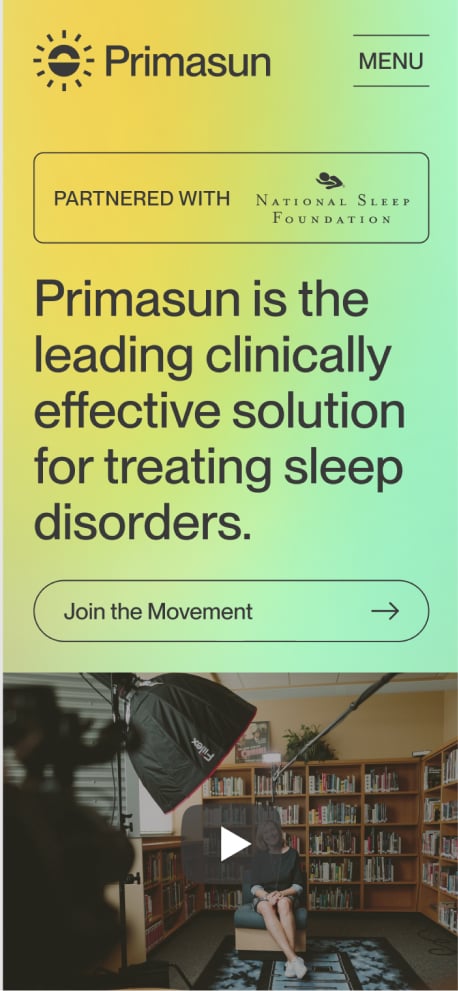
Primasun, an Alphabet precision health company, brings together cutting-edge technology and data-driven care management on a single, streamlined digital platform. Their mission? To revolutionize the way we approach sleep and pave the way for a more efficient and fair pathway to better sleep.
In early 2022, Primasun turned to Takt to bring their groundbreaking vision to life online. They needed an industry-defining website and a marketing campaign that would wake-up the sleep conversation and generate buzz in the months leading up to their product launch.
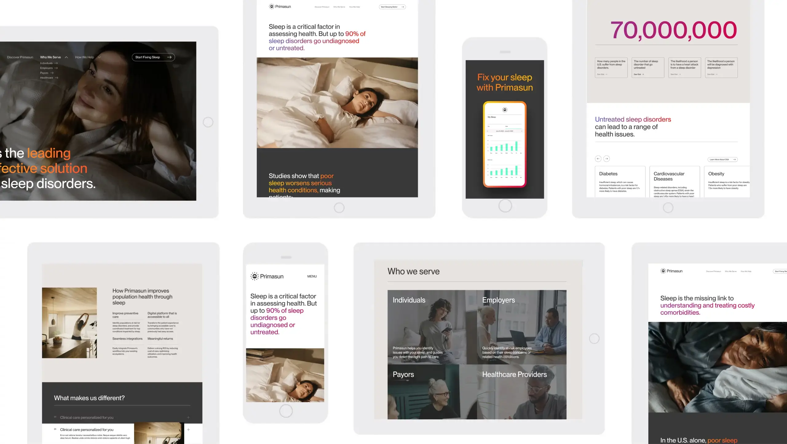
With a new logo in-hand and two mobile applications in the pipe, developing a successful digital homebase for Primasun meant accomplishing three things:
The result was a second-to-none, 3-time award-winning digital experience and awareness campaign.
On the technology front, our approach was methodical and future-focused. To accommodate Primasun’s need for a hyper secure, lightning quick website, we opted for a headless CMS, integrating Contentful with Gatsby, which provided a dynamic and flexible platform. This approach ensured that the site was not only rapid and secure but also accessible to a wide audience.
A modular design and component library allowed for easy updates and adaptations, aligning with Primasun’s evolving needs and ambitions.
With the success of the brand and website behind us, we began strategizing a go-to-market approach for its B2C and B2B campaigns in the lead-up to its product launches.
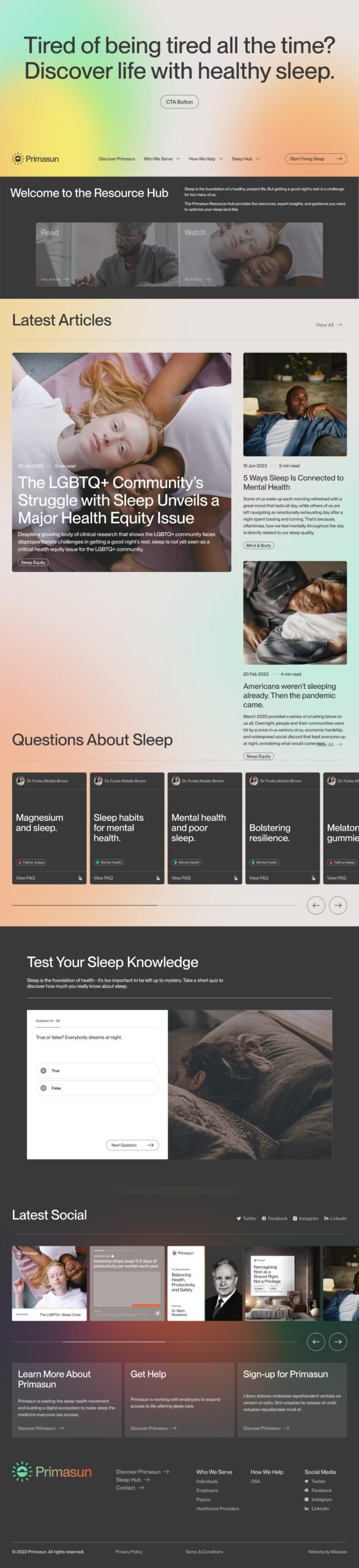
Facebook, Instagram and Reddit campaigns educated audiences prior to the launch by challenging their perspectives on sleep and its relationship to health, creating hype and interest around Primaun’s “Sleep Movement” and driving traffic to its Resource Hub for sleep insights.

Email Drip campaigns were created and ensured those who pre-registered interest for the app remained engaged. Additionally, Massive supported organic advertising with a robust content plan aimed at both PrimaSun’s B2B and B2C audiences.
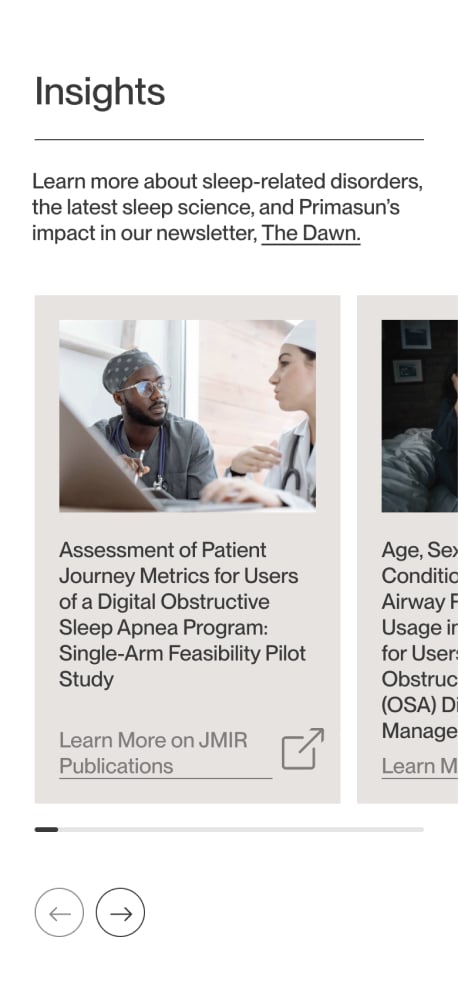
On B2C platforms, we simplified the often-complex subject of sleep science, making it accessible to all. The use of engaging visuals, infographics, and uncomplicated language turned scientific insights into relatable and actionable advice. By breaking down the science of sleep into easily understandable elements, Primasun succeeded in highlighting sleep’s importance and relevance to daily well-being for a broader audience.
Common questions about healthcare website projects, answered from experience.
Designing a healthcare website for high-stress contexts means reducing cognitive load with scannable layouts, thoughtful information hierarchy, and predictable pathways to support. We prioritize “need it now” tasks and use structure, contrast, and content chunking to make real-time decisions easier for users. CMHA North + West Vancouver’s previous site, for example, was difficult to navigate and text-heavy, which is why the redesign emphasized clarity and quicker access to critical information.
A healthcare website’s mobile user experience improves most when templates are built responsively at the component level, navigation is simplified, and content is structured to support scanning and quick actions. Performance and readability need to be validated during build, not retrofitted after launch. For Kelowna Dental Centre, the site was rebuilt to deliver a clean, conversion-ready experience across devices, with accessibility and performance treated as core UX requirements.
WCAG 2.1 AA compliance includes accessible components and templates, adequate contrast, keyboard navigation, screen-reader support, and consistent interaction patterns that remain accessible as content scales. The practical win is governance: accessibility holds because it’s baked into the system, not dependent on one-off page fixes.
The “best” platform is the one that supports structured content, reusable components, secure integrations, and the authoring reality of your internal team. For high-performance, security-sensitive builds, a headless approach can be a strong fit because it decouples content management from the front end and reduces risk. For Primasun, an Alphabet-funded precision health company, Takt used a headless CMS approach (Contentful + Gatsby) to support speed, security, and accessibility at scale.
Success for healthcare website redesigns is measured through real outcomes tied to user intent: discoverability (organic visibility, SEO), engagement quality (time, depth, ease of action), and meaningful actions (calls, form submits, bookings, resource downloads). Then instrument analytics around those tasks so you can prove impact and keep improving post-launch. For Evergreen MD Aesthetics, the website redesign’s success was measured by concrete lifts in engagement and acquisition metrics, including increases in session duration, call volume, and organic traffic.
A healthcare brand strategy has to earn trust before it can earn attention. Patients, caregivers, partners, and referring professionals, for example, expect signals of safety, credibility, competence, and care, often while navigating stress, uncertainty, or highly personal decisions.
Our approach starts with the organization’s specific trust-building architecture: who the key audiences are, what reassurance looks like for each, and where perception is misaligned with reality. That work is grounded in research, whether that means stakeholder interviews and value-definition workshops, competitive review, audience and behaviour analysis, or a bespoke combination of these mechanisms, depending on the project’s unique goals and context.
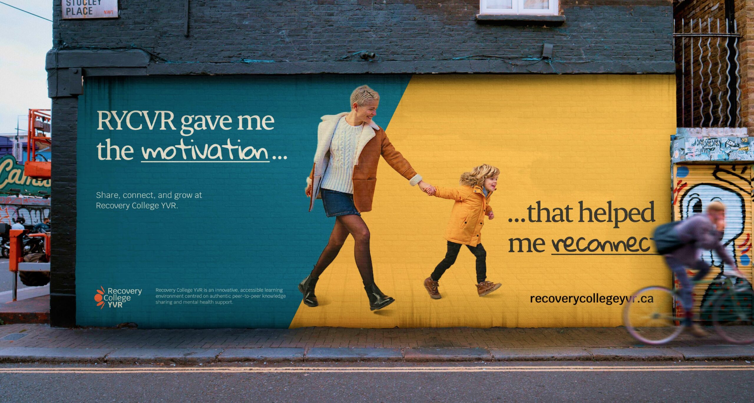
It also means recognizing that “healthcare” is not a single audience or emotional context. Recovery College YVR needed a brand that felt inclusive, real, and community-led, as opposed to clinical or institutional, which led to the narrative “Real people. Sharing. Learning.” Community Action Initiative, by contrast, needed brand strategy and messaging that clarified its mission and distinct role in British Columbia’s mental health and addiction landscape after confusion around its name and purpose. For Medtronic Labs, that meant using workshops and stakeholder interviews to clarify core values such as pioneering, collaboration, and empathy for a global health innovation organization.
The common thread is that healthcare branding works best when it translates complexity into trust, and when the strategy is precise enough to reflect how people actually experience care, support, solutions, and/or wellness.
Clinical credibility comes from specificity, not jargon: naming what a service does and what outcomes it produces in language real people can follow. Warmth comes from how the brand frames that science in relation to the person receiving care. When both work together, clinical detail actually makes the brand feel more human, because it signals that the organization takes its patients seriously enough to be precise.
In practice, this shapes decisions across the entire brand system: messaging hierarchy, visual tone, typography, imagery, and the language used in patient-facing content. The goal is never to strip out the science. It’s to make the science feel like it belongs to the patient, not just the clinician.
We’ve navigated this tension across very different healthcare contexts, from Medtronic LABS (global health innovation speaking to government partners and underserved communities) to Evergreen MD Aesthetics (a physician-led cosmetic clinic in a crowded consumer market).
A healthcare organization should consider a rebrand when there’s a meaningful gap between what the organization has become and what its brand communicates.
That gap shows up as difficulty recruiting staff who don’t recognize the organization from its public presence, patient confusion about available services, fragmented brand architecture after a merger or expansion, or a strategic pivot the existing identity can’t carry.
A rebrand isn’t always the answer, though. Sometimes the issue is messaging clarity or visual consistency, not positioning. We start by diagnosing which problem actually exists before recommending scope.
The work we did with CMHA North + West Vancouver was a structural and digital overhaul, not a repositioning. The work with Community Action Initiative required a full brand strategy and visual identity because stakeholders were confused about the organization’s name, mission, and distinct role. Two different diagnoses, two different scopes.